
Python海运面格网
Python海运面格网
提问于 2018-07-05 15:43:34
我为每一位顾客数了一次绿色/橙色/红色,由销售员提供:
    sellor  customer    red green   orange
0   73  c1  5   96  15
1   77  c1  88  18  79
2   97  c1  58  59  71
我可以用:
df = pd.DataFrame()
df["sellor"]   = np.random.randint(0,100, 20)
df["customer"]   = ["c1"]*5 + ["C2"]*5 + ["C3"]*5 + ["c4"]*5
df["red"] = np.random.randint(0,100, 20)
df["green"] = np.random.randint(0,100, 20)
df["orange"] = np.random.randint(0,100, 20)

df.sellor = df.sellor.astype("category")
df.customer = df.customer.astype("category")
现在,我想将数据表示为图表:现在我这样做了:
for customer in df.customer.unique():
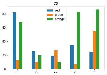
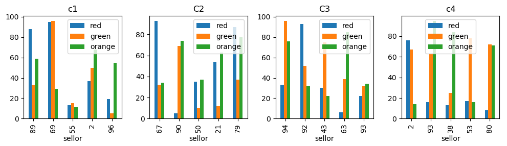
df[df.customer==customer].plot.bar(title=customer)它给了我4张图片,就像那张折页的照片:
我想我也能做同样的事情,但是我没有找到真正的方法。我试过:
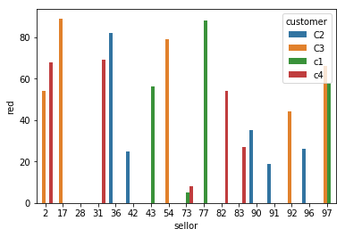
sns.barplot(data=df, x="sellor", y="red", hue="customer")但是它只给了我一个地块(没有按客户细分)+它没有给我三个sellors的酒吧:(
如何使用facetgrid来获得与我的循环相同的结果?
回答 1
Stack Overflow用户
回答已采纳
发布于 2018-07-05 17:00:27
如果不使用海运,您可以将您的商标图绘制成相同图形的不同子图,
import matplotlib.pyplot as plt

u = df.customer.unique()
fig, axes = plt.subplots(ncols=len(u), figsize=(10,3))

for customer, ax in zip(u, axes):
    df[df.customer==customer].plot.bar(x="sellor", title=customer, ax =ax )

plt.tight_layout()
plt.show()
您可以通过以下方式实现类似于海运的FacetGrid
import seaborn as sns
g = sns.FacetGrid(data=df, col="customer", col_order=["c1", "C2", "C3", "c4"])

def plot(*args,**kwargs):
    kwargs["data"].plot(kind="bar", x="sellor", ax=plt.gca())
g.map_dataframe(plot)
plt.show()

最后,要更改这里使用的颜色以匹配dataframe名称的颜色,您可以设置颜色周期。
plt.rcParams["axes.prop_cycle"] = plt.cycler("color", ["red", "green", "orange"])页面原文内容由Stack Overflow提供。腾讯云小微IT领域专用引擎提供翻译支持
原文链接:
https://stackoverflow.com/questions/51195372
复制相关文章
相似问题
腾讯云开发者
