
在css网格中,如何使子p标记与自动宽度在同一个网格中相同?
在css网格中,如何使子p标记与自动宽度在同一个网格中相同?
提问于 2018-09-07 11:36:18
我有一个.post div,它是显示:网格,我让所有的列和行自动调整以适应我的img的大小。img的最大宽度为19 it,我不希望.post div超过该最大宽度的图像宽度,但是当我的p标记太长时,div的宽度也随之扩展,超过img的宽度。当p标签超出我的img的宽度时,我希望它在它下面的下一行上,但是我不知道怎么做。
.post {
  display: inline-grid;
  grid-template-columns: auto;
  grid-template-rows: auto auto auto;
  border: solid 2px gray;
  margin: 5px 10px;
  grid-template-areas:
  'top top top'
  'name name name'
  'comment comment .';
}

.post > img {
  max-height: 19em;
  max-width: 19em;
  grid-area: top;
}

.post > h3 {
  grid-area: name;
  padding-left: 5px;
  padding-top: 5px;
  color: #0f0;
}

.post > p {
  grid-area: comment;
  padding: 4px 4px 6px 6px;
  white-space: initial;
}<div class="post">
<img src="https://placehold.it/600x400" alt="">
<h3>Heading</h3>
<p>Lorem ipsum dolor sit amet, consectetur adipiscing elit, sed do eiusmod tempor incididunt ut labore et dolore magna aliqua. Ut enim ad minim veniam, quis nostrud exercitation ullamco laboris nisi ut aliquip ex ea commodo consequat. </p>
</div>
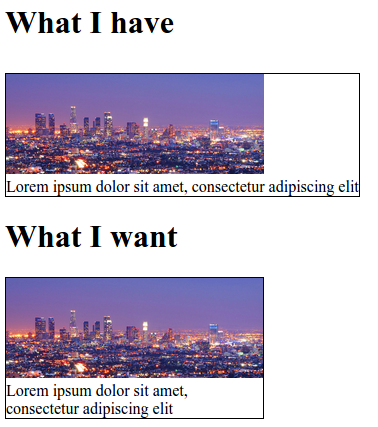
编辑:我不想通过使高度自动在我的图像上,因为我的一些图像太大,我想把他们的高度限制在19 my。我如何解决这一问题,而不取消对我的图像高度限制?
Stack Overflow用户
回答已采纳
发布于 2018-09-07 13:41:39
我通过在img中做一个容器div并使用最大高度和最小高度来解决这个问题。这是我改变的-
   <div class='post'>
        <div class='post2'>
           <img src='uploadedFiles/<?php echo $image->image; ?>' alt='$image->id'>
           <h3><?php echo $image->user; ?></h3>
           <p>"<?php echo $image->description; ?>"</p>
        </div>
    </div>


.post {

    display: inline-grid;

    border: solid 2px gray;

    margin: 5px 10px;

    max-width : 19em;

    text-align: center;

}

.post2 {

    max-width: 19em;

    display:inline-block;
}

.post2 > img {

    max-height: 19em;

    min-width:100%;

    max-width: 100%;

    cursor: pointer;

}

.post2 > h3 {

    padding-left : 5px;

    padding-top : 5px;

    font-weight: bold;

    color: #00ff00;

}

.post2 > p {


    padding: 4px 4px 6px 6px;

    white-space: initial;

    word-wrap: break-word;

}页面原文内容由Stack Overflow提供。腾讯云小微IT领域专用引擎提供翻译支持
原文链接:
https://stackoverflow.com/questions/52221767
复制相关文章
相似问题
腾讯云开发者
