
如何在地块上显示数据中每列的最高百分比
如何在地块上显示数据中每列的最高百分比
提问于 2018-10-08 07:53:59
我有航班数据集
3列(“准时”、“早”、“延迟”) 12行(月)
为了说明每个月的出发时间,我在它上做了一个标有标杆的情节。
我的问题是如何在地块上显示每一列的最高百分比(“准时”、“早”、“延迟”)与几个月的航班总数相比。
例如,:
on_time: 8月份10%的航班 早:10月份有70%的航班 延误:6月份80%的航班
from mlxtend.plotting import stacked_barplot
fig= stacked_barplot(df,rotation=45,legend_loc='best')
fig.text(??)
fig.show()回答 1
Stack Overflow用户
回答已采纳
发布于 2018-10-08 09:53:19
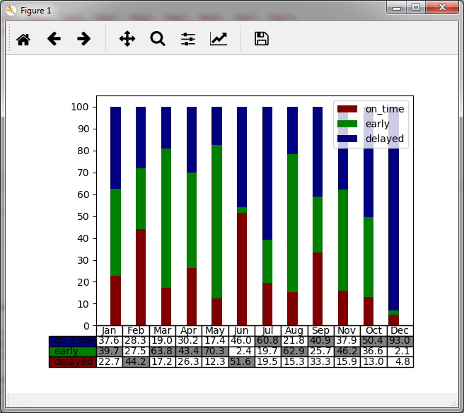
您可以向条形图中添加一个表,以显示数据并突出显示特定数据。
例如(深受表格启发)
import numpy as np
import matplotlib.pyplot as plt


data = np.random.rand(3,12)
for i in range(0,12):
    data[:,i]=data[:,i]/sum(data[:,i])*100.0

columns = ('Jan', 'Feb', 'Mar', 'Apr', 'May', 'Jun', 'Jul', 'Aug', 'Sep', 'Nov', 'Oct', 'Dec')
rows = ['on_time', 'early', 'delayed']

values = np.arange(0, 110, 10)
value_increment = 1

colors = np.zeros((3,3))
colors[0,0]=0.5
colors[1,1]=0.5
colors[2,2]=0.5
n_rows = len(data)
n_columns = len(data[0])

index = np.arange(len(columns)) + 0.3
bar_width = 0.4

# Initialize the vertical-offset for the stacked bar chart.
y_offset = np.zeros(len(columns))

# Plot bars and create text labels for the table
cell_text = []
colors_cell = np.ones((3,12,3))
p=list()
for row in range(n_rows):
    p.append(plt.bar(index, data[row,:], bar_width, bottom=y_offset, color=colors[row]))
    #
    y_offset = y_offset + data[row,:]
    cell_text.append(['%1.1f' % (x) for x in data[row]])
plt.legend((p[0][0], p[1][0], p[2][0]), ('on_time', 'early', 'delayed'))
for column in range(n_columns):
    arg_i = np.argmax(data[:,column])
    colors_cell[2-arg_i, column, 0] = 0.5
    colors_cell[2-arg_i, column, 1] = 0.5
    colors_cell[2-arg_i, column, 2] = 0.5
# Reverse colors and text labels to display the last value at the top.
colors = colors[::-1]
cell_text.reverse()

# Add a table at the bottom of the axes
the_table = plt.table(cellText=cell_text,
                      cellColours=colors_cell,
                      rowLabels=rows,
                      rowColours=colors,
                      colLabels=columns,
                      loc='bottom')
# Adjust layout to make room for the table:
plt.subplots_adjust(left=0.2, bottom=0.2)

plt.yticks(values * value_increment, ['%d' % val for val in values])
plt.xticks([])

plt.show()
页面原文内容由Stack Overflow提供。腾讯云小微IT领域专用引擎提供翻译支持
原文链接:
https://stackoverflow.com/questions/52697727
复制相关文章
相似问题
腾讯云开发者
