
如何修改x轴以下凌乱和重叠的日期标签
如何修改x轴以下凌乱和重叠的日期标签
提问于 2018-11-28 21:03:34
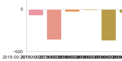
df (Pandas DataFrame)有两列:日期(作为datetime64)和数量(作为浮点数)。
我根据时间绘制“金额”列中的值,使用barplot:
sns.barplot(x="Date", y="Amount", data=df)
plt.show()
然而,日期标签是一个可怕的混乱(见图)。在潘达斯,什么是处理这件事的优雅方法?我正在考虑从标签上删除月份和年份,或者将标签旋转90度。如何做到这一点,或者是否有更好的选择?谢谢。
回答 3
Stack Overflow用户
回答已采纳
发布于 2018-11-28 21:08:24
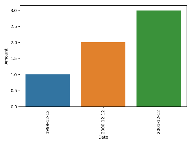
我会同时做两件事:旋转你的x标签,只使用日期:
import seaborn as sns
import matplotlib.pyplot as plt

# dummy data:
df = pd.DataFrame({'Date':pd.to_datetime(['1999-12-12', '2000-12-12', '2001-12-12']),'Amount':[1,2,3]})

sns.barplot(x="Date", y="Amount", data=df)
# use the original locations of your xticks, and only the date for your label
# rotate the labels 90 degrees using the rotation argument
plt.xticks(plt.xticks()[0], df.Date.dt.date, rotation=90)
plt.tight_layout()
plt.show()
Stack Overflow用户
发布于 2020-08-30 05:32:06
这会自动调整SNS绘图的日期x轴,因此在大多数情况下不必手动完成此操作:sns_plot.get_figure().autofmt_xdate()
Stack Overflow用户
发布于 2019-03-23 03:29:58
另一种解决方案是,如果你有大量的日期,并且喜欢在一个更稀疏的间隔上给它们贴上标签;
import pandas as pd
import seaborn as sns
import matplotlib.pyplot as plt
import matplotlib.dates as mdates

# dummy data:
df = pd.DataFrame({'Date':pd.to_datetime(['1999-12-12', '2000-12-12', '2001-12-12',
                                          '2002-12-12', '2003-12-12', '2004-12-12',
                                          '2005-12-12','2006-12-12', '2007-12-12', '2008-12-12']),
                                          'Amount':[1,2,3,4,5,6,7,8,9,10]})

fig, ax = plt.subplots()
sns.barplot(x="Date", y="Amount", data=df, ax=ax)

# set the frequency for labelling the xaxis
freq = int(2)

# set the xlabels as the datetime data for the given labelling frequency,
# also use only the date for the label
ax.set_xticklabels(df.iloc[::freq].Date.dt.date)
# set the xticks at the same frequency as the xlabels
xtix = ax.get_xticks()
ax.set_xticks(xtix[::freq])
# nicer label format for dates
fig.autofmt_xdate()

plt.tight_layout()
plt.show()
也值得考虑使用海运地块默认值,并将日期放在yaxis上,以便于阅读,但这是更多的个人偏好。
import pandas as pd
import seaborn as sns
import matplotlib.pyplot as plt
import matplotlib.dates as mdates

# set the seaborn asthetics
sns.set()

# dummy data:
df = pd.DataFrame({'Date':pd.to_datetime(['1999-12-12', '2000-12-12', '2001-12-12',
                                          '2002-12-12', '2003-12-12', '2004-12-12',
                                          '2005-12-12','2006-12-12', '2007-12-12', '2008-12-12']),
                                          'Amount':[1,2,3,4,5,6,7,8,9,10]})

fig, ax = plt.subplots()
# plot with a horizontal orientation
sns.barplot(y="Date", x="Amount", data=df, ax=ax, orient='h')

# set the frequency for labelling the yaxis
freq = int(2)

# set the ylabels as the datetime data for the given labelling frequency,
# also use only the date for the label
ax.set_yticklabels(df.iloc[::freq].Date.dt.date)
# set the yticks at the same frequency as the ylabels
ytix = ax.get_yticks()
ax.set_yticks(ytix[::freq])

plt.tight_layout()
plt.show()
页面原文内容由Stack Overflow提供。腾讯云小微IT领域专用引擎提供翻译支持
原文链接:
https://stackoverflow.com/questions/53528054
复制相关文章
相似问题
腾讯云开发者
