
如何在散点图上建立单独的均值、误差条,以及如何建立一条水平平均线?
如何在散点图上建立单独的均值、误差条,以及如何建立一条水平平均线?
提问于 2019-04-25 13:01:47
我想让position_dodged scatter plot的平均值表示为水平线(带有错误条)。
我遇到了麻烦,position_dodging,使用stat_summary()的平均值和误差条,并使平均值显示为一条水平线。
我想表明,性别之间的平均值是不同的。我知道每个小组都有不同的方法,但我不知道如何想象它。
download.file(url="https://ndownloader.figshare.com/files/2292169",
              destfile = "~/portal_data_joined.csv")

surveys <- read.csv

surveys_cln <- surveys %>% filter(sex=="F"|sex=="M")

ggplot(data = surveys_cln, mapping = aes(x=species_id, y=weight, color=sex))+
  geom_jitter(alpha=.6, position = position_dodge(.5))+
  stat_summary(fun.data = mean_sdl, fun.args = list(mult=1),
               geom="errorbar", color="red", width=.5, position=position_dodge2(width=.9))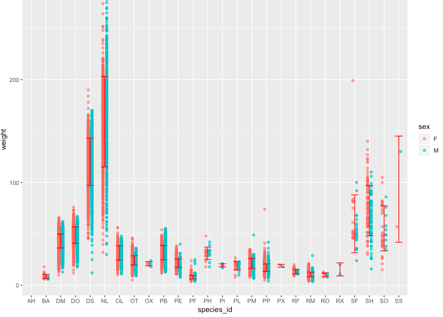
stat_summary(fun.y=mean, geom="errorbar", color="red", width = .75, linetype = "dashed", position=position_dodge(9))我每个条件只有一个mean+errorbar,而不是一个条件的两个组。如果我能为男女分别展示mean+errorbar,那就太好了。
这是图像
嗨!谢谢你的帮助。下面是更新的代码:
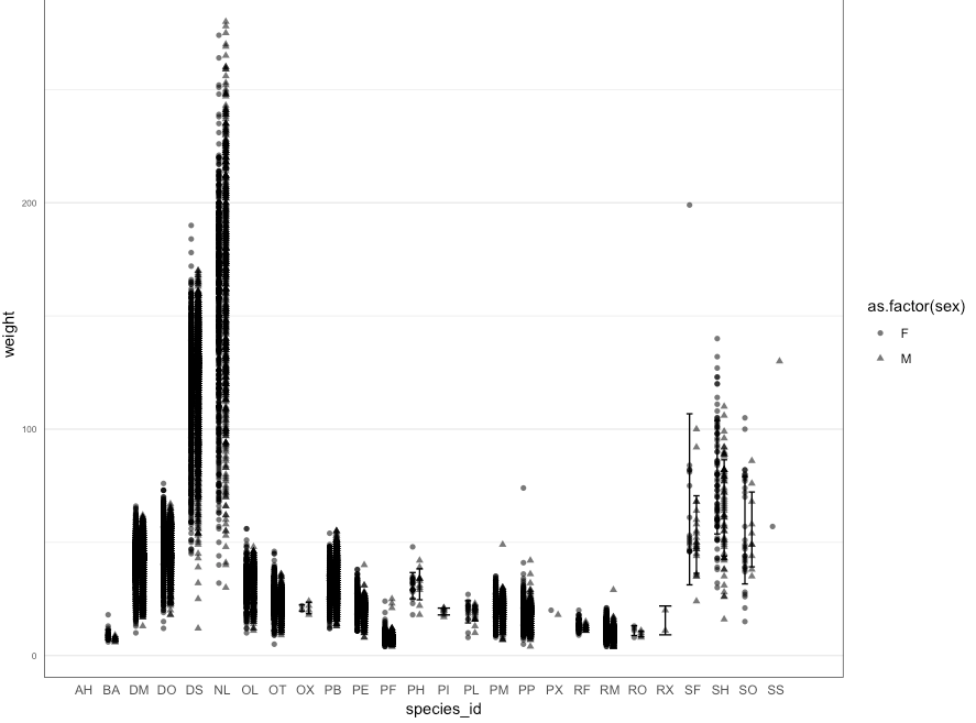
  ggplot(data = surveys_cln, mapping = aes(x=species_id, y=weight, fill=as.factor(sex), shape=as.factor(sex)))+

  geom_jitter(alpha=.6, position = position_dodge(.5))+
  stat_summary(aes(group = sex), fun.data = mean_sdl, fun.args = list(mult=1),
  geom="errorbar", width=.5, position=position_dodge2(width=.9))+
  stat_summary(fun.y=mean, geom="errorbar", width = .75, linetype = "dotted", position=position_dodge(9))+

  scale_fill_manual(values=c("#006D2C","#DEEBF7"))+
  #scale_fill_brewer(palette="Paired")+

  theme_bw()+
  #theme(text=element_text(size=30))+
  theme(#legend.position = "none",
    plot.title = element_blank(),
    panel.grid.major.x = element_blank(),
    axis.title.x = element_text(),
    axis.text.x = element_text(),
    axis.ticks = element_blank(),
    axis.text.y = element_text(size=rel(.7)))
你能帮我弄一下颜色吗?我要F=#000000和M=#73000a。
另外,在错误栏之间是否有将平均值形象化为水平条的情况?
这是第二次尝试
再次感谢!
回答 2
Stack Overflow用户
回答已采纳
发布于 2019-04-25 13:09:44
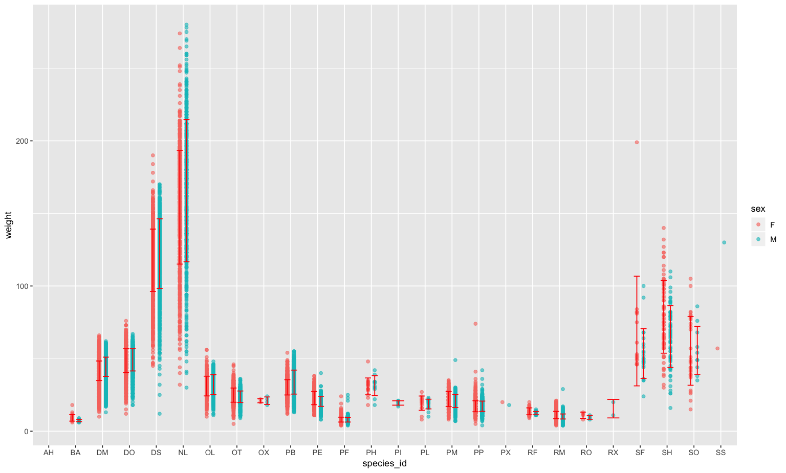
您需要在您的aes(group = sex)中添加geom_*()。
ggplot(data = surveys_cln,
       mapping = aes(x = species_id, y = weight, color = sex)) +
  geom_jitter(alpha = .6, position = position_dodge(.5)) +
  stat_summary(fun.data = mean_sdl, fun.args = list(mult = 1),
               aes(group = sex),
               geom = "errorbar", color = "red", width = .5,
               position = position_dodge2(width = .9))
Stack Overflow用户
发布于 2019-04-25 13:13:41
虽然@abichat的答案是完全正确的,但您也可以删除color="red"参数,这会导致ggplot不对数据进行分组。
这样,你的情节将显示错误条与良好的颜色(可能增加他们的厚度,以提高可读性)。
页面原文内容由Stack Overflow提供。腾讯云小微IT领域专用引擎提供翻译支持
原文链接:
https://stackoverflow.com/questions/55849917
复制相关文章
相似问题
腾讯云开发者
