
如何在geom_path中为多个类别添加渐变褪色/变化
如何在geom_path中为多个类别添加渐变褪色/变化
提问于 2019-06-18 20:03:51
我试图用geom_path在ggplot2上展示鸟类的移动,在这里,每只鸟都有自己的路径。我想展示每条鸟的路径是如何随时间变化的(也就是说,路径的开始颜色更深,末端更浅,反之亦然)。
到目前为止,我能够使用geom_path为每只鸟获得一条不同的颜色线。然而,我似乎不能得到一个渐进的褪色或其他颜色的变化,以显示时间的进展。
下面是我的数据的一个例子:
datexample <- data.frame(
  "site" = c("A","B", "A", "B"),
  "bird" = c("1A","2A"),
  "week" = c(28, 28, 29, 29),
  "lat" =  c(45.25, 44.75, 45.25, 45.75),
  "lon" = c(-61.75, -61.25, -62.75, -62.25)
)
datexample
下面是图的代码示例:
p = ggplot() +
  geom_path(data = datexample, aes(x = lon, y = lat, colour=bird))+
  coord_sf(crs = 4326, xlim = c(-58, -69), ylim = c(40, 48))+
  xlab("Longitude")+
  ylab("Latitude")+
  labs(color='Bird ID')
p
以下是输出的样子:
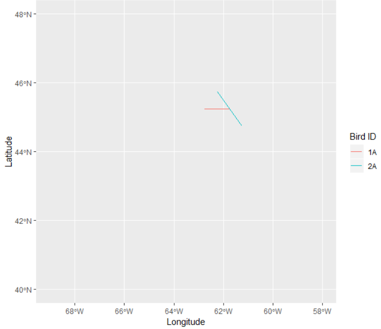
本质上,我想要能够显示出鸟类在采样的几周内移动的路径(即哪一点第一,第二,等等)。
我是相对较新的R,所以任何帮助都将不胜感激!
回答 1
Stack Overflow用户
回答已采纳
发布于 2019-06-18 20:23:20
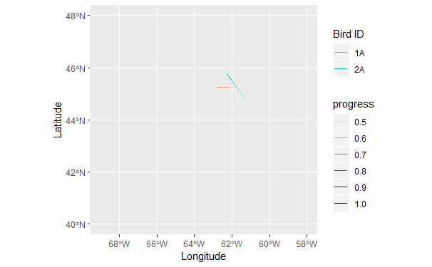
在geom_path上有几种指示方向的方法。
一种方法是使用ggforce::geom_link2代替ggplot2::geom_path,允许沿着路径的长度逐渐遮阳。在这里,我添加了一个“进度”变量,显示每只鸟沿着它的总路径有多远,然后将其映射到alpha (透明)。geom_link2在路径中创建细分,以允许路径的每一段逐渐衰落。
library(dplyr)
p = ggplot() +
  ggforce::geom_link2(data = datexample %>%
                       group_by(bird, site) %>%
                       mutate(progress = row_number()/n()),
            aes(x = lon, y = lat, colour=bird, alpha = progress))+
  coord_sf(crs = 4326, xlim = c(-58, -69), ylim = c(40, 48))+
  xlab("Longitude")+
  ylab("Latitude")+
  labs(color='Bird ID')
p
或者,您可以添加一个箭头:
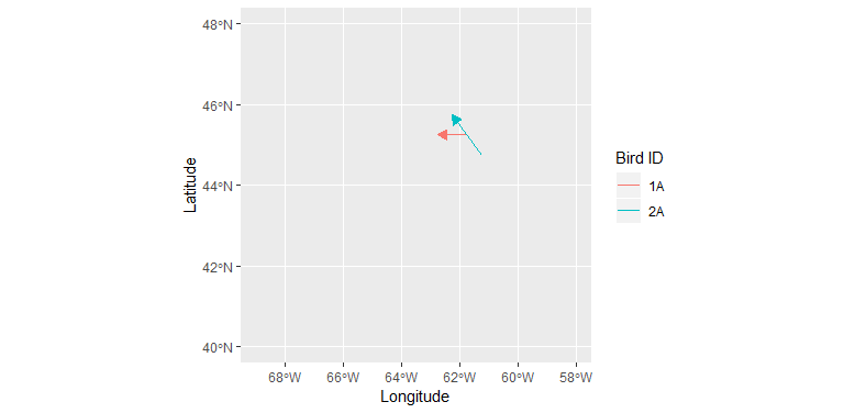
p = ggplot() +
  geom_path(data = datexample,
            aes(x = lon, y = lat, colour=bird),
            arrow = arrow(type = "closed", length = unit(0.03, "npc")))+
  coord_sf(crs = 4326, xlim = c(-58, -69), ylim = c(40, 48))+
  xlab("Longitude")+
  ylab("Latitude")+
  labs(color='Bird ID')
p页面原文内容由Stack Overflow提供。腾讯云小微IT领域专用引擎提供翻译支持
原文链接:
https://stackoverflow.com/questions/56656301
复制相关文章
相似问题
腾讯云开发者
