TUILiveKit 弹幕系统为直播场景提供完整互动解决方案,能够增强直播的互动性和趣味性。通过本文档,您可快速实现直播间弹幕互动功能,并支持深度定制以满足业务需求。PC 浏览器 | 移动端 H5 |
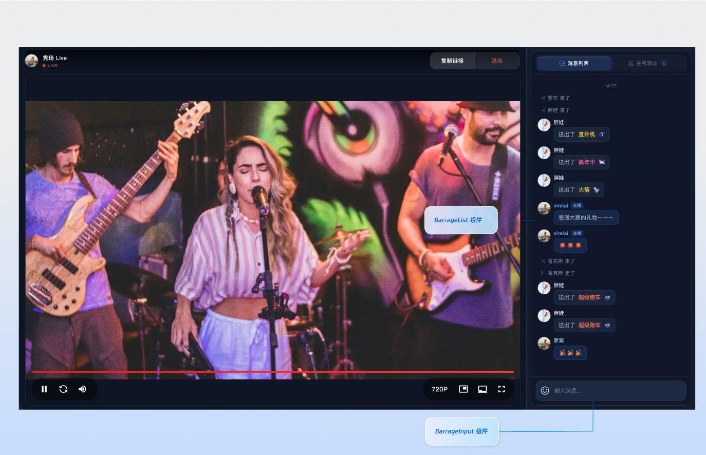 |  |
组件构成
组件名称 | 具体内容 |
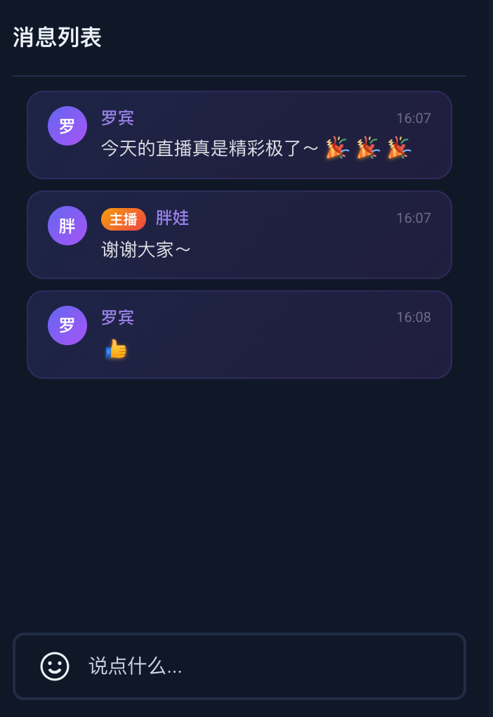
弹幕消息组件(BarrageList) | 负责实时展示和管理弹幕消息流的组件,提供消息列表渲染、时间聚合、用户交互和响应式适配等完整的消息展示解决方案。 |
消息发送组件(BarrageInput) | 提供富文本编辑和消息发送功能的输入组件,集成表情选择器、字符限制、状态管理和跨平台适配,为用户提供流畅的消息输入体验。 |
组件接入
步骤1:配置环境并开通服务
步骤2:安装依赖
npm install tuikit-atomicx-vue3 @tencentcloud/uikit-base-component-vue3 --save
pnpm add tuikit-atomicx-vue3 @tencentcloud/uikit-base-component-vue3
yarn add tuikit-atomicx-vue3 @tencentcloud/uikit-base-component-vue3
步骤3:接入弹幕消息和发送组件
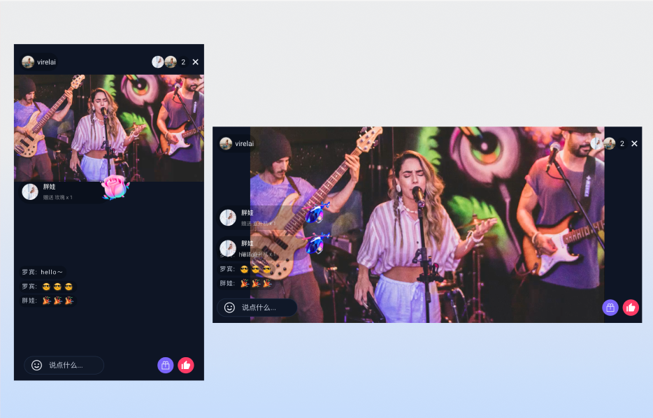
在您的项目中引入并使用弹幕组件,可直接复制如下示例至您的项目中展示完整的直播间弹幕消息组件以及消息发送组件。
<template><UIKitProvider theme="dark"><div class="app"><div class="chat-container"><div class="chat-content"><BarrageList class="barrage-list" /></div><div class="chat-input"><BarrageInput class="barrage-input" /></div></div></div></UIKitProvider></template><script setup lang="ts">import { onMounted, ref } from 'vue';import { UIKitProvider } from '@tencentcloud/uikit-base-component-vue3';import { BarrageList, BarrageInput, useLoginState, useLiveListState } from 'tuikit-atomicx-vue3';const { login } = useLoginState();const { joinLive } = useLiveListState();async function initLogin() {try {await login({sdkAppId: 0, // SDKAppID, 可以参考步骤 1 获取userId: '', // UserID, 可以参考步骤 1 获取userSig: '', // userSig, 可以参考步骤 1 获取});} catch (error) {console.error('登录失败:', error);}}onMounted(async () => {await initLogin();await joinLive({liveId: '输入对应直播间 LiveId', // 输入对应 liveId 进入直播间});});</script><style scoped>.app{width:100vw;height:100vh;display:flex;justify-content:center;align-items:center;padding:20px;box-sizing:border-box}.chat-container{width:100%;max-width:500px;height:600px;border-radius:16px;display:flex;flex-direction:column;overflow:hidden}.chat-content{flex:1;overflow:hidden}.barrage-list{width:100%;height:100%}.chat-input{background-color:var(--bg-color-dialog);padding:16px}.barrage-input{width:100%}</style>
自定义组件
弹幕系统的两个核心组件均支持灵活的自定义能力,您可以根据业务需求选择不同的定制方式。
弹幕消息组件(BarrageList)自定义
弹幕消息组件提供了三个层次的自定义能力,您可以根据定制深度选择合适的方式:
定制场景 | 推荐方式 | 说明 |
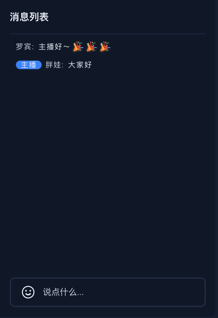
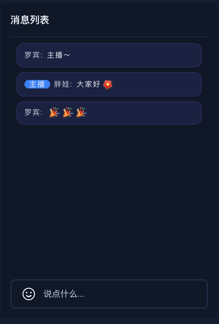
仅调整容器/消息项的颜色、间距等样式 | Props: containerStyle / itemStyle | 最简单,几行样式代码即可实现。 |
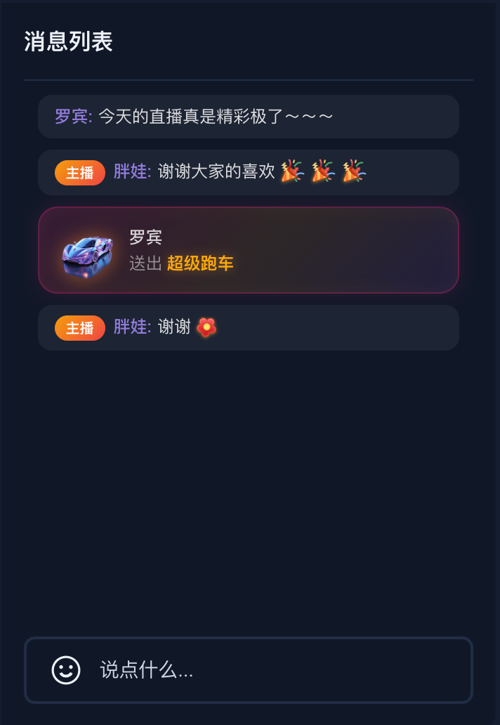
替换整个消息渲染组件,但保留组件内部的消息分类逻辑 | Props: Message | 传入自定义 Vue 组件,控制单条消息的渲染方式。(礼物消息的渲染无法控制) |
完全接管消息渲染,需要按消息类型差异化展示(例如区分礼物消息) | Slot: message-item | 最灵活,所有消息(含礼物)都通过插槽传递。 |
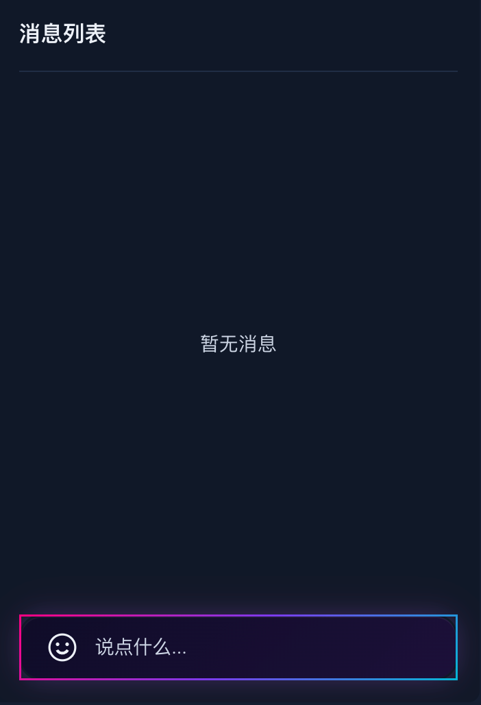
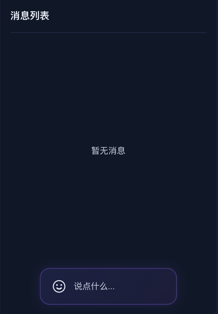
修改前 | 修改后 | | |
| containerStyle + itemStyle | 替换消息组件(Message Props) | 完全接管消息渲染(Slot 插槽) |
 |  |  |  |
注意:
使用 BarrageList 的默认消息组件时,表情消息会自动渲染为图片。但当您通过
Message Props 或 message-item Slot 接管自定义消息渲染时,message.textContent 中的表情编码(例如 [TUIEmoji_Flower])不会自动解析,需要您参考 如何处理自定义弹幕消息时的表情渲染 处理。containerStyle + itemStyle 调整样式
通过
containerStyle、itemStyle、style、height 等 Props,您可以快速调整弹幕消息组件的外观,无需编写额外组件。<BarrageList:containerStyle="{padding: '10px',overflow: 'hidden',}":itemStyle="{background: 'rgba(99, 102, 241, 0.12)',borderRadius: '12px',padding: '8px 12px',border: '1px solid rgba(139, 92, 246, 0.2)',boxShadow: '0 1px 4px rgba(0, 0, 0, 0.15)',marginRight: '6px',boxSizing: 'border-box',}"/>
替换消息组件(Message Props)
如果样式调整无法满足需求,您可以编写一个自定义 Vue 组件,然后通过 BarrageList 的
Message Props 传入,从而完全替换默认的消息渲染逻辑。BarrageList 在渲染每条消息时,会将当前弹幕消息对象作为 message Props 传递给您的自定义组件。因此,您的自定义组件需要声明接收一个
message Props:Props | 类型 | 说明 |
message | 当前弹幕消息对象,包含 textContent(文本内容)、sender(发送者信息)、timestampInSecond(发送时间戳)、data(自定义数据 JSON 字符串)等字段。 |
步骤 1:创建自定义消息组件
// MyCustomMessage.vue<template><div class="custom-message"><div class="message-header"><span class="user-name">{{ getSenderName(message) }}</span><span class="message-time">{{ formatTime(message.timestampInSecond) }}</span></div><div class="message-content">{{ getMessageText(message) }}</div></div></template><script setup lang="ts">import type { Barrage } from 'tuikit-atomicx-vue3';const props = defineProps<{message: Barrage;}>();const formatTime = (timestampInSecond: number) => {return new Date(timestampInSecond * 1000).toLocaleTimeString('zh-CN', {hour: '2-digit',minute: '2-digit'});};const getSenderName = (message: Barrage) => {const sender = message.sender;return sender.nameCard || sender.userName || sender.userId || '匿名用户';};const getMessageText = (message: Barrage) => {if (message.textContent) {return message.textContent;}return '';};</script><style scoped>.custom-message{background:linear-gradient(135deg,#667eea 0%,#764ba2 100%);color:white;padding:12px;border-radius:12px;margin:4px 0;box-shadow:0 2px 8px rgba(0,0,0,0.1);transition:transform 0.2s ease}.custom-message:hover{transform:translateY(-2px)}.message-header{display:flex;justify-content:space-between;align-items:center;margin-bottom:8px;font-size:12px;opacity:0.9}.user-name{font-weight:500;max-width:120px;overflow:hidden;text-overflow:ellipsis;white-space:nowrap}.message-time{font-size:11px;opacity:0.7}.message-content{font-size:14px;line-height:1.4;word-break:break-word}</style>
步骤 2:在 BarrageList 中使用自定义组件
<template><BarrageList :Message="MyCustomMessage" /></template><script setup lang="ts">import MyCustomMessage from "./MyCustomMessage.vue";</script>
完全接管消息渲染(Slot 插槽)
1. message-item 插槽的优先级高于 Message Props,两者同时使用时以插槽为准。
2. PC 和 H5 两端的插槽行为一致,所有消息(包括礼物消息)都会传递给插槽。
3. 不使用插槽时,H5 端默认不渲染礼物消息(礼物消息在独立的礼物区域展示)。
插槽参数
插槽名 | 参数名 | 参数类型 | 说明 |
message-item | message | 当前弹幕消息对象,包含 textContent(文本内容)、sender(发送者)、messageType(消息类型)、data(自定义数据 JSON 字符串)等字段。 | |
| sender | 发送者信息,包含 userId、userName、avatarUrl 等字段。 | |
<template><BarrageList><template #message-item="{ message, sender }"><!-- 礼物消息 --><div v-if="isGiftMessage(message)" class="slot-gift-item"><img v-if="getGiftIcon(message)" class="slot-gift-img" :src="getGiftIcon(message)" :alt="getGiftName(message)" /><div class="slot-gift-info"><span class="slot-gift-sender">{{ sender.nameCard || sender.userName || sender.userId }}</span><span class="slot-gift-detail">送出 <span class="slot-gift-name">{{ getGiftName(message) }}</span><span class="slot-gift-count"> x{{ getGiftCount(message) }}</span></span></div></div><!-- 普通文本消息 --><div v-else class="slot-text-item"><span v-if="sender.userId === currentLive?.liveOwner?.userId" class="slot-owner-badge">主播</span><span class="slot-sender-name">{{ sender.nameCard || sender.userName || sender.userId }}:</span><span class="slot-message-text">{{ message.textContent }}</span></div></template></BarrageList></template><script setup lang="ts">import { BarrageList, useLiveListState } from 'tuikit-atomicx-vue3';const { currentLive } = useLiveListState();function safelyParseJSON(str: string): any {try {return JSON.parse(str);} catch {return null;}}function isGiftMessage(message: { data?: string }): boolean {if (!message.data) return false;const data = safelyParseJSON(message.data);return data?.type === 'gift';}function getGiftData(message: { data?: string }) {if (!message.data) return null;const data = safelyParseJSON(message.data);return data?.type === 'gift' ? data : null;}function getGiftName(message: { data?: string }): string {return getGiftData(message)?.giftInfo?.name || '礼物';}function getGiftIcon(message: { data?: string }): string {return getGiftData(message)?.giftInfo?.iconUrl || '';}function getGiftCount(message: { data?: string }): number {return getGiftData(message)?.count || 1;}</script><style scoped>.slot-text-item{font-size:12px;line-height:1.6;padding:6px 12px;border-radius:10px;background:rgba(255,255,255,0.05);word-break:break-word}.slot-owner-badge{display:inline-block;background:linear-gradient(135deg,#f59e0b,#ef4444);color:#fff;font-size:10px;font-weight:600;padding:1px 8px;border-radius:10px;margin-right:6px;vertical-align:middle;line-height:1.6}.slot-sender-name{color:rgba(167,139,250,0.85);font-weight:500;margin-right:4px}.slot-message-text{color:rgba(255,255,255,0.85)}.slot-gift-item{display:flex;align-items:center;gap:10px;padding:10px 14px;border-radius:14px;background:linear-gradient(135deg,rgba(255,0,128,0.15),rgba(255,140,0,0.12) 50%,rgba(168,85,247,0.1));border:1px solid rgba(255,0,128,0.25);box-shadow:0 0 12px rgba(255,0,128,0.1),inset 0 0 12px rgba(255,140,0,0.05)}.slot-gift-img{width:40px;height:40px;flex-shrink:0;object-fit:contain;filter:drop-shadow(0 0 6px rgba(255,140,0,0.5))}.slot-gift-info{display:flex;flex-direction:column;gap:2px;min-width:0}.slot-gift-sender{font-size:12px;color:rgba(255,255,255,0.8);font-weight:500;overflow:hidden;text-overflow:ellipsis;white-space:nowrap}.slot-gift-detail{font-size:12px;color:rgba(255,255,255,0.5)}.slot-gift-name{color:#ffaa00;font-weight:700;text-shadow:0 0 8px rgba(255,170,0,0.4)}.slot-gift-count{color:#ff4081;font-weight:800;font-size:13px;margin-left:2px;text-shadow:0 0 8px rgba(255,64,129,0.4)}</style>
Props 速查表
参数名 | 参数类型 | 默认值 | 说明 |
Message | Component | 自定义消息组件。 | |
containerStyle | CSSProperties | - | 自定义消息列表容器样式。 |
itemStyle | CSSProperties | - | 自定义单条消息项样式。 |
height | String | - | 组件高度,支持 CSS 单位。 |
style | CSSProperties | - | 指定根元素自定义样式。 |
消息发送组件(BarrageInput)自定义配置
消息发送组件提供了样式、尺寸、输入行为和发送流程等多个维度的自定义能力,以下按使用场景逐一说明。
修改前 | 修改后 | ||
| containerStyle 调整样式 | containerClass 自定义样式 | 调整尺寸 |
 |  |  |  |
调整样式
消息发送组件提供了
containerStyle、containerClass 属性用于自定义外观。通过内联样式自定义
给
containerStyle 属性传递一个样式对象,可调整输入框容器的样式。<BarrageInput:containerStyle="{background: 'linear-gradient(135deg, rgba(255, 0, 128, 0.1) 0%, rgba(99, 102, 241, 0.15) 50%, rgba(168, 85, 247, 0.1) 100%)',border: '1.5px solid rgba(168, 85, 247, 0.35)',borderRadius: '24px',padding: '8px 18px',boxShadow: '0 0 20px rgba(139, 92, 246, 0.15), 0 0 40px rgba(255, 0, 128, 0.05), inset 0 0 12px rgba(99, 102, 241, 0.08)',}"/>
通过 CSS 类名自定义
给
containerClass 属性传递一个类名字符串,可使用自定义 CSS 类控制样式。<template><BarrageInput containerClass="cyberpunk-input" /></template><style>.cyberpunk-input{background:linear-gradient(135deg,rgba(15,10,40,0.9),rgba(30,15,60,0.85))!important;border:1.5px solid transparent!important;border-radius:16px!important;padding:8px 18px!important;box-shadow:0 0 15px rgba(139,92,246,0.2),0 0 30px rgba(255,0,128,0.08),inset 0 1px 0 rgba(255,255,255,0.05)!important;transition:box-shadow .3s ease!important;border-image:linear-gradient(135deg,#ff0080,#7c3aed,#06b6d4) 1!important;border-image-slice:1!important}.cyberpunk-input:focus-within{box-shadow:0 0 24px rgba(139,92,246,0.35),0 0 48px rgba(255,0,128,0.12),inset 0 1px 0 rgba(255,255,255,0.08)!important}</style>
调整尺寸
<BarrageInputwidth="70%"height="60px"minHeight="60px"maxHeight="60px":containerStyle="{margin: '0 auto',background: 'linear-gradient(135deg, rgba(99, 102, 241, 0.12) 0%, rgba(168, 85, 247, 0.08) 100%)',border: '1.5px solid rgba(139, 92, 246, 0.3)',borderRadius: '16px',padding: '10px 18px',boxShadow: '0 0 16px rgba(139, 92, 246, 0.12)',}"/>
介入发送流程
消息发送组件提供了两个钩子,允许您在弹幕发送前后介入处理流程:
onWillSendBarrage:发送前触发,返回
false 可拦截发送(支持异步),适用于内容审核、敏感词过滤。onDidSendBarrage:发送成功后触发,适用于埋点统计、发送成功提示。
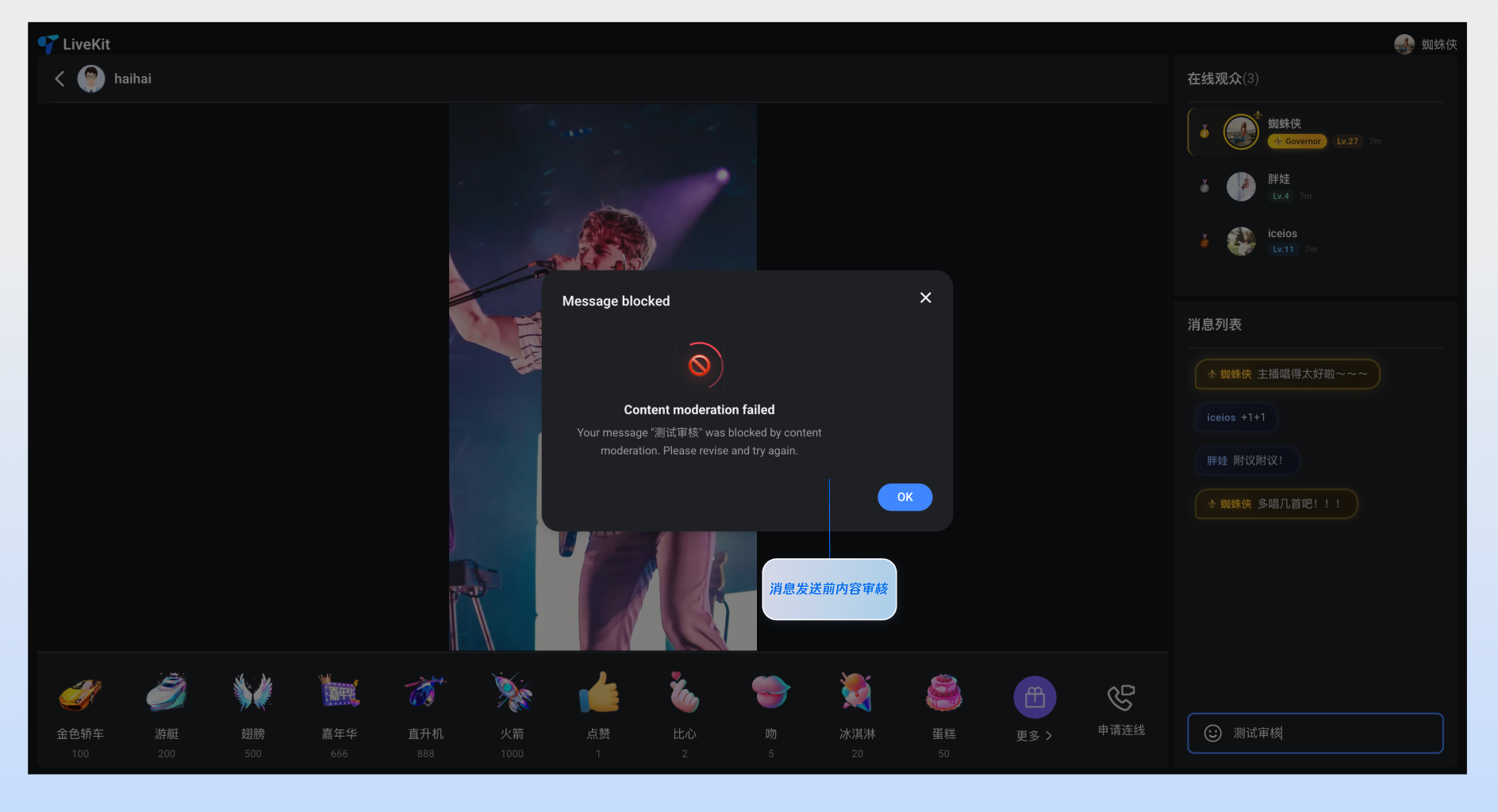
<template><BarrageInput:onWillSendBarrage="handleWillSend":onDidSendBarrage="handleDidSend"/></template><script setup lang="ts">import { BarrageInput } from 'tuikit-atomicx-vue3';import type { Barrage } from 'tuikit-atomicx-vue3';// 发送前内容过滤 — 返回 false 可拦截发送function handleWillSend(message: Barrage): boolean {const sensitiveWords = ['spam', 'abuse'];const hasSensitive = sensitiveWords.some(word => (message.textContent || '').includes(word));if (hasSensitive) {alert('消息包含敏感内容,已拦截发送');return false;}return true;}// 发送成功后的埋点统计function handleDidSend(message: Barrage) {console.log('已发送:', message.textContent);}</script>
监听事件
消息发送组件支持以下事件:
事件名 | 参数 | 说明 |
focus | - | 输入框获得焦点时触发。 |
blur | - | 输入框失去焦点时触发。 |
Props 速查表
参数名 | 类型 | 默认值 | 说明 |
containerClass | String | '' | 自定义容器的 CSS 类名。 |
containerStyle | Record<string, any> | {} | 自定义容器的内联样式。 |
width | String | - | 组件宽度,支持 CSS 单位。 |
height | String | - | 组件高度,支持 CSS 单位。 |
minHeight | String | '40px' | 组件最小高度,支持 CSS 单位。 |
maxHeight | String | '140px' | 组件最大高度,支持 CSS 单位。 |
placeholder | String | - | 输入框占位符文本。 |
disabled | Boolean | false | 是否禁用输入框。 |
autoFocus | Boolean | true | 是否自动聚焦到输入框。 |
maxLength | Number | 80 | 输入内容的最大字符数限制。 |
onWillSendBarrage | - | 弹幕发送前的回调钩子。接收即将发送的 Barrage 消息对象作为参数,返回 false 可拦截本次发送,返回 true 或 void 则允许发送。支持异步回调(Promise<boolean>),适用于内容审核、敏感词过滤等场景。 | |
onDidSendBarrage | - | 弹幕发送成功后的回调钩子。接收已成功发送的 Barrage 消息对象作为参数,适用于埋点统计、发送成功提示等场景。 |
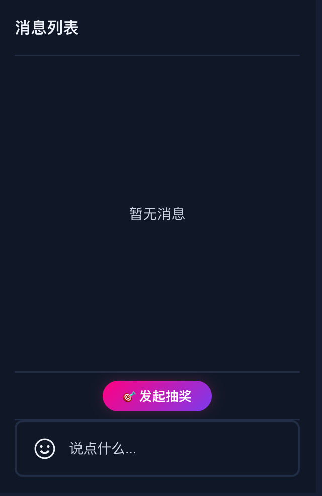
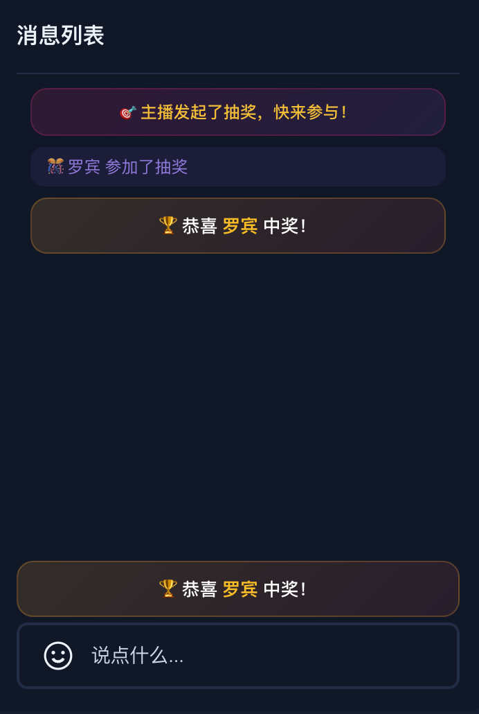
进阶场景:如何快速实现“弹幕抽奖”
弹幕抽奖是直播互动的核心玩法。通过
tuikit-atomicx-vue3 提供的自定义消息能力,您可以轻松实现从“参与抽奖”到“中奖公示”的全流程。主播端 | 观众端 | ||||
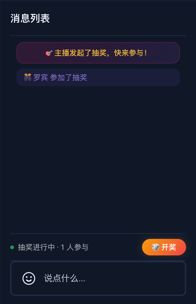
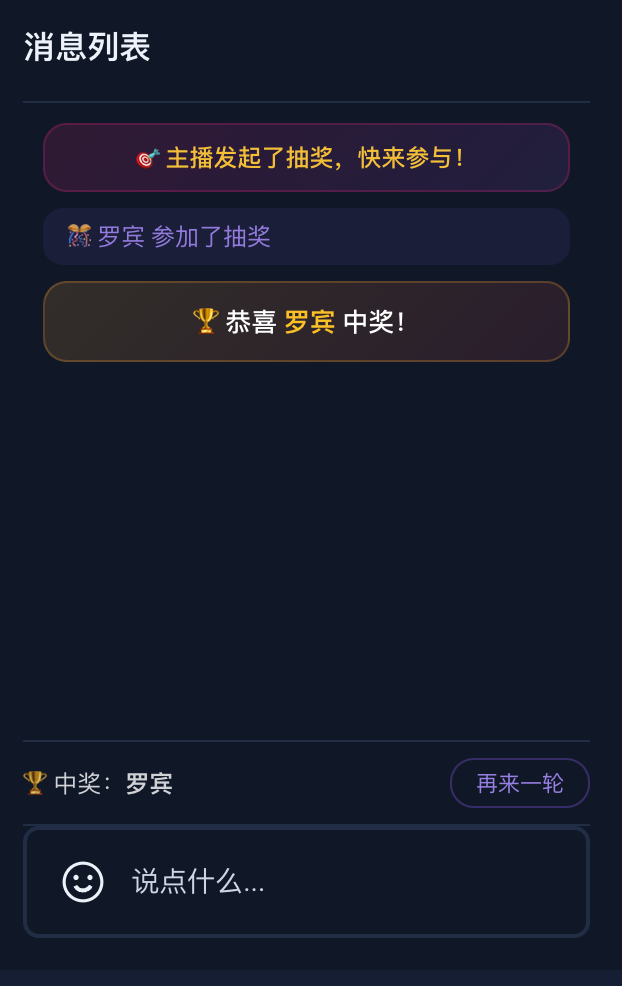
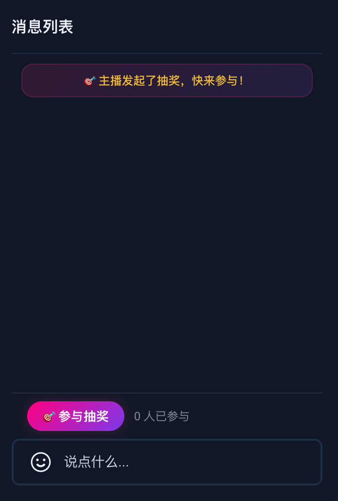
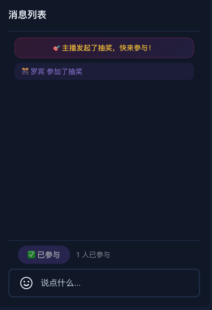
发起抽奖 | 准备开奖 | 开奖结算页面 | 参与抽奖页面 | 参与抽奖成功 | 开奖结算页面 |
 |  |  |  |  |  |
1. 主播端:发起抽奖与开奖
主播点击"发起抽奖"后,通过 sendCustomMessage 向直播间所有人广播一条抽奖开始的消息。之后通过 subscribeEvent 实时监听观众的参与请求,记录参与名单。主播点击"开奖"时随机抽取中奖者,并再次通过自定义消息将中奖结果广播给所有人。
<template><!-- Lottery control panel for host --><div v-if="isInLive" class="lottery-panel"><div v-if="!lotteryActive && !lotteryWinner"><button @click="startLottery">🎯 发起抽奖</button></div><div v-else-if="lotteryActive"><span>抽奖进行中 · {{ lotteryParticipants.length }} 人参与</span><button :disabled="lotteryParticipants.length === 0" @click="drawLottery">🎲 开奖</button></div><div v-else-if="lotteryWinner"><span>🏆 中奖:{{ lotteryWinner.userName }}</span><button @click="startLottery">再来一轮</button></div></div></template><script setup lang="ts">import { ref, computed } from 'vue';import {useBarrageState,useLoginState,useLiveListState,BarrageType,BarrageEvent,} from 'tuikit-atomicx-vue3';const { sendCustomMessage, subscribeEvent, unsubscribeEvent } = useBarrageState();const { loginUserInfo } = useLoginState();const { currentLive } = useLiveListState();const isInLive = computed(() => !!currentLive.value?.liveId);const lotteryActive = ref(false);const lotteryParticipants = ref<{ userId: string; userName: string }[]>([]);const lotteryWinner = ref<{ userId: string; userName: string } | null>(null);// Step 1: 主播发送 LOTTERY_START 类型的消息给所有观众const startLottery = async () => {lotteryActive.value = true;lotteryParticipants.value = [];lotteryWinner.value = null;await sendCustomMessage({businessId: 'LOTTERY_START',data: JSON.stringify({lotteryId: `LOTTERY_${Date.now()}`,hostName: loginUserInfo.value?.userName || loginUserInfo.value?.userId || '',}),});};// Step 2: 监听来自观众 LOTTERY_JOIN 类型的消息const handleLotteryBarrage = (barrage: any) => {if (barrage.messageType === BarrageType.custom && barrage.businessId === 'LOTTERY_JOIN') {try {const data = JSON.parse(barrage.data);const already = lotteryParticipants.value.some(p => p.userId === barrage.sender?.userId);if (!already) {lotteryParticipants.value.push({userId: barrage.sender?.userId,userName: data.userName || barrage.sender?.userName || '',});}} catch {// ignore}}};// Step 3: 主播随机选择一个「中奖者」并发送 LOTTERY_RESULT 类型的消息const drawLottery = async () => {if (lotteryParticipants.value.length === 0) return;const winnerIndex = Math.floor(Math.random() * lotteryParticipants.value.length);const winner = lotteryParticipants.value[winnerIndex];lotteryWinner.value = winner;await sendCustomMessage({businessId: 'LOTTERY_RESULT',data: JSON.stringify({winnerId: winner.userId,winnerName: winner.userName,}),});lotteryActive.value = false;};subscribeEvent(BarrageEvent.onBarrageReceived, handleLotteryBarrage);</script><style scoped>.lottery-panel{padding:8px 0;border-top:1px solid rgba(255,255,255,0.1);display:flex;justify-content:center;gap:10px;align-items:center}.lottery-panel button{padding:6px 20px;border:none;border-radius:20px;font-size:13px;font-weight:600;cursor:pointer;color:#fff;background:linear-gradient(135deg,#ff0080,#7c3aed);box-shadow:0 0 12px rgba(255,0,128,0.2);transition:all .2s ease}.lottery-panel button:hover:not(:disabled){box-shadow:0 0 20px rgba(255,0,128,0.35);transform:translateY(-1px)}.lottery-panel button:disabled{opacity:.5;cursor:not-allowed}.lottery-panel span{font-size:12px;color:rgba(255,255,255,0.7)}</style>
2. 观众端:参与抽奖
<template><!-- Show join button when lottery is active --><div v-if="lotteryActive" class="lottery-bar"><button :disabled="hasJoinedLottery" @click="joinLottery">{{ hasJoinedLottery ? '✅ 已参与' : '🎯 参与抽奖' }}</button><span>{{ lotteryParticipants.length }} 人已参与</span></div><!-- Show winner banner --><div v-if="lotteryWinnerName" class="lottery-winner-banner">🏆 恭喜 {{ lotteryWinnerName }} 中奖!</div></template><script setup lang="ts">import { ref } from 'vue';import {useBarrageState,useLoginState,BarrageType,BarrageEvent,} from 'tuikit-atomicx-vue3';const { sendCustomMessage, subscribeEvent, unsubscribeEvent } = useBarrageState();const { loginUserInfo } = useLoginState();const lotteryActive = ref(false);const hasJoinedLottery = ref(false);const lotteryParticipants = ref<string[]>([]);const lotteryWinnerName = ref('');// 当观众点击 "参与抽奖" 时发送 LOTTERY_JOIN 类型的消息const joinLottery = async () => {await sendCustomMessage({businessId: 'LOTTERY_JOIN',data: JSON.stringify({lotteryId: 'ACT_2026_001',userName: loginUserInfo.value?.userName || loginUserInfo.value?.userId || '',timestamp: Date.now(),}),});hasJoinedLottery.value = true;};// 监听所有 LOTTERY_START 类型的消息const handleLotteryBarrage = (barrage: any) => {if (barrage.messageType !== BarrageType.custom) return;if (barrage.businessId === 'LOTTERY_START') {// 主播开始了新的抽奖lotteryActive.value = true;hasJoinedLottery.value = false;lotteryParticipants.value = [];lotteryWinnerName.value = '';} else if (barrage.businessId === 'LOTTERY_JOIN') {// 有人参与了抽奖try {const data = JSON.parse(barrage.data);if (!lotteryParticipants.value.includes(data.userName)) {lotteryParticipants.value.push(data.userName);}} catch {// ignore}} else if (barrage.businessId === 'LOTTERY_RESULT') {// 主播宣布「中奖者」lotteryActive.value = false;try {const data = JSON.parse(barrage.data);lotteryWinnerName.value = data.winnerName || '';setTimeout(() => { lotteryWinnerName.value = ''; }, 5000);} catch {// ignore}}};subscribeEvent(BarrageEvent.onBarrageReceived, handleLotteryBarrage);</script><style scoped>.lottery-bar{display:flex;align-items:center;gap:10px;padding:8px 16px;border-top:1px solid rgba(255,255,255,0.1)}.lottery-bar button{padding:6px 16px;border:none;border-radius:20px;font-size:13px;font-weight:600;cursor:pointer;color:#fff;background:linear-gradient(135deg,#ff0080,#7c3aed);box-shadow:0 0 12px rgba(255,0,128,0.2);transition:all .2s ease}.lottery-bar button:hover:not(:disabled){box-shadow:0 0 20px rgba(255,0,128,0.35);transform:translateY(-1px)}.lottery-bar button:disabled{opacity:.6;cursor:not-allowed;background:rgba(139,92,246,0.3);box-shadow:none}.lottery-bar span{font-size:12px;color:rgba(255,255,255,0.5)}.lottery-winner-banner{padding:10px 14px;text-align:center;font-size:13px;font-weight:500;color:#fff;background:linear-gradient(135deg,rgba(245,158,11,0.15),rgba(239,68,68,0.1));border:1px solid rgba(245,158,11,0.25);border-radius:12px;margin:4px 0;animation:banner-pop .4s ease}.lottery-winner-banner .winner-name{color:#fbbf24;font-weight:700}@keyframes banner-pop{0%{opacity:0;transform:scale(.9)}100%{opacity:1;transform:scale(1)}}</style>
<template><BarrageList><template #message-item="{ message, sender }"><!-- 主播发起抽奖 --><div v-if="message.businessId === 'LOTTERY_START'" class="lottery-sys-msg">🎯 主播发起了抽奖,快来参与!</div><!-- 观众参与抽奖 --><div v-else-if="message.businessId === 'LOTTERY_JOIN'" class="lottery-join-msg">🎊 {{ sender.nameCard || sender.userName || sender.userId }} 参加了抽奖</div><!-- 中奖结果 --><div v-else-if="message.businessId === 'LOTTERY_RESULT'" class="lottery-result-msg">🏆 恭喜 <span class="winner-name">{{ getWinnerName(message) }}</span> 中奖!</div><!-- 普通文本消息 --><div v-else-if="message.textContent" class="normal-msg"><span class="msg-sender">{{ sender.nameCard || sender.userName || sender.userId }}:</span><span>{{ message.textContent }}</span></div></template></BarrageList></template><script setup lang="ts">import { BarrageList } from 'tuikit-atomicx-vue3';function getWinnerName(message: { data?: string }): string {if (!message.data) return '';try {const data = JSON.parse(message.data);return data.winnerName || '';} catch {return '';}}</script><style scoped>.lottery-sys-msg{font-size:12px;padding:8px 14px;border-radius:12px;background:linear-gradient(135deg,rgba(255,0,128,0.12),rgba(168,85,247,0.1));border:1px solid rgba(255,0,128,0.2);color:rgba(255,200,50,0.95);font-weight:500;text-align:center}.lottery-join-msg{font-size:12px;padding:6px 12px;border-radius:10px;background:rgba(139,92,246,0.08);color:rgba(167,139,250,0.85)}.lottery-result-msg{font-size:13px;padding:10px 14px;border-radius:12px;background:linear-gradient(135deg,rgba(245,158,11,0.15),rgba(239,68,68,0.1));border:1px solid rgba(245,158,11,0.25);color:#fff;font-weight:500;text-align:center}.winner-name{color:#fbbf24;font-weight:700}.normal-msg{font-size:12px;line-height:1.6;padding:4px 0;word-break:break-word}.msg-sender{color:rgba(167,139,250,0.85);font-weight:500;margin-right:4px}</style>
常见问题
如何在自定义弹幕消息中区分房主和观众?
import { useLiveListState } from 'tuikit-atomicx-vue3';const { currentLive } = useLiveListState();function isLiveOwner(userId: string): boolean {return userId === currentLive.value?.liveOwner.userId;}
如何拦截用户发送的违规弹幕?
同步/异步拦截:该钩子支持返回
Promise<boolean>。您可以调用后台的敏感词过滤接口,若返回 false,弹幕将不会发出。示例:
async function handleWillSend(message) {const isLegal = await checkMessageWithAI(message.textContent);return isLegal; // 若为 false,组件内部会自动停止发送流程}
如何处理自定义弹幕消息时的表情渲染?
使用 BarrageList 的默认消息组件时,表情消息会自动渲染为图片。但当您通过 Message Props 或 message-item Slot 自定义消息渲染时,message.textContent 中的表情编码(例如 [TUIEmoji_Flower])不会自动解析,需要您自行处理。
处理自定义弹幕消息时的表情渲染
表情编码格式
弹幕消息中的表情以 [TUIEmoji_xxx] 格式嵌入在 textContent 中。例如:
大家好[TUIEmoji_Flower][TUIEmoji_Flower][TUIEmoji_Flower]
每个表情编码对应一张托管在 CDN 上的图片,基础 URL 为:
https://web.sdk.qcloud.com/im/assets/emoji-plugin/
解决方案
步骤1: 创建表情解析工具
创建一个 emojiParser.ts 工具文件,将 [TUIEmoji_xxx] 编码解析为可渲染的片段数组:
// utils/emojiParser.tsconst EMOJI_BASE_URL = 'https://web.sdk.qcloud.com/im/assets/emoji-plugin/';const EMOJI_URL_MAP: Record<string, string> = {'[TUIEmoji_Expect]': 'emoji_0@2x.png','[TUIEmoji_Blink]': 'emoji_1@2x.png','[TUIEmoji_Guffaw]': 'emoji_2@2x.png','[TUIEmoji_KindSmile]': 'emoji_3@2x.png','[TUIEmoji_Haha]': 'emoji_4@2x.png','[TUIEmoji_Cheerful]': 'emoji_5@2x.png','[TUIEmoji_Smile]': 'emoji_6@2x.png','[TUIEmoji_Sorrow]': 'emoji_7@2x.png','[TUIEmoji_Speechless]': 'emoji_8@2x.png','[TUIEmoji_Amazed]': 'emoji_9@2x.png','[TUIEmoji_Complacent]': 'emoji_10@2x.png','[TUIEmoji_Lustful]': 'emoji_11@2x.png','[TUIEmoji_Stareyes]': 'emoji_12@2x.png','[TUIEmoji_Giggle]': 'emoji_13@2x.png','[TUIEmoji_Daemon]': 'emoji_14@2x.png','[TUIEmoji_Rage]': 'emoji_15@2x.png','[TUIEmoji_Yawn]': 'emoji_16@2x.png','[TUIEmoji_TearsLaugh]': 'emoji_17@2x.png','[TUIEmoji_Silly]': 'emoji_18@2x.png','[TUIEmoji_Wail]': 'emoji_19@2x.png','[TUIEmoji_Kiss]': 'emoji_20@2x.png','[TUIEmoji_Trapped]': 'emoji_21@2x.png','[TUIEmoji_Fear]': 'emoji_22@2x.png','[TUIEmoji_BareTeeth]': 'emoji_23@2x.png','[TUIEmoji_FlareUp]': 'emoji_24@2x.png','[TUIEmoji_Tact]': 'emoji_25@2x.png','[TUIEmoji_Shit]': 'emoji_26@2x.png','[TUIEmoji_ShutUp]': 'emoji_27@2x.png','[TUIEmoji_Sigh]': 'emoji_28@2x.png','[TUIEmoji_Hehe]': 'emoji_29@2x.png','[TUIEmoji_Silent]': 'emoji_30@2x.png','[TUIEmoji_Skull]': 'emoji_31@2x.png','[TUIEmoji_Mask]': 'emoji_32@2x.png','[TUIEmoji_Beer]': 'emoji_33@2x.png','[TUIEmoji_Cake]': 'emoji_34@2x.png','[TUIEmoji_RedPacket]': 'emoji_35@2x.png','[TUIEmoji_Bombs]': 'emoji_36@2x.png','[TUIEmoji_Ai]': 'emoji_37@2x.png','[TUIEmoji_Celebrate]': 'emoji_38@2x.png','[TUIEmoji_Bless]': 'emoji_39@2x.png','[TUIEmoji_Flower]': 'emoji_40@2x.png','[TUIEmoji_Watermelon]': 'emoji_41@2x.png','[TUIEmoji_Cow]': 'emoji_42@2x.png','[TUIEmoji_Fool]': 'emoji_43@2x.png','[TUIEmoji_Surprised]': 'emoji_44@2x.png','[TUIEmoji_Askance]': 'emoji_45@2x.png','[TUIEmoji_Monster]': 'emoji_46@2x.png','[TUIEmoji_Pig]': 'emoji_47@2x.png','[TUIEmoji_Coffee]': 'emoji_48@2x.png','[TUIEmoji_Ok]': 'emoji_49@2x.png','[TUIEmoji_Heart]': 'emoji_50@2x.png','[TUIEmoji_Sun]': 'emoji_51@2x.png','[TUIEmoji_Moon]': 'emoji_52@2x.png','[TUIEmoji_Star]': 'emoji_53@2x.png','[TUIEmoji_Rich]': 'emoji_54@2x.png','[TUIEmoji_Fortune]': 'emoji_55@2x.png','[TUIEmoji_857]': 'emoji_56@2x.png','[TUIEmoji_666]': 'emoji_57@2x.png','[TUIEmoji_Prohibit]': 'emoji_58@2x.png','[TUIEmoji_Convinced]': 'emoji_59@2x.png','[TUIEmoji_Knife]': 'emoji_60@2x.png','[TUIEmoji_Like]': 'emoji_61@2x.png',};export type EmojiSegment =| { type: 'text'; text: string }| { type: 'emoji'; src: string; key: string }| { type: 'custom'; key: string };/*** Parse textContent containing [TUIEmoji_xxx] codes into renderable segments.* Also supports custom emoji with [@custom_xxx] format.** @example* parseEmoji('Hello[TUIEmoji_Flower]!')* // Returns:* // [* // { type: 'text', text: 'Hello' },* // { type: 'emoji', src: 'https://...emoji_40@2x.png', key: '[TUIEmoji_Flower]' },* // { type: 'text', text: '!' },* // ]*/export function parseEmoji(text: string): EmojiSegment[] {const segments: EmojiSegment[] = [];let temp = text;while (temp !== '') {const left = temp.indexOf('[');const right = temp.indexOf(']');if (left === 0) {if (right === -1) {segments.push({ type: 'text', text: temp });temp = '';} else {const emojiKey = temp.slice(0, right + 1);if (emojiKey.indexOf('@custom') > -1) {// Custom emoji: [@custom_xxx] format, render with your own image sourcesegments.push({ type: 'custom', key: emojiKey });temp = temp.substring(right + 1);} else if (EMOJI_URL_MAP[emojiKey]) {segments.push({type: 'emoji',src: EMOJI_BASE_URL + EMOJI_URL_MAP[emojiKey],key: emojiKey,});temp = temp.substring(right + 1);} else {segments.push({ type: 'text', text: '[' });temp = temp.slice(1);}}} else if (left === -1) {segments.push({ type: 'text', text: temp });temp = '';} else {segments.push({ type: 'text', text: temp.slice(0, left) });temp = temp.substring(left);}}return segments;}
步骤 2:在自定义组件中使用
在 Message Props 自定义组件中使用
// CustomBarrageMessage.vue<template><div class="custom-message"><span class="sender">{{ message.sender.userName }}:</span><span class="content"><template v-for="(seg, i) in parseEmoji(message.textContent || '')" :key="i"><img v-if="seg.type === 'emoji'" class="emoji" :src="seg.src" :alt="seg.key" /><span v-else-if="seg.type === 'custom'" class="custom-emoji">{{ seg.key }}</span><span v-else>{{ seg.text }}</span></template></span></div></template><script setup lang="ts">import type { Barrage } from 'tuikit-atomicx-vue3';import { parseEmoji } from './utils/emojiParser';defineProps<{ message: Barrage }>();</script><style scoped>.emoji {width: 20px;height: 20px;vertical-align: middle;margin: 0 1px;}</style>
在 Slot 插槽中使用
<template><BarrageList><template #message-item="{ message, sender }"><div class="barrage-item"><span class="sender">{{ sender.userName }}:</span><span class="content"><template v-for="(seg, i) in parseEmoji(message.textContent || '')" :key="i"><img v-if="seg.type === 'emoji'" class="emoji" :src="seg.src" :alt="seg.key" /><span v-else-if="seg.type === 'custom'" class="custom-emoji">{{ seg.key }}</span><span v-else>{{ seg.text }}</span></template></span></div></template></BarrageList></template><script setup lang="ts">import { BarrageList } from 'tuikit-atomicx-vue3';import { parseEmoji } from './utils/emojiParser';</script><style scoped>.emoji {width: 20px;height: 20px;vertical-align: middle;margin: 0 1px;}</style>
解析原理
parseEmoji 函数从左到右扫描文本,遇到 [ 时尝试匹配表情编码:
1. 自定义表情([@custom_xxx]):生成一个 custom 类型片段,您需要根据 key 自行加载对应的图片资源。
2. 内置表情([TUIEmoji_xxx]):匹配成功则生成 emoji 类型片段,包含对应的 CDN 图片地址。
3. 匹配失败(例如 [普通文本]):将 [ 作为普通文本处理,继续扫描。
4. 无 [ 符号:整段作为纯文本输出。
说明:
默认的 BarrageList 内置消息组件已包含表情解析能力,仅在自定义渲染时需要手动处理。
表情图片托管在腾讯云 CDN(https://web.sdk.qcloud.com/im/assets/emoji-plugin/),请确保您的网络环境可以访问该地址。
自定义表情使用 [@custom_xxx] 格式,parseEmoji 会将其识别为 custom 类型片段并保留 key,您需要根据业务自行映射图片地址进行渲染。
如需扩展内置表情,可在 EMOJI_URL_MAP 中添加对应的 key-value 映射。


