flask + pyecharts 疫情数据分析 搭建交互式动态可视化新冠肺炎疫情地图(附代码实现)

flask + pyecharts 疫情数据分析 搭建交互式动态可视化新冠肺炎疫情地图(附代码实现)

云微
发布于 2023-02-11 10:01:23
发布于 2023-02-11 10:01:23
该项目是浙江大学地理空间数据库课程作业8:空间分析中,使用 flask + pyecharts 搭建的简单新冠肺炎疫情数据可视化交互分析平台的一部分,完整的实现包含疫情数据获取、态势感知、预测分析、舆情监测等任务;
包含完整代码、数据集和实现的github地址: https://github.com/yunwei37/COVID-19-NLP-vis
项目分析报告已部署到网页端,可点击http://flask.yunwei123.tech/进行查看,数据已更新到6.17
最终效果:
动态交互展示的世界地图:
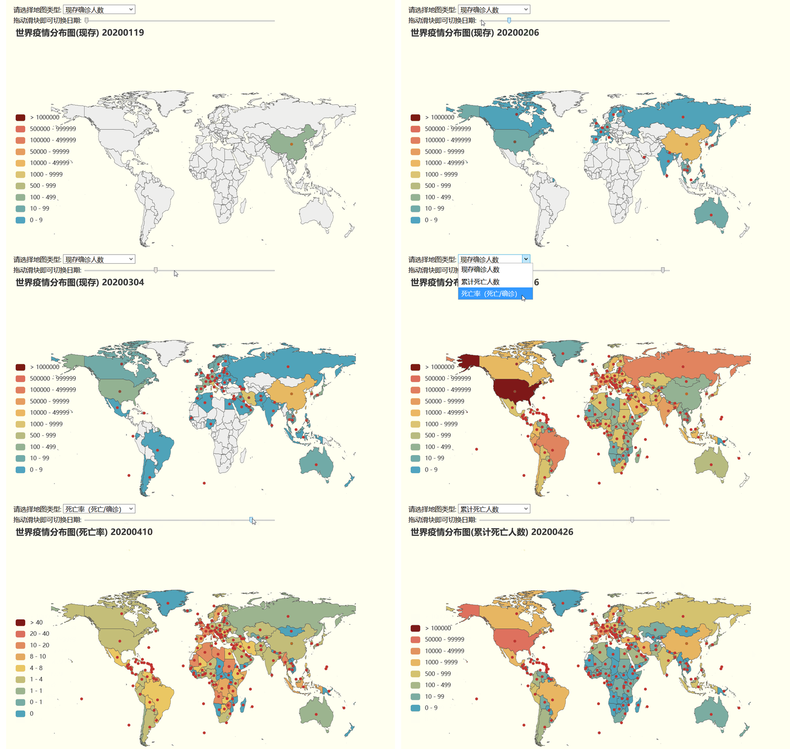
除了世界地图还可以动态展示中国地图:(这里就暂时没有录屏啦qwq)

代码实现
由于篇幅限制,这里讨论一下具体的函数实现方式,完整代码可在github中获取:
实现的基本原理是采用ajax方式,通过页面响应向后端flask发送请求,用pyecharts渲染新的地图,然后返回前端进行动态刷新:
先定义一个渲染当前国内确诊人数的函数,返回pyecharts图表:
import time, json
import pandas as pd
from pyecharts.charts import Map
import pyecharts.options as opts

def render_mapcountChina_rate(dateId):
    data = pd.read_csv(n)
    data = data[data['dateId'] == dateId]
    #print(data['currentConfirmedCount'])
    list_data = zip(list(data['provinceShortName']), list((data['deadCount']*1000 // data['confirmedCount'])/10))
    # [('湖北', 48206), ('广东', 1241), ('河南', 1169), ('浙江', 1145), ..., ('澳门', 10), ('西藏', 1)]

    c = (
        Map()
        .add('', list_data, 'china')
        .set_global_opts(
            title_opts=opts.TitleOpts(title='全国疫情分布图(死亡率)'+str(dateId)),
            visualmap_opts=opts.VisualMapOpts(is_show=True,
                                            split_number=6,
                                            is_piecewise=True,  # 是否为分段型
                                            pos_top='center',
                                            pieces=[
                                                    {'min': 40, 'color': '#7f1818'},  #不指定 max
                                                    {'min': 20, 'max': 40},
                                                    {'min': 10, 'max': 20},
                                                    {'min': 8, 'max': 10},
                                                    {'min': 4, 'max': 8},
                                                    {'min': 1, 'max': 4},
                                                    {'min': 0.6, 'max': 1},
                                                    {'min': 0.1, 'max': 0.5},
                                                    {'min': 0, 'max': 0}
                                                 ]),
        )
    )
    return c

def render_mapcountChina(dateId,type = 0):
    if(type==0):
        return render_mapcountChina_current(dateId)
    elif(type==1):
        return render_mapcountChina_death(dateId)
    elif(type==2):
        return render_mapcountChina_rate(dateId)
在flask中调用该函数:
@app.route("/chinamap",methods=['POST', 'GET'])
def get_china_map():
    if request.method == 'GET':
        maptype = int(request.args.get('type', ''))
        i = int(request.args.get('index', ''))
        print(maptype)
        print(i)
        return render_mapcountChina(date_list[int(i)],maptype).dump_options_with_quotes()
在html页面中添加:
<div id="current-maps" >
    <div>
        <label>请选择地图类型:     </label>
        <select name="select-map" id="mapselecter">
            <option value="0" >现存确诊人数</option>
            <option value="1" >累计死亡人数</option>
            <option value="2" >死亡率(死亡/确诊)</option>
        </select>
    </div>
    <div>
        <label>拖动滑块即可切换日期:</label>
        <input id='slider' style="width: 400px;vertical-align: middle;" type='range' min='0' max='121' step='1'/>
    </div>
    <div id="worldMap" class="maps" style="width:800px; height:600px;display: inline-block;"></div>
    <div id="chinaMap" class="maps" style="width:800px; height:600px;display: inline-block;"></div>
</div>
添加js代码:
document.getElementById('slider').onchange =  function changeDate(){
    fetchworldMapData(worldmap);
    fetchchinaMapData(chinamap);
}

document.getElementById('mapselecter').onchange = function changeCountry(){
    fetchworldMapData(worldmap);
    fetchchinaMapData(chinamap);
}

function fetchworldMapData(chart) {
    $.ajax({
        type: "GET",
        url: "/worldmap",
        dataType: "json",
        data:  "type="+document.getElementById('mapselecter').value+'&'+"index="+document.getElementById('slider').value,
        success: function (result) {
            chart.setOption(result);
        }
    });
}

function fetchchinaMapData(chart) {
    $.ajax({
        type: "GET",
        url: "/chinamap",
        dataType: "json",
        data:  "type="+document.getElementById('mapselecter').value+'&'+"index="+document.getElementById('slider').value,
        success: function (result) {
            chart.setOption(result);
        }
    });
}
分析结果:
通过交互分析可以发现:
- 现存确诊人数图
- 在1.20日左右,全国公布的疫情一开始出现在广东、湖北、北京上海等地,此时湖北的疫情确诊人数已经突破200;
- 此后,疫情从湖北开始向四周身份成扩散趋势,在1.26日湖北的确诊人数已经突破1000;除湖北外,浙江与广东确诊人数也到达三位数;国外在美国、澳大利亚、法国和泰国等东南亚国家也出现确诊病例;
- 在2.2日前后,湖北的确诊人数突破五位数,其他地区疫情人数继续增加;国外疫情也在欧洲、东南亚、美洲呈缓慢扩散趋势
- 在2月中旬,西藏成为国内首个清零的省份;国外继续缓慢增长;国内疫情迎来拐点,现存确诊人数趋于平缓、不再增加,并开始缓慢减少;现存确诊人数约为50000左右,其中大部分集中在湖北;
- 二月底三月初,国内确诊人数逐渐减少,国外此时开始大规模出现感染并扩散到多个国家;此时意大利、伊朗疫情较为严重;疫情开始扩散到非洲、南美洲;
- 三月中旬后,国内疫情已经基本得到控制,大多省份恢复到个位数或清零,绝大多数现存确诊病例集中在湖北;而世界上大部分国家都已出现确诊报告,许多国家突破五位数确诊;其中欧洲和伊朗、美国较为严重;
- 四月初,国内确诊人数继续减少,但有部分省份出现略微反扑;国外疫情几乎已经扩散到世界所有国家,其中美国确诊人数已经突破20万,是世界最严重的地区;
- 从四月中旬开始,由于外来输入原因,国内黑龙江及东北地区出现了一次比较严重的疫情反扑,确诊人数接近500,但在五月初逐步得到控制;
- 国外疫情在四五月份继续趋向严重,在5.8美国的确诊人数突破百万;但部分早期疫情严重的国家由于采取了有效的控制手段导致疫情缓解;
- 累计死亡人数
- 二月初,世界各国开始出现死亡病例;
- 国内的死亡病例数在二月中旬趋向平缓;
- 在三月中旬,世界各国死亡病例陆续出现或开始明显增多;
- 在五月份,报告的死亡数以美国、欧洲最为严重,许多国家死亡人数已经远远超过了中国;
- 死亡率:
- 死亡率也可以反应出疫情的控制程度,死亡率越低表明患者得到救治的概率越大;
- 在医疗资源充足的地区,死亡率可以降低到1%左右;医疗资源不足的地区,死亡率可以高达10%;
- 国内死亡率数据分析:
- 在一月下旬,中国的死亡率以黑龙江、湖北、湖南河南较为严重,但在一月底二月初除湖北外,其他省份呈下降趋势;
- 在国内疫情确诊人数峰值的二月中旬,国内平均死亡率为2.5,死亡率相对较高的是湖北、黑龙江、海南、台湾等地;
- 此后,国内湖北的死亡率继续升高,可能是由于医疗资源不足,无法给予患者有效救治,同时此前积累的确诊患者也陆续出现死亡;同样升高的有新疆、黑龙江;
- 三月中旬后,在国内疫情基本得到控制的情况下,全国平均死亡率在4%,湖北死亡率达到4.7左右;
- 在四月中旬补统计了一下之前因为新冠去世但未计入死亡率数据的死亡人数,最后湖北的死亡率为6.6,国内平均死亡率在5.5
- 国外死亡率数据分析:
- 从三月下旬开始,伴随着疫情的大规模扩散,各国疫情死亡率也逐步增高;
- 值得注意的是,许多国家的统计数据表明在其疫情刚开始出现的数日内死亡率是一个高峰,可能表明了在初始阶段未能对患者作出良好的检测和发现,只能从新冠重症患者处得到资料;
- 虽然非洲等某些不发达国家的疫情报告数据较少,但死亡率较高;可能表明了对于新冠的轻症患者,并没有良好的检测能力;
- 死亡率较高的国家显著集中在欧洲地区,表明了医疗资源的相对短缺;墨西哥的死亡率也较高;
总体来看:
- 中国在三月份就逐步控制住了疫情趋势,为世界抗疫事业做出了卓越的典范;
- 欧洲和美洲等发达国家疫情数据较为严重,可能是发达国家在世界范围内流动的人口较大,但更可能是发达国家能得到有效的检测并报告病例;
本文参与 腾讯云自媒体同步曝光计划,分享自作者个人站点/博客。
原始发表:2020-06-04,如有侵权请联系 cloudcommunity@tencent.com 删除
目录
腾讯云开发者

Copyright © 2013 - 2026 Tencent Cloud. All Rights Reserved. 腾讯云 版权所有
深圳市腾讯计算机系统有限公司 ICP备案/许可证号:粤B2-20090059  粤公网安备44030502008569号
腾讯云计算(北京)有限责任公司 京ICP证150476号 | 京ICP备11018762号