医信融合创新沙龙投稿-圆形柱状图(富集圈图)
原创
医信融合创新沙龙投稿-圆形柱状图(富集圈图)
原创
叶子Tenney
发布于 2023-03-07 23:22:15
发布于 2023-03-07 23:22:15
简介
在文章中, 我们有时会看到一些很coooooool的圆形柱状图,
一张图就可以表现多组数据,
比如下面这种形式:
还有进阶版的这种形式:
其实, 这些图并没有那么高级,
而是扭曲的柱状图罢了.
方法
首先, 我们学习一下饼状图的画法(使用dplyr::starwars数据),
rm(list = ls())

library(librarian)

shelf(dplyr) #(iris)


dim(starwars)

starwars

# > dim(starwars)

# [1] 87 14

# > starwars

# # A tibble: 87 × 14

# name  height  mass hair\_color skin\_color eye\_color birth\_year sex   gender homeworld species

# <chr>  <int> <dbl> <chr>      <chr>      <chr>          <dbl> <chr> <chr>  <chr>     <chr>

#   1 Luke…    172    77 blond      fair       blue            19   male  mascu… Tatooine  Human

# 2 C-3PO    167    75 NA         gold       yellow         112   none  mascu… Tatooine  Droid

# 3 R2-D2     96    32 NA         white, bl… red             33   none  mascu… Naboo     Droid

# 4 Dart…    202   136 none       white      yellow          41.9 male  mascu… Tatooine  Human

# 5 Leia…    150    49 brown      light      brown           19   fema… femin… Alderaan  Human

# 6 Owen…    178   120 brown, gr… light      blue            52   male  mascu… Tatooine  Human

# 7 Beru…    165    75 brown      light      blue            47   fema… femin… Tatooine  Human

# 8 R5-D4     97    32 NA         white, red red             NA   none  mascu… Tatooine  Droid

# 9 Bigg…    183    84 black      light      brown           24   male  mascu… Tatooine  Human

# 10 Obi-…    182    77 auburn, w… fair       blue-gray       57   male  mascu… Stewjon   Human

# # … with 77 more rows, and 3 more variables: films <list>, vehicles <list>, starships <list>


table(data$hair\_color)


# 按照头发颜色进行分组并统计个数

df <- table(data$hair\_color) %>%

  as.data.frame(value = c(data.frame(.)[,2]),

                group = c(data.frame(.)[,1])) %>%

  arrange(desc(Freq)) %>%

  dplyr::rename(group=Var1,value=Freq)%>% print


# 作图数据准备

df$fraction = df$value / sum(df$value) # 百分比计算

df$ymax = cumsum(df$fraction) # 单元素最大值

df$ymin = c(0, head(df$ymax, n = -1)) # 单元素最小值

labs <- paste0(df$group," \n(", round(df$value/sum(df$value)\*100,2), "%)") #标签(带百分比)

lab <- paste0(round(df$value/sum(df$value)\*100,2), "%") #标签(不带百分比)

ggplot(data = df, aes(fill = group, ymax = ymax, ymin = ymin, xmax = 4, xmin = 3)) +

  geom\_rect(show.legend = F,alpha=0.8) +

  scale\_fill\_brewer(palette = 'Set3')+

  coord\_polar(theta = "y") +

  labs(x = "", y = "", title = "",fill=df$group) +

  theme\_light() +

  theme(panel.grid=element\_blank()) + ## 去掉白色外框

  theme(axis.text=element\_blank()) + ## 把图旁边的标签去掉

  theme(axis.ticks=element\_blank()) + ## 去掉左上角的坐标刻度线

  theme(panel.border=element\_blank()) + ## 去掉最外层的正方形边框

  geom\_text(aes(x = 4, y = ((ymin+ymax)/2),label = labs) ) # 可用size=3.6改变大小, x值代表高度
仔细看的话不难发现,
其实这里是先做出一张柱状图,
而后转变为饼图.
ggplot(data = df, aes(fill = group, ymax = ymax, ymin = ymin, xmax = 4, xmin = 3)) +

  geom\_rect(show.legend = F,alpha=0.8) +

  scale\_fill\_brewer(palette = 'Set3')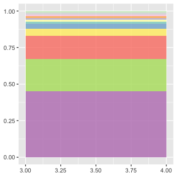
这样我们就学会了使用ggplot2画出了一个饼状图,
之后可以按照需求处理数据或用AI(Adobe Illustrator)处理.
比如,
我们使用df <- df[-which(df$fraction < 0.03),]去掉部分或用AI处理.
可以看到, 饼状图事实上是一种以'y轴'进行'卷曲'(也就是建立极坐标系)的柱状图,
那么, 如果我们以'x轴'进行卷曲呢?
ggplot(data = df, aes(fill = group, ymax = ymax, ymin = ymin, xmax = 4, xmin = 3)) +

  geom\_rect(show.legend = F,alpha=0.8) +

  scale\_fill\_brewer(palette = 'Set3')+

  coord\_polar(theta = "x") +

  labs(x = "", y = "", title = "",fill=df$group) +

  theme\_light() +

  theme(panel.grid=element\_blank()) + ## 去掉白色外框

  theme(axis.text=element\_blank()) + ## 把图旁边的标签去掉

  theme(axis.ticks=element\_blank()) + ## 去掉左上角的坐标刻度线

  theme(panel.border=element\_blank()) + ## 去掉最外层的正方形边框

  geom\_text(aes(x = 4, y = ((ymin+ymax)/2),label = lab) ) # 可用size=3.6改变大小, x值代表高度
是的, 我们几乎得到了一个圆形柱状图(假设之前我们有一张正常的柱状图的话).

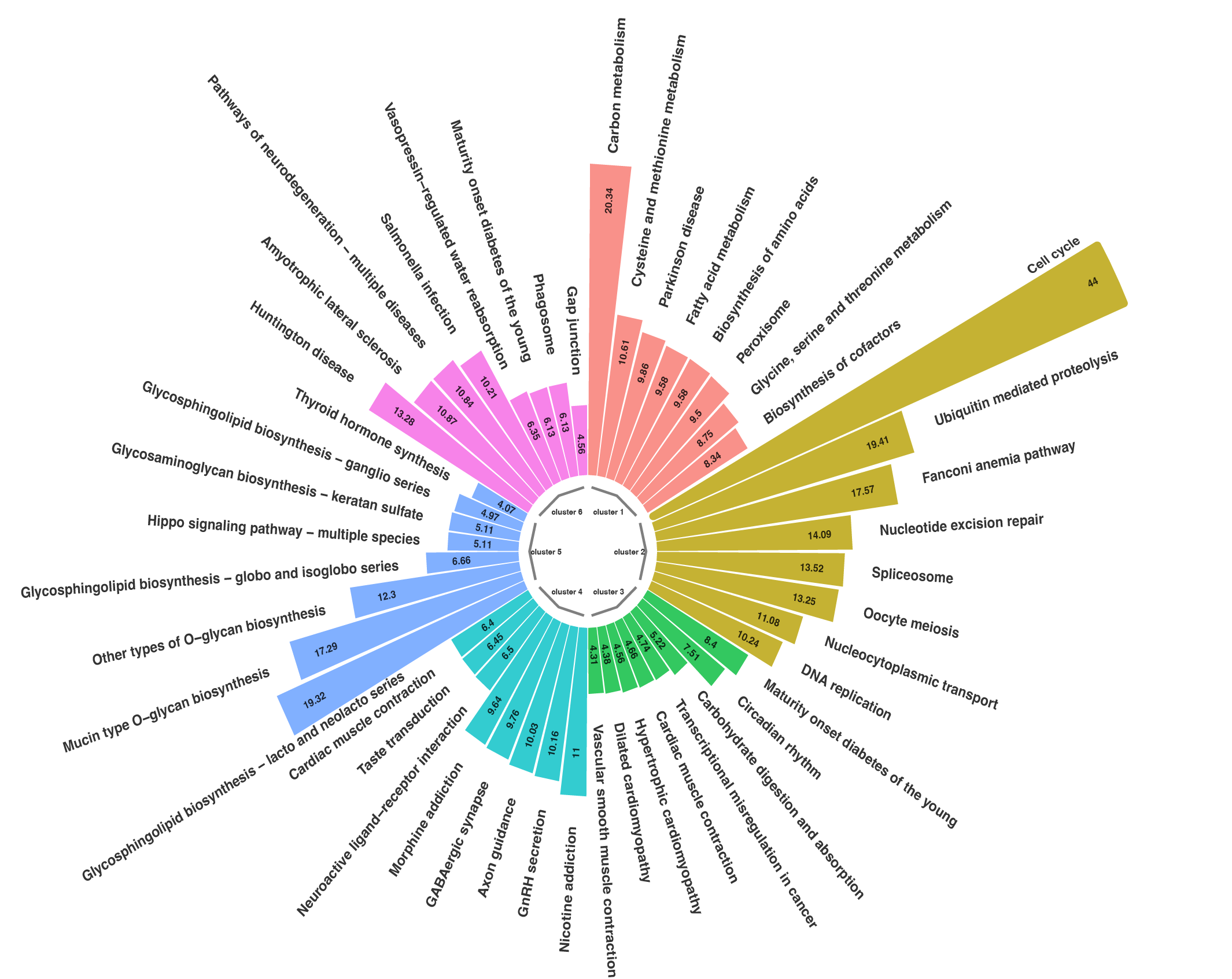
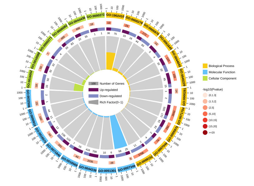
下面是一个富集圈图的完整代码, 效果如图:
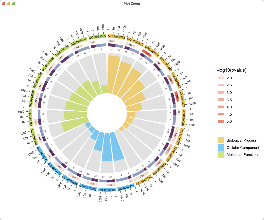
library(dplyr)

library(ggplot2)

library(RColorBrewer)

enrich\_circle\_data <- read.table('https://www.omicshare.com/tools/Public/Home/dist/js/editor/attached/image/file/20200930/20200930101047\_81100.txt', sep = '\t', header = T)


# Circular bar plot

dat <- enrich\_circle\_data #[,c(1:4)]

colnames(dat)

colnames(dat)[2] <- 'group'

dat$'-log10p' <- -log10(dat$pvalue)

# 挑选前25行数据绘制

dat <- dat %>% filter(row\_number() <= 25)

# # 挑选P值最小的前25行数据绘制

# dat <- dat %>% arrange(pvalue) %>% filter(row\_number() <= 25)

# # 挑选每组的前8个

# dat <- dat %>%

#   dplyr::group\_by(group) %>%

#   filter(row\_number() <= 8)


dat$RichFactor <- (dat$up + dat$down) / dat$all

dat$group <- as.factor(dat$group) # 固定顺序

table(dat$group)


dat <- dat %>% dplyr::group\_by(group)  %>% arrange(desc(RichFactor)) %>% arrange(group) # 将数据根据分组进行排序

dat$id <- seq(1, nrow(dat))

#### 构建label\_data ----

# 获取每个样本的名称在y轴的位置和倾斜角度

label\_data <- dat#[,c('ID', 'id')]

number\_of\_bar <- nrow(label\_data) # 计算条的数量

angle <- 90 - 360 \* (label\_data$id-0.5) / number\_of\_bar ## 每个条上标签的轴坐标的倾斜角度

label\_data$hjust <- ifelse(angle < -90 , 1, 0) # 调整标签的对其方式

label\_data$angle <- ifelse(angle > 0 | angle < -180 , angle-90, angle+90) ## 标签倾斜角度\_平行

label\_data$angle\_vertical <- ifelse(angle < -90 , angle+180, angle) ## 标签倾斜角度\_垂直

label\_data$start <- label\_data$id - 0.45

label\_data <- label\_data %>%

  mutate(end=start + 0.9, all\_gene=up\_gene+down\_gene) %>%

  # mutate(deg\_background\_gene\_ratio = (up\_gene/all\_gene)) %>%

  mutate(gene\_length = log10(all)) %>%

  mutate(up\_down\_gene\_ratio\_end = start + (0.9\*up\_gene/all\_gene), gene\_length\_end = start + 0.9 \* (6/7) \*(gene\_length/3))  #0.9 \* (6/7) 为1000所在的位置


# separate\_num <-

range\_sep\_num <- range(label\_data$'-log10p') %>% round(0)

separate\_num <- seq(range\_sep\_num[1],range\_sep\_num[2],0.5)

label\_data$colour\_pvalue <- cut(label\_data$'-log10p', breaks = c(-Inf, separate\_num, Inf), labels = c(separate\_num[1]-0.5, separate\_num), right=FALSE)

fill\_colour = c("#F7D116", "deepskyblue","olivedrab2")

label\_data <- table(label\_data$group) %>%

  as.data.frame() %>%

  dplyr::rename(group=Var1) %>%

  mutate(fill\_colour = fill\_colour ) %>%

  left\_join(label\_data, ., "group")


## 可视化分组圆环条形图

p1 <-

  ggplot(label\_data)+

  ## 添加背景条形图

  geom\_bar(aes(x=as.factor(id), y= 1 ), stat="identity",

           alpha=0.2)  +

  ## 添加条形图

  geom\_bar(aes(x=as.factor(id), y= RichFactor , fill=group), stat="identity",

           alpha=0.8)  + guides(fill=guide\_legend(title=NULL)) + #注意colour/fill/color/shape转换 +

  ##可以为条形图添加线

  geom\_segment(data= label\_data, aes(x = start, y = 1.42, xend =  end, yend = 1.42),

               colour = label\_data$fill\_colour, alpha=1, size=4 ,inherit.aes = FALSE) +

  geom\_segment(data= label\_data, aes(x = start, y = 1.3, xend =  gene\_length\_end, yend = 1.3, colour = as.numeric(colour\_pvalue)), alpha=1, size=3 ,inherit.aes = FALSE) +

  guides(colour=guide\_legend(title='-log10(pvalue)')) + #注意colour/fill/color/shape转换

  geom\_segment(data= label\_data, aes(x = start, y = 1.2, xend =  end, yend = 1.2),

               colour = "#8E96CC", alpha=1, size=3 ,inherit.aes = FALSE) +

  geom\_segment(data= label\_data, aes(x = start, y = 1.2, xend =  up\_down\_gene\_ratio\_end, yend = 1.2),

               colour = "#740F67", alpha=1, size=3 ,inherit.aes = FALSE) +

  geom\_blank(aes(y = -0.5)) +

  # ylim(-0.5,1.5) + ## 设置y轴坐标表的取值范围,可流出更大的圆心空白

  ## 设置使用的主题并使用极坐标系可视化条形图

  theme\_minimal() +

  theme(#legend.position = "none", # 不要图例

    axis.text = element\_blank(),# 不要x轴的标签

    axis.title = element\_blank(), # 不要坐标系的名称

    panel.grid = element\_blank(), # 不要网格线

    # plot.margin = unit(rep(-1,5), "cm") ## 整个图与周围的边距

  )+

  coord\_polar(theta = "x", start = 0, direction=1) +

  scale\_fill\_manual(values = fill\_colour) +

  scale\_color\_steps(low = "#FEE8DE", high = "red", breaks = c(-Inf, separate\_num, Inf))

p1


## 为条形图添加文本

p2 <-

p1+  geom\_text(data=label\_data,

               aes(x=(start+end)/2, y=1.42, label=ID, hjust=0.5),

               color="black",fontface="bold",alpha=0.8, size=2.5,

               angle= label\_data$angle, inherit.aes = T) +

  geom\_text(data=label\_data,

            aes(x=(start+gene\_length\_end)/2, y=1.3, label=all, hjust=0.5),

            color="black",fontface="bold",alpha=0.8, size=1.8,

            angle= label\_data$angle, inherit.aes = FALSE) +

  geom\_text(data=label\_data,

            aes(x=(start+up\_down\_gene\_ratio\_end)/2, y=1.1, label=up\_gene, hjust=0.5),

            color="black",fontface="bold",alpha=0.8, size=1.8,

            angle= label\_data$angle, inherit.aes = FALSE) +

  geom\_text(data=label\_data,

            aes(x=(up\_down\_gene\_ratio\_end+end)/2, y=1.1, label=down\_gene, hjust=0.5),

            color="black",fontface="bold",alpha=0.8, size=1.8,

            angle= label\_data$angle, inherit.aes = FALSE)

p2

# 添加标尺线

grid\_data <- label\_data[,c('ID', 'end', 'start','hjust'), drop=F]

grid\_data <- grid\_data %>%

  mutate(distance = end - start) %>%

  mutate(sec\_breakpoint = start + (2/7)\*distance) %>%

  mutate(third\_breakpoint = start + (4/7)\*distance) %>%

  mutate(fourth\_breakpoint = start + (6/7)\*distance)

grid\_ylim <- 1.47

grid\_ylimax <- grid\_ylim + 0.05

p3 <- p2 +

  geom\_segment(data= grid\_data, aes(x = start, y = grid\_ylim, xend =  start, yend = grid\_ylimax), colour = "black", alpha=0.8, size=0.5 ,inherit.aes = FALSE) +

  geom\_segment(data= grid\_data, aes(x = sec\_breakpoint, y = grid\_ylim, xend =  sec\_breakpoint, yend = grid\_ylimax), colour = "black", alpha=0.8, size=0.5 ,inherit.aes = FALSE) +

  geom\_segment(data= grid\_data, aes(x = third\_breakpoint, y = grid\_ylim, xend =  third\_breakpoint, yend = grid\_ylimax), colour = "black", alpha=0.8, size=0.5 ,inherit.aes = FALSE) +

  geom\_segment(data= grid\_data, aes(x = fourth\_breakpoint, y = grid\_ylim, xend =  fourth\_breakpoint, yend = grid\_ylimax), colour = "black", alpha=0.8, size=0.5 ,inherit.aes = FALSE)

  # geom\_segment(data= grid\_data, aes(x = start, y = grid\_ylim, xend =  fourth\_breakpoint, yend = grid\_ylim), colour = "black", alpha=0.8, size=0.5 ,inherit.aes = FALSE) # 下线

p3


# 添加标尺线

grid\_data <- grid\_data %>%

  mutate(start\_text = '1') %>%

  mutate(sec\_breakpoint\_text = '10') %>%

  mutate(third\_breakpoint\_text = '100') %>%

  mutate(fourth\_breakpoint\_text = '1000')

grid\_ylimax\_text <- grid\_ylimax + 0.05

text\_factor <- c('start\_text','sec\_breakpoint\_text','third\_breakpoint\_text','fourth\_breakpoint\_text')

p4 <-

p3 +

  geom\_text(data=grid\_data,

            aes(x=start, y=grid\_ylimax\_text, label=start\_text, hjust=hjust),

            color="black",fontface="bold",alpha=0.8, size=2.5,

            angle= label\_data$angle\_vertical, inherit.aes = T) +

  geom\_text(data=grid\_data,

            aes(x=sec\_breakpoint, y=grid\_ylimax\_text, label=sec\_breakpoint\_text, hjust=hjust),

            color="black",fontface="bold",alpha=0.8, size=2.5,

            angle= label\_data$angle\_vertical, inherit.aes = T)  +

  geom\_text(data=grid\_data,

            aes(x=third\_breakpoint, y=grid\_ylimax\_text, label=third\_breakpoint\_text, hjust=hjust),

            color="black",fontface="bold",alpha=0.8, size=2.5,

            angle= label\_data$angle\_vertical, inherit.aes = T)  +

  geom\_text(data=grid\_data,

            aes(x=fourth\_breakpoint, y=grid\_ylimax\_text, label=fourth\_breakpoint\_text, hjust=hjust),

            color="black",fontface="bold",alpha=0.8, size=2.5,

            angle= label\_data$angle\_vertical, inherit.aes = T)

p4
代码链接:
https://gist.github.com/5eeaaa0646f11d8c71bba3b48de4750f
数据来源:
OmicShare Tools - 基迪奥生信云工具/ Tools center / functional analysis / enrich circle / Example
注意的点:
- scale_color/fill的不同可以对不同的组填充颜色
- 可以通过geom_segment添加多组线段
- hjust来调整角度对位置造成的影响,当旋转180度的时候,hjust设置为1自然可以移动到原位置
特别鸣谢:
研究生学生信
原创声明:本文系作者授权腾讯云开发者社区发表,未经许可,不得转载。
如有侵权,请联系 cloudcommunity@tencent.com 删除。
原创声明:本文系作者授权腾讯云开发者社区发表,未经许可,不得转载。
如有侵权,请联系 cloudcommunity@tencent.com 删除。
评论
登录后参与评论
推荐阅读
目录
腾讯云开发者

Copyright © 2013 - 2026 Tencent Cloud. All Rights Reserved. 腾讯云 版权所有
深圳市腾讯计算机系统有限公司 ICP备案/许可证号:粤B2-20090059 ![]() 粤公网安备44030502008569号
粤公网安备44030502008569号
腾讯云计算(北京)有限责任公司 京ICP证150476号 | 京ICP备11018762号