布局
原创
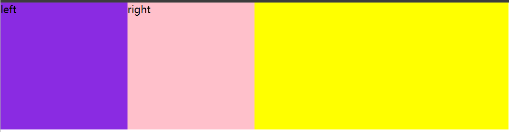
竖着布局:div
横着布局:
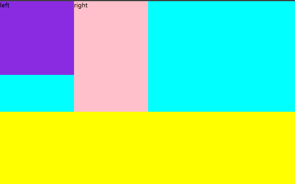
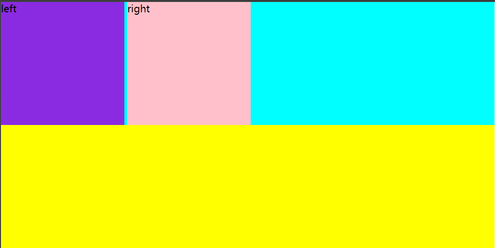
1.传统布局 float 像需要横着布局的元素添加float 属性
<!DOCTYPE html>
<html lang="en">
<head>
    <meta charset="UTF-8">
    <meta name="viewport" content="width=device-width, initial-scale=1.0">
    <title>Document</title>
    <link rel="stylesheet" href="css/06.css">
</head>
<body>
    <div class="top">
        <div class="left">left</div>
        <div class="right">right</div>
    </div>
    <div class="bottom"></div>


</body>
</html>/* left(左浮动)*/
*{
padding: 0;
margin: 0;
}
.top{
width: 800px;
background: aqua;
height: 300px;
}
.left{
width: 200px;
height: 200px;
background: blueviolet;
float: left;
}
.right{
width: 200px;
height: 200px;
background: pink;
float: left;
}
.bottom{
width: 800px;
background: yellow;
height: 200px;
}
.right{
    width: 200px;
    height: 200px;
    background: pink;
    float: right;

}/*右浮动*/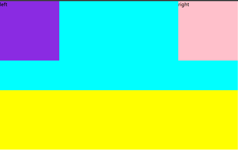
overflow:hidden 超出部分隐藏 父级随子级高度变化而变化
*{
    padding: 0;
    margin: 0;
}
.top{
    width: 800px;
    background: aqua;
    overflow: hidden;
}
.left{
    width: 200px;
    height: 200px;
    background: blueviolet;
    float: left;
}
.right{
    width: 200px;
    height: 300px;
    background: pink;
    float: left;

}
.bottom{
    width: 800px;
    background: yellow;
    height: 200px;
}
存在的问题
使用float之后,如果所在的父级没有高度,会导致下方元素上移
*{
    padding: 0;
    margin: 0;
}
.top{
    width: 800px;
    background: aqua;
}
.left{
    width: 200px;
    height: 200px;
    background: blueviolet;
    float: left;
}
.right{
    width: 200px;
    height: 200px;
    background: pink;
    float: left;

}
.bottom{
    width: 800px;
    background: yellow;
    height: 200px;
}
解决办法:
1.给父级设置高度,不够灵活
2.给父级设置overflow:hidden 但不设置高度,这样可以使父级随子级最大的高度变化而变化,自适应
无法解决的问题
1.元素平分父级元素 需要计算,而且不一定能均分
2.元素之间的间距如果想要均匀分布的话,也需要计算,而且也不一定均分
3.书写比较繁琐,代码冗余
2.内联块级元素布局 向所有想要横着布局的元素使用 displsy:inline-block让元素变为内联块级元素
内联块级元素的特点:不独占一行,而且对宽高支持
存在问题:
浏览器会把元素之间的换行,空格都当作空格处理,使用display:inline-block之后,元素之间产生空隙,对整体布局产生影响
*{
    padding: 0;
    margin: 0;
}
.top{
    width: 800px;
    background: aqua;

}
.left{
    width: 200px;
    height: 200px;
    background: blueviolet;
    display: inline-block;
}
.right{
    width: 200px;
    height: 200px;
    background: pink;
    display: inline-block;

}
.bottom{
    width: 800px;
    background: yellow;
    height: 200px;
}
解决方式:
1.把元素首位相连(不推荐)
<div class="top">
        <div class="left">left</div><div class="right">right</div>
    </div>
    <div class="bottom"></div>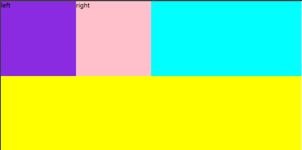
2.对文字大小进行处理,给使用display:inline-block的父级元素,添加font-size=0,并且该元素要设置有效的文字大小
*{
    padding: 0;
    margin: 0;
}
.top{
    width: 800px;
    background: aqua;
    font-size: 0;
}
.left{
    width: 200px;
    height: 200px;
    background: blueviolet;
    display: inline-block;
    font-size: 16px;
}
.right{
    width: 200px;
    height: 200px;
    background: pink;
    display: inline-block;
    font-size: 16px;

}
.bottom{
    width: 800px;
    background: yellow;
    height: 200px;
}
无法解决的问题
1.元素平分父级元素 需要计算,而且不一定能均分
2.元素之间的间距如果想要均匀分布的话,也需要计算,而且也不一定均分
3.书写比较繁琐,代码冗余
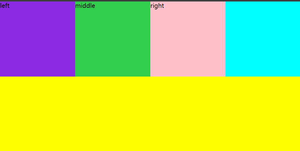
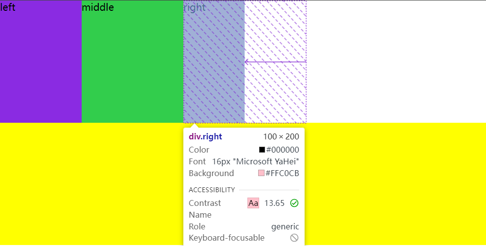
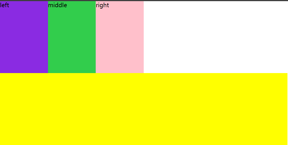
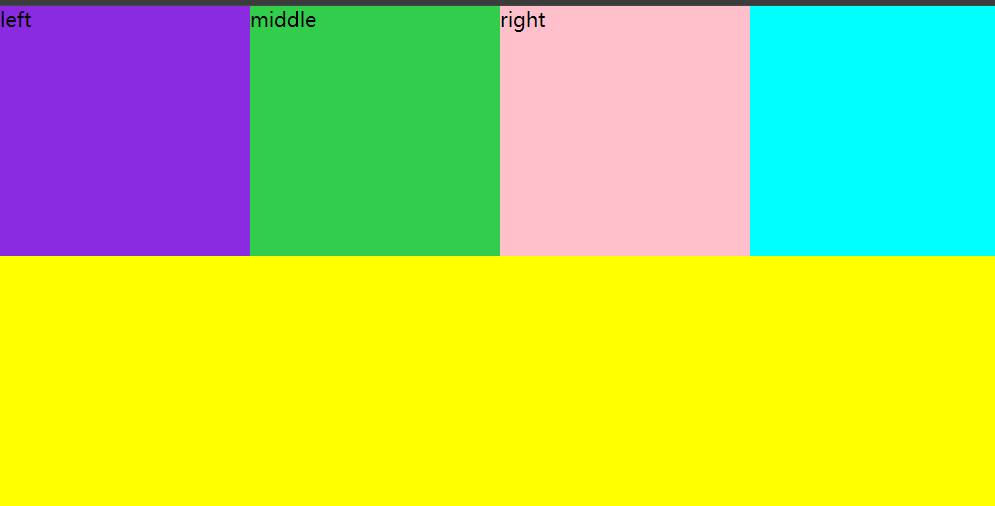
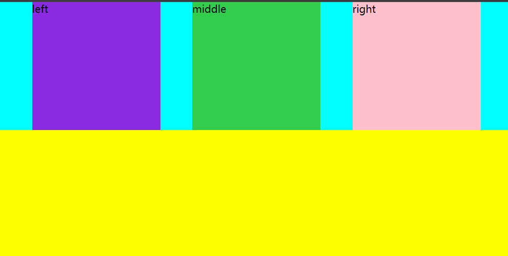
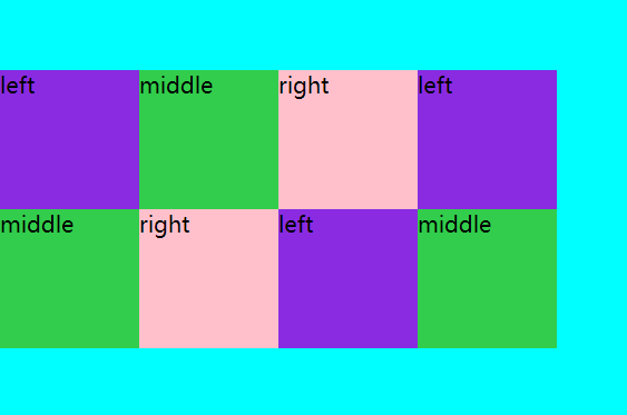
3.现代布局:display:flex弹性盒子布局
让元素横向布局,只需要给这些元素的父级元素添加 display:flex
*{
    padding: 0;
    margin: 0;
}
.top{
    width: 800px;
    background: aqua;
    display: flex;

}
.left{
    width: 200px;
    height: 200px;
    background: blueviolet;

}
.middle{
    width: 200px;
    height: 200px;
    background: rgb(50, 205, 76);

}
.right{
    width: 200px;
    height: 200px;
    background: pink;


}
.bottom{
    width: 800px;
    background: yellow;
    height: 200px;
}<div class="top">
<div class="left">left</div>
<div class="middle">middle</div>
<div class="right">right</div>
</div>
<div class="bottom"></div>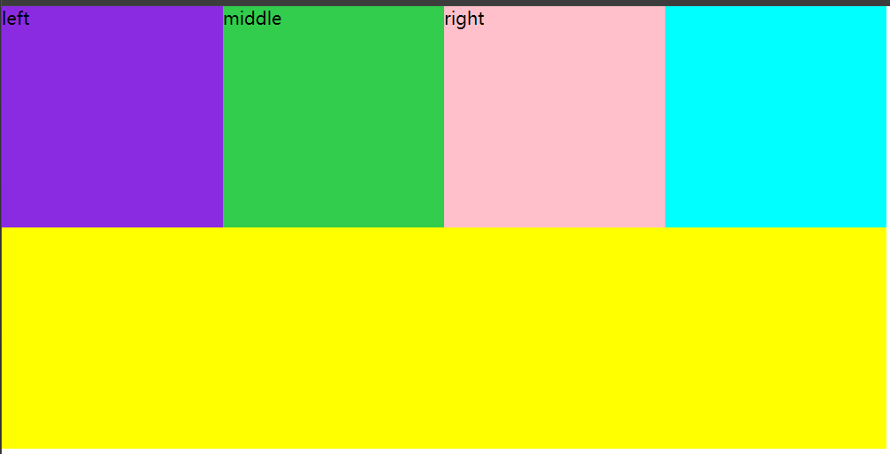
1.flex-direction设置弹性盒子内,子元素的排列方向
flex-direction:row元素横向从左到右排列
flex-direction:row-reverse元素横向从右到左排列
flex-direction:column纵向从上到下排列
flex-direction:column-reverse纵向从下到上排列
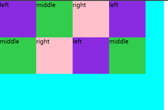
2.flex-wrap设置弹性盒子内元素是否换行
wrap设置元素满了之后换行

nowrap设置元素不换行
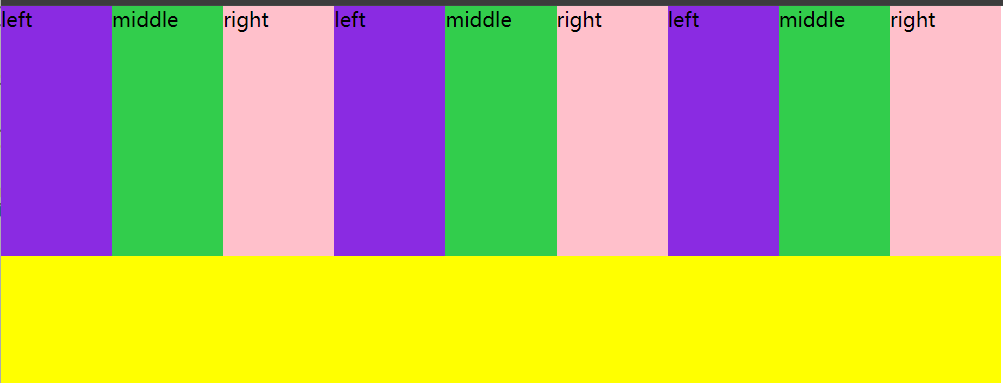
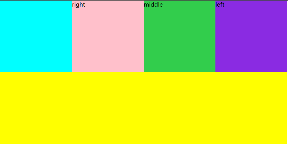
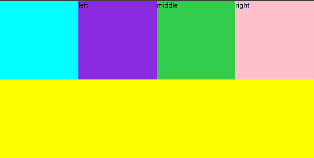
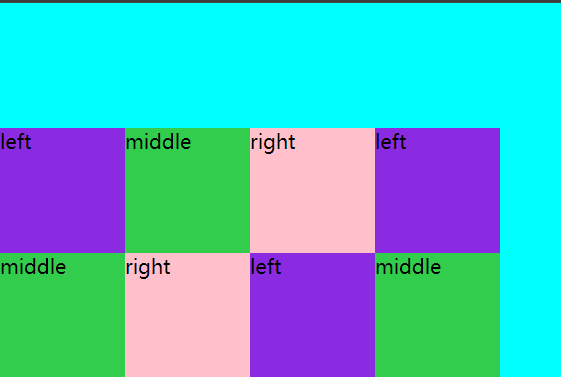
3.order设置子元素的排列顺序 作用到子元素
order取值为整数,整数越小,出现的顺序越靠前
*{
    padding: 0;
    margin: 0;
}
.top{
    width: 800px;
    background: aqua;
    display: flex;


}
.left{
    width: 200px;
    height: 200px;
    background: blueviolet;
    order: 2;
}
.middle{
    width: 200px;
    height: 200px;
    background: rgb(50, 205, 76);
    order: 1;
}
.right{
    width: 200px;
    height: 200px;
    background: pink;
    order: 3;

}
.bottom{
    width: 800px;
    background: yellow;
    height: 200px;
}
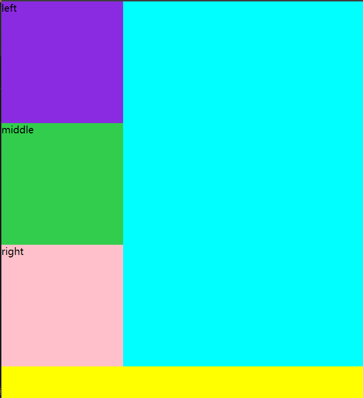
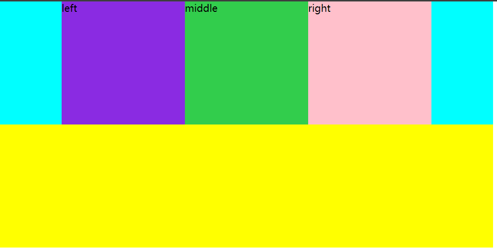
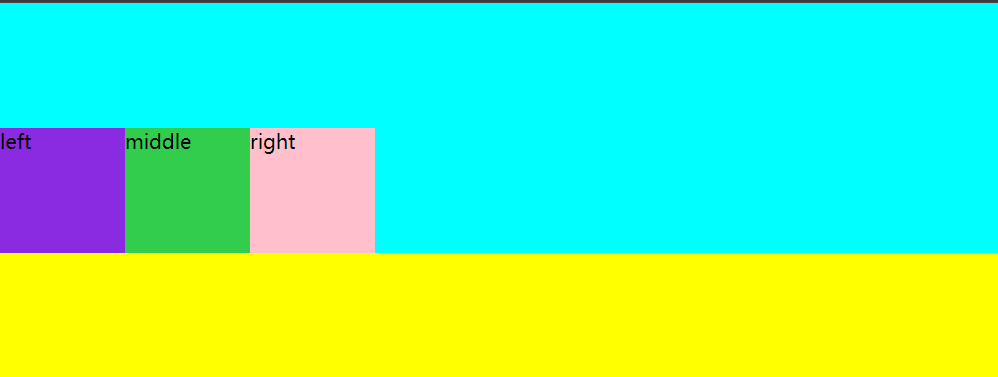
4.flex复合属性 控制弹性盒子内子元素的缩放比例
flex-grow:拉伸因子
*{
    padding: 0;
    margin: 0;
}
.top{
    width: 800px;
    background: aqua;
    display: flex;


}
.left{
    width: 200px;
    height: 200px;
    background: blueviolet;
    flex-grow: 2;
}
.middle{
    width: 200px;
    height: 200px;
    background: rgb(50, 205, 76);
    flex-grow: 1;
}
.right{
    width: 200px;
    height: 200px;
    background: pink;
    flex-grow: 3;

}
.bottom{
    width: 800px;
    background: yellow;
    height: 200px;
}
按照比例进行拉伸,把剩余的200px,按照2:1:3的比例分给子元素

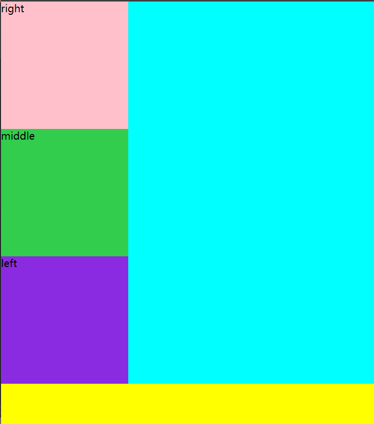
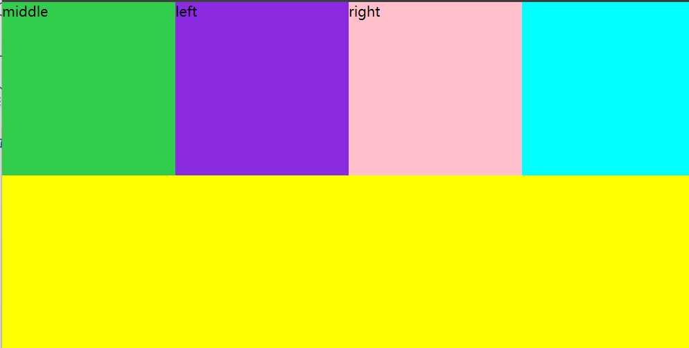
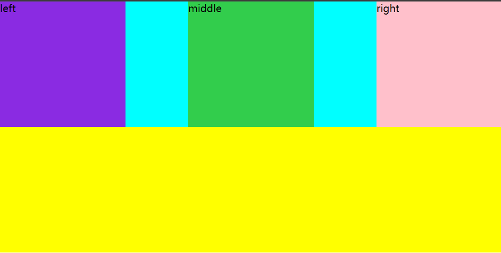
flex-shrink:压缩因子
把比父级元素多200px的空间,按照2:1:3的比例进行对应压缩
*{
    padding: 0;
    margin: 0;
}
.top{
    width: 400px;
    background: aqua;
    display: flex;


}
.left{
    width: 200px;
    height: 200px;
    background: blueviolet;
    flex-shrink: 2;
}
.middle{
    width: 200px;
    height: 200px;
    background: rgb(50, 205, 76);
    flex-shrink: 1;
}
.right{
    width: 200px;
    height: 200px;
    background: pink;
    flex-shrink: 3;


}
.bottom{
    width: 800px;
    background: yellow;
    height: 200px;
}
不加压缩因子,会按照默认比例进行压缩
flex-basis:基准因子
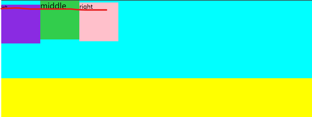
5.justify-content 控制弹性盒子内,子元素的分布方式
.top{
    width: 800px;
    background: aqua;
    display: flex;
    justify-content: flex-start;

}
flex-start 元素都在左边/上边 代表元素在排列方向的开始位置分布
flex-end 元素在排列方向上的结束位置分布(右/下)
center元素在排列方向的中间位置分布
space-between代表空白元素分布在元素与元素之间
space-around 代表空白元素分布在各个元素两边

space-evenly代表空白元素均匀分布在空隙
6.align-items控制弹性盒子内子元素在垂直方向上的对齐方式
flex-start 控制弹性盒子内元素在顶部或者左边对齐

flex-end 控制元素在底部对齐/右边对齐
center 元素垂直方向上居中对齐

baseline 首行底部对齐
*{
    padding: 0;
    margin: 0;
}
.top{
    width: 800px;
    background: aqua;
    display: flex;
    height: 200px;
    align-items: baseline;

}
.left{
    width: 100px;
    height: 100px;
    font-size: 10px;
    background: blueviolet;

}
.middle{
    width: 100px;
    height: 100px;
    background: rgb(50, 205, 76);
   font-size: 20px;
}
.right{
    width: 100px;
    height: 100px;
    background: pink;

    font-size: 15px;

}
.bottom{
    width: 800px;
    background: yellow;
    height: 100px;
}
7.align-content 设置弹性盒子内,多行分布方式
flex-start 所有行都靠近顶部或左端
flex-end 所有行都靠近底端或右端
center所有行居中显示
space-between空白元素放在行和行之间

space-around 空白元素平均放在行的上下两册
space-evenly 空白元素均匀分布在空隙

原创声明:本文系作者授权腾讯云开发者社区发表,未经许可,不得转载。
如有侵权,请联系 cloudcommunity@tencent.com 删除。
原创声明:本文系作者授权腾讯云开发者社区发表,未经许可,不得转载。
如有侵权,请联系 cloudcommunity@tencent.com 删除。
评论
登录后参与评论
推荐阅读
目录
腾讯云开发者

Copyright © 2013 - 2026 Tencent Cloud. All Rights Reserved. 腾讯云 版权所有
深圳市腾讯计算机系统有限公司 ICP备案/许可证号:粤B2-20090059  粤公网安备44030502008569号
腾讯云计算(北京)有限责任公司 京ICP证150476号 | 京ICP备11018762号