`margin:0 auto;`和`width:50%`不以我的div为中心
尝试将其他div内的垂直和水平div居中时,我遇到了一些问题。
这就是我想要做的:
我还读过如何水平居中<div>?以及如何使“position:absolute”元素居中。
这个问题与这两个问题都不重复,因为我不想把一个div作为中心position:absolute。我想把一个div position放在一个div中,而div里面没有属性position:absolute。
margin: 0 auto;并且width:50% 不起作用。
对齐图像,文本和按钮每个都需要不同的方法,我不知道。
这是我的代码:
body {
  margin: 0;
  padding: 0;
  font-family: sans-serif;
  background: url(back-image.jpg) no-repeat center center fixed;
  -webkit-background-size: cover;
  -moz-background-size: cover;
  -o-background-size: cover;
  background-size: cover;
  height: 100%;
  overflow: hidden;
  background-color: gray;
}

html {
  min-height: 100%;
}

#container {
  width: 80%;
  height: 100%;
  margin: 0 auto;
}

.top-container,
.center-container,
.side-container {
  position: absolute;
}

.top-container {
  left: 20%;
  top: 0;
  height: 30%;
  width: 50%;
  background: red;
  text-align: center;
}

.center-container {
  left: 20%;
  top: 40%;
  height: 50%;
  width: 50%;
  background: blue;
  text-align: center;
}

.side-container {
  left: 70%;
  top: 14%;
  height: 80%;
  width: 30%;
  background: green;
}

.top-container #logo {
  /* background: black;     */
  margin-top: 50px;
  width: 50%;
  height: 50px;
}


/* .top-container #logo img {
    display: inline-block;
} */

.top-container .title {
  margin-top: 50px;
  width: 100%;
  height: 40px;
  /* margin: 0 auto; */
  background: black;
  border-bottom: 1px solid red;
}

.center-container .title {
  /* margin: 0 auto; */
  background: greenyellow;
  height: 40px;
  width: 100%;
  border-bottom: 1px solid red;
}

#text-box {
  color: white;
  margin: 0 auto;
  width: 100%;
  height: 50%;
  background: black;
}

.center-container #text-box {
  background: black;
  height: 100%;
}

#text-box p {
  margin: 10px 10px;
  padding: 5px;
  text-align: left;
}

#text-box span {
  color: cyan;
  margin: 10px;
  text-align: right;
}

.side-container .title {
  /* margin: 0 auto; */
  background: greenyellow;
  height: 40px;
  width: 100%;
  text-align: center;
  border-bottom: 1px solid red;
}

#settings-button {
  width: 50%;
  background: none;
  border: 2px solid red;
  color: white;
  padding: 5px;
  font-size: 18px;
  cursor: pointer;
  margin: 0 auto;
  height: 40px;
}
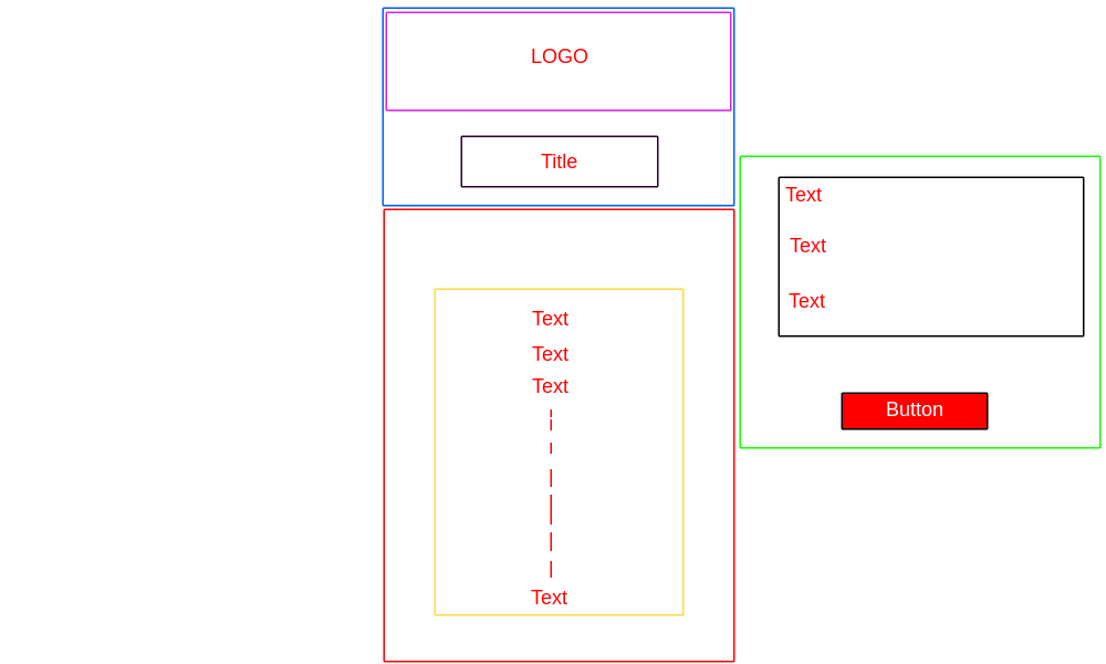
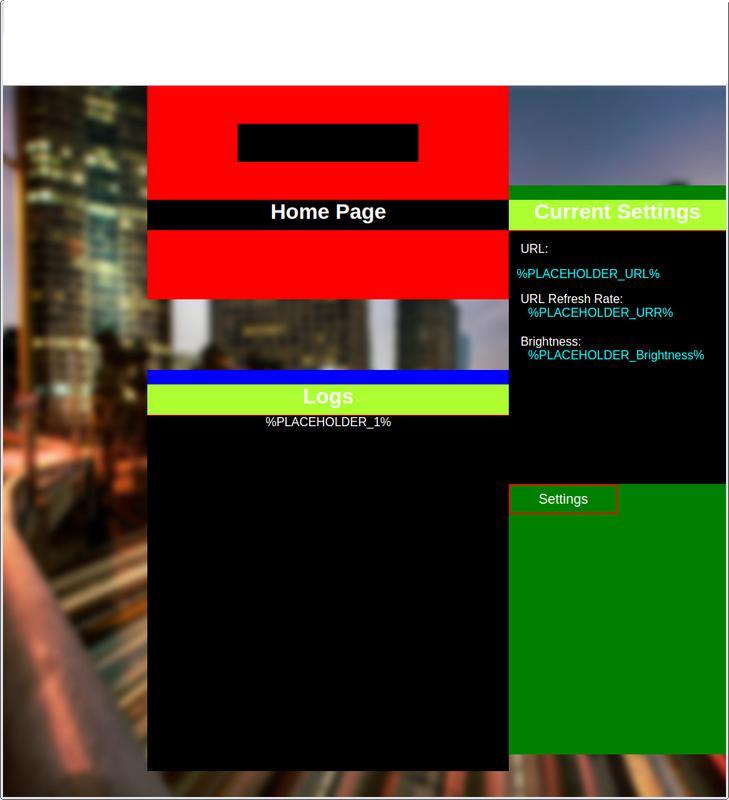
<div id="container">
  <div class="top-container">
    <div id="logo"><img url="logo.png"></div>
    <div class="title">
      <h1>Home Page</h1>
    </div>
  </div>
  <div class="center-container">
    <div class="text-box">%PLACEHOLDER_1%</div>
  </div>
  <div class="side-container">
    <div id="text-box">
      <p>URL: %PLACEHOLDER_URL%</p>
      <p>URL Refresh Rate: %PLACEHOLDER_URR%</p>
      <p>Brightness: %PLACEHOLDER_Brightness%</p>
    </div>
    <input id="settings-button" type="submit" name="" value="Settings">
  </div>
</div>
这是结果:
有些问题我不知道如何修复:
- 无法居中的图像居中
#logo。 它div有background: black。它正在使用width:50%并且它在内部很好地居中.top-container但是img它不以#logodiv的中心为中心。我试过了:这个和这个,但它只会让事情变得更糟。 - 不能中心
#settings-button内.side-container。**这是一样的#logo。.center-container .title并.side-container .title表现得像他们所设定的那样top= 5px。:他们为什么不放置在它们的包装的div的开始.center-container和.side-container分别?
我已经习惯text align: center了.title水平居中的文本。为了使文本垂直居中,还需要做些什么?
我用过width:100%文本divs因为我不需要divs居中。改变width:到任何百分比仍然使其居中。
我试着加入display:grid和flex和inline-block,但他们只会使事情变得更糟。
这是我能够去的。
回答 1
Stack Overflow用户
发布于 2019-05-14 11:06:31
我试图修复您的代码示例,但很难将问题的各个部分与您的代码示例相关联。相反,我会告诉你如何自己修复它。
垂直居中非常棘手 - 除非您使用flexbox或CSS Grid。然后这很容易。老实说,如果你花费大约30分钟摆弄flexbox,你就会把它弄下来 - 而且布局很简单,而且不像花车那样有意义。
Bootstrap有一个原因可以将他们的整个平台从Bootstrap3重新安装到Bootstrap4,主要是为了从使用浮动更改为flexbox。
Flexbox需要两件事:
- 父容器(例如DIV,部分,旁边,p等)
- 一个或多个子元素(例如div,p,img等)
您在父项上打开flexbox :display:flex;
然后,有各种开关。有些是在父级上设置的(如果是justify-content),但其他可能在项目上设置(如同flex-grow:1)
观看教程,从现在起40分钟后你的问题就会解决 - 你就会知道flexbox。
PS我与视频或其主持人没有关系 - 我很幸运能够发现它,现在将其传递出去。
https://stackoverflow.com/questions/-100006720
复制相似问题
腾讯云开发者
