
如何对齐条形图和两条线图?
如何对齐条形图和两条线图?
提问于 2020-02-10 18:15:26
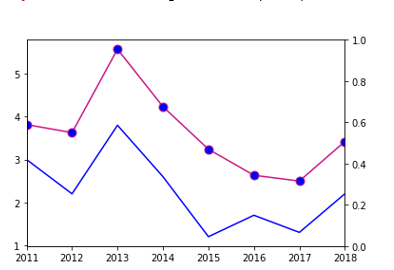
我需要在同一张图中得到两张线图&条形图。两条线图都有相同的y轴,但条形图有一个不同的轴。
表格格式
Indicator Name                                     2011 2012 2013 2014 2015 2016 2017 2018 2019
Bank nonperforming loans to total gross loans (%) 3.8   3.6  5.5  4.2  3.2  2.6  2.4  3.4  4.2
Bank nonperforming loans to total net loans (%)   3     2.2  3.8  2.6  1.2  1.7  1.3  2.2  2.5
Bank Total gross loans ( LK Bn)                   99   116.6 191  165 152.8 142.3 160.7 263.1 275.5
这是我的密码:
df.loc['Bank nonperforming loans to total gross loans (%)', years].plot(kind = 'line',color='mediumvioletred',marker ='o',
markerfacecolor ='blue',markersize=9,label = "NPL %")
df.loc['Bank nonperforming loans to total net loans (%)', years].plot(kind = 'line',color='blue',label = "SL")
plt.twinx()
df.loc['Bank Total gross loans (LK Bn)', years].plot(kind = 'Bar',color='brown',label = "chk")
plt.ylim([90,280])
plt.title('Immigration from Afghanistan')
plt.ylabel('NPL %')
plt.xlabel('years')
plt.legend()
下面是我得到的图表,但它没有显示条形图。
Stack Overflow用户
回答已采纳
发布于 2020-02-11 17:47:45
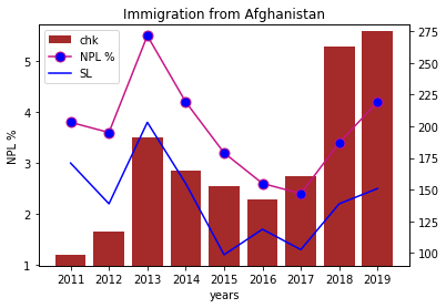
您的情况需要比DataFrame.plot可能提供的更多的控制。你需要定义你的情节的顺序:线条应该在条形图的顶部,但是在附加的情况下,你的条形线是在双轴上,这就产生了另一个问题。以下是您的问题的解决方案,主要基于这个answer。
代码:
import pandas as pd
import matplotlib.pyplot as plt


data = {
    2011: [3.8, 3, 99],
    2012: [3.6, 2.2, 116.6],
    2013: [5.5, 3.8, 191],
    2014: [4.2, 2.6, 165],
    2015: [3.2, 1.2, 152.8],
    2016: [2.6, 1.7, 142.3],
    2017: [2.4, 1.3, 160.7],
    2018: [3.4, 2.2, 263.1],
    2019: [4.2, 2.5, 275.5],
}

df = pd.DataFrame(
    data,
    index=['Bank nonperforming loans to total gross loans (%)',
           'Bank nonperforming loans to total net loans (%)',
           'Bank Total gross loans (LK Bn)'],
    columns=data.keys()
)

years = list(data.keys())

fig, ax = plt.subplots()

# axis for the bar
ax2 = ax.twinx()
ax2.set_ylim([90, 280])

# creating a cloned axis from ax for lines
# wee need this to put line plots on bars
ax1 = fig.add_axes(ax.get_position(), sharex=ax, sharey=ax)
ax1.set_facecolor('none')
ax1.set_axis_off()
ax1.set_xticks(years)

bar = ax2.bar(
    years,
    df.loc['Bank Total gross loans (LK Bn)'], color='brown',
    label='chk',
)

line1, = ax1.plot(
    df.loc['Bank nonperforming loans to total gross loans (%)', years],
    color='mediumvioletred',
    marker='o',
    markerfacecolor='blue',
    markersize=9,
    label='NPL %',
)

line2, = ax1.plot(
    df.loc['Bank nonperforming loans to total net loans (%)', years],
    color='blue',
    label='SL',
)

ax.set_title('Immigration from Afghanistan')
ax.set_ylabel('NPL %')
ax.set_xlabel('years')

ax2.legend([bar, line1, line2], ['chk', 'NPL %', 'SL'])
情节:
页面原文内容由Stack Overflow提供。腾讯云小微IT领域专用引擎提供翻译支持
原文链接:
https://stackoverflow.com/questions/60156134
复制相关文章
相似问题
腾讯云开发者
