
完全对齐几个情节
完全对齐几个情节
提问于 2016-07-28 13:04:48
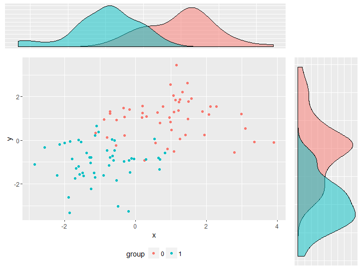
我的目标是一个复合地块,它结合了一个散点图和两个地块来估计密度。我面临的问题是,密度图与散点图不正确地对齐,这是由于密度图的轴标记和散点图的图例所致。它可以通过与plot.margin的周旋来调整。然而,这并不是一个更好的解决方案,因为如果情节发生变化,我将不得不一次又一次地调整它。是否有一种方法,以一种方式定位所有的情节,使实际绘图面板完美地对齐?
我尽量将代码保持在最低限度,但为了重现问题,它仍然相当多。
library(ggplot2)
library(gridExtra)

df <- data.frame(y     = c(rnorm(50, 1, 1), rnorm(50, -1, 1)),
                 x     = c(rnorm(50, 1, 1), rnorm(50, -1, 1)),
                 group = factor(c(rep(0, 50), rep(1,50))))


empty <- ggplot() +
              geom_point(aes(1,1), colour="white") +
              theme(
                plot.background = element_blank(),
                panel.grid.major = element_blank(),
                panel.grid.minor = element_blank(),
                panel.border = element_blank(),
                panel.background = element_blank(),
                axis.title.x = element_blank(),
                axis.title.y = element_blank(),
                axis.text.x = element_blank(),
                axis.text.y = element_blank(),
                axis.ticks = element_blank()
              )


scatter <-  ggplot(df, aes(x = x, y = y, color = group)) +
                geom_point() +
                theme(legend.position = "bottom")

top_plot <- ggplot(df, aes(x = y)) +
                geom_density(alpha=.5, mapping = aes(fill = group)) +
                theme(legend.position = "none") +
                theme(axis.title.y = element_blank(),
                      axis.title.x = element_blank(),
                      axis.text.y=element_blank(),
                      axis.text.x=element_blank(),
                      axis.ticks=element_blank() )

right_plot <- ggplot(df, aes(x = x)) +
                geom_density(alpha=.5, mapping = aes(fill = group)) +
                coord_flip() + theme(legend.position = "none") +
                theme(axis.title.y = element_blank(),
                      axis.title.x = element_blank(),
                      axis.text.y  = element_blank(),
                      axis.text.x=element_blank(),
                      axis.ticks=element_blank())

grid.arrange(top_plot, empty, scatter, right_plot, ncol=2, nrow=2, widths=c(4, 1), heights=c(1, 4))Stack Overflow用户
发布于 2016-07-28 13:58:06
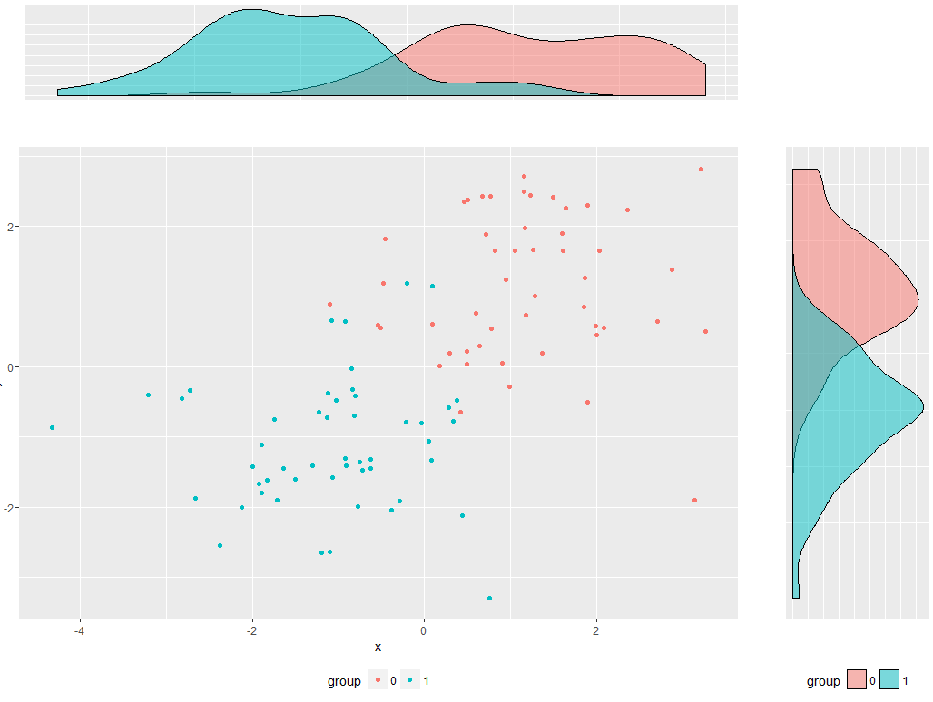
当您将轴设置为element_blank()时,它将移除轴,并允许图形填充其余的空间。相反,设置为color = "white“(或您的背景):
# All other code remains the same:

scatter <-  ggplot(df, aes(x = x, y = y, color = group)) +
  geom_point() +
  theme(legend.position = "bottom")

top_plot <- ggplot(df, aes(x = y)) +
  geom_density(alpha=.5, mapping = aes(fill = group)) +
  theme(legend.position = "none")+
  theme(axis.title = element_text(color = "white"),
        axis.text=element_text(color = "white"),
        axis.ticks=element_line(color = "white") )

right_plot <- ggplot(df, aes(x = x)) +
  geom_density(alpha=.5, mapping = aes(fill = group)) +
  coord_flip() +
  theme(legend.position = "bottom") +
  theme(axis.title = element_text(color = "white"),
        axis.text  = element_text(color = "white"),
        axis.ticks=element_line(color = "white"))

grid.arrange(top_plot, empty, scatter, right_plot, ncol=2, nrow=2, widths=c(4, 1), heights=c(1, 4))
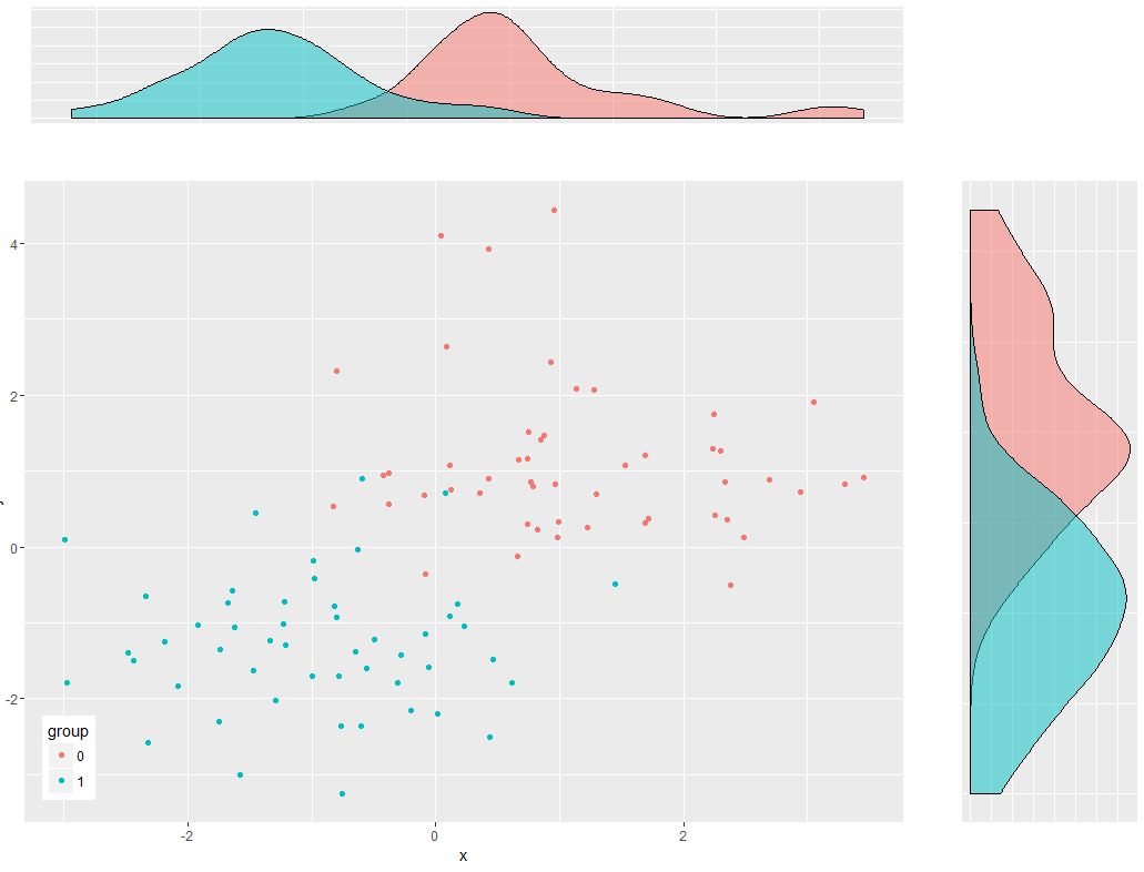
我还得在正确的情节中加入一个传奇。如果你不想这样,我也建议把散布中的传说移到情节里去:
scatter <-  ggplot(df, aes(x = x, y = y, color = group)) +
  geom_point() +
  theme(legend.position = c(0.05,0.1))

top_plot <- ggplot(df, aes(x = y)) +
  geom_density(alpha=.5, mapping = aes(fill = group)) +
  theme(legend.position = "none")+
  theme(axis.title = element_text(color = "white"),
        axis.text=element_text(color = "white"),
        axis.ticks=element_line(color = "white") )

right_plot <- ggplot(df, aes(x = x)) +
  geom_density(alpha=.5, mapping = aes(fill = group)) +
  coord_flip() +
  theme(legend.position = "none") +
  theme(axis.title = element_text(color = "white"),
        axis.text  = element_text(color = "white"),
        axis.ticks=element_line(color = "white"))

grid.arrange(top_plot, empty, scatter, right_plot, ncol=2, nrow=2, widths=c(4, 1), heights=c(1, 4))
页面原文内容由Stack Overflow提供。腾讯云小微IT领域专用引擎提供翻译支持
原文链接:
https://stackoverflow.com/questions/38637261
复制相关文章
相似问题
腾讯云开发者
