如何实现此通知设计并使其具有明智的响应性
如何实现此通知设计并使其具有明智的响应性
提问于 2016-08-08 14:55:03
我试图实现这一点,对于通知块来说,它的设计非常简单。
包括通过将文本块封装在较小的屏幕上来响应的能力,类似于下面的内容;
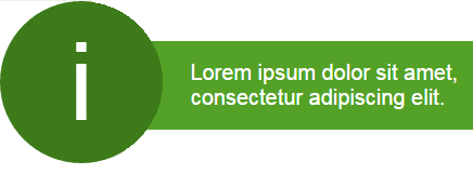
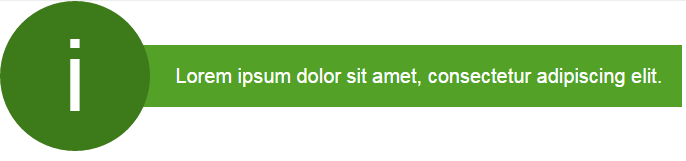
这里的意图是将通知与父行对齐,最好是当视区太小时,使其所在的水平横幅的文本包装和高度相应地增加。这将包括在一个引导项目(可能影响浮动等)。
这是一支钢笔展示了一种更简单的方法(到目前为止可能是最近的),我一直在尝试实现这一点。
*,
html {
  font-family: arial;
  font-size: 20px;
}
.extra-row {
  text-align: center;
  padding: 1em;
  border: 1px solid #eee;
  background-color: #ccc;
}
.notification {
  text-align: center;
  color: #fff;
  white-space: nowrap;
}
.notification-circle {
  width: 150px;
  height: 150px;
  background-color: #3D7A1A;
  -moz-border-radius: 75px;
  -webkit-border-radius: 75px;
  border-radius: 75px;
  position: relative;
  display: -webkit-flexbox;
  display: -ms-flexbox;
  display: -webkit-flex;
  display: inline-flex;
  -webkit-flex-align: center;
  -ms-flex-align: center;
  -webkit-align-items: center;
  align-items: center;
  justify-content: center;
}
.notification-icon {
  font-size: 5em;
}
.notification-block {
  min-height: 150px;
  line-height: 150px;
  display: inline-block;
  margin-left: -30px;
  vertical-align: top
}
.notification-block span {
  background-color: #54A127;
  padding: 1em;
  padding-left: 50px;
}<link href="https://maxcdn.bootstrapcdn.com/bootstrap/3.3.6/css/bootstrap.min.css" rel="stylesheet"/>
<div class="container">
<div class="row extra-row">
<div class="col-lg-12">
<p>This is a row above</p>
</div>
</div>
<div class="row">
<div class="col-lg-12">
<div class="notification">
<div class="notification-circle"><span class="notification-icon">i</span>
</div>
<p class="notification-block"><span>Lorem ipsum dolor sit amet, consectetur adipiscing elit. </span>
</p>
</div>
</div>
</div>
<div class="row extra-row">
<div class="col-lg-12">
<p>This is a row below</p>
</div>
</div>
</div>
有相当多的建议,垂直居中的文本以这种方式,大多数似乎依赖于线的高度,这是一个问题,在这里包装文本。
这可能不是最好的方法,因为使用线高度,但这里的问题是;
- 防止循环容器和文本容器包装。
- 在容器中包装文本,同时仍然保持文本块的整体高度/垂直中心位置。
- 用合理的线条高度包装文字。
将white-space: nowrap;添加到.notification元素确实会阻止#1,但会阻止文本包装,这只是通过视口扩展。
有谁能说明一个更好的方法吗?任何想法都将不胜感激。
非常感谢,
巴普斯。
回答 1
Stack Overflow用户
回答已采纳
发布于 2016-08-08 16:06:43
希望这能让你走上正确的道路。
我删除了很多不必要的代码。我还删除了演示的前缀。
这种调整可能是您所需要的全部:
.notification {
     display: flex;                  /* 1 */
     align-items: center;            /* 2 */
     color:#fff;
}
.notification-circle {
     flex: 0 0 150px;                /* 3 */
     height: 150px;
     background-color: #3D7A1A;
     border-radius: 75px;
     display: flex;
     align-items: center;
     justify-content: center;
}
.notification-block {
     margin-left: -50px;             /* 4 */
     background-color: #54A127;      /* 5 */
     padding: 1em;                   /* 5 */
     padding-left: 75px;             /* 5 */
     z-index: -1;                    /* 6 */
}
.notification-block span { }
.notification-icon { font-size: 5em; }备注:
- 使包装器成为一个灵活的容器
- 垂直中心两个弯曲子(
.notification-circle和.notification-block) - 别再长了。不要退缩。保持固定在150 at宽度。
- 从
margin-left: -30px - 从
span子节点重新定位代码 - 确保
.notification-block不重叠.notification-circle
页面原文内容由Stack Overflow提供。腾讯云小微IT领域专用引擎提供翻译支持
原文链接:
https://stackoverflow.com/questions/38839689
复制相关文章
相似问题
腾讯云开发者
