跟着Genome Biology学作图:R语言ggplot2+ggforce画桑基图

跟着Genome Biology学作图:R语言ggplot2+ggforce画桑基图

用户7010445
发布于 2023-01-06 20:24:30
发布于 2023-01-06 20:24:30
论文
A pan-Zea genome map for enhancing maize improvement
https://genomebiology.biomedcentral.com/articles/10.1186/s13059-022-02742-7
s13059-022-02742-7.pdf
论文中没有提供作图数据和代码,但是桑基图的作图数据相对比较简单 我们可以自己来构造数据
今天的推文主要内容是重复一下论文中的Figure1D桑基图
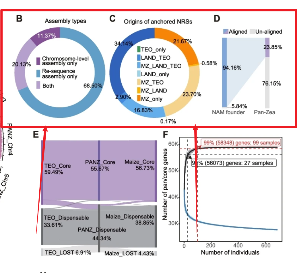
image.png
昨天的推文介绍的也是绘制桑基图,但是是借助的现成R包ggalluvial,暂时不知道用这个R包来做各个部分的比例如何调整。桑基图可以简单理解成两个柱子,然后柱子之间有连线,柱子可以借用ggplot2的geom_rect()函数来做,连线可以借助ggforce的geom_diagonal_wide()来做,但是相对比较繁琐,只有两列还好,像Figure4E实现起来就非常繁琐,但是暂时还想不到比较好的办法
首先是Figure4D
先画两个柱子
library(ggplot2)
ggplot()+
  geom_rect(aes(xmin=1-0.1,xmax=1+0.1,ymin=0,ymax=5.84),
            fill="#e3e2e2")+
  geom_rect(aes(xmin=1-0.1,xmax=1+0.1,ymin=5.84,ymax=100),
            fill="#7fa7d8")+
  geom_rect(aes(xmin=2-0.1,xmax=2+0.1,ymin=0,ymax=76.15),
            fill="#e3e2e2")+
  geom_rect(aes(xmin=2-0.1,xmax=2+0.1,ymin=76.15,ymax=100),
            fill="#af9dcc")+
  theme_void()
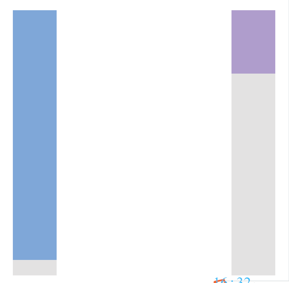
image.png
链接指定的区域
library(ggforce)
ggplot()+
  geom_rect(aes(xmin=1-0.1,xmax=1+0.1,ymin=0,ymax=5.84),
            fill="#e3e2e2")+
  geom_rect(aes(xmin=1-0.1,xmax=1+0.1,ymin=5.84,ymax=100),
            fill="#7fa7d8")+
  geom_rect(aes(xmin=2-0.1,xmax=2+0.1,ymin=0,ymax=76.15),
            fill="#e3e2e2")+
  geom_rect(aes(xmin=2-0.1,xmax=2+0.1,ymin=76.15,ymax=100),
            fill="#af9dcc")+
  theme_void()+
  geom_diagonal_wide(aes(x=c(1.1,1.9,1.9,1.1),
                         y=c(5.84,76.15,100,100)),
                     fill="#e0eaf3")
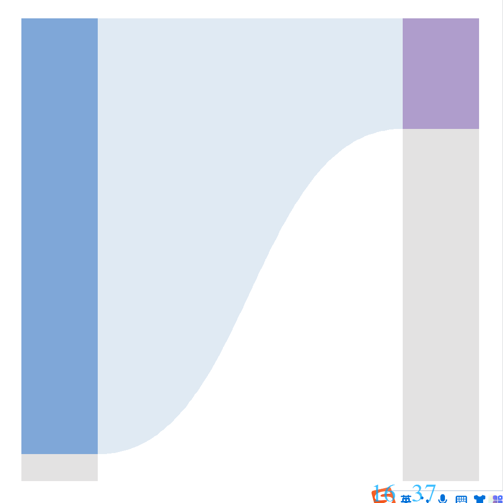
image.png
接下来是添加各部分的文字
ggplot()+
  geom_rect(aes(xmin=1-0.1,xmax=1+0.1,ymin=0,ymax=5.84),
            fill="#e3e2e2")+
  geom_rect(aes(xmin=1-0.1,xmax=1+0.1,ymin=5.84,ymax=100),
            fill="#7fa7d8")+
  geom_rect(aes(xmin=2-0.1,xmax=2+0.1,ymin=0,ymax=76.15),
            fill="#e3e2e2")+
  geom_rect(aes(xmin=2-0.1,xmax=2+0.1,ymin=76.15,ymax=100),
            fill="#af9dcc")+
  #theme_void()+
  geom_diagonal_wide(aes(x=c(1.1,1.9,1.9,1.1),
                         y=c(5.84,76.15,100,100)),
                     fill="#e0eaf3")+
  scale_x_continuous(breaks = c(1,2),
                     labels = c("NAM founder","Pan-Zea")) -> p1

x<-c(1,1,2,2)
y<-c(5.84/2,5.84+94.16/2,
     76.15/2,76.15+23.85/2)
label<-paste0(c(5.84,94.16,76.15,23.85),"%")
x;y
label

for (i in 1:4){
  p1<-p1+
    annotate(geom = "text",
             x=x[i],
             y=y[i],
             label=label[i])
}
p1
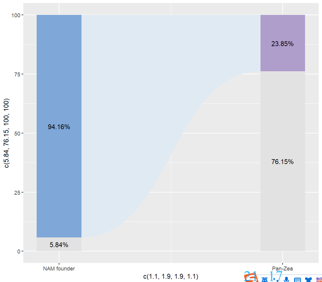
image.png
对主题进行设置
p1+
  theme(panel.background = element_blank(),
        axis.text.y = element_blank(),
        axis.ticks = element_blank(),
        axis.title = element_blank())+
  scale_y_continuous(expand = expansion(mult = c(0,0))) -> p1.1
制作图例
dflegend<-data.frame(x=c(1,1,2,2),
                     y=c(1,1,1,1),
                     group=c("A","B","C","D"))
dflegend

ggplot(data=dflegend,aes(x=x,y=y,shape=group,
                         color=group))+
  geom_point(size=10)+
  scale_shape_manual(values=c("\u25E4","\u25E2","\u25E4","\u25E2"))+
  scale_color_manual(values = c("#7fa7d8","#af9dcc","#e3e2e2","#e3e2e2"))+
  theme_void()+
  theme(legend.position = "none")+
  xlim(0.5,2.5)+
  annotate(geom = "text",x=1.1,y=1,
           label="Aligned",hjust=0,
           size=5)+
  annotate(geom = "text",x=2.1,y=1,
           label="Un-aligned",hjust=0,
           size=5) -> p2
p2
采用拼图的形式将图例和主图组合到一起
library(patchwork)

p2/p1.1+
  plot_layout(heights = c(1,10))
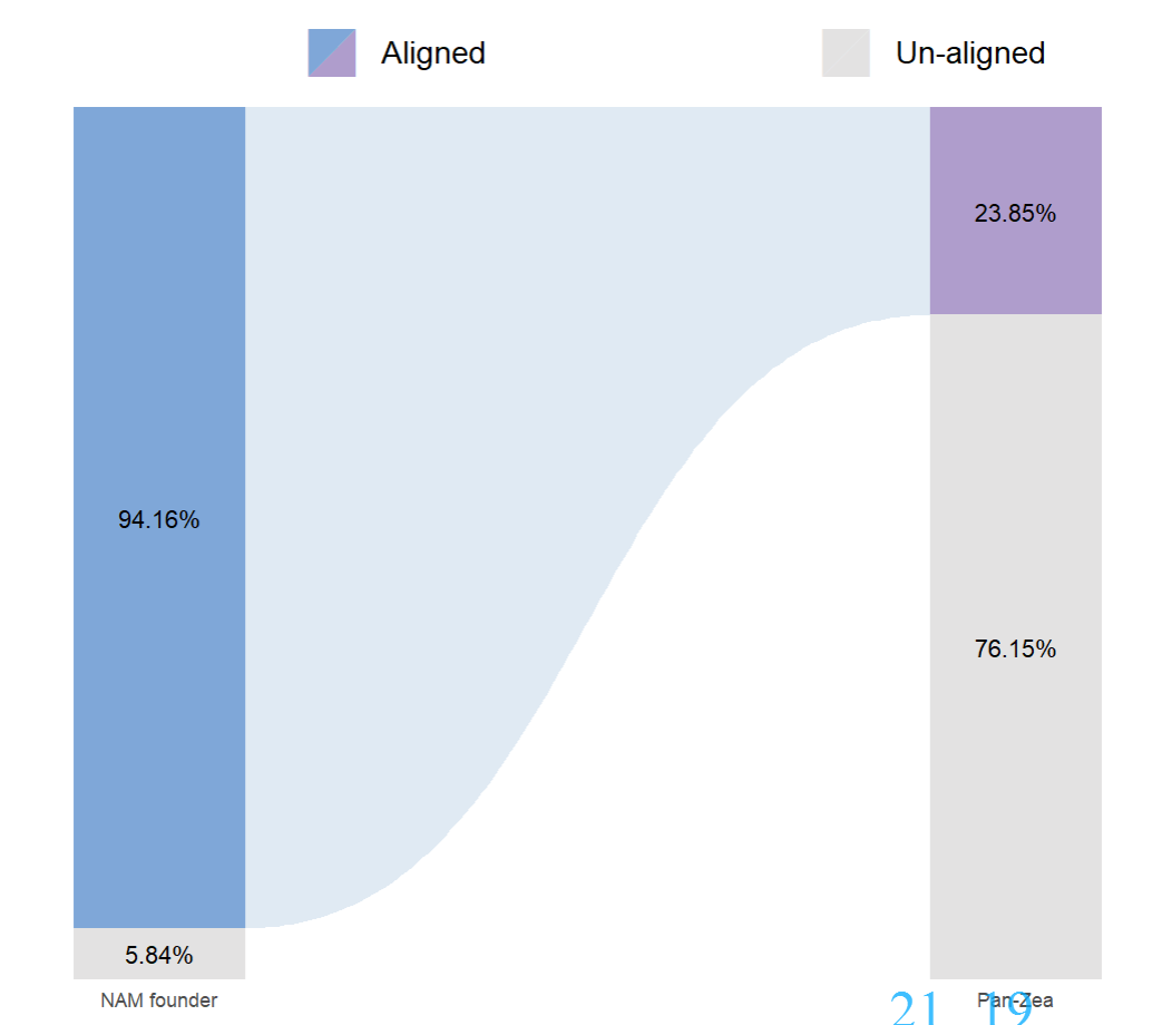
image.png
这里新学到一个知识点,ggplot2做散点图,散点图的形状可以使用unicode,比如这里的两个上下三角,具体有哪些形状可以选可以参考下面这个图片
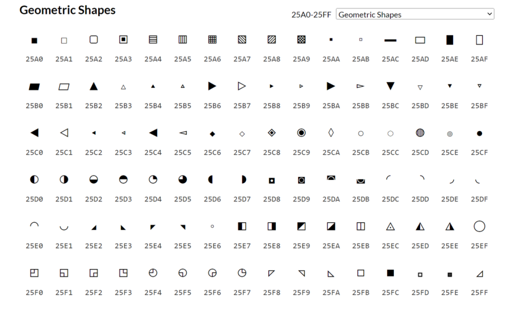
image.png
但是遇到一个问题是导出pdf以后形状显示不出来,暂时不知道啥原因
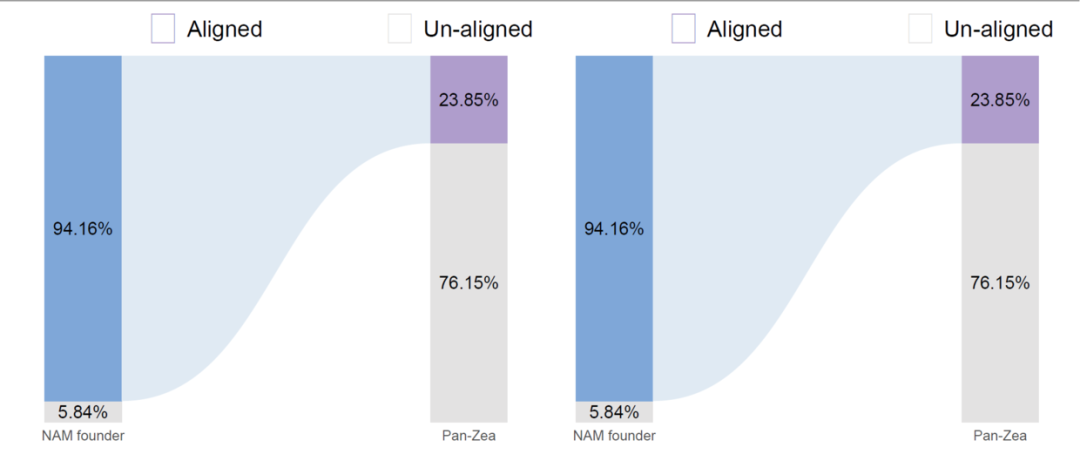
image.png
制作封面图
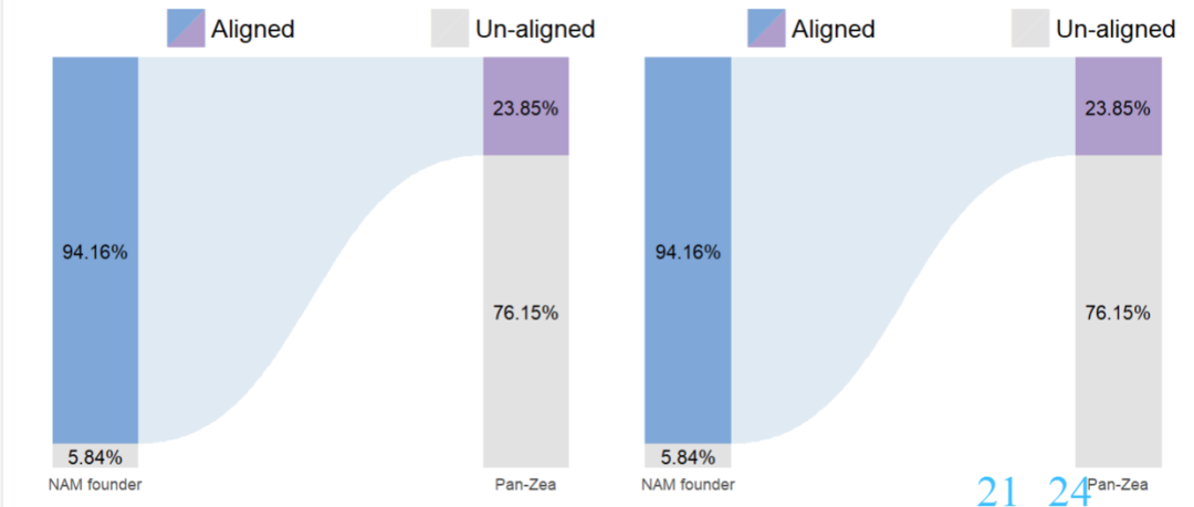
image.png
这次推文没有示例数据,数据是和代码写到一起了,代码直接在推文中复制就行
本文参与 腾讯云自媒体同步曝光计划,分享自微信公众号。
原始发表:2022-09-11,如有侵权请联系 cloudcommunity@tencent.com 删除
评论
登录后参与评论
推荐阅读
目录
腾讯云开发者

Copyright © 2013 - 2026 Tencent Cloud. All Rights Reserved. 腾讯云 版权所有
深圳市腾讯计算机系统有限公司 ICP备案/许可证号:粤B2-20090059 ![]() 粤公网安备44030502008569号
粤公网安备44030502008569号
腾讯云计算(北京)有限责任公司 京ICP证150476号 | 京ICP备11018762号