RNA-seq 详细教程:可视化(12)

RNA-seq 详细教程:可视化(12)

数据科学工厂
发布于 2023-02-27 13:00:11
发布于 2023-02-27 13:00:11
学习内容
- 了解如何为可视化准备数据
- 了解如果利用可视化来探索分析结果
- 火山图可视化
- 热图可视化
可视化结果
当我们处理大量数据时,以图形方式显示该信息以获得更多信息,可能很有用。在本课中,我们将让您开始使用探索差异基因表达数据时常用的一些基本和更高级的图,但是,其中许多图也有助于可视化其他类型的数据。
我们将使用我们在前面的课程中创建的三个不同的数据对象:
- 样本的元数据(数据框):
meta - 每个样本中每个基因的归一化表达数据(矩阵):
normalized_counts - 上一课中生成的
DESeq2结果的Tibble版本:res_tableOE_tb和res_tableKD_tb
首先,让我们从数据框中创建一个元数据 tibble(不要丢失行名!)
mov10_meta <- meta %>%
              rownames_to_column(var="samplename") %>%
              as_tibble()
接下来,让我们将带有 gene symbols 的列引入 normalized_counts 对象,以便我们可以使用它们来标记我们的图。 Ensembl ID 对很多事情都很有用,但作为生物学家,gene symbols 对我们来说更容易识别。
# DESeq2 creates a matrix when you use the counts() function
## First convert normalized_counts to a data frame and transfer the row names to a new column called "gene"
normalized_counts <- counts(dds, normalized=T) %>%
                     data.frame() %>%
                     rownames_to_column(var="gene")

# Next, merge together (ensembl IDs) the normalized counts data frame with a subset of the annotations in the tx2gene data frame (only the columns for ensembl gene IDs and gene symbols)
grch38annot <- tx2gene %>%
               dplyr::select(ensgene, symbol) %>%
               dplyr::distinct()

## This will bring in a column of gene symbols
normalized_counts <- merge(normalized_counts, grch38annot, by.x="gene", by.y="ensgene")

# Now create a tibble for the normalized counts
normalized_counts <- normalized_counts %>%
                     as_tibble()

normalized_counts
- 上面的快捷方式如下:
normalized_counts <- counts(dds, normalized=T) %>%
                     data.frame() %>%
                     rownames_to_column(var="gene") %>%
                     as_tibble() %>%
                     left_join(grch38annot, by=c("gene" = "ensgene"))
可视化DE基因
可视化结果的一种方法是简单地绘制少数基因的表达数据。我们可以通过挑选出感兴趣的特定基因或选择一系列基因来做到这一点。
- 使用
DESeq2 plotCounts()绘制单个基因的表达
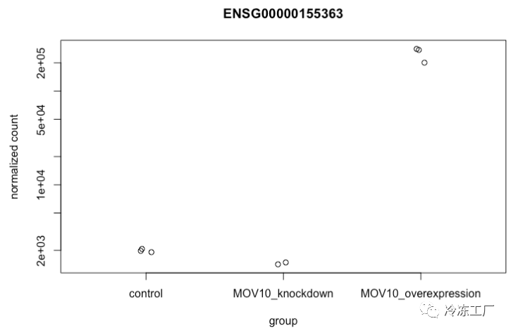
要挑选出感兴趣的特定基因进行绘图,例如 MOV10,我们可以使用 DESeq2 中的 plotCounts()。 plotCounts() 要求指定的基因与 DESeq2 的原始输入匹配,在我们的例子中是 Ensembl ID。
# Find the Ensembl ID of MOV10
grch38annot[grch38annot$symbol == "MOV10", "ensgene"]

# Plot expression for single gene
plotCounts(dds, gene="ENSG00000155363", intgroup="sampletype")
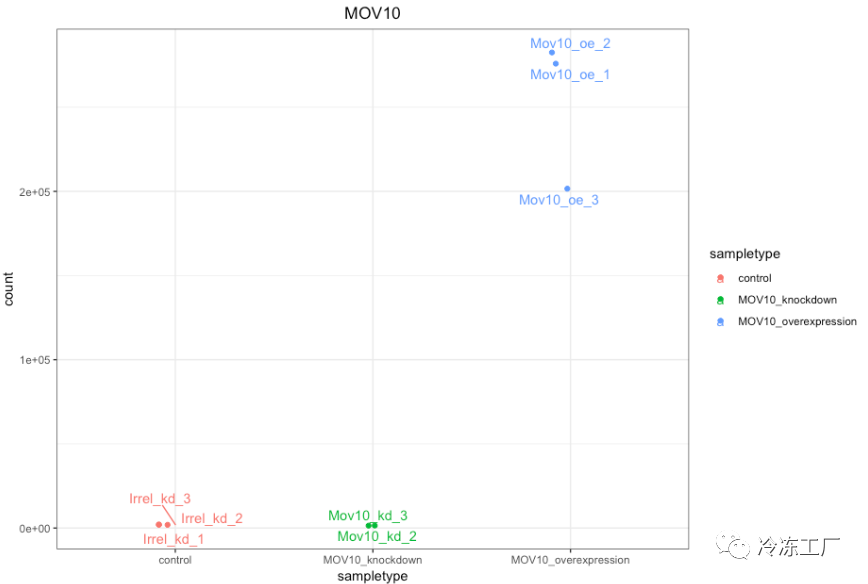
- 使用
ggplot2绘制单个基因的表达
如果您想更改此图的外观,我们可以将 plotCounts() 的输出保存到指定 returnData=TRUE 参数的变量中,然后使用 ggplot():
# Save plotcounts to a data frame object
d <- plotCounts(dds, gene="ENSG00000155363", intgroup="sampletype", returnData=TRUE)

# What is the data output of plotCounts()?
d %>% View()

# Plot the MOV10 normalized counts, using the samplenames (rownames(d) as labels)
ggplot(d, aes(x = sampletype, y = count, color = sampletype)) +
    geom_point(position=position_jitter(w = 0.1,h = 0)) +
    geom_text_repel(aes(label = rownames(d))) +
    theme_bw() +
    ggtitle("MOV10") +
    theme(plot.title = element_text(hjust = 0.5))
★ 请注意,在下面的图中(上面的代码),我们使用 ggrepel 包中的 geom_text_repel() 来标记图中的各个点。 ”
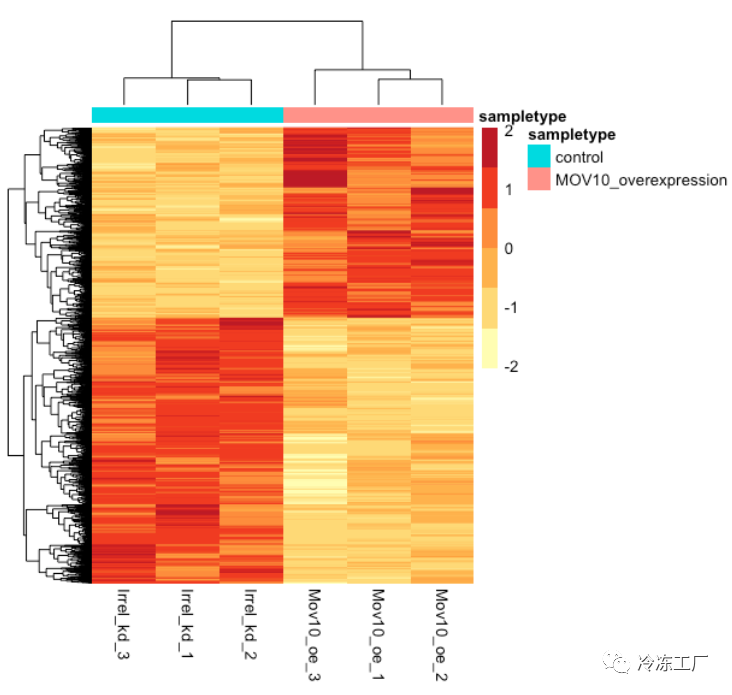
热图
除了绘制子集,我们还可以提取所有重要基因的归一化值,并使用 pheatmap() 绘制其表达的热图。
### Extract normalized expression for significant genes from the OE and control samples (2:4 and 7:9)
norm_OEsig <- normalized_counts[,c(1:4,7:9)] %>%
              filter(gene %in% sigOE$gene)
现在让我们使用 pheatmap绘制热图:
### Set a color palette
heat_colors <- brewer.pal(6, "YlOrRd")

### Run pheatmap using the metadata data frame for the annotation
pheatmap(norm_OEsig[2:7],
    color = heat_colors,
    cluster_rows = T,
    show_rownames = F,
    annotation = meta,
    border_color = NA,
    fontsize = 10,
    scale = "row",
    fontsize_row = 10,
    height = 20)
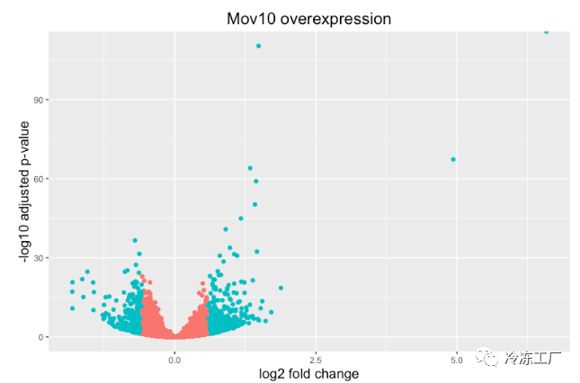
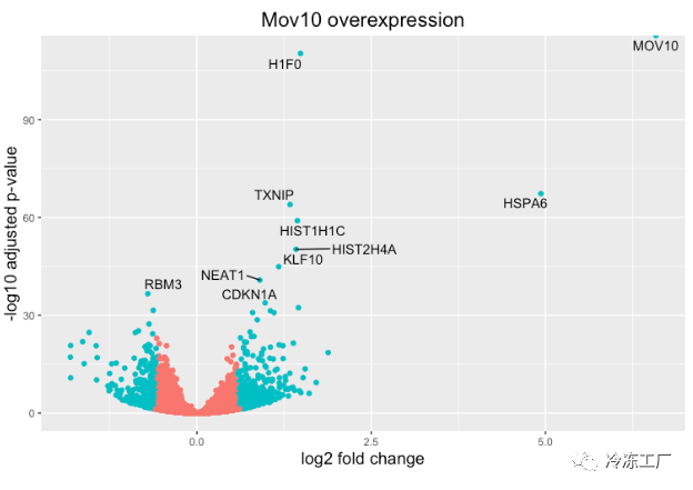
火山图
上面的图很适合查看大量基因的表达水平,但对于更多的全局视图,我们可以绘制其他图。一个常用的是火山图;其中,您在 y 轴上绘制了对数转换调整后的 p 值,在 x 轴上绘制了 log2 倍变化值。
要生成火山图,我们首先需要在结果数据中有一列,表明该基因是否被认为是基于 p 调整值的差异表达,我们将在此处包括 log2fold 变化。
## Obtain logical vector where TRUE values denote padj values < 0.05 and fold change > 1.5 in either direction

res_tableOE_tb <- res_tableOE_tb %>%
                  mutate(threshold_OE = padj < 0.05 & abs(log2FoldChange) >= 0.58)
现在我们可以开始绘图了。 geom_point 对象最适用,因为这本质上是一个散点图:
## Volcano plot
ggplot(res_tableOE_tb) +
    geom_point(aes(x = log2FoldChange, y = -log10(padj), colour = threshold_OE)) +
    ggtitle("Mov10 overexpression") +
    xlab("log2 fold change") +
    ylab("-log10 adjusted p-value") +
    #scale_y_continuous(limits = c(0,50)) +
    theme(legend.position = "none",
          plot.title = element_text(size = rel(1.5), hjust = 0.5),
          axis.title = element_text(size = rel(1.25)))
如果我们还想知道我们的 DE 列表中的前 10 个基因(最低的 padj)在这个图上的位置怎么办?我们可以使用 geom_text_repel() 在火山图上用基因名称标记这些点。
首先,我们需要按 padj 对 res_tableOE tibble 进行排序,并向其添加一个额外的列,以包含我们要用于标记图的那些基因名称。
## Add all the gene symbols as a column from the grch38 table using bind_cols()
res_tableOE_tb <- bind_cols(res_tableOE_tb, symbol=grch38annot$symbol[match(res_tableOE_tb$gene, grch38annot$ensgene)])

## Create an empty column to indicate which genes to label
res_tableOE_tb <- res_tableOE_tb %>% mutate(genelabels = "")

## Sort by padj values
res_tableOE_tb <- res_tableOE_tb %>% arrange(padj)

## Populate the genelabels column with contents of the gene symbols column for the first 10 rows, i.e. the top 10 most significantly expressed genes
res_tableOE_tb$genelabels[1:10] <- as.character(res_tableOE_tb$symbol[1:10])

View(res_tableOE_tb)
接下来,我们像以前一样用 geom_text_repel() 的附加层绘制它,我们可以在其中指定我们刚刚创建的基因标签列。
ggplot(res_tableOE_tb, aes(x = log2FoldChange, y = -log10(padj))) +
    geom_point(aes(colour = threshold_OE)) +
    geom_text_repel(aes(label = genelabels)) +
    ggtitle("Mov10 overexpression") +
    xlab("log2 fold change") +
    ylab("-log10 adjusted p-value") +
    theme(legend.position = "none",
          plot.title = element_text(size = rel(1.5), hjust = 0.5),
          axis.title = element_text(size = rel(1.25)))
本文参与 腾讯云自媒体同步曝光计划,分享自微信公众号。
原始发表:2022-12-17,如有侵权请联系 cloudcommunity@tencent.com 删除
评论
登录后参与评论
推荐阅读
目录
腾讯云开发者

Copyright © 2013 - 2026 Tencent Cloud. All Rights Reserved. 腾讯云 版权所有
深圳市腾讯计算机系统有限公司 ICP备案/许可证号:粤B2-20090059 ![]() 粤公网安备44030502008569号
粤公网安备44030502008569号
腾讯云计算(北京)有限责任公司 京ICP证150476号 | 京ICP备11018762号