单细胞韧皮部研究代码解析1-QC_filtering.R
原创单细胞韧皮部研究代码解析1-QC_filtering.R
原创
由于最近一直需要加班和做试验,我把更文的时间变成一周一次啦,有问题的小伙伴可以留言,我们做生信的小可爱们一起学习进步。
我去年分享了一篇单细胞韧皮部研究的文献分享,我一直都很喜欢看这篇文章作者的代码,写的很棒,推荐给大家。
没看过文献的人,可以提前看一下我去年写的文献分享的链接:https://cloud.tencent.com/developer/article/2078101?areaSource=&traceId=
首先作者对相关的结果进行了数据质控,作者用的SingleCellExperiment的格式,如果友友手上的数据格式是Seurat格式的,可以根据这篇文章的内容,来对数据格式进行更改https://satijalab.org/seurat/articles/conversion_vignette.html
代码解析
##R包的加载
library(data.table)
library(scater)
library(scran)
library(ggplot2)
library(ggpointdensity)
library(ggridges)
library(patchwork)

# set seed for reproducible results
set.seed(1001)

# set ggplot2 theme
theme_set(theme_bw() + theme(text = element_text(size = 14)))

# source util functions,这一段是作者的R代码,里面有getReducedDim函数,不加载后面的图出不来
source("analysis/functions/utils.R")

# Marker genes whose promoters were used for cell sorting
#文章里面加入了marker基因对不同的细胞类型进行了筛选
markers <- data.table(name = c("APL", "MAKR5", "PEARdel", "S17", "sAPL"),
                      id = c("AT1G79430", "AT5G52870", "AT2G37590", "AT2G22850", "AT3G12730"))


# read data ---------------------------------------------------------------
#作者前面自己进行了数据过滤,后面是进行可视化的代码

# soft filtering (only on mitochondrial genes)
ring_soft <- readRDS("data/processed/SingleCellExperiment/ring_batches_softfilt.rds")

# hard filtering (also total UMIs > 1000)
ring_hard <- readRDS("data/processed/SingleCellExperiment/ring_batches_hardfilt.rds")


# UMI statistics and filters ----------------------------------------------

# UMI count distribution
#选用了ggplot函数对umi、No. detected genes、sample的结果进行可视化
p1 <- ggplot(colData(ring_soft), aes(total, Sample)) +
  geom_density_ridges(fill = "lightgrey", alpha = 0.5) +
  geom_vline(xintercept = 1000, linetype = "dashed") +
  scale_x_log10() +
  annotation_logticks(sides = "b") +
  labs(x = "Total UMIs per cell", y = "")

# Detected genes distribution
p2 <- ggplot(colData(ring_soft), aes(detected, Sample)) +
  geom_density_ridges(fill = "lightgrey", alpha = 0.5) +
  scale_x_log10() +
  annotation_logticks(sides = "b") +
  labs(x = "No. detected genes", y = "")

p3 <- ggplot(colData(ring_soft), aes(total, detected)) +
  geom_pointdensity() +
  geom_vline(xintercept = 1000, linetype = "dashed") +
  scale_x_log10() + scale_y_log10() +
  annotation_logticks(sides = "bl") +
  scale_colour_viridis_c(guide = "none", option = "magma") +
  facet_wrap(~ Sample)

(p1 + p2) / p3 + plot_annotation(tag_levels = "A")

# Checking how many cells pass different thresholds
coldat <- as.data.table(colData(ring_soft))
coldat[, .(no_filt = .N,
           mito_filt = sum(subsets_mitochondria_percent < 10),
           total_filt = sum(subsets_mitochondria_percent < 10 & total > 1e3)),
       by = Sample]


# Total UMIs - to filter or not to filter? -------------------------------
# 为了对umi值是否进行过滤,选用了过滤前后的结果进行可视化,进行比较

# Correlation of PC scores and total UMI
# 选择spearman评估1-12pcs的相关性

pc_cor <- data.frame(PC = factor(1:12),
                     cor = sapply(1:12, function(i) cor(ring_soft$total,
                                                        reducedDim(ring_soft, "PCA")[, i],
                                                        method = "spearman")),
                     var = attr(reducedDim(ring_soft, "PCA"), "percentVar")[1:12])

p1 <- ggplot(pc_cor, aes(PC, cor)) +
  geom_label(aes(label = round(var))) +
  geom_hline(yintercept = 0, linetype = "dashed") +
  coord_cartesian(ylim = c(-1, 1)) +
  labs(x = "PC", y = "Spearman Correlation") +
  theme_classic()

# Visualise this correlation
p2 <- ggplot(getReducedDim(ring_soft, "PCA"), aes(total, PC2)) +
  geom_point() +
  scale_x_log10() +
  labs(x = "Total UMIs",
       y = paste0("PC2 (", round(attr(reducedDim(ring_soft, "PCA"), "percentVar")[2]), "%)"),
       subtitle = paste0("Spearman correlation = ",
                         round(
                           cor(ring_soft$total,
                               getReducedDim(ring_soft, "PCA")$PC2, method = "spearman"),
                           2)))

p3 <- ggplot(getReducedDim(ring_soft, "PCA"), aes(PC1, PC2, colour = total)) +
  geom_point() +
  scale_colour_viridis_c(trans = "log10") +
  labs(x = paste0("PC1 (", round(attr(reducedDim(ring_soft, "PCA"), "percentVar")[1]), "%)"),
       y = paste0("PC2 (", round(attr(reducedDim(ring_soft, "PCA"), "percentVar")[2]), "%)")) +
  coord_fixed(ratio = 0.8)

# 在单细胞的文章中,经常有多个图需要进行排列,这个函数可以进行排图plot_layout(ncol = 2)
p1 + p2 + p3 + plot_layout(ncol = 2)


# clustering without PC2
# 这一部分是感觉前面的相关性的结果中pc2有可能是作者不需要的,选用了这一部分去除pc2后与前面的结果进行比较
# reducedDim:添加降维temp
# buildSNNGraph:Build a nearest-neighbor graph

reducedDim(ring_soft, "temp") <- reducedDim(ring_soft, "PCA")[, -2]
graph_pca <- buildSNNGraph(ring_soft, k = 100, use.dimred = "temp",
                           type = "jaccard")
ring_soft$cluster_pca_minus2 <- factor(igraph::cluster_louvain(graph_pca)$membership)
rm(graph_pca)

# UMAP without using PC2
reducedDim(ring_soft, "UMAPtemp") <- calculateUMAP(ring_soft,
                                               dimred = "temp",
                                               n_neighbors = 30)

p1 <- ggplot(getReducedDim(ring_soft, "UMAPall_30"), aes(V1, V2)) +
  geom_point(aes(colour = total)) +
  geom_label(stat = "centroid",
             aes(group = cluster_pca, label = cluster_pca),
             alpha = 0.5) +
  scale_colour_viridis_c(trans = "log10") +##viridis包下面的颜色面板,可以选择不同的组进行颜色的可视化
  labs(x = "UMAP 1", y = "UMAP 2", subtitle = "UMAP including PC2") +
  coord_fixed() #将图片结果进行x轴y轴转置

p2 <- ggplot(getReducedDim(ring_soft, "UMAPtemp"), aes(V1, V2)) +
  geom_point(aes(colour = total)) +
  geom_label(stat = "centroid", ##对于计数变量添加计数的值
             aes(group = cluster_pca_minus2, label = cluster_pca_minus2),
             alpha = 0.5) +
  scale_colour_viridis_c(trans = "log10") +
  labs(x = "UMAP 1", y = "UMAP 2", subtitle = "UMAP excluding PC2") +
  coord_fixed()

p3 <- ggplot(colData(ring_soft), aes(cluster_pca, cluster_pca_minus2)) +
  geom_count() +
  coord_fixed() +
  labs(x = "Cluster (all PCs)", y = "Cluster (excluding PC2)")

(p1 | p2) / (p3 | plot_spacer()) +
  plot_layout(guides = "collect") +
  plot_annotation(tag_levels = "A")
下面是开始对数据进行批次效应的去除。作者根据methods中的方法进行了批次效应的去除
# Batch effects - hard filter ---------------------------------------------
# 对于单细胞研究中,去除批次效应是一个前面数据质控很重要的内容

# UMAP on original and corrected data
p1 <- ggplot(getReducedDim(ring_hard, type = "UMAPall_30"),
             aes(V1, V2)) +
  geom_point(aes(colour = Sample), alpha = 0.5) +
  scale_colour_brewer(palette = "Dark2") +
  labs(x = "UMAP 1", y = "UMAP 2", subtitle = "No batch correction",
       caption = "UMAP ran on all PCs")

pcvar <- data.table(pc = 1:50,
                    var = attr(reducedDim(ring_hard, "PCA"), "percentVar"))
p2 <- ggplot(pcvar, aes(pc, var)) +
  geom_col() +
  geom_point(aes(y = cumsum(var))) +
  geom_line(aes(y = cumsum(var))) +
  geom_vline(xintercept = 10, colour = "dodgerblue", linetype = 2) +
  labs(x = "PC", y = "% Variance") +
  scale_y_continuous(limits = c(0, 80))

p3 <- ggplot(getReducedDim(ring_hard, type = "UMAP_30"),
       aes(V1, V2)) +
  geom_point(aes(colour = Sample), alpha = 0.5) +
  scale_colour_brewer(palette = "Dark2") +
  labs(x = "UMAP 1", y = "UMAP 2", subtitle = "No batch correction",
       caption = "UMAP ran on first 10 PCs")

p4 <- ggplot(getReducedDim(ring_hard, type = "UMAP-MNN_30"),
       aes(V1, V2)) +
  geom_point(aes(colour = Sample), alpha = 0.5) +
  scale_colour_brewer(palette = "Dark2") +
  labs(x = "UMAP 1", y = "UMAP 2", subtitle = "Batch correction",
       caption = "UMAP ran on MNN-corrected data")

(p1 | p2) / (p3 | p4) +
  plot_layout(guides = "collect") + plot_annotation(tag_levels = "A")##后期在图片合并的时候选用在A开始的时候进行图片的合并
##上面的结果也是选用在去除和未去除批次效应后进行比较
作者在比对批次效应后,选择了去除批次效应的结果进行下游的分析
# comparing clustering using 50 PCs, 10 PCs and MNN-corrected data
## 为了去测试哪个降维的type是合理的,也是选择了三个方法进行比较,根据作者在methods中的内容,是选择了MNN进行后续的分析
graph_50pcs <- buildSNNGraph(ring_hard, k = 20, d = 50, type = "jaccard")
ring_hard$cluster_50pcs <- factor(igraph::cluster_louvain(graph_50pcs)$membership)

graph_10pcs <- buildSNNGraph(ring_hard, k = 20, d = 10, type = "jaccard")
ring_hard$cluster_10pcs <- factor(igraph::cluster_louvain(graph_10pcs)$membership)

graph_mnn <- buildSNNGraph(ring_hard, k = 20, use.dimred="MNN_corrected", type = "jaccard")
ring_hard$cluster_mnn <- factor(igraph::cluster_louvain(graph_mnn)$membership)


# visualise distribution of cells in clusters and batches
p1 <- plotReducedDim(ring_hard, "UMAPall_30",
               colour_by = "cluster_50pcs", text_by = "cluster_50pcs") +
  theme(legend.position = "none") +
  labs(x = "UMAP 1", y = "UMAP 2", title = "UMAP on 50 PCs") +
  scale_fill_viridis_d()

temp <- as.data.table(colData(ring_hard))
temp <- temp[, .(n = .N), by = c("cluster_50pcs", "Sample")]
temp <- temp[, pct := n/sum(n), by = "Sample"]
p2 <- ggplot(temp, aes(Sample, cluster_50pcs)) +
  geom_point(aes(size = pct))

p3 <- plotReducedDim(ring_hard, "UMAP_30",
                     colour_by = "cluster_10pcs", text_by = "cluster_10pcs") +
  theme(legend.position = "none") +
  labs(x = "UMAP 1", y = "UMAP 2", title = "UMAP on 10 PCs") +
  scale_fill_viridis_d()

temp <- as.data.table(colData(ring_hard))
temp <- temp[, .(n = .N), by = c("cluster_10pcs", "Sample")]
temp <- temp[, pct := n/sum(n), by = "Sample"]
p4 <- ggplot(temp, aes(Sample, cluster_10pcs)) +
  geom_point(aes(size = pct))

p5 <- plotReducedDim(ring_hard, "UMAP-MNN_30",
                     colour_by = "cluster_mnn", text_by = "cluster_mnn") +
  theme(legend.position = "none") +
  labs(x = "UMAP 1", y = "UMAP 2", title = "UMAP on MNN") +
  scale_fill_viridis_d()

temp <- as.data.table(colData(ring_hard))
temp <- temp[, .(n = .N), by = c("cluster_mnn", "Sample")]
temp <- temp[, pct := n/sum(n), by = "Sample"]
p6 <- ggplot(temp, aes(Sample, cluster_mnn)) +
  geom_point(aes(size = pct))

(p1 + p2) / (p3 + p4) / (p5 + p6) &
  theme(legend.position = "none")


# Batch effects - soft filter ---------------------------------------------

# UMAP on original and corrected data
p1 <- ggplot(getReducedDim(ring_soft, type = "UMAPall_30"),
             aes(V1, V2)) +
  geom_point(aes(colour = Sample), alpha = 0.5) +
  scale_colour_brewer(palette = "Dark2") +
  labs(x = "UMAP 1", y = "UMAP 2", subtitle = "No batch correction",
       caption = "UMAP ran on all PCs")

pcvar <- data.table(pc = 1:50,
                    var = attr(reducedDim(ring_soft, "PCA"), "percentVar"))
p2 <- ggplot(pcvar, aes(pc, var)) +
  geom_col() +
  geom_point(aes(y = cumsum(var))) +
  geom_line(aes(y = cumsum(var))) +
  geom_vline(xintercept = 10, colour = "dodgerblue", linetype = 2) +
  labs(x = "PC", y = "% Variance") +
  scale_y_continuous(limits = c(0, 80))

p3 <- ggplot(getReducedDim(ring_soft, type = "UMAP_30"),
             aes(V1, V2)) +
  geom_point(aes(colour = Sample), alpha = 0.5) +
  scale_colour_brewer(palette = "Dark2") +
  labs(x = "UMAP 1", y = "UMAP 2", subtitle = "No batch correction",
       caption = "UMAP ran on first 10 PCs")

p4 <- ggplot(getReducedDim(ring_soft, type = "UMAP-MNN_30"),
             aes(V1, V2)) +
  geom_point(aes(colour = Sample), alpha = 0.5) +
  scale_colour_brewer(palette = "Dark2") +
  labs(x = "UMAP 1", y = "UMAP 2", subtitle = "Batch correction",
       caption = "UMAP ran on MNN-corrected data")

(p1 | p2) / (p3 | p4) +
  plot_layout(guides = "collect") + plot_annotation(tag_levels = "A")


# highlight those cells with low UMIs - batch correction has large effect on there!
p1 <- ggplot(getReducedDim(ring_soft, type = "UMAPall_30"),
             aes(V1, V2)) +
  geom_point(aes(colour = total)) +
  scale_colour_viridis_c(trans = "log10") +
  labs(x = "UMAP 1", y = "UMAP 2", subtitle = "No batch correction",
       caption = "UMAP ran 50 PCs")

p2 <- ggplot(getReducedDim(ring_soft, type = "UMAP-MNN_30"),
             aes(V1, V2)) +
  geom_point(aes(colour = total)) +
  scale_colour_viridis_c(trans = "log10") +
  labs(x = "UMAP 1", y = "UMAP 2", subtitle = "Batch correction",
       caption = "UMAP ran on MNN-corrected data")

p3 <- ggplot(getReducedDim(ring_soft, type = "UMAPall_30"),
       aes(V1, V2)) +
  geom_point(aes(colour = total < 1000)) +
  labs(x = "UMAP 1", y = "UMAP 2", subtitle = "No batch correction",
       caption = "UMAP ran 50 PCs")

p4 <- ggplot(getReducedDim(ring_soft, type = "UMAP-MNN_30"),
       aes(V1, V2)) +
  geom_point(aes(colour = total < 1000)) +
  labs(x = "UMAP 1", y = "UMAP 2", subtitle = "Batch correction",
       caption = "UMAP ran on MNN-corrected data")

(p1 | p2) / (p3 | p4) +
  plot_layout(guides = "collect") + plot_annotation(tag_levels = "A")

# 以上的部分作者是根据前面的对三种降维的内容进行了去除了批次与未去除批次的结果的比较,来去确定最终进行下游分析的数据集。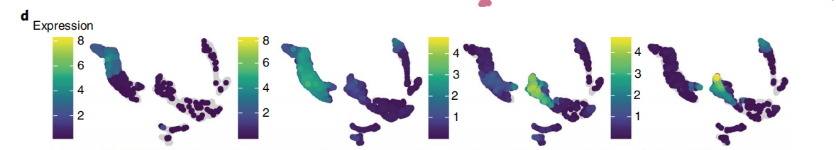
# Marker genes ------------------------------------------------------------
## 这里是选择了MNN_30的降维结果,选择在前面读入的marker的结果,对基因进行可视化
# visualise expression of marker genes in different datasets
dat <- getReducedDim(ring_hard, "UMAP-MNN_30",
                     genes = unique(markers$id), melted = TRUE)
dat <- merge(dat, markers, by = "id")
dat$expr <- ifelse(dat$expr == 0, NA, dat$expr)
ggplot(dat[order(expr, na.last = FALSE), ], aes(V1, V2)) +
  geom_point(aes(colour = expr)) +
  scale_colour_viridis_c() +
  facet_wrap( ~ name) +
  labs(x = "UMAP 1", y = "UMAP 2") +
  coord_fixed()

# Same but with soft-filtered data
dat <- getReducedDim(ring_soft, "UMAP-MNN_30",
                     genes = unique(markers$id), melted = TRUE)
dat <- merge(dat, markers, by = "id")
dat$expr <- ifelse(dat$expr == 0, NA, dat$expr)
ggplot(dat[order(expr, na.last = FALSE), ], aes(V1, V2)) +
  geom_point(aes(colour = expr)) +
  scale_colour_viridis_c() +
  facet_wrap( ~ name) +
  labs(x = "UMAP 1", y = "UMAP 2") +
  coord_fixed()

# Look at correlation of each gene and total UMIs
dat <- getReducedDim(ring_soft, "UMAP-MNN_30",
                     genes = unique(markers$id), melted = TRUE)
dat <- merge(dat, markers, by = "id")
ggplot(dat,
       aes(total, expr)) +
  geom_pointdensity(show.legend = FALSE, size = 0.3) +
  facet_wrap(~ name) +
  scale_x_log10() +
  scale_colour_viridis_c(option = "magma")


# Some random sample of genes
set.seed(1588669631)
dat <- getReducedDim(ring_soft, "UMAP-MNN_30",
                     genes = sample(rownames(ring_soft), 9), melted = TRUE)
ggplot(dat,
       aes(total, expr)) +
  geom_pointdensity(show.legend = FALSE, size = 0.3) +
  facet_wrap(~ id) +
  scale_x_log10() +
  scale_colour_viridis_c(option = "magma") +
  labs(x = "Total UMIs", y = "logcounts", title = "Random Sample of Genes")


# Figure ------------------------------------------------------------------
# a figure summarising all the QC issues and justification for removing low-UMI clusters

# Total UMI distributions
ggplot(colData(ring_soft),
       aes(total, Sample)) +
  ggridges::geom_density_ridges(alpha = 0.5) +
  scale_x_log10(labels = scales::label_number_si()) +
  annotation_logticks(sides = "b") +
  labs(x = "Total UMIs", y = "")

# detected genes
ggplot(colData(ring_soft),
       aes(detected, Sample)) +
  ggridges::geom_density_ridges(alpha = 0.5) +
  scale_x_log10(labels = scales::label_number_si()) +
  annotation_logticks(sides = "b") +
  labs(x = "No. detected genes", y = "")

# UMAP coloured by total counts
ggplot(getReducedDim(ring_soft, "UMAP-MNN_30"),
       aes(V1, V2)) +
  geom_point(aes(colour = total)) +
  geom_label(stat = "centroid", aes(group = cluster_mnn, label = cluster_mnn),
             alpha = 0.8, label.padding = unit(0.1, "lines")) +
  scale_colour_viridis_c(trans = "log10") +
  labs(x = "UMAP1", y = "UMAP2", colour = "Total UMIs")

# PCA showing high correlation with PC2
ggplot(getReducedDim(ring_soft, "PCA"),
       aes(PC1, PC2)) +
  geom_point(aes(colour = total)) +
  scale_colour_viridis_c(trans = "log10",
                         labels = scales::label_number_si()) +
  labs(colour = "Total UMIs",
       x = paste0("PC1 (", round(attr(reducedDim(ring_soft, "PCA"), "percentVar")[1]), "%)"),
       y = paste0("PC1 (", round(attr(reducedDim(ring_soft, "PCA"), "percentVar")[2]), "%)"))
总结
作者的代码中大部分是可视化的内容,基本思路是先对数据进行基本的数据质控,然后umi,检测到的基因的结果进行可视化吗,确定基本数据质控的质量,其中去看一些PCA降维的内容是不是对后续的分析有影响;随后开始进行是否需要做批次效应分析,一般单细胞分析是需要默认做批次效应处理的,因为不同时间上机测序的样品之间有很大的批次效应,但是作者为了比较差异,也是选用了是否做批次的分析内容;然后开始进行降维处理,选择了PCA和UMAP的降维方式,也是比较了3种不同的方法,去确定合适的数据集进行后面的下游分析;最后为了数据的结果进行分群前的确定,由于前面在做流式分选的时候是选用的marker 基因进行分选的,作者在这里也选用了前面的基因来对数据集进行可视化,表明自己用的marker 基因确实在数据集中的表达是很高的。
原创声明:本文系作者授权腾讯云开发者社区发表,未经许可,不得转载。
如有侵权,请联系 cloudcommunity@tencent.com 删除。
原创声明:本文系作者授权腾讯云开发者社区发表,未经许可,不得转载。
如有侵权,请联系 cloudcommunity@tencent.com 删除。