数据可视化基础与应用-04-seaborn库从入门到精通03
数据可视化基础与应用-04-seaborn库从入门到精通03

总结
本系列是数据可视化基础与应用的第04篇seaborn,是seaborn从入门到精通系列第3篇。本系列的目的是可以完整的完成seaborn从入门到精通。主要介绍基于seaborn实现数据可视化。
参考
seaborn从入门到精通03-绘图功能实现01-关系绘图
总结
本文主要是seaborn从入门到精通系列第3篇,本文介绍了seaborn的绘图功能实现,本文是关系绘图,同时介绍了较好的参考文档置于博客前面,读者可以重点查看参考链接。本系列的目的是可以完整的完成seaborn从入门到精通。重点参考连接

参考
【宝藏级】全网最全的Seaborn详细教程-数据分析必备手册(2万字总结)
关系-分布-分类
relational “关系型” distributional “分布型” categorical “分类型”
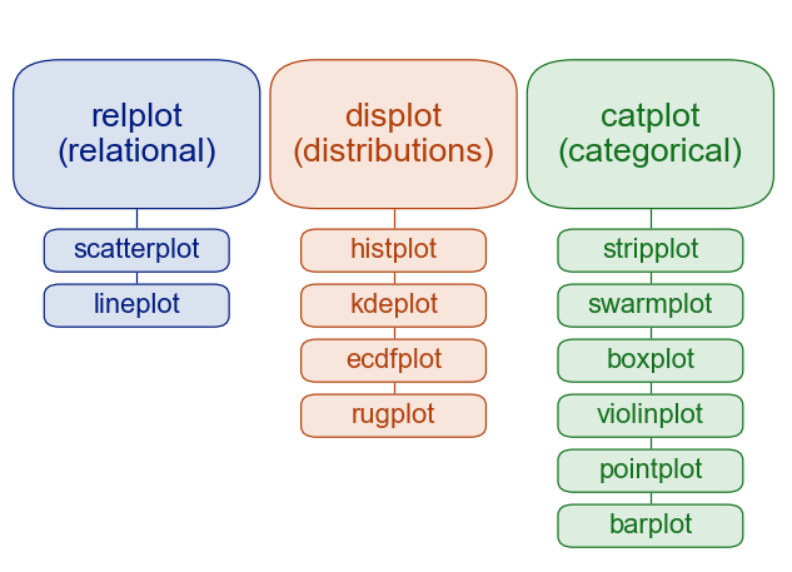
关系绘图-Visualizing statistical relationships
Statistical analysis is a process of understanding how variables in a dataset relate to each other and how those relationships depend on other variables. Visualization can be a core component of this process because, when data are visualized properly, the human visual system can see trends and patterns that indicate a relationship. 统计分析是一个理解数据集中的变量如何相互关联以及这些关系如何依赖于其他变量的过程。可视化可以是这个过程的核心组成部分,因为当数据被正确地可视化时,人类的视觉系统可以看到表明关系的趋势和模式。 We will discuss three seaborn functions in this tutorial. The one we will use most is relplot(). This is a figure-level function for visualizing statistical relationships using two common approaches: scatter plots and line plots. relplot() combines a FacetGrid with one of two axes-level functions: 我们将在本教程中讨论三个seaborn函数。我们将使用最多的一个是relplot()。这是一种用两种常见方法可视化统计关系的数字级函数:scatter plots 和line plots。relplot()结合了一个由两个轴级函数之一的FacetGrid: scatterplot() (with kind=“scatter”; the default) lineplot() (with kind=“line”) As we will see, these functions can be quite illuminating because they use simple and easily-understood representations of data that can nevertheless represent complex dataset structures. They can do so because they plot two-dimensional graphics that can be enhanced by mapping up to three additional variables using the semantics of hue, size, and style. 正如我们所看到的,这些函数可以很有启发性,因为它们使用简单易懂的数据表示,而数据可以表示复杂的数据集结构。它们可以这样做,因为它们绘制二维图形,可以通过使用色相、大小和样式的语义映射到三个额外的变量。
import numpy as np
import pandas as pd
import matplotlib.pyplot as plt
import seaborn as sns
sns.set_theme(style="darkgrid")
散点图表示变量关系-replot
参考:http://seaborn.pydata.org/generated/seaborn.relplot.html
seaborn.relplot(data=None, *, x=None, y=None, hue=None, size=None, style=None, units=None, row=None, col=None, col_wrap=None,
row_order=None, col_order=None, palette=None, hue_order=None, hue_norm=None, sizes=None, size_order=None, size_norm=None,
markers=None, dashes=None, style_order=None, legend='auto', kind='scatter', height=5, aspect=1, facet_kws=None, **kwargs)
在所有的seaborn绘图时,里面的参数是众多的,但是不用担心,大部分参数是相同的,只有少部分存在差异,有些通过对单词的理解就可知道其含义,这里我只根据每个具体的图形重要的参数做一些解释,并简单的介绍这些常用参数的含义。 x,y:容易理解就是你需要传入的数据,一般为dataframe中的列; hue:也是具体的某一可以用做分类的列,作用是分类; data:是你的数据集,可要可不要,一般都是dataframe; style:绘图的风格(后面单独介绍); size:绘图的大小(后面介绍); palette:调色板(后面单独介绍); markers:绘图的形状(后面介绍); ci:允许的误差范围(空值误差的百分比,0-100之间),可为‘sd’,则采用标准差(默认95); n_boot(int):计算置信区间要使用的迭代次数; alpha:透明度; x_jitter,y_jitter:设置点的抖动程度。
import numpy as np
import pandas as pd
import matplotlib.pyplot as plt
import seaborn as sns
sns.set_theme(style="darkgrid")

tips = sns.load_dataset("tips",cache=True,data_home=r'.\seaborn-data')
tips.head()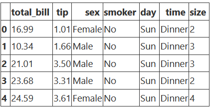
案例1-关系散点图replot
ax =sns.relplot(data=tips, x="total_bill", y="tip")
ax.figure.set_size_inches(5,5)
plt.title("1")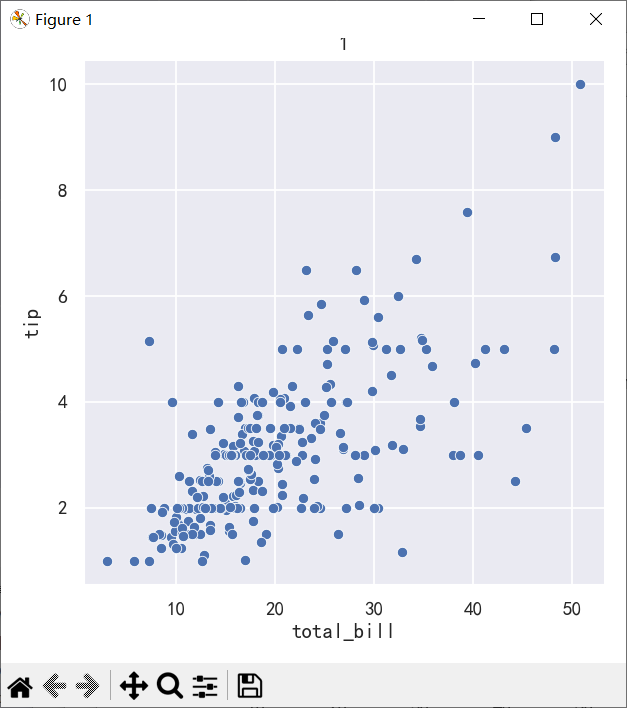
案例2-添加hue参数和style参数
# hue参数是用来控制第三个变量的颜色显示的
ax=sns.relplot(data=tips, x="total_bill", y="tip", hue="smoker")
ax.figure.set_size_inches(5,5)
plt.title("2-hue-分类")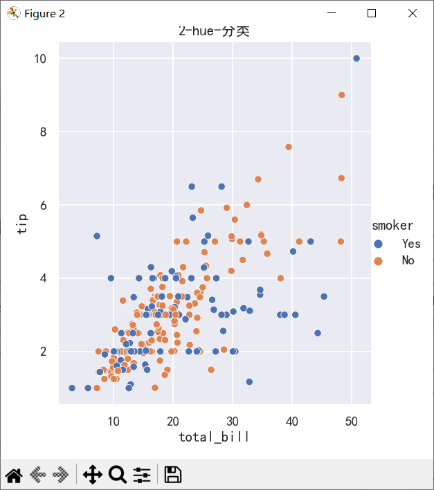
# hue参数是用来控制第三个变量的颜色显示的 style为标记样式
ax=sns.relplot(
    data=tips,
    x="total_bill", y="tip", hue="smoker", style="smoker"
)
ax.figure.set_size_inches(5,5)

plt.title("3-hue-style-相同的离散值")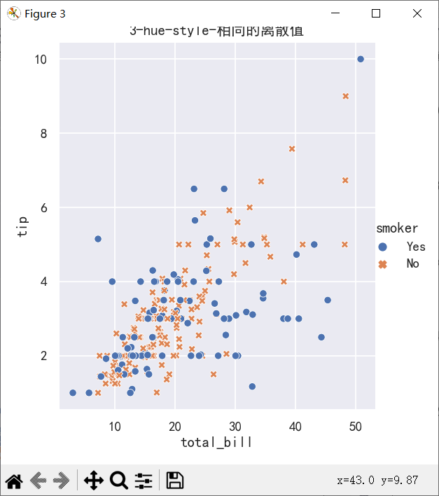
ax=sns.relplot(
    data=tips,
    x="total_bill", y="tip", hue="smoker", style="time",
)
ax.figure.set_size_inches(5,5)
plt.title("4-hue-style不同的离散值")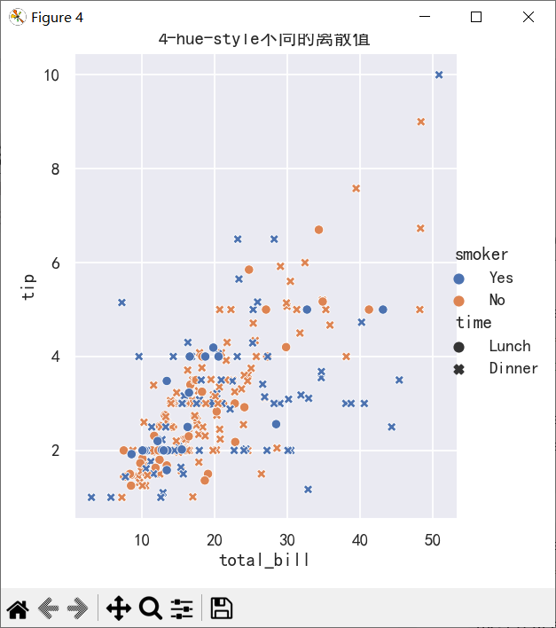
ax=sns.relplot(
    data=tips, x="total_bill", y="tip", hue="size",
)
ax.figure.set_size_inches(5,5)
plt.title("5-hue为连续值")

plt.show()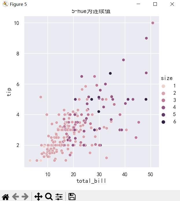
案例3-添加size参数和sizes参数
sns.relplot(
    data=tips, x="total_bill", y="tip",
    size="size", sizes=(15, 200)
)
ax.figure.set_size_inches(5,5)
plt.title("6-指定点大小以及点范围")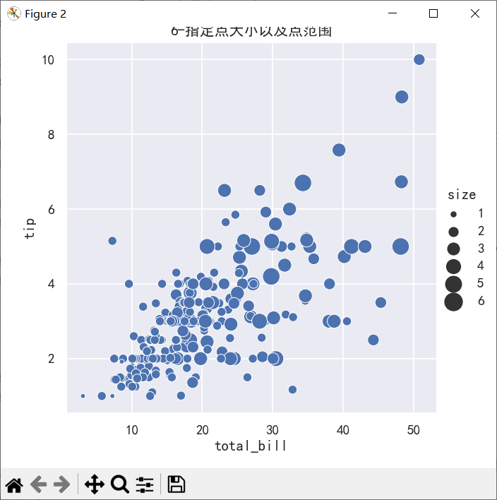
案例4-添加col和row参数
col和row,可以将图根据某个属性的值的个数分割成多列或者多行。比如在以上图的基础之上我们想要把Lunch(午餐)和Dinner(晚餐)分割成两个图来显示,再在row上添加一个新的变量,比如把性别按照行显示出来,那么可以通过以下代码来实现:
ax=sns.relplot(x="total_bill",y="tip",hue="day",
            col="time",row="sex",data=tips)
# ax.figure.set_size_inches(5,5)
plt.suptitle("7-指定col和row")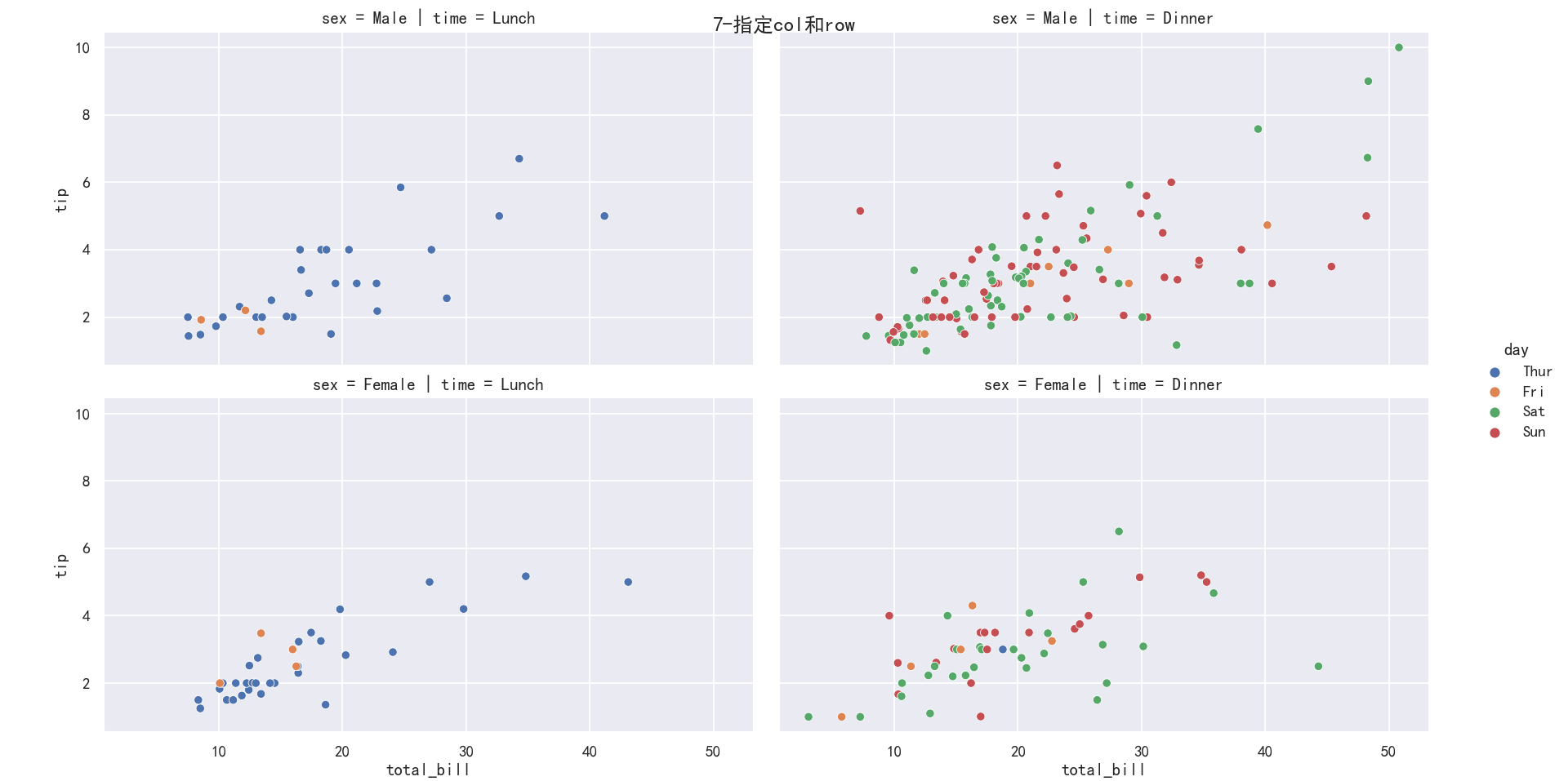
案例5-添加col_wrap
有时候我们的图有很多,默认情况下会在一行中全部展示出来,那么我们可以通过col_wrap来指定具体多少列。
sns.relplot(x="total_bill",y="tip",hue="day",
            col="time",col_wrap=1,data=tips)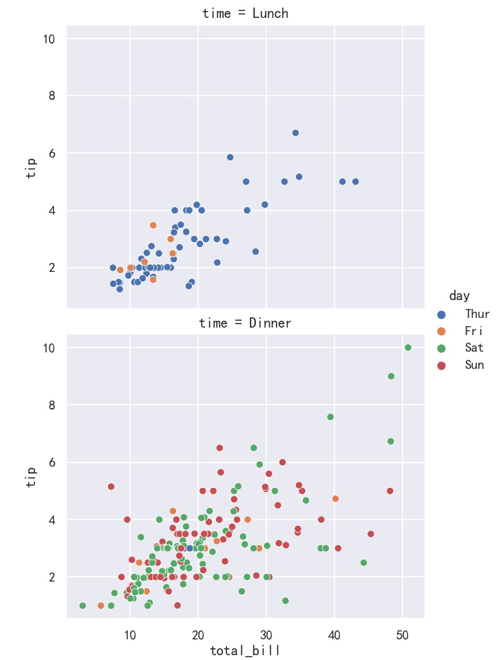
散点图表示变量关系-scatter
参考:
http://seaborn.pydata.org/generated/seaborn.scatterplot.html
seaborn.scatterplot(data=None, *, x=None, y=None, hue=None, size=None, style=None, palette=None, hue_order=None,
hue_norm=None, sizes=None, size_order=None, size_norm=None, markers=True, style_order=None, legend='auto', ax=None, **kwargs)
案例1-结合子图绘制散点图
fig,axes=plt.subplots(1,1)
ax = sns.scatterplot(x="total_bill", y="tip", data=tips,ax=axes)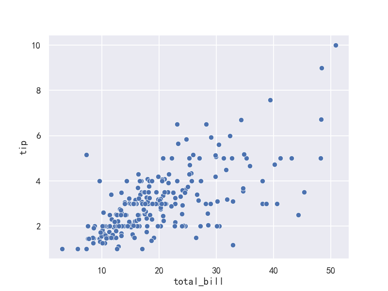
案例2-指定hue分类,style样式,size大小
fig,axes=plt.subplots(1,1)

ax = sns.scatterplot(x="total_bill", y="tip",hue="day",
 style="time",size='size',data=tips,ax=axes)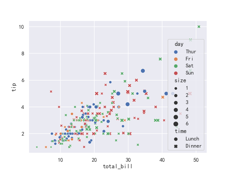
线图绘制变量关系-relplot
读取数据-flights dataset
flights dataset航班数据集有10年的每月航空乘客数据:
import numpy as np
import pandas as pd
import matplotlib.pyplot as plt
import matplotlib as  mpl
import seaborn as sns
sns.set_theme(style="darkgrid")

mpl.rcParams['font.sans-serif']=['SimHei']
mpl.rcParams['axes.unicode_minus']=False

flights = sns.load_dataset("flights",cache=True,data_home=r'.\seaborn-data')
flights.head()
year month passengers 0 1949 Jan 112 1 1949 Feb 118 2 1949 Mar 132 3 1949 Apr 129 4 1949 May 121
案例1-折线图基于replot
may_flights = flights.query("month == 'May'")
sns.relplot(data=may_flights, x="year", y="passengers",kind="line")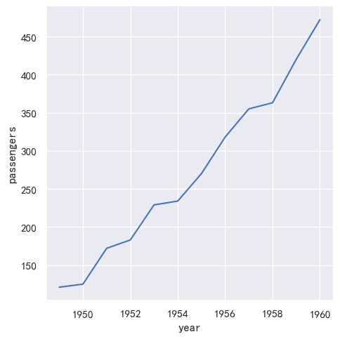
线图绘制变量关系-lineplot
参考:http://seaborn.pydata.org/generated/seaborn.lineplot.html
seaborn.lineplot(data=None, *, x=None, y=None, hue=None, size=None, style=None, units=None, palette=None, hue_order=None,
hue_norm=None, sizes=None, size_order=None, size_norm=None, dashes=True, markers=None, style_order=None, estimator='mean',
errorbar=('ci', 95), n_boot=1000, seed=None, orient='x', sort=True, err_style='band', err_kws=None, legend='auto',
ci='deprecated', ax=None, **kwargs)
读取数据-flights dataset
flights dataset航班数据集有10年的每月航空乘客数据:
import numpy as np
import pandas as pd
import matplotlib.pyplot as plt
import matplotlib as  mpl
import seaborn as sns
sns.set_theme(style="darkgrid")

mpl.rcParams['font.sans-serif']=['SimHei']
mpl.rcParams['axes.unicode_minus']=False

flights = sns.load_dataset("flights",cache=True,data_home=r'.\seaborn-data')
flights.head()
year month passengers 0 1949 Jan 112 1 1949 Feb 118 2 1949 Mar 132 3 1949 Apr 129 4 1949 May 121
案例1-折线图基于replot-单线
may_flights = flights.query("month == 'May'")
sns.lineplot(data=may_flights, x="year", y="passengers")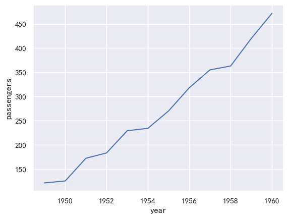
案例2-折线图基于lineplot-多线
#使用标记而不是破折号来识别组
ax = sns.lineplot(x="year", y="passengers",hue="month", style="month",
markers=True, dashes=False, data=flights)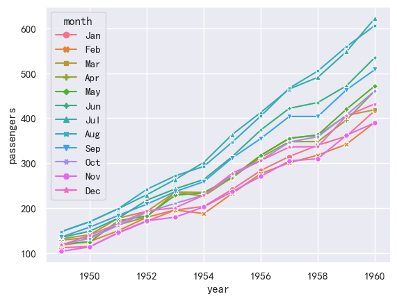
案例3-折线图基于lineplot-显示置信区间
以长期模式传递整个数据集将对重复值(每年)进行聚合,以显示平均值和95%置信区间:
ax = sns.lineplot(x="year", y="passengers",data=flights)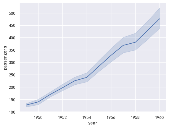
置信区间是使用自举计算的,对于较大的数据集,这可能是时间密集型的。因此可以禁用它们:
ax = sns.lineplot(x="year", y="passengers",data=flights,errorbar=None,)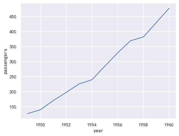
另一个很好的选择,特别是对于较大的数据,是通过绘制标准偏差而不是置信区间来表示每个时间点的分布分布:
ax = sns.lineplot(x="year", y="passengers",data=flights,errorbar="sd",)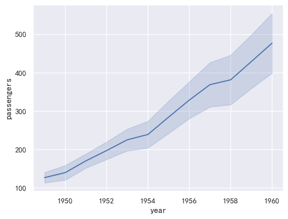
案例4-折线图-指定方向
使用orient参数沿图的垂直维度进行聚合和排序:
sns.lineplot(data=flights, x="passengers", y="year", orient="y") 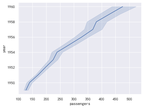
seaborn从入门到精通03-绘图功能实现02-分类绘图Categorical plots
总结
本文主要是seaborn从入门到精通系列第3篇,本文介绍了seaborn的绘图功能实现,本文是分类绘图,同时介绍了较好的参考文档置于博客前面,读者可以重点查看参考链接。本系列的目的是可以完整的完成seaborn从入门到精通。重点参考连接
参考
【宝藏级】全网最全的Seaborn详细教程-数据分析必备手册(2万字总结)
关系-分布-分类
relational “关系型” distributional “分布型” categorical “分类型”
分类绘图-Visualizing categorical data
In the relational plot tutorial we saw how to use different visual representations to show the relationship between multiple variables in a dataset. In the examples, we focused on cases where the main relationship was between two numerical variables. If one of the main variables is “categorical” (divided into discrete groups) it may be helpful to use a more specialized approach to visualization. 在关系图教程中,我们看到了如何使用不同的可视化表示来显示数据集中多个变量之间的关系。在示例中,我们关注的主要关系是两个数值变量之间的情况。如果其中一个主要变量是“分类的”(分为离散的组),那么使用更专业的可视化方法可能会有所帮助。 In seaborn, there are several different ways to visualize a relationship involving categorical data. Similar to the relationship between relplot() and either scatterplot() or lineplot(), there are two ways to make these plots. There are a number of axes-level functions for plotting categorical data in different ways and a figure-level interface, catplot(), that gives unified higher-level access to them. 在seaborn中,有几种不同的方法来可视化涉及分类数据的关系。类似于relplot()和scatterplot()或lineplot()之间的关系,有两种方法来创建这些图。有许多轴级函数用于以不同的方式绘制分类数据,还有一个图形级接口catplot(),用于提供对分类数据的统一高级访问。 It’s helpful to think of the different categorical plot kinds as belonging to three different families, which we’ll discuss in detail below. They are: 将不同的分类情节类型视为属于三个不同的家族是有帮助的,我们将在下面详细讨论。它们是:
Categorical scatterplots:(分类散点图)
    stripplot() (with kind="strip"; the default) (分布散点图)
    swarmplot() (with kind="swarm") (分布密度散点图)

Categorical distribution plots: (分类分布图)
    boxplot() (with kind="box") (箱线图)
    violinplot() (with kind="violin") (小提琴图)
    boxenplot() (with kind="boxen") (为更大的数据集绘制增强的箱形图。)

Categorical estimate plots: (分类估计图)
    pointplot() (with kind="point") (点图)
    barplot() (with kind="bar") (条形图)
    countplot() (with kind="count") (计数统计图)
These families represent the data using different levels of granularity. When deciding which to use, you’ll have to think about the question that you want to answer. The unified API makes it easy to switch between different kinds and see your data from several perspectives. 这些族表示使用不同粒度级别的数据。在决定使用哪种方法时,你必须考虑你想要回答的问题。统一的API可以方便地在不同类型之间切换,并从多个角度查看数据。 In this tutorial, we’ll mostly focus on the figure-level interface, catplot(). Remember that this function is a higher-level interface each of the functions above, so we’ll reference them when we show each kind of plot, keeping the more verbose kind-specific API documentation at hand. 在本教程中,我们将主要关注图形级接口catplot()。请记住,这个函数是上面每个函数的高级接口,因此我们将在显示每种类型的图表时引用它们,并保留更详细的特定于类型的API文档。
图形级接口catplot–figure-level interface
参考:http://seaborn.pydata.org/generated/seaborn.catplot.html#seaborn.catplot
seaborn.catplot(data=None, *, x=None, y=None, hue=None, row=None, col=None, col_wrap=None, estimator='mean', errorbar=('ci', 95),
n_boot=1000, units=None, seed=None, order=None, hue_order=None, row_order=None, col_order=None, height=5, aspect=1, kind='strip',
native_scale=False, formatter=None, orient=None, color=None, palette=None, hue_norm=None, legend='auto', legend_out=True,
sharex=True, sharey=True, margin_titles=False, facet_kws=None, ci='deprecated', **kwargs)
data:用于绘图的数据集。 x, y:指定分类变量和数值变量。 hue:指定另一个分类变量,相当于给绘图加上一维,不同颜色表示不同的分类。 row, col:指定用哪个变量分行或分列展示。 col_wrap:分列时展示的最大列数。 estimator:设定如何计算均值以及置信区间。 errorbar:设定误差线风格及置信水平。 n_boot:设定计算置信区间使用的bootstrap次数。 units:指定用于聚合的观测单位。 seed:设置随机数生成的种子。 order, hue_order, row_order, col_order:指定排序顺序。 height, aspect:设置图像的大小和比例。 kind:指定绘图类型,如’strip’, ‘swarm’, ‘box’, 'violin’等。 native_scale:设定原始数据是否进行标准化。 formatter:设定文本标签的格式。 orient:设置图像的方向。 color:指定所有元素的颜色。 palette:指定颜色调色板。 hue_norm:指定颜色标准化。 legend:设定是否显示图例。 legend_out:设定图例是否放在绘图外。 sharex, sharey:设定是否使用相同的x、y轴范围。 margin_titles:设定上边缘的标题是否显示。 facet_kws:可选的传递给 FacetGrid 的其他参数。 ci:设定计算置信区间的方法。 **kwargs:其他可选参数。
导入库与查看tips和diamonds 数据
import numpy as np
import pandas as pd
import matplotlib.pyplot as plt
import matplotlib as  mpl
import seaborn as sns
sns.set_theme(style="darkgrid")

mpl.rcParams['font.sans-serif']=['SimHei']
mpl.rcParams['axes.unicode_minus']=False

tips = sns.load_dataset("tips",cache=True,data_home=r"./seaborn-data")
tips.head()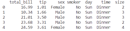
diamonds = sns.load_dataset("diamonds",cache=True,data_home=r"./seaborn-data")
print(diamonds.head())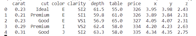
titanic = sns.load_dataset("titanic",cache=True,data_home=r"./seaborn-data")
print(titanic.info())
print(titanic.head())
输出:
<class 'pandas.core.frame.DataFrame'>
RangeIndex: 891 entries, 0 to 890
Data columns (total 15 columns):
 #   Column       Non-Null Count  Dtype
---  ------       --------------  -----
 0   survived     891 non-null    int64
 1   pclass       891 non-null    int64
 2   sex          891 non-null    object
 3   age          714 non-null    float64
 4   sibsp        891 non-null    int64
 5   parch        891 non-null    int64
 6   fare         891 non-null    float64
 7   embarked     889 non-null    object
 8   class        891 non-null    category
 9   who          891 non-null    object
 10  adult_male   891 non-null    bool
 11  deck         203 non-null    category
 12  embark_town  889 non-null    object
 13  alive        891 non-null    object
 14  alone        891 non-null    bool
dtypes: bool(2), category(2), float64(2), int64(4), object(5)
memory usage: 80.7+ KB
None
   survived  pclass     sex   age  sibsp  parch  ...    who adult_male deck  embark_town  alive  alone
0         0       3    male  22.0      1      0  ...    man       True  NaN  Southampton     no  False
1         1       1  female  38.0      1      0  ...  woman      False    C    Cherbourg    yes  False
2         1       3  female  26.0      0      0  ...  woman      False  NaN  Southampton    yes   True
3         1       1  female  35.0      1      0  ...  woman      False    C  Southampton    yes  False
4         0       3    male  35.0      0      0  ...    man       True  NaN  Southampton     no   True
分类散点图
Categorical scatterplots:(分类散点图)
    stripplot() (with kind="strip"; the default) (分布散点图)
    swarmplot() (with kind="swarm") (分布密度散点图)
参考
分布散点图stripplot
参考:http://seaborn.pydata.org/generated/seaborn.stripplot.html#seaborn.stripplot
seaborn.stripplot(data=None, *, x=None, y=None, hue=None, order=None, hue_order=None, jitter=True, dodge=False, orient=None,
color=None, palette=None, size=5, edgecolor='gray', linewidth=0, hue_norm=None, native_scale=False, formatter=None, legend='auto',
ax=None, **kwargs)
data:用于绘图的数据集。 x, y:指定分类变量和数值变量。 hue:指定另一个分类变量,相当于给绘图加上一维,不同颜色表示不同的分类。 row, col:指定用哪个变量分行或分列展示。 col_wrap:分列时展示的最大列数。 estimator:设定如何计算均值以及置信区间。 errorbar:设定误差线风格及置信水平。 n_boot:设定计算置信区间使用的bootstrap次数。 units:指定用于聚合的观测单位。 seed:设置随机数生成的种子。 order, hue_order, row_order, col_order:指定排序顺序。 height, aspect:设置图像的大小和比例。 kind:指定绘图类型,如’strip’, ‘swarm’, ‘box’, 'violin’等。 native_scale:设定原始数据是否进行标准化。 formatter:设定文本标签的格式。 orient:设置图像的方向。 color:指定所有元素的颜色。 palette:指定颜色调色板。 hue_norm:指定颜色标准化。 legend:设定是否显示图例。 legend_out:设定图例是否放在绘图外。 sharex, sharey:设定是否使用相同的x、y轴范围。 margin_titles:设定上边缘的标题是否显示。 facet_kws:可选的传递给 FacetGrid 的其他参数。 ci:设定计算置信区间的方法。 **kwargs:其他可选参数。
分布密度散点图-swarmplot()
这个函数类似于stripplot(),但是对点进行了调整(只沿着分类轴),这样它们就不会重叠。这更好地表示了值的分布,但它不能很好地扩展到大量的观测。
seaborn.swarmplot(data=None, *, x=None, y=None, hue=None, order=None, hue_order=None, dodge=False, orient=None, color=None,
palette=None, size=5, edgecolor='gray', linewidth=0, hue_norm=None, native_scale=False, formatter=None, legend='auto',
 warn_thresh=0.05, ax=None, **kwargs)
这个函数类似于stripplot(),但是调整了点(仅沿分类轴),使它们不重叠。这可以更好地表示值的分布,但它不能很好地扩展到大量的观测。这种类型的情节有时被称为“蜂群”。
案例1-默认分类散点图-jitter抖动
在catplot()中,数据的默认表示形式使用散点图。实际上在seaborn中有两种不同的分类散点图,第一种是stripplot(),stripplot()是catplot()中默认的“kind”,它使用的方法是用少量的随机“抖动jitter”来调整点在分类轴上的位置:
ax = sns.catplot(data=tips, x="day", y="total_bill")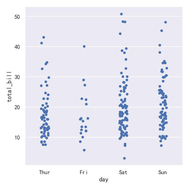
jitter参数控制抖动的大小或完全禁用抖动:
ax = sns.catplot(data=tips, x="day", y="total_bill",jitter=False)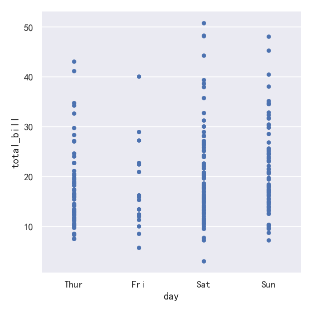
案例2-分类散点图kind=“swarm”
第二种方法是使用一种防止重叠的算法沿分类轴调整点。它可以更好地表示观测数据的分布,尽管它只适用于相对较小的数据集。这种图有时被称为“蜂群”,并通过在catplot()中设置kind="swarm"来激活swarmplot()在seaborn中绘制:
sns.catplot(data=tips, x="day", y="total_bill", kind="swarm")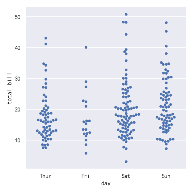
案例3-hue参数
Similar to the relational plots, it’s possible to add another dimension to a categorical plot by using a hue semantic. (The categorical plots do not currently support size or style semantics). Each different categorical plotting function handles the hue semantic differently. For the scatter plots, it is only necessary to change the color of the points: 与关系图类似,可以通过使用色调语义向分类图添加另一个维度。(分类图目前不支持大小或样式语义)。每个不同的分类绘图函数都以不同的方式处理色调语义。对于散点图,只需要改变点的颜色:
sns.catplot(data=tips, x="day", y="total_bill", hue="sex",kind="swarm")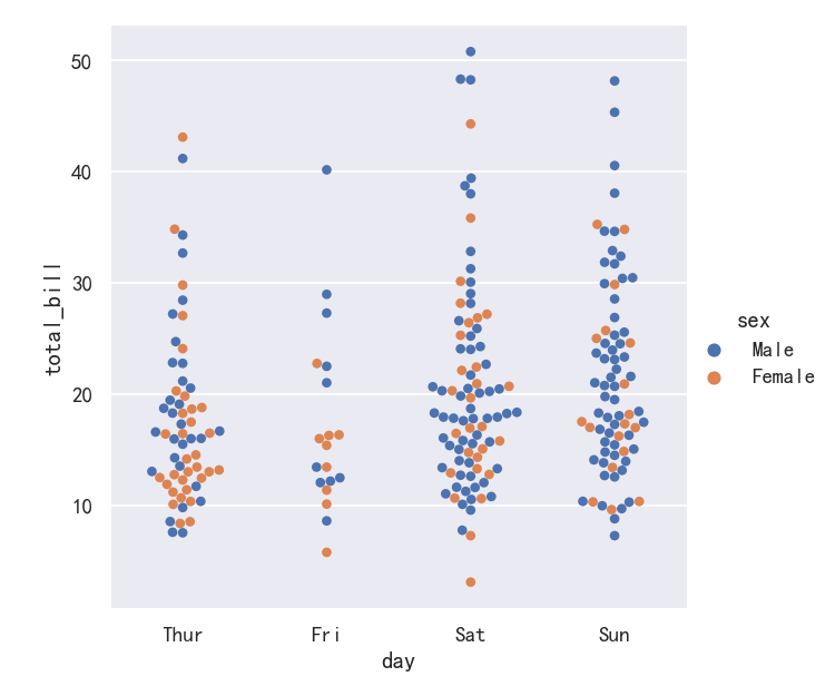
案例4-横向分布
We’ve referred to the idea of “categorical axis”. In these examples, that’s always corresponded to the horizontal axis. But it’s often helpful to put the categorical variable on the vertical axis (particularly when the category names are relatively long or there are many categories). To do this, swap the assignment of variables to axes: 我们已经提到了“分类轴”的概念。在这些例子中,它总是对应于横轴。但将类别变量放在垂直轴上通常是有帮助的(特别是当类别名称相对较长或有许多类别时)。要做到这一点,交换变量的分配到轴:
sns.catplot(data=tips, x="total_bill", y="day", hue="time", kind="swarm")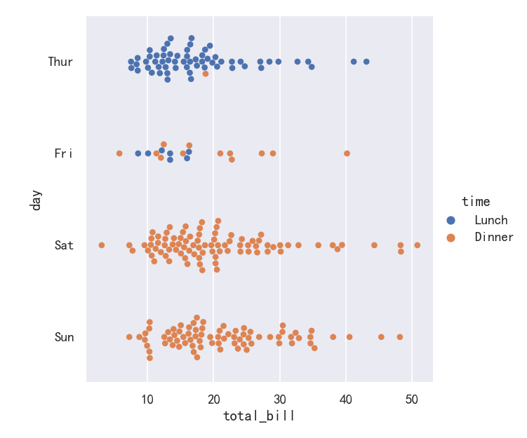
分类分布图
As the size of the dataset grows, categorical scatter plots become limited in the information they can provide about the distribution of values within each category. When this happens, there are several approaches for summarizing the distributional information in ways that facilitate easy comparisons across the category levels. 随着数据集规模的增长,分类散点图所能提供的关于每个类别内值分布的信息变得有限。当这种情况发生时,有几种方法可以总结分布信息,以便在类别级别之间进行简单的比较。
Categorical distribution plots: (分类分布图)
    boxplot() (with kind="box") (箱线图)
    violinplot() (with kind="violin") (小提琴图)
    boxenplot() (with kind="boxen") (为更大的数据集绘制增强的箱形图。)
参考:
案例1-箱线图-Boxplots
The first is the familiar boxplot(). This kind of plot shows the three quartile values of the distribution along with extreme values. The “whiskers” extend to points that lie within 1.5 IQRs of the lower and upper quartile, and then observations that fall outside this range are displayed independently. This means that each value in the boxplot corresponds to an actual observation in the data. 第一个是我们熟悉的箱线图()。这种图显示了分布的三个四分位值和极值。“胡须”延伸到位于上下四分位数1.5 IQRs范围内的点,然后在此范围之外的观测结果将独立显示。这意味着箱线图中的每个值都对应于数据中的一个实际观测值。
sns.catplot(data=tips, x="day", y="total_bill", kind="box")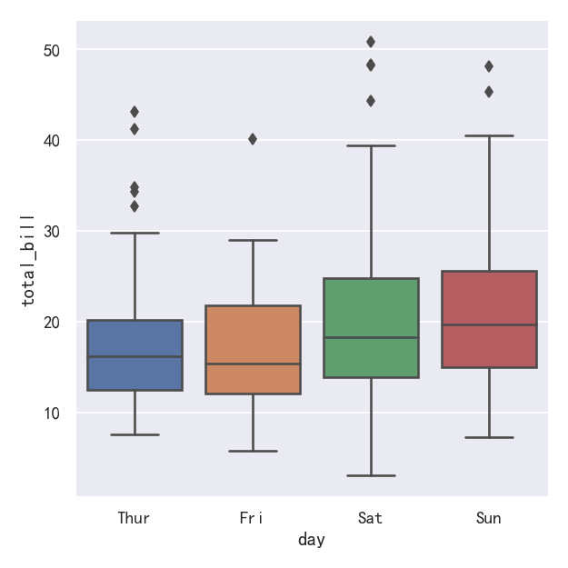
案例2-箱线图boxplot带hue参数
When adding a hue semantic, the box for each level of the semantic variable is moved along the categorical axis so they don’t overlap: 当添加色相语义时,语义变量的每一层的方框都沿着分类轴移动,这样它们就不会重叠:
sns.catplot(data=tips, x="day", y="total_bill",hue='smoker', kind="box")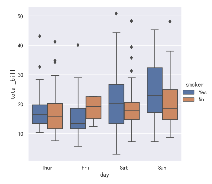
案例3-箱线图boxplot带
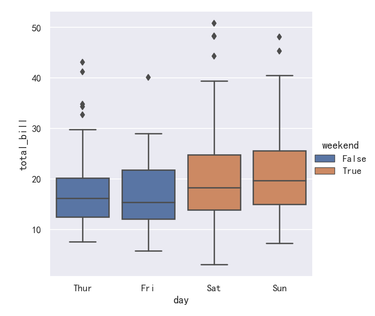
This behavior is called “dodging” and is turned on by default because it is assumed that the semantic variable is nested within the main categorical variable. If that’s not the case, you can disable the dodging: 这种行为称为“回避”,默认情况下是开启的,因为假定语义变量嵌套在主类别变量中。如果不是这样,你可以禁用闪避:
import copy

tips_copy = copy.deepcopy(tips)
tips_copy["weekend"] = tips_copy["day"].isin(["Sat", "Sun"])
sns.catplot(
    data=tips_copy, x="day", y="total_bill", hue="weekend",
    kind="box", dodge=False,
)
案例4-更大的箱型图boxenplot
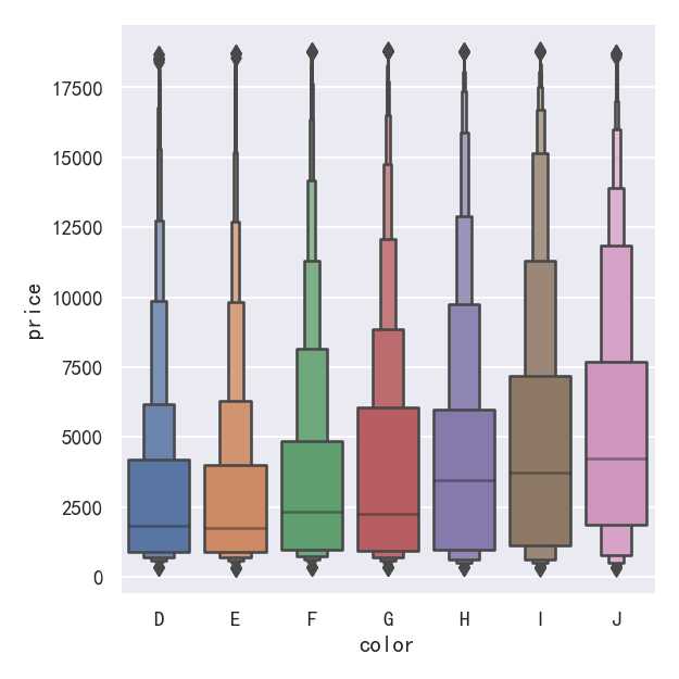
A related function, boxenplot(), draws a plot that is similar to a box plot but optimized for showing more information about the shape of the distribution. It is best suited for larger datasets: 与此相关的函数boxenplot()绘制了一个类似于箱形图的图,但优化了显示关于分布形状的更多信息。它最适合大型数据集:
sns.catplot(
    data=diamonds.sort_values("color"),
    x="color", y="price", kind="boxen",
)
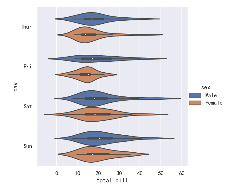
案例5-小提琴图Violinplots
A different approach is a violinplot(), which combines a boxplot with the kernel density estimation procedure described in the distributions tutorial: 另一种方法是violinplot(),它将箱线图与分布教程中描述的内核密度估计过程结合在一起:
sns.catplot(
    data=tips, x="total_bill", y="day", hue="sex", kind="violin",
)
案例6-小提琴图Violinplots参数bw和cut
This approach uses the kernel density estimate to provide a richer description of the distribution of values. Additionally, the quartile and whisker values from the boxplot are shown inside the violin. The downside is that, because the violinplot uses a KDE, there are some other parameters that may need tweaking, adding some complexity relative to the straightforward boxplot: 这种方法使用核密度估计来提供更丰富的值分布描述。此外,箱线图中的四分位值和晶须值显示在小提琴内部。缺点是,由于violinplot使用KDE,有一些其他参数可能需要调整,相对于简单的箱线图增加了一些复杂性: bw{‘scott’, ‘silverman’, float}, optional Either the name of a reference rule or the scale factor to use when computing the kernel bandwidth. The actual kernel size will be determined by multiplying the scale factor by the standard deviation of the data within each bin. 引用规则的名称或计算内核带宽时使用的比例因子。实际的内核大小将通过将比例因子乘以每个bin中的数据的标准偏差来确定。 cut float, optional Distance, in units of bandwidth size, to extend the density past the extreme datapoints. Set to 0 to limit the violin range within the range of the observed data (i.e., to have the same effect as trim=True in ggplot. 距离(以带宽大小为单位),以将密度扩展到极限数据点。设置为0将小提琴的范围限制在观察到的数据范围内(即,与ggplot中的trim=True具有相同的效果。
sns.catplot(
    data=tips, x="total_bill", y="day", hue="sex",
    kind="violin", bw=.15, cut=0,
)
案例7-小提琴图Violinplots参数splits
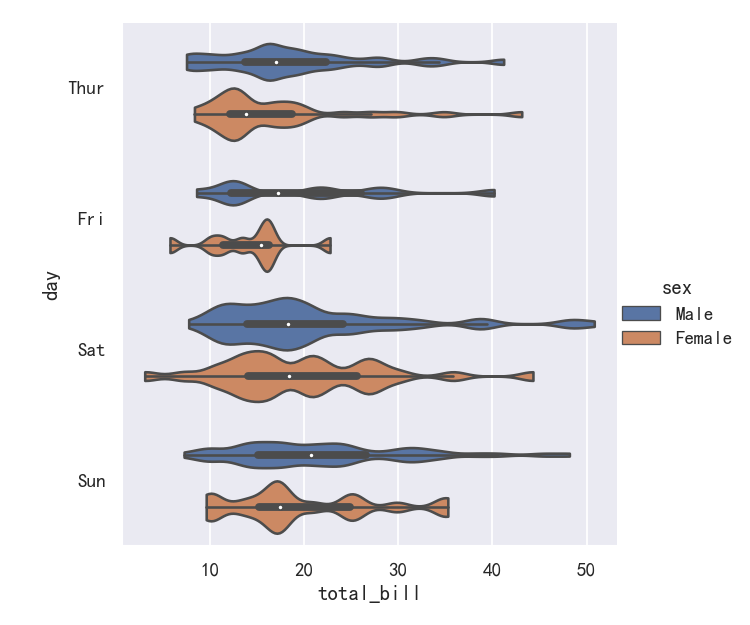
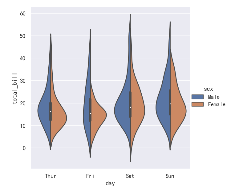
It’s also possible to “split” the violins when the hue parameter has only two levels, which can allow for a more efficient use of space: 当色调参数只有两层时,也可以“分割”小提琴,这可以更有效地利用空间:
sns.catplot(
    data=tips, x="day", y="total_bill", hue="sex",
    kind="violin", split=True,
)
案例/-小提琴图Violinplots参数inner
Finally, there are several options for the plot that is drawn on the interior of the violins, including ways to show each individual observation instead of the summary boxplot values: 最后,在小提琴内部绘制的图有几个选项,包括显示每个单独的观察结果而不是总结箱线图值的方法 inner=“stick” “box” “point” “quart”
sns.catplot(
    data=tips, x="day", y="total_bill", hue="sex",
    kind="violin", inner="stick", split=True, palette="pastel",
)
案例8-小提琴图Violinplots参数整合swarmplot()或stripplot()
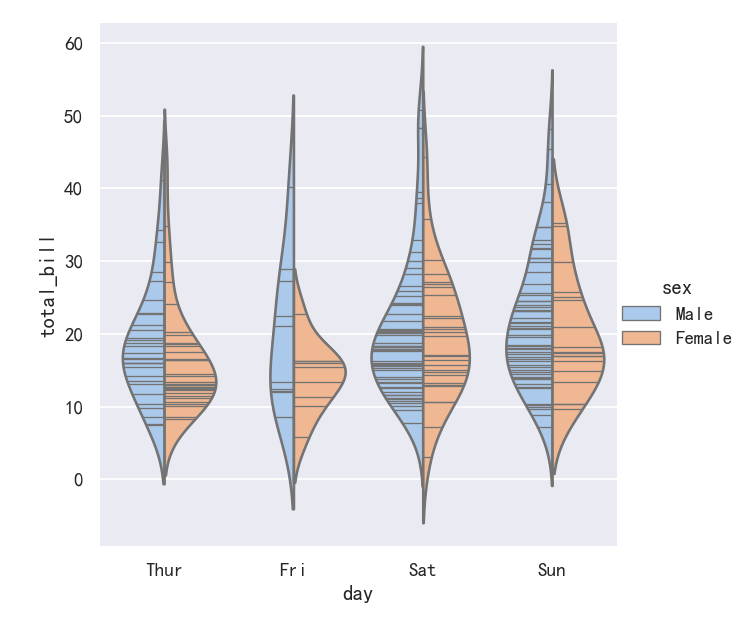
It can also be useful to combine swarmplot() or stripplot() with a box plot or violin plot to show each observation along with a summary of the distribution: 将swarmplot()或stripplot()与箱形图或小提琴图结合起来也很有用,以显示每个观察结果以及分布的摘要:
g = sns.catplot(data=tips, x="day", y="total_bill", kind="violin", inner=None)
sns.swarmplot(data=tips, x="day", y="total_bill", color="k", size=3, ax=g.ax)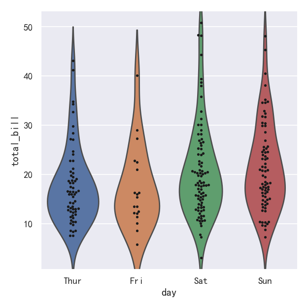
分类估计图
For other applications, rather than showing the distribution within each category, you might want to show an estimate of the central tendency of the values. Seaborn has two main ways to show this information. Importantly, the basic API for these functions is identical to that for the ones discussed above. 对于其他应用程序,与其显示每个类别内的分布,不如显示值的集中趋势的估计值。Seaborn有两种主要方式来显示这些信息。重要的是,这些函数的基本API与上面讨论的相同。
Categorical estimate plots: (分类估计图)
    pointplot() (with kind="point") (点图)
    barplot() (with kind="bar") (条形图)
    countplot() (with kind="count") (计数统计图)
参考
案例1-条形图barplot
A familiar style of plot that accomplishes this goal is a bar plot. In seaborn, the barplot() function operates on a full dataset and applies a function to obtain the estimate (taking the mean by default). When there are multiple observations in each category, it also uses bootstrapping to compute a confidence interval around the estimate, which is plotted using error bars: 实现这一目标的常见情节类型是条形图。在seaborn中,barplot()函数操作一个完整的数据集,并应用一个函数来获得估计值(默认取平均值)。当每个类别中有多个观测值时,它还使用自举来计算估计值周围的置信区间,该置信区间使用误差条绘制:
sns.catplot(data=titanic, x="sex", y="survived", hue="class", kind="bar")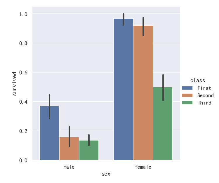
案例2-条形图barplot的置信区间
The default error bars show 95% confidence intervals, but (starting in v0.12), it is possible to select from a number of other representations: 默认的错误条显示95%的置信区间,但是(从v0.12开始),可以从许多其他表示中选择:
sns.catplot(data=titanic, x="age", y="deck", errorbar=("pi", 95), kind="bar")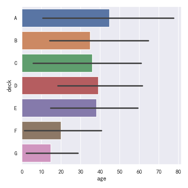
案例3-计数统计图countplot
A special case for the bar plot is when you want to show the number of observations in each category rather than computing a statistic for a second variable. This is similar to a histogram over a categorical, rather than quantitative, variable. In seaborn, it’s easy to do so with the countplot() function: 条形图的一个特殊情况是,当您希望显示每个类别中的观察数,而不是计算第二个变量的统计数据时。这类似于分类变量的直方图,而不是定量变量。在seaborn中,使用countplot()函数很容易做到这一点:
sns.catplot(data=titanic, x="deck", kind="count", palette="ch:.25")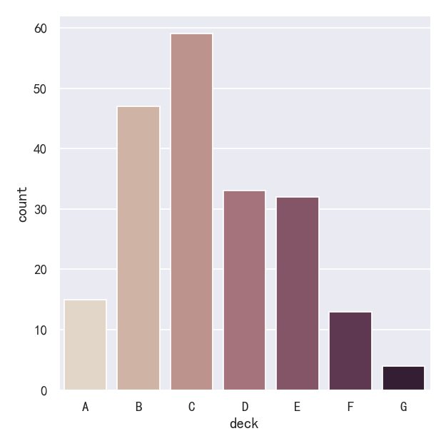
案例4-计数统计图countplot参数edgecolor
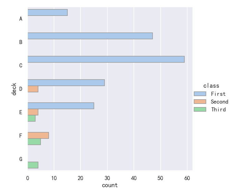
Both barplot() and countplot() can be invoked with all of the options discussed above, along with others that are demonstrated in the detailed documentation for each function: barplot()和countplot()都可以用上面讨论的所有选项调用,以及在每个函数的详细文档中演示的其他选项:
sns.catplot(
    data=titanic, y="deck", hue="class", kind="count",
    palette="pastel", edgecolor=".6",
)
案例5-点图pointplot
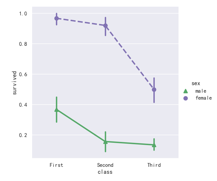
An alternative style for visualizing the same information is offered by the pointplot() function. This function also encodes the value of the estimate with height on the other axis, but rather than showing a full bar, it plots the point estimate and confidence interval. Additionally, pointplot() connects points from the same hue category. This makes it easy to see how the main relationship is changing as a function of the hue semantic, because your eyes are quite good at picking up on differences of slopes: pointplot()函数提供了可视化相同信息的另一种样式。该函数还在另一个轴上对高度的估计值进行编码,但它不是显示完整的条,而是绘制点估计值和置信区间。此外,pointplot()连接来自相同色调类别的点。这使得我们很容易看到主要关系是如何随着色调语义的变化而变化的,因为你的眼睛非常擅长捕捉斜率的差异:
sns.catplot(data=titanic, x="sex", y="survived", hue="class", kind="point")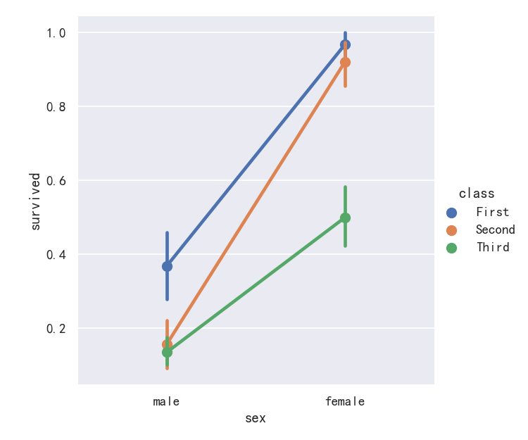
案例6-点图pointplot参数markers和linestyles
While the categorical functions lack the style semantic of the relational functions, it can still be a good idea to vary the marker and/or linestyle along with the hue to make figures that are maximally accessible and reproduce well in black and white: 虽然分类函数缺乏关系函数的风格语义,但随着色调变化标记和/或线条风格仍然是一个好主意,以使图形最大限度地可访问并在黑白中再现:
sns.catplot(
    data=titanic, x="class", y="survived", hue="sex",
    palette={"male": "g", "female": "m"},
    markers=["^", "o"], linestyles=["-", "--"],
    kind="point"
)
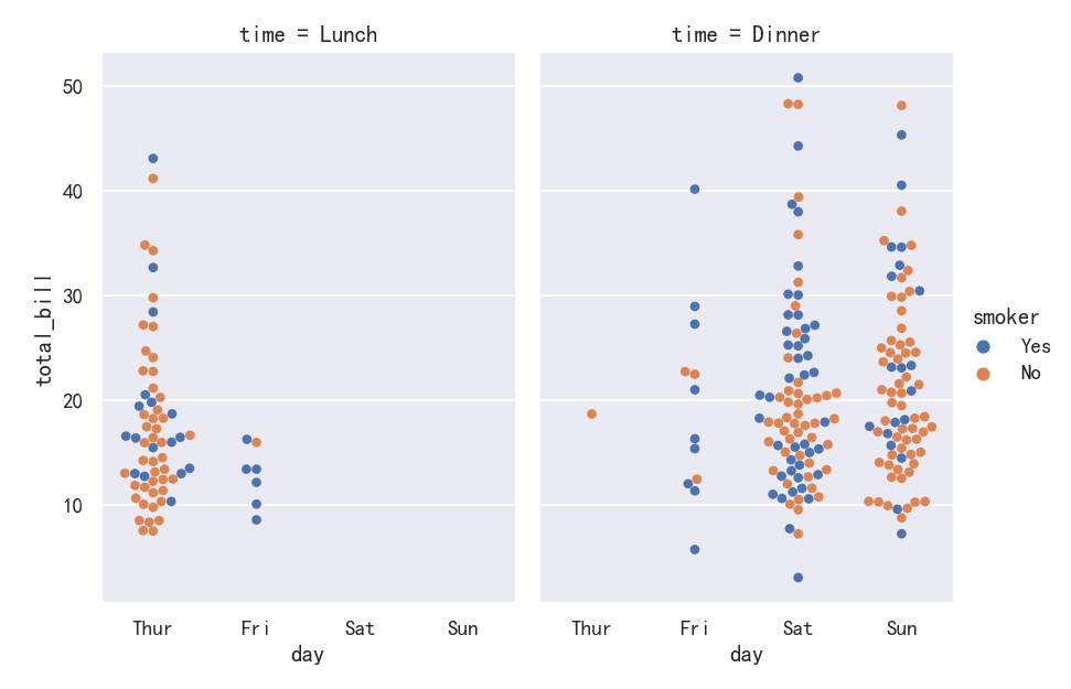
显示其他维度-Showing additional dimensions
Just like relplot(), the fact that catplot() is built on a FacetGrid means that it is easy to add faceting variables to visualize higher-dimensional relationships: 就像relplot()一样,事实上catplot()是在FacetGrid上构建的,这意味着很容易添加faceting变量来可视化高维关系:
sns.catplot(
    data=tips, x="day", y="total_bill", hue="smoker",
    kind="swarm", col="time", aspect=.7,
)
For further customization of the plot, you can use the methods on the FacetGrid object that it returns: 为了进一步定制绘图,您可以使用它返回的FacetGrid对象上的方法:
g = sns.catplot(
    data=titanic,
    x="fare", y="embark_town", row="class",
    kind="box", orient="h",
    sharex=False, margin_titles=True,
    height=1.5, aspect=4,
)
g.set(xlabel="Fare", ylabel="")
g.set_titles(row_template="{row_name} class")
for ax in g.axes.flat:
    ax.xaxis.set_major_formatter('${x:.0f}')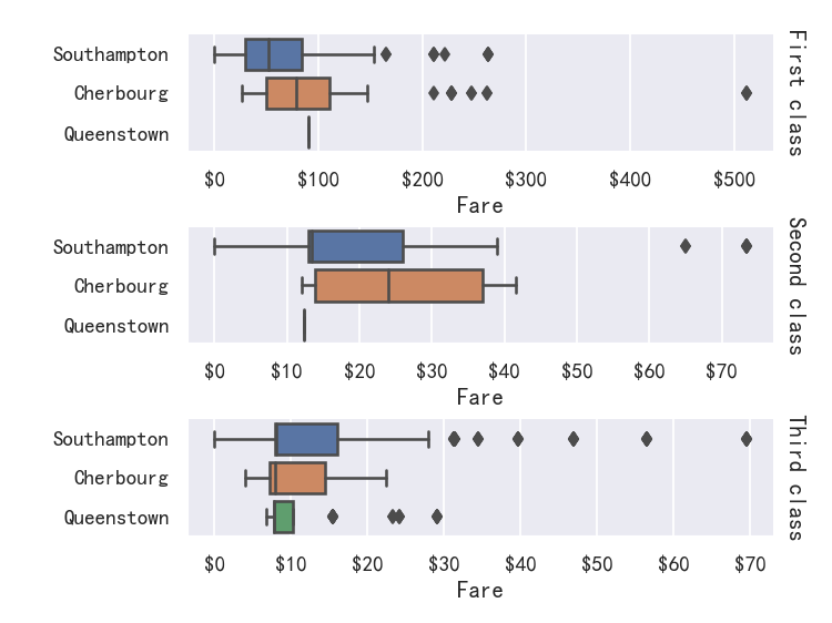
seaborn从入门到精通03-绘图功能实现03-分布绘图distributional plots
总结
本文主要是seaborn从入门到精通系列第3篇,本文介绍了seaborn的绘图功能实现,本文是分布绘图,同时介绍了较好的参考文档置于博客前面,读者可以重点查看参考链接。本系列的目的是可以完整的完成seaborn从入门到精通。重点参考连接
参考
【宝藏级】全网最全的Seaborn详细教程-数据分析必备手册(2万字总结)
关系-分布-分类
relational “关系型” distributional “分布型” categorical “分类型”
分布绘图-Visualizing distributions data
An early step in any effort to analyze or model data should be to understand how the variables are distributed. Techniques for distribution visualization can provide quick answers to many important questions. What range do the observations cover? What is their central tendency? Are they heavily skewed in one direction? Is there evidence for bimodality? Are there significant outliers? Do the answers to these questions vary across subsets defined by other variables? 任何分析或建模数据的工作的早期步骤都应该是理解变量是如何分布的。分布可视化技术可以为许多重要问题提供快速答案。观察的范围是什么?它们的集中趋势是什么?它们是否严重偏向一个方向?是否有双态的证据?是否存在显著的异常值?这些问题的答案是否在其他变量定义的子集中有所不同? The distributions module contains several functions designed to answer questions such as these. The axes-level functions are histplot(), kdeplot(), ecdfplot(), and rugplot(). They are grouped together within the figure-level displot(), jointplot(), and pairplot() functions… 分发模块包含几个旨在回答此类问题的函数。轴级函数是histplot()、kdeploy()、ecdfplot()和rugplot()。它们在图形级的displot()、jointplot()和pairplot()函数中组合在一起。 There are several different approaches to visualizing a distribution, and each has its relative advantages and drawbacks. It is important to understand these factors so that you can choose the best approach for your particular aim. 有几种不同的方法来可视化发行版,每种方法都有其相对的优点和缺点。了解这些因素是很重要的,这样你就可以为你的特定目标选择最好的方法。
图形级接口displot/jointplot/pairplot–figure-level interface
参考
轴级接口histplot/kdeplot/ecdfplot/rugplot–axes-level interface
导入库与查看tips和diamonds 数据
import numpy as np
import pandas as pd
import matplotlib.pyplot as plt
import matplotlib as  mpl
import seaborn as sns
sns.set_theme(style="darkgrid")

mpl.rcParams['font.sans-serif']=['SimHei']
mpl.rcParams['axes.unicode_minus']=False

tips = sns.load_dataset("tips",cache=True,data_home=r"./seaborn-data")
tips.head()diamonds = sns.load_dataset("diamonds",cache=True,data_home=r"./seaborn-data")
print(diamonds.head())titanic = sns.load_dataset("titanic",cache=True,data_home=r"./seaborn-data")
print(titanic.info())
print(titanic.head())输出:
<class 'pandas.core.frame.DataFrame'>
RangeIndex: 891 entries, 0 to 890
Data columns (total 15 columns):
 #   Column       Non-Null Count  Dtype
---  ------       --------------  -----
 0   survived     891 non-null    int64
 1   pclass       891 non-null    int64
 2   sex          891 non-null    object
 3   age          714 non-null    float64
 4   sibsp        891 non-null    int64
 5   parch        891 non-null    int64
 6   fare         891 non-null    float64
 7   embarked     889 non-null    object
 8   class        891 non-null    category
 9   who          891 non-null    object
 10  adult_male   891 non-null    bool
 11  deck         203 non-null    category
 12  embark_town  889 non-null    object
 13  alive        891 non-null    object
 14  alone        891 non-null    bool
dtypes: bool(2), category(2), float64(2), int64(4), object(5)
memory usage: 80.7+ KB
None
   survived  pclass     sex   age  sibsp  parch  ...    who adult_male deck  embark_town  alive  alone
0         0       3    male  22.0      1      0  ...    man       True  NaN  Southampton     no  False
1         1       1  female  38.0      1      0  ...  woman      False    C    Cherbourg    yes  False
2         1       3  female  26.0      0      0  ...  woman      False  NaN  Southampton    yes   True
3         1       1  female  35.0      1      0  ...  woman      False    C  Southampton    yes  False
4 0 3 male 35.0 0 0 ... man True NaN Southampton no True penguins = sns.load_dataset("penguins",cache=True,data_home=r"./seaborn-data")
print(penguins.head())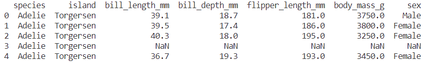
直方图histplot
案例1-单变量直方图histplot
Perhaps the most common approach to visualizing a distribution is the histogram. This is the default approach in displot(), which uses the same underlying code as histplot(). A histogram is a bar plot where the axis representing the data variable is divided into a set of discrete bins and the count of observations falling within each bin is shown using the height of the corresponding bar: 也许可视化分布的最常用方法是直方图。这是displot()中的默认方法,它使用与histplot()相同的底层代码。直方图是一种条形图,其中表示数据变量的轴被划分为一组离散的bins,并且每个bin内的观测值的计数使用相应的bar的高度表示:
sns.displot(penguins, x="flipper_length_mm")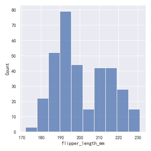
This plot immediately affords a few insights about the flipper_length_mm variable. For instance, we can see that the most common flipper length is about 195 mm, but the distribution appears bimodal, so this one number does not represent the data well. 这个图立即提供了关于flipper_length_mm变量的一些见解。例如,我们可以看到最常见的鳍长约为195 mm,但分布呈双峰,所以这一个数字并不能很好地代表数据。
案例2-直方图histplot-参数设置bin数量,大小和宽度
The size of the bins is an important parameter, and using the wrong bin size can mislead by obscuring important features of the data or by creating apparent features out of random variability. By default, displot()/histplot() choose a default bin size based on the variance of the data and the number of observations. But you should not be over-reliant on such automatic approaches, because they depend on particular assumptions about the structure of your data. It is always advisable to check that your impressions of the distribution are consistent across different bin sizes. To choose the size directly, set the binwidth parameter: 容器的大小是一个重要的参数,使用错误的容器大小可能会通过模糊数据的重要特征或通过随机可变性创建明显的特征而产生误导。默认情况下,displot()/histplot()根据数据的方差和观测值的数量选择默认的bin大小。但是您不应该过度依赖这种自动方法,因为它们依赖于对数据结构的特定假设。检查你对不同容器大小的分布的印象是否一致总是明智的。
sns.displot(penguins, x="flipper_length_mm", binwidth=3)
sns.displot(penguins, x="flipper_length_mm", bins=20)In other circumstances, it may make more sense to specify the number of bins, rather than their size: 在其他情况下,指定箱子的数量而不是它们的大小可能更有意义:

One example of a situation where defaults fail is when the variable takes a relatively small number of integer values. In that case, the default bin width may be too small, creating awkward gaps in the distribution: 默认值失败的一个例子是当变量接受相对较少的整数值时。在这种情况下,默认的bin宽度可能太小,在分布中产生尴尬的间隙:
sns.displot(tips, x="size")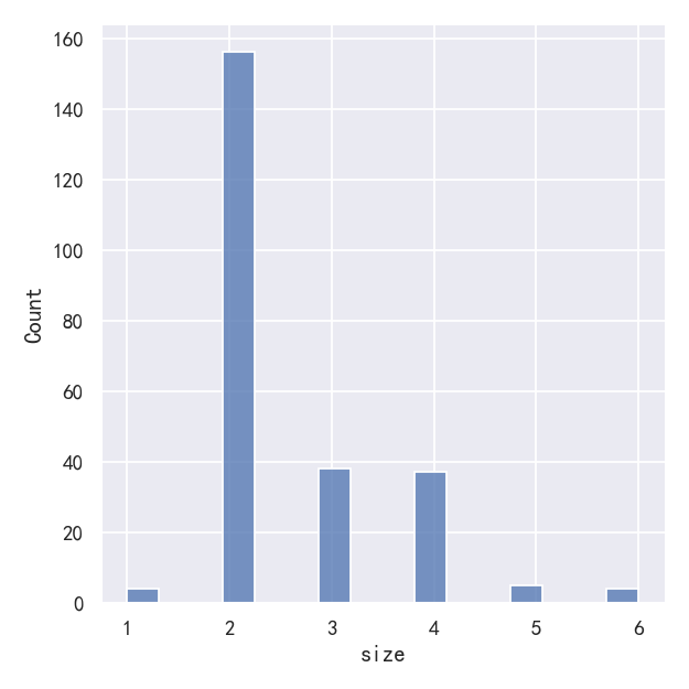
# sns.displot(tips, x="size")
sns.displot(tips, x="size", bins=[1, 2, 3, 4, 5, 6, 7])One approach would be to specify the precise bin breaks by passing an array to bins: 一种方法是通过传递一个数组给bins来指定精确的bin换行符:
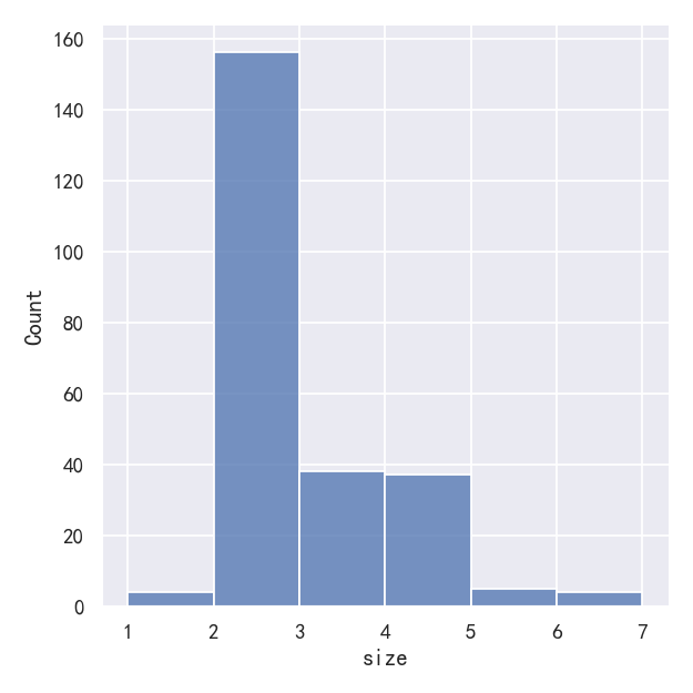
This can also be accomplished by setting discrete=True, which chooses bin breaks that represent the unique values in a dataset with bars that are centered on their corresponding value. 这也可以通过设置discrete=True来实现,它选择代表数据集中唯一值的分站符,其中的条以相应的值为中心。
sns.displot(tips, x="size", discrete=True)
It’s also possible to visualize the distribution of a categorical variable using the logic of a histogram. Discrete bins are automatically set for categorical variables, but it may also be helpful to “shrink” the bars slightly to emphasize the categorical nature of the axis: 也可以使用直方图的逻辑来可视化分类变量的分布。离散箱是自动为分类变量设置的,但它可能也有助于“缩小”条,以强调轴的分类性质:
sns.displot(tips, x="day", shrink=.8)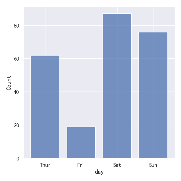
案例3-直方图histplot-Conditioning on other variables
Once you understand the distribution of a variable, the next step is often to ask whether features of that distribution differ across other variables in the dataset. For example, what accounts for the bimodal distribution of flipper lengths that we saw above? displot() and histplot() provide support for conditional subsetting via the hue semantic. Assigning a variable to hue will draw a separate histogram for each of its unique values and distinguish them by color: 一旦你理解了一个变量的分布,下一步通常是问这个分布的特征在数据集中的其他变量之间是否不同。例如,是什么解释了我们上面看到的鳍状肢长度的双峰分布?Displot()和histplot()通过色调语义提供条件子集的支持。将变量赋值为hue将为每个变量的唯一值绘制单独的直方图,并通过颜色区分它们:
sns.displot(penguins, x="flipper_length_mm", hue="species")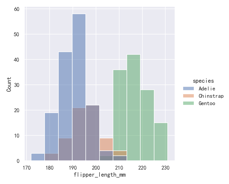
案例4-直方图histplot转换为阶梯图
By default, the different histograms are “layered” on top of each other and, in some cases, they may be difficult to distinguish. One option is to change the visual representation of the histogram from a bar plot to a “step” plot: 默认情况下,不同的直方图是相互“分层”的,在某些情况下,它们可能很难区分。一种选择是将直方图的可视化表示从条形图更改为“阶梯”图:
# sns.displot(penguins, x="flipper_length_mm", hue="species")
sns.displot(penguins, x="flipper_length_mm", hue="species", element="step")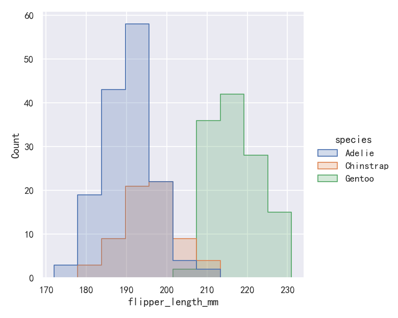
案例5-直方图histplot堆叠图stack
sns.displot(penguins, x="flipper_length_mm", hue="species", multiple="stack")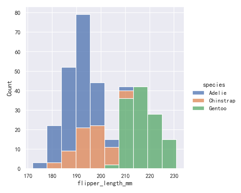
The stacked histogram emphasizes the part-whole relationship between the variables, but it can obscure other features (for example, it is difficult to determine the mode of the Adelie distribution. Another option is “dodge” the bars, which moves them horizontally and reduces their width. This ensures that there are no overlaps and that the bars remain comparable in terms of height. But it only works well when the categorical variable has a small number of levels: 堆叠直方图强调变量之间的部分-整体关系,但它可能会掩盖其他特征(例如,很难确定阿德利分布的模式。另一种选择是“dodge”,这将水平移动它们并减少它们的宽度。这确保了没有重叠,并且条在高度方面保持可比性。但它只在类别变量具有少量级别时才能很好地工作:
sns.displot(penguins, x="flipper_length_mm", hue="sex", multiple="dodge")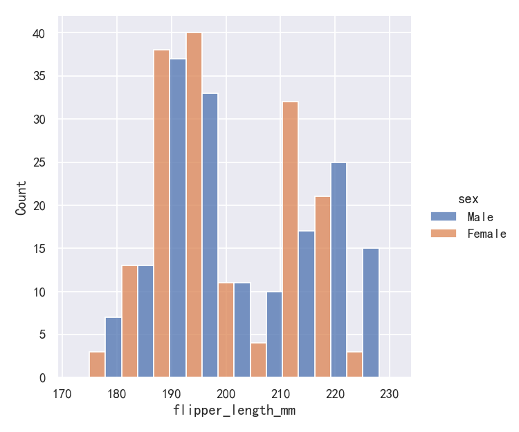
Because displot() is a figure-level function and is drawn onto a FacetGrid, it is also possible to draw each individual distribution in a separate subplot by assigning the second variable to col or row rather than (or in addition to) hue. This represents the distribution of each subset well, but it makes it more difficult to draw direct comparisons: 因为displot()是一个图形级函数,并且被绘制到FacetGrid上,所以还可以通过将第二个变量分配给col或row而不是(或加上)hue来在单独的子图中绘制每个单独的分布。这很好地代表了每个子集的分布,但它使进行直接比较变得更加困难:
sns.displot(penguins, x="flipper_length_mm", col="sex")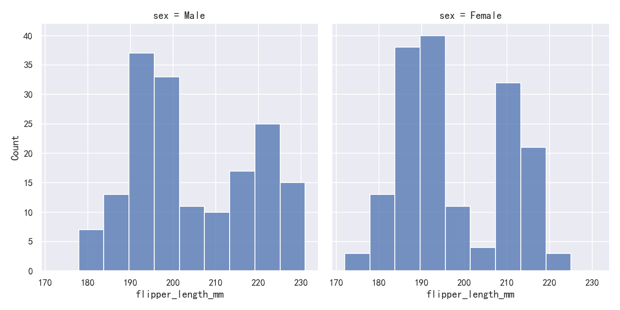
None of these approaches are perfect, and we will soon see some alternatives to a histogram that are better-suited to the task of comparison. 这些方法都不是完美的,我们很快就会看到一些替代直方图的方法,它们更适合进行比较。
案例5-直方图hist-标准化直方图Normalized histogram statistics
Before we do, another point to note is that, when the subsets have unequal numbers of observations, comparing their distributions in terms of counts may not be ideal. One solution is to normalize the counts using the stat parameter: 在此之前,需要注意的另一点是,当子集具有不等数量的观测值时,比较它们在计数方面的分布可能并不理想。一种解决方案是使用stat参数规范化计数: By default, however, the normalization is applied to the entire distribution, so this simply rescales the height of the bars. By setting common_norm=False, each subset will be normalized independently: 但是,默认情况下,归一化应用于整个分布,因此这只是重新调整了柱状图的高度。通过设置common_norm=False,每个子集将被独立地规范化:
sns.displot(penguins, x="flipper_length_mm", hue="species",)
# sns.displot(penguins, x="flipper_length_mm", hue="species", stat="density")
sns.displot(penguins, x="flipper_length_mm", hue="species", stat="density", common_norm=False)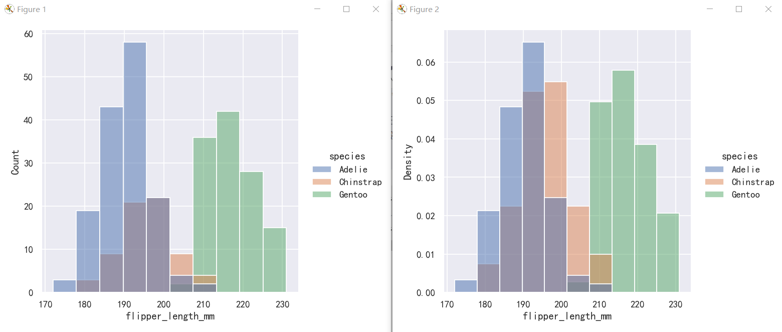
Density normalization scales the bars so that their areas sum to 1. As a result, the density axis is not directly interpretable. Another option is to normalize the bars to that their heights sum to 1. This makes most sense when the variable is discrete, but it is an option for all histograms: 密度归一化使条形图的面积之和为1。因此,密度轴是不能直接解释的。另一种选择是将柱形归一化,使其高度之和为1。当变量是离散的时,这是最有意义的,但它是所有直方图的一个选项:
sns.displot(penguins, x="flipper_length_mm", hue="species", stat="density")
sns.displot(penguins, x="flipper_length_mm", hue="species", stat="probability")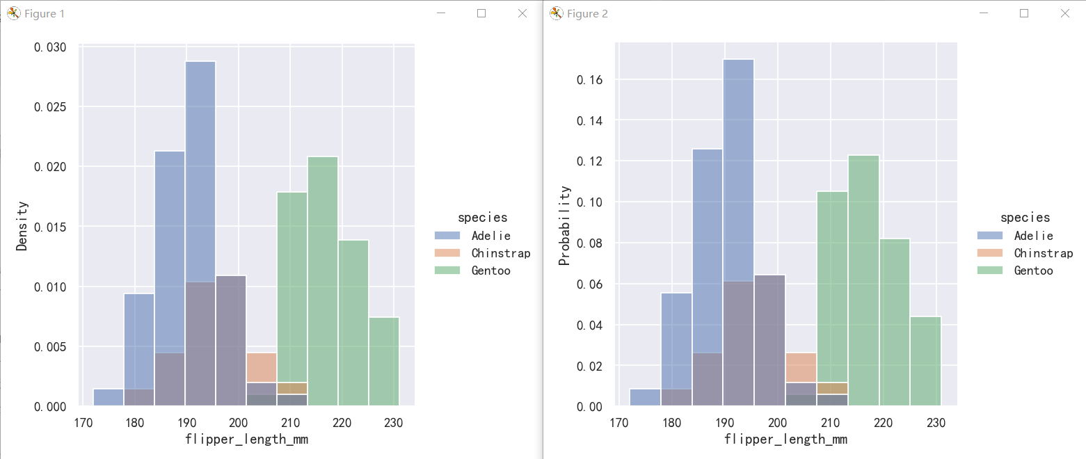
核密度估计图-Kernel density estimation
A histogram aims to approximate the underlying probability density function that generated the data by binning and counting observations. Kernel density estimation (KDE) presents a different solution to the same problem. Rather than using discrete bins, a KDE plot smooths the observations with a Gaussian kernel, producing a continuous density estimate: 直方图旨在通过对观察结果进行分类和计数来近似生成数据的底层概率密度函数。核密度估计(KDE)对同样的问题提出了不同的解决方案。KDE图不是使用离散箱,而是用高斯核平滑观察,产生连续的密度估计:
案例1-核密度估计图
sns.displot(penguins, x="flipper_length_mm", kind="kde")
案例2-核密度估计图-Choosing the smoothing bandwidth
Much like with the bin size in the histogram, the ability of the KDE to accurately represent the data depends on the choice of smoothing bandwidth. An over-smoothed estimate might erase meaningful features, but an under-smoothed estimate can obscure the true shape within random noise. The easiest way to check the robustness of the estimate is to adjust the default bandwidth: 就像直方图中的箱子大小一样,KDE准确表示数据的能力取决于平滑带宽的选择。过度平滑的估计可能会抹去有意义的特征,但未平滑的估计可能会在随机噪声中掩盖真实的形状。检查估计的稳健性最简单的方法是调整默认带宽:
如果发现曲线还是不够平滑时,可以增大bw_adjust,即对bw乘以一个系数
sns.displot(penguins, x="flipper_length_mm", kind="kde", bw_adjust=.25)
sns.displot(penguins, x="flipper_length_mm", kind="kde", bw_adjust=1.0)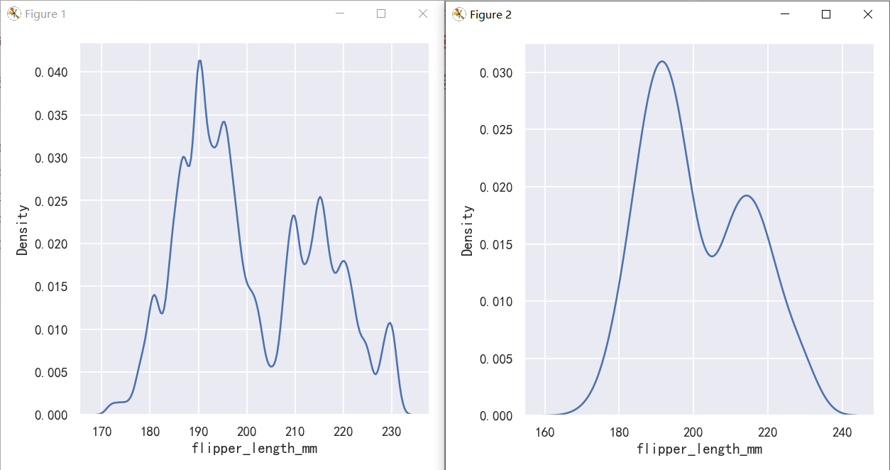
案例3-核密度估计图-参数hue与fill填充
与直方图一样,如果你分配了一个色调变量,将为该变量的每个级别计算一个单独的密度估计:
sns.displot(penguins, x="flipper_length_mm", hue="species", kind="kde")
sns.displot(penguins, x="flipper_length_mm", hue="species", kind="kde", fill=True)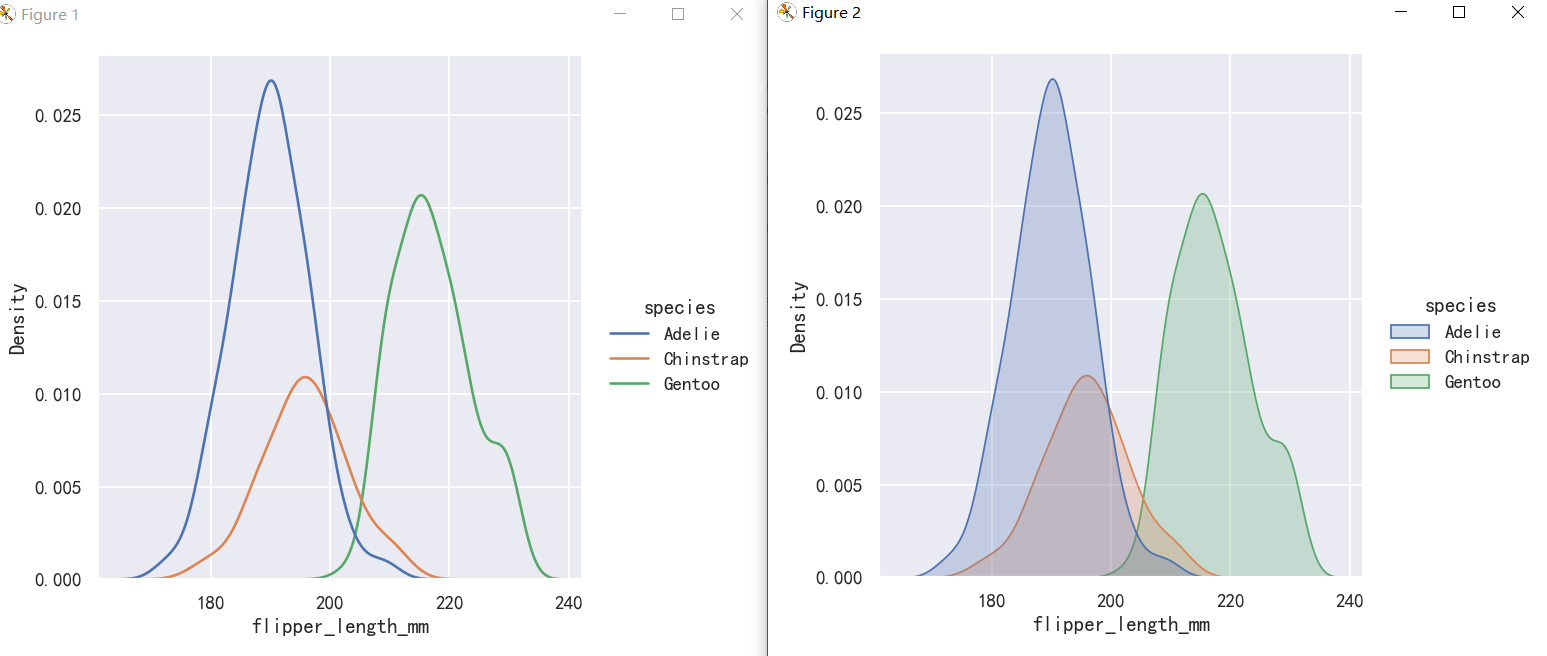
案例4-核密度估计图缺陷-Kernel density estimation pitfalls
KDE plots have many advantages. Important features of the data are easy to discern (central tendency, bimodality, skew), and they afford easy comparisons between subsets. But there are also situations where KDE poorly represents the underlying data. This is because the logic of KDE assumes that the underlying distribution is smooth and unbounded. One way this assumption can fail is when a variable reflects a quantity that is naturally bounded. If there are observations lying close to the bound (for example, small values of a variable that cannot be negative), the KDE curve may extend to unrealistic values: KDE图有很多优点。数据的重要特征很容易辨别(集中倾向、双峰性、歪斜),并且可以很容易地在子集之间进行比较。但是也有KDE不能很好地表示底层数据的情况。这是因为KDE的逻辑假设底层分布是平滑且无界的。当一个变量反映一个自然有界的量时,这个假设就会失败。如果观测值接近边界(例如,变量的小值不能为负),则KDE曲线可能扩展为不真实
sns.displot(tips, x="total_bill", kind="hist")
sns.displot(tips, x="total_bill", kind="kde")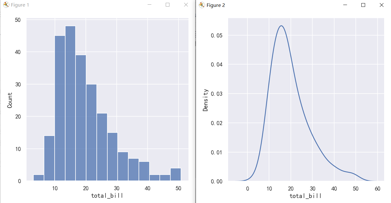
This can be partially avoided with the cut parameter, which specifies how far the curve should extend beyond the extreme datapoints. But this influences only where the curve is drawn; the density estimate will still smooth over the range where no data can exist, causing it to be artificially low at the extremes of the distribution: 使用cut参数可以部分避免这种情况,该参数指定曲线应该超出极端数据点的范围。但这只会影响曲线的绘制位置;密度估计仍然会在没有数据存在的范围内平滑,导致在分布的极端处人为地降低:
sns.displot(tips, x="total_bill", kind="kde")
sns.displot(tips, x="total_bill", kind="kde", cut=0)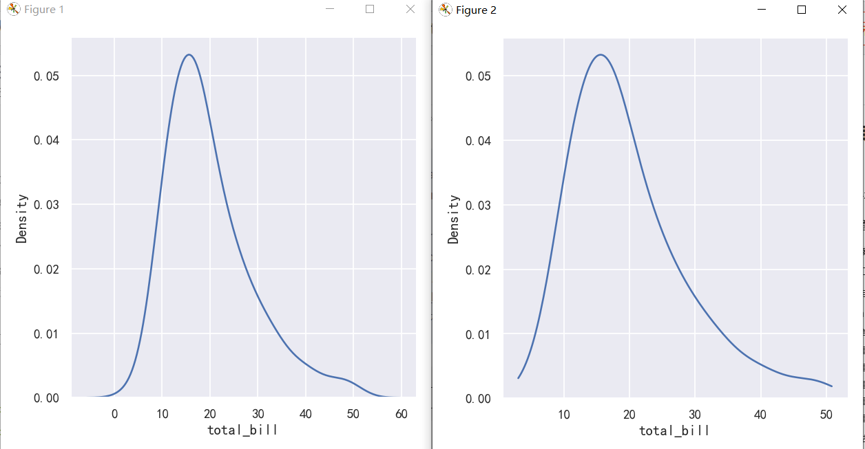
The KDE approach also fails for discrete data or when data are naturally continuous but specific values are over-represented. The important thing to keep in mind is that the KDE will always show you a smooth curve, even when the data themselves are not smooth. For example, consider this distribution of diamond weights: KDE方法对于离散数据或当数据自然连续但特定值被过度表示时也会失败。需要记住的重要一点是,KDE将始终向您显示平滑的曲线,即使数据本身并不平滑。例如,考虑钻石重量的分布: While the KDE suggests that there are peaks around specific values, the histogram reveals a much more jagged distribution: 虽然KDE表明在特定值周围有峰值,但直方图揭示了一个更加锯齿状的分布:
sns.displot(diamonds, x="carat", kind="kde")
sns.displot(diamonds, x="carat")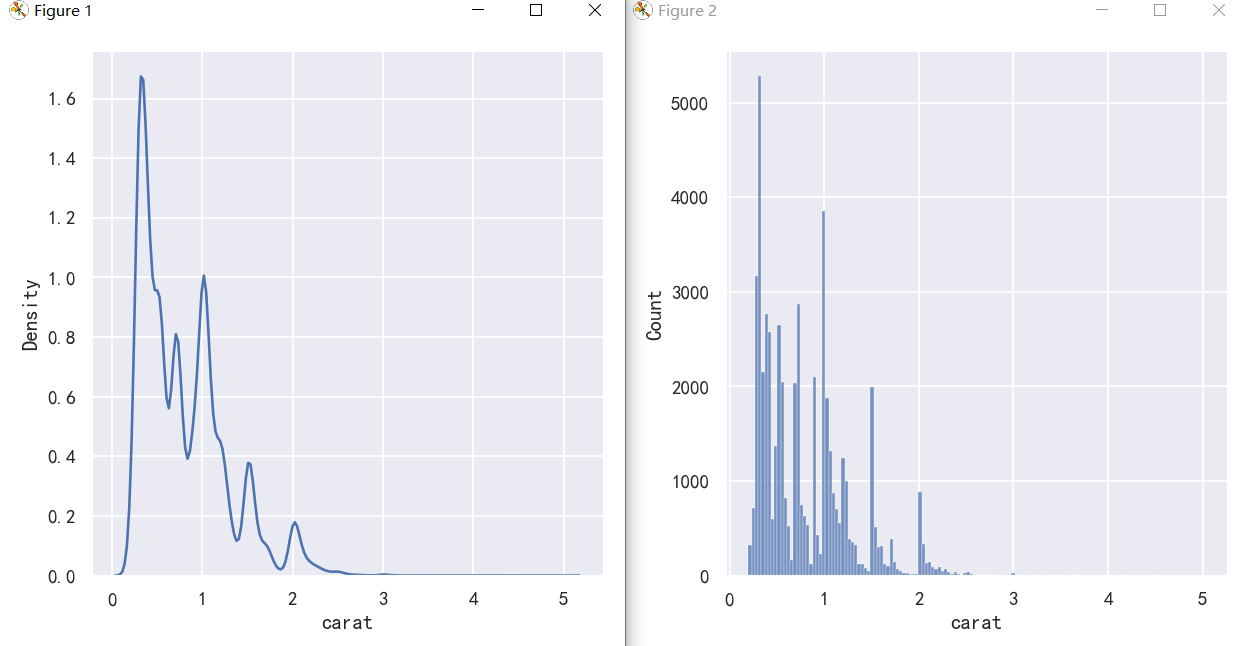
As a compromise, it is possible to combine these two approaches. While in histogram mode, displot() (as with histplot()) has the option of including the smoothed KDE curve (note kde=True, not kind=“kde”): 作为一种折衷,可以将这两种方法结合起来。在直方图模式下,displot()(与histplot()一样)可以选择包括平滑的KDE曲线(注意KDE =True, not kind=" KDE "):
sns.displot(diamonds, x="carat", kde=True)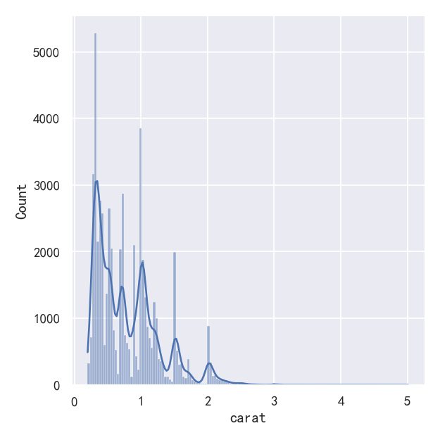
经验累计分布-Empirical cumulative distributions
A third option for visualizing distributions computes the “empirical cumulative distribution function” (ECDF). This plot draws a monotonically-increasing curve through each datapoint such that the height of the curve reflects the proportion of observations with a smaller value: 可视化分布的第三个选项是计算“经验累积分布函数”(ECDF)。该图通过每个数据点绘制了一条单调递增的曲线,这样曲线的高度反映了具有较小值的观测值的比例:
案例1-经验累计分布图ecdf
sns.displot(penguins,x="flipper_length_mm",kde="kde")
sns.displot(penguins, x="flipper_length_mm", kind="ecdf")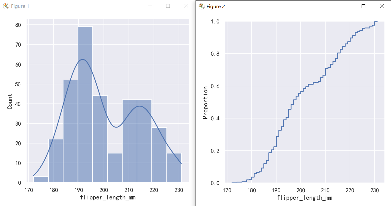
案例2-经验累计分布图ecdf优势多个分布
The ECDF plot has two key advantages. Unlike the histogram or KDE, it directly represents each datapoint. That means there is no bin size or smoothing parameter to consider. Additionally, because the curve is monotonically increasing, it is well-suited for comparing multiple distributions: ECDF地块有两个关键优势。与直方图或KDE不同,它直接表示每个数据点。这意味着不需要考虑bin大小或平滑参数。此外,由于曲线是单调递增的,它非常适合比较多个分布:
sns.displot(penguins, x="flipper_length_mm", hue="species", kind="ecdf")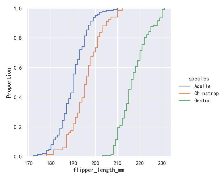
The major downside to the ECDF plot is that it represents the shape of the distribution less intuitively than a histogram or density curve. Consider how the bimodality of flipper lengths is immediately apparent in the histogram, but to see it in the ECDF plot, you must look for varying slopes. Nevertheless, with practice, you can learn to answer all of the important questions about a distribution by examining the ECDF, and doing so can be a powerful approach. ECDF图的主要缺点是它表示分布的形状不如直方图或密度曲线直观。考虑鳍状肢长度的双峰性如何在直方图中立即显现,但要在ECDF图中看到它,必须寻找不同的斜率。尽管如此,通过实践,您可以通过检查ECDF来学习回答关于发行版的所有重要问题,这样做可能是一种强大的方法。
双变量分布可视化-Visualizing bivariate distributions
All of the examples so far have considered univariate distributions: distributions of a single variable, perhaps conditional on a second variable assigned to hue. Assigning a second variable to y, however, will plot a bivariate distribution: 到目前为止,所有的例子都考虑了单变量分布:单个变量的分布,可能取决于赋给色调的第二个变量。然而,将第二个变量赋值给y,将绘制一个二元分布:
案例1-双变量分布直方图与核密度图
A bivariate histogram bins the data within rectangles that tile the plot and then shows the count of observations within each rectangle with the fill color (analogous to a heatmap()). Similarly, a bivariate KDE plot smoothes the (x, y) observations with a 2D Gaussian. The default representation then shows the contours of the 2D density: 二元直方图将数据装入平铺图的矩形中,然后用填充色显示每个矩形中的观察计数(类似于热图())。类似地,二元KDE图用二维高斯平滑(x, y)观测值。默认的表示形式然后显示2D密度的轮廓:
sns.displot(penguins, x="bill_length_mm", y="bill_depth_mm")
sns.displot(penguins, x="bill_length_mm", y="bill_depth_mm", kind="kde")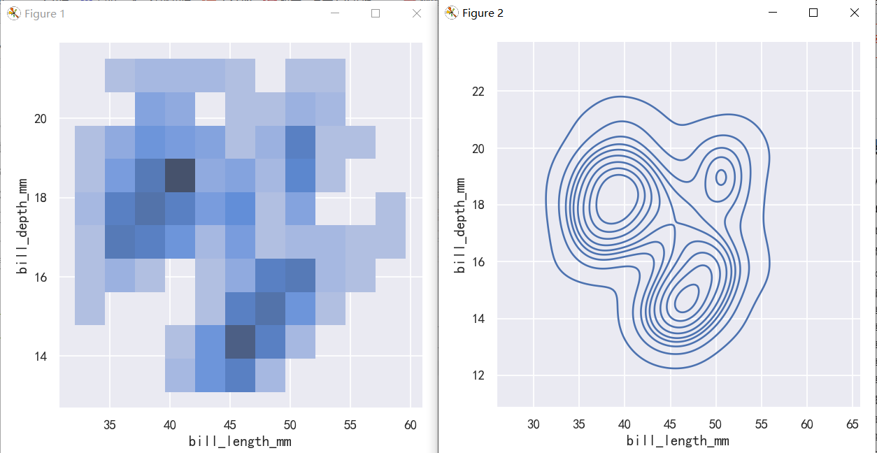
案例2-双变量分布直方图与核密度图-参数hue
sns.displot(penguins, x="bill_length_mm", y="bill_depth_mm",hue="species")
sns.displot(penguins, x="bill_length_mm", y="bill_depth_mm",hue="species", kind="kde")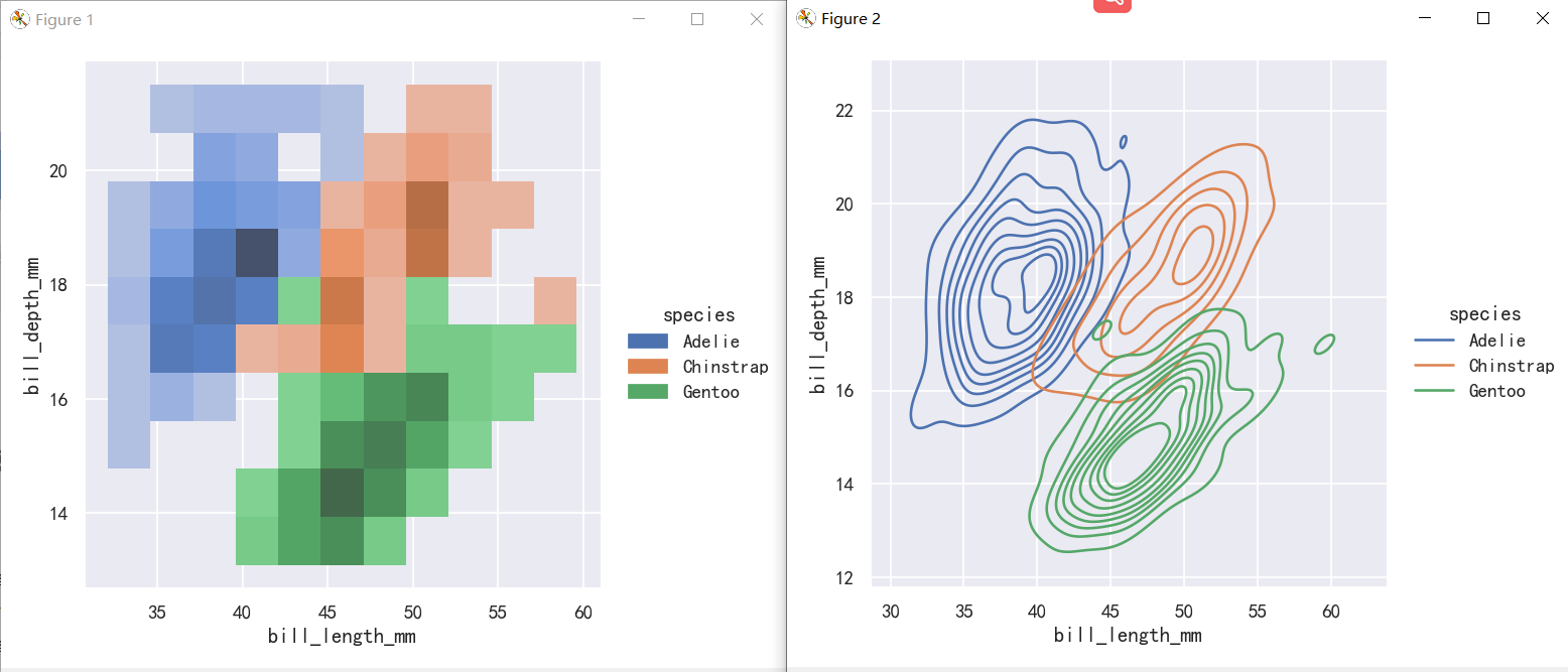
The contour approach of the bivariate KDE plot lends itself better to evaluating overlap, although a plot with too many contours can get busy: 二元KDE图的等高线方法更适合评估重叠
案例3-双变量分布直方图与核密度图-bin大小和颜色
To aid interpretation of the heatmap, add a colorbar to show the mapping between counts and color intensity: 为了帮助解释热图,添加一个颜色条来显示计数和颜色强度之间的映射:
sns.displot(penguins, x="bill_length_mm", y="bill_depth_mm", binwidth=(2, .5))
sns.displot(penguins, x="bill_length_mm", y="bill_depth_mm", binwidth=(2, .5), cbar=True)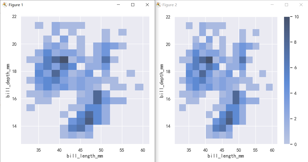
The meaning of the bivariate density contours is less straightforward. Because the density is not directly interpretable, the contours are drawn at iso-proportions of the density, meaning that each curve shows a level set such that some proportion p of the density lies below it. The p values are evenly spaced, with the lowest level contolled by the thresh parameter and the number controlled by levels: 二元密度等高线的含义不那么直接。由于密度不能直接解释,等高线是按照密度的等比例绘制的,这意味着每条曲线都显示了一个水平集,使得密度的某个比例p位于它以下。p值均匀间隔,最低级别由thresh参数控制,数量由级别控制: The levels parameter also accepts a list of values, for more control: evel参数还接受一个值列表,以便进行更多的控制:
sns.displot(penguins, x="bill_length_mm", y="bill_depth_mm", kind="kde", thresh=.2, levels=4)
sns.displot(penguins, x="bill_length_mm", y="bill_depth_mm", kind="kde", levels=[.01, .05, .1, .8])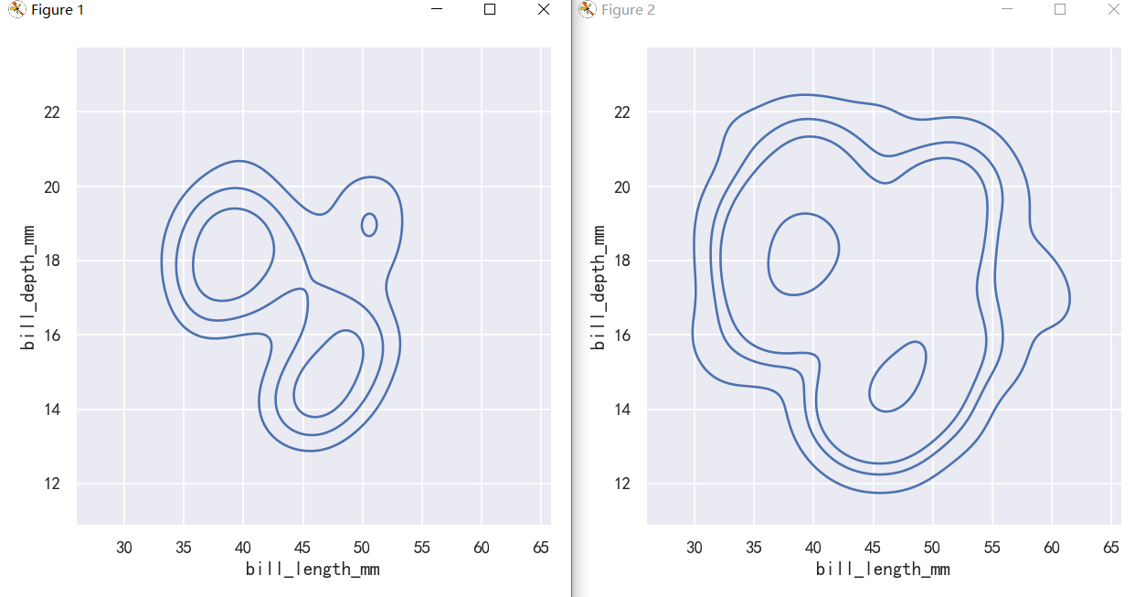
分布可视化-pairplot和joinplot
案例1-绘制节理和边际分布-Plotting joint and marginal distributions
The first is jointplot(), which augments a bivariate relatonal or distribution plot with the marginal distributions of the two variables. By default, jointplot() represents the bivariate distribution using scatterplot() and the marginal distributions using histplot(): 第一个是jointplot(),它用两个变量的边际分布来增加一个双变量关系图或分布图。默认情况下,jointplot()使用scatterplot()表示二元分布,使用histplot()表示边际分布:
sns.jointplot(data=penguins, x="bill_length_mm", y="bill_depth_mm",)
sns.jointplot(data=penguins, x="bill_length_mm", y="bill_depth_mm",hue="species",)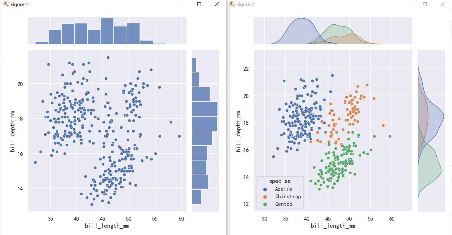
sns.jointplot(data=penguins, x="bill_length_mm", y="bill_depth_mm",hue="species",)
sns.jointplot(data=penguins,x="bill_length_mm", y="bill_depth_mm", hue="species",kind="kde")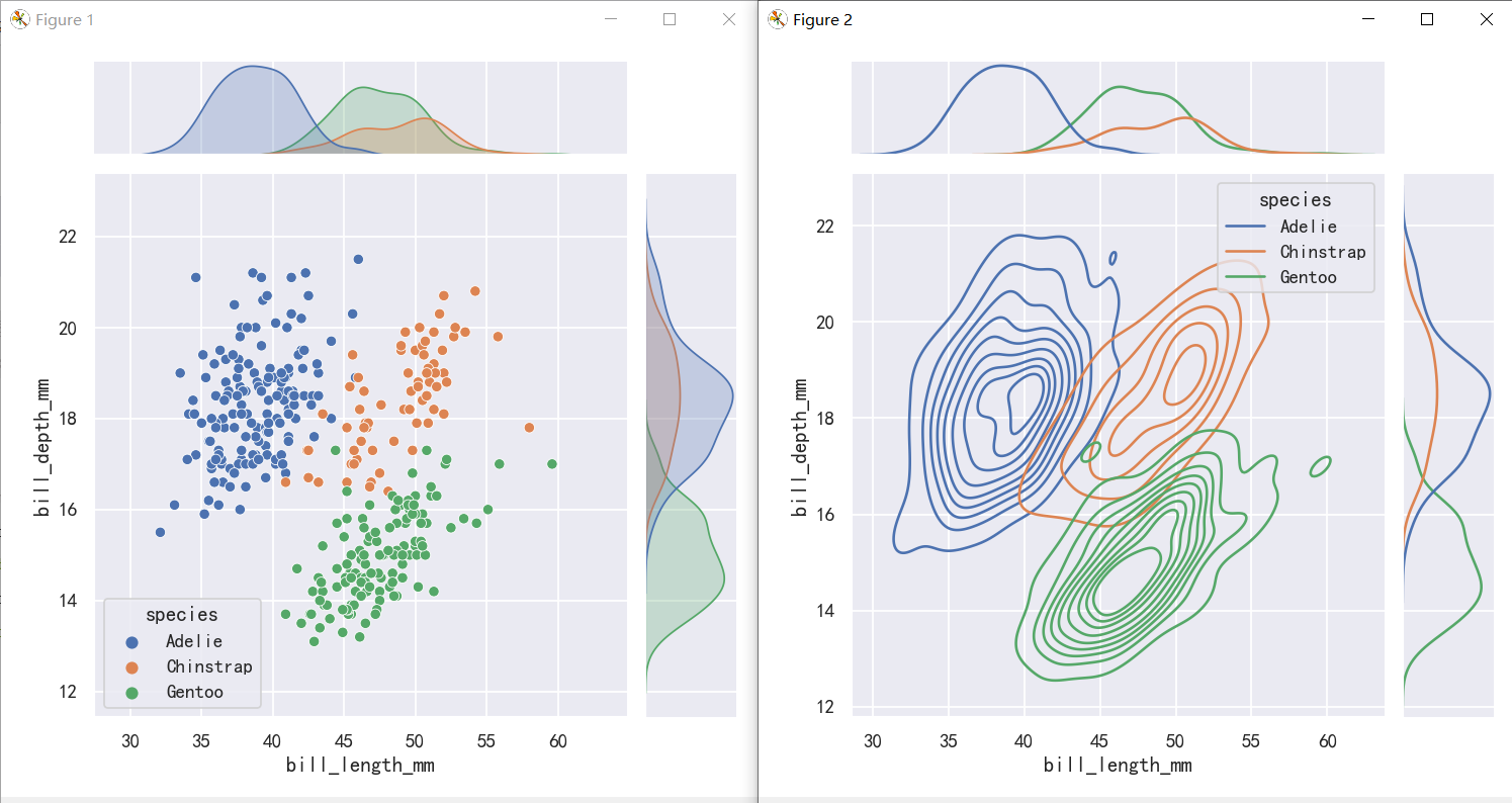
jointplot() is a convenient interface to the JointGrid class, which offeres more flexibility when used directly: jointplot()是JointGrid类的一个方便接口,直接使用时提供了更多的灵活性:
g = sns.JointGrid(data=penguins, x="bill_length_mm", y="bill_depth_mm")
g.plot_joint(sns.histplot)
g.plot_marginals(sns.boxplot)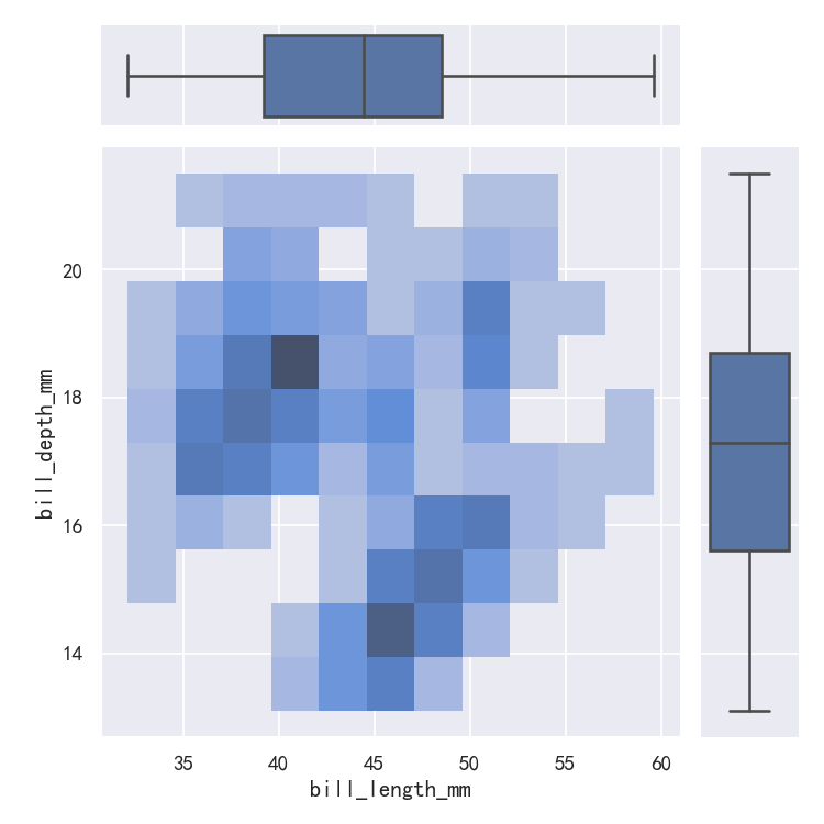
案例2-绘制节理和边际分布-地毯图rugplot
A less-obtrusive way to show marginal distributions uses a “rug” plot, which adds a small tick on the edge of the plot to represent each individual observation. This is built into displot(): 显示边际分布的一种不那么突兀的方法是使用“地毯”图,它在图的边缘添加一个小标记来表示每个单独的观察结果。这是内置在displot()中:
sns.displot(penguins, x="bill_length_mm", y="bill_depth_mm",kind="kde")
sns.displot(penguins, x="bill_length_mm", y="bill_depth_mm",kind="kde", rug=True)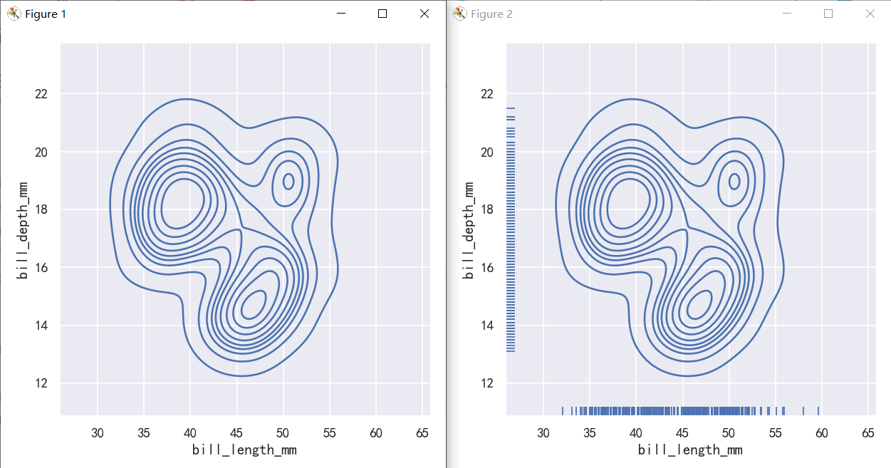
And the axes-level rugplot() function can be used to add rugs on the side of any other kind of plot: 轴级rugplot()函数可用于在任何其他类型的plot的一侧添加地毯:
g=sns.relplot(data=penguins, x="bill_length_mm", y="bill_depth_mm")
sns.rugplot(data=penguins, x="bill_length_mm", y="bill_depth_mm",ax=g.ax)
# sns.relplot(data=penguins, x="bill_length_mm", y="bill_depth_mm")
# sns.rugplot(data=penguins, x="bill_length_mm", y="bill_depth_mm")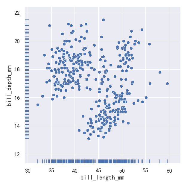
案例3-pairplot绘制多个分布
The pairplot() function offers a similar blend of joint and marginal distributions. Rather than focusing on a single relationship, however, pairplot() uses a “small-multiple” approach to visualize the univariate distribution of all variables in a dataset along with all of their pairwise relationships: pairplot()函数提供了类似的联合分布和边际分布的混合。然而,pairplot()不是专注于单个关系,而是使用“小倍数”方法来可视化数据集中所有变量的单变量分布及其所有的成对关系:
sns.pairplot(penguins)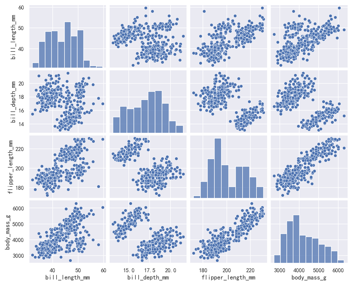
As with jointplot()/JointGrid, using the underlying PairGrid directly will afford more flexibility with only a bit more typing: 与jointplot()/JointGrid一样,直接使用底层的PairGrid将提供更多的灵活性,只需要多一点输入:
g = sns.PairGrid(penguins)
g.map_upper(sns.histplot)
g.map_lower(sns.kdeplot, fill=True)
g.map_diag(sns.histplot, kde=True)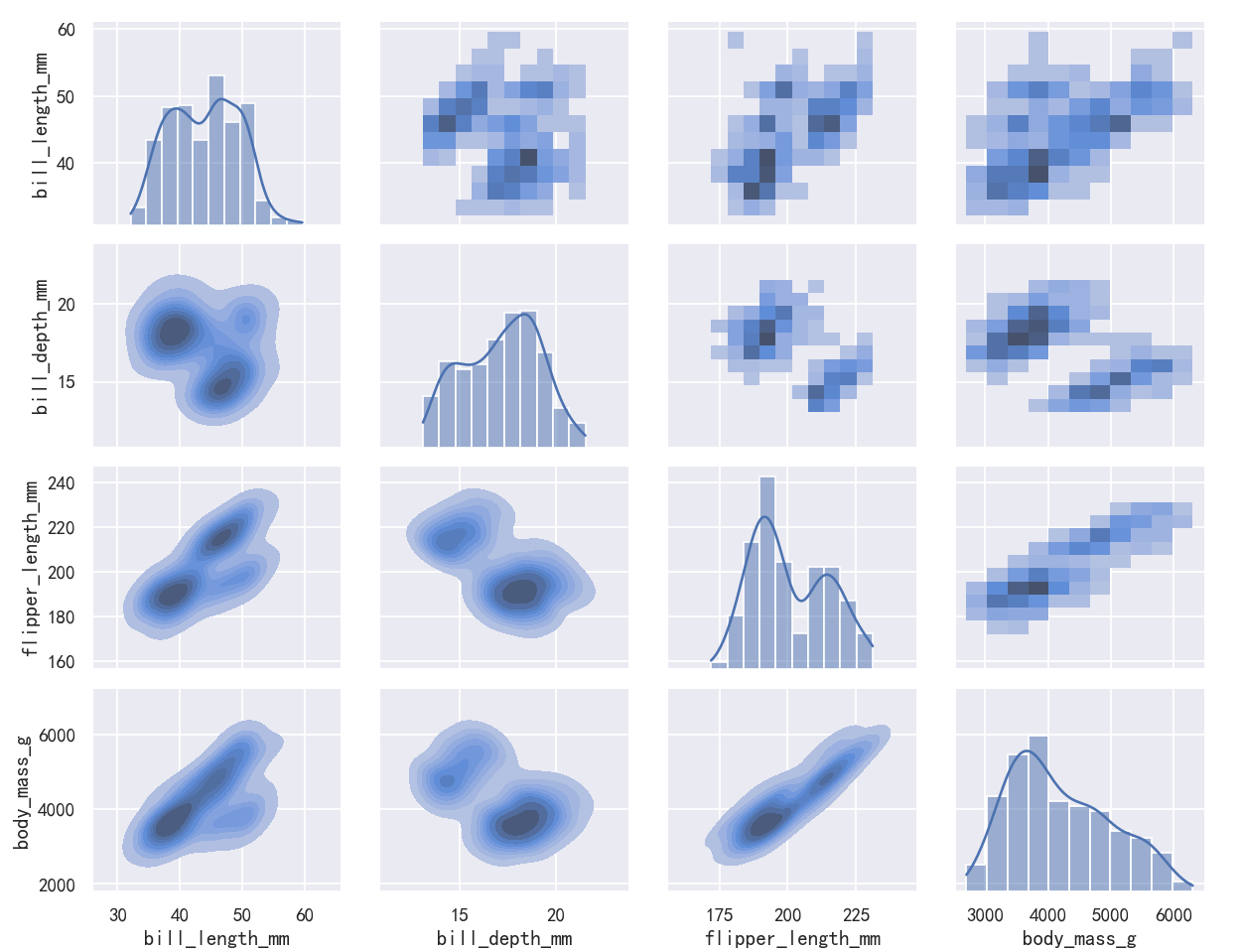
seaborn从入门到精通03-绘图功能实现04-回归拟合绘图Estimating regression fits
总结
本文主要是seaborn从入门到精通系列第3篇,本文介绍了seaborn的绘图功能实现,本文是回归拟合绘图,同时介绍了较好的参考文档置于博客前面,读者可以重点查看参考链接。本系列的目的是可以完整的完成seaborn从入门到精通。重点参考连接
参考
【宝藏级】全网最全的Seaborn详细教程-数据分析必备手册(2万字总结)
分布绘图-Visualizing distributions data
Many datasets contain multiple quantitative variables, and the goal of an analysis is often to relate those variables to each other. We previously discussed functions that can accomplish this by showing the joint distribution of two variables. It can be very helpful, though, to use statistical models to estimate a simple relationship between two noisy sets of observations. The functions discussed in this chapter will do so through the common framework of linear regression. 许多数据集包含多个定量变量,分析的目标通常是将这些变量相互关联起来。我们之前讨论过可以通过显示两个变量的联合分布来实现这一点的函数。不过,使用统计模型来估计两组有噪声的观测数据之间的简单关系是非常有用的。本章讨论的函数将通过线性回归的通用框架来实现。 The goal of seaborn, however, is to make exploring a dataset through visualization quick and easy, as doing so is just as (if not more) important than exploring a dataset through tables of statistics. seaborn的目标是通过可视化快速轻松地探索数据集,因为这样做与通过统计表探索数据集一样重要(如果不是更重要的话)。
绘制线性回归模型的函数-Functions for drawing linear regression models
The two functions that can be used to visualize a linear fit are regplot() and lmplot(). In the simplest invocation, both functions draw a scatterplot of two variables, x and y, and then fit the regression model y ~ x and plot the resulting regression line and a 95% confidence interval for that regression: 可以用来可视化线性拟合的两个函数是regplot()和lmplot()。 在最简单的调用中,两个函数都绘制了两个变量x和y的散点图,然后拟合回归模型y ~ x,并绘制出最终的回归线和该回归的95%置信区间: These functions draw similar plots, but regplot() is an axes-level function, and lmplot() is a figure-level function. Additionally, regplot() accepts the x and y variables in a variety of formats including simple numpy arrays, pandas.Series objects, or as references to variables in a pandas.DataFrame object passed to data. In contrast, lmplot() has data as a required parameter and the x and y variables must be specified as strings. Finally, only lmplot() has hue as a parameter. 这些函数绘制类似的图形,但regplot()是一个轴级函数,而lmplot()是一个图形级函数。此外,regplot()接受各种格式的x和y变量,包括简单的numpy数组和pandas。系列对象,或者作为pandas中变量的引用。传递给data的DataFrame对象。相反,lmplot()将数据作为必需的参数,x和y变量必须指定为字符串。最后,只有lmplot()有hue参数。
参考
导入库与查看tips和diamonds 数据
import numpy as np
import pandas as pd
import matplotlib.pyplot as plt
import matplotlib as mpl
import seaborn as sns
sns.set_theme(style="darkgrid")
mpl.rcParams['font.sans-serif']=['SimHei']
mpl.rcParams['axes.unicode_minus']=False
tips = sns.load_dataset("tips",cache=True,data_home=r"./seaborn-data")
tips.head()diamonds = sns.load_dataset("diamonds",cache=True,data_home=r"./seaborn-data")
print(diamonds.head())anscombe = sns.load_dataset("anscombe",cache=True,data_home=r"./seaborn-data")
print(anscombe.head())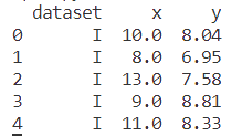
penguins = sns.load_dataset("penguins",cache=True,data_home=r"./seaborn-data")
print(penguins.head())案例1-回归拟合
sns.regplot(x="total_bill", y="tip", data=tips)
sns.lmplot(x="total_bill", y="tip", data=tips)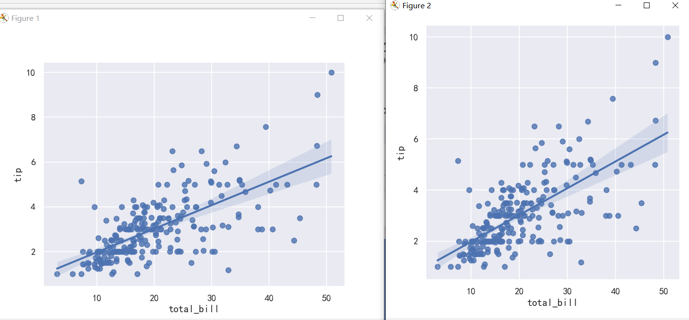
It’s possible to fit a linear regression when one of the variables takes discrete values, however, the simple scatterplot produced by this kind of dataset is often not optimal: 当其中一个变量取离散值时,有可能拟合线性回归,然而,这种数据集产生的简单散点图通常不是最优的:
sns.lmplot(x="size", y="tip", data=tips);
sns.lmplot(x="size", y="tip", data=tips, x_jitter=.05);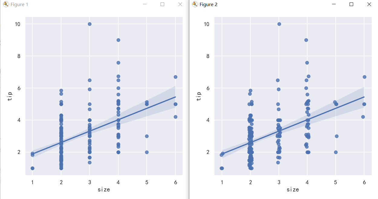
案例2-适合不同模型的拟合-Anscombe的四重奏数据集
scatter_kws参数控制颜色,透明度,点的大小 ci 回归估计的置信区间大小。这将使用回归线周围的半透明带绘制。使用自举法估计置信区间;对于大型数据集,建议通过将该参数设置为None来避免计算。
sns.lmplot(x="x", y="y", data=anscombe.query("dataset == 'I'"),ci=None, scatter_kws={"s": 80})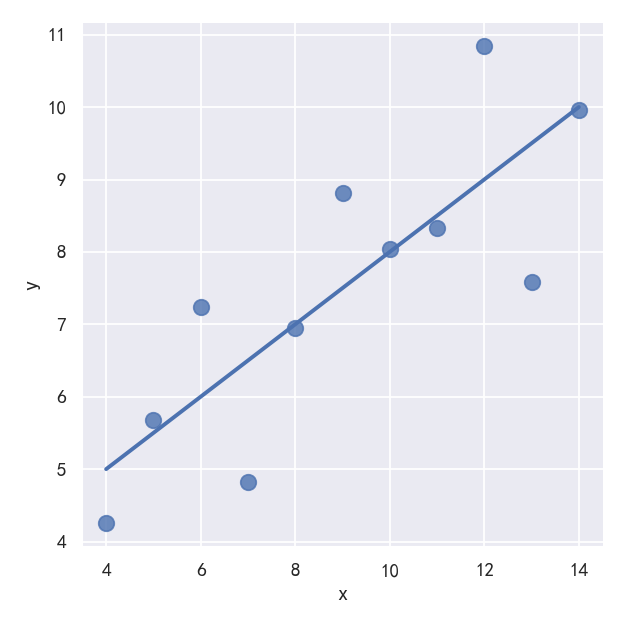
The linear relationship in the second dataset is the same, but the plot clearly shows that this is not a good model: 第二个数据集中的线性关系是相同的,但图表清楚地表明这不是一个好的模型:
sns.lmplot(x="x", y="y", data=anscombe.query("dataset == 'II'"),ci=None, scatter_kws={"s": 80})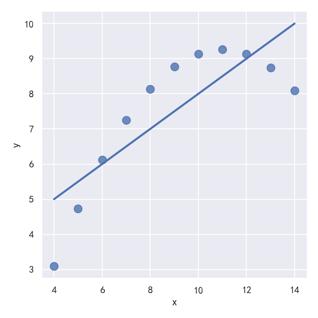
In the presence of these kind of higher-order relationships, lmplot() and regplot() can fit a polynomial regression model to explore simple kinds of nonlinear trends in the dataset: 在这些高阶关系的存在下,lmplot()和regplot()可以拟合一个多项式回归模型来探索数据集中简单的非线性趋势: order参数: If order is greater than 1, use numpy.polyfit to estimate a polynomial regression. 如果order大于1,则使用numpy.Polyfit来估计一个多项式回归。 参考:https://blog.csdn.net/lishiyang0902/article/details/127652317
# sns.lmplot(x="x", y="y", data=anscombe.query("dataset == 'II'"),ci=None, scatter_kws={"s": 80})
sns.lmplot(x="x", y="y", data=anscombe.query("dataset == 'II'"),order=2, ci=None, scatter_kws={"s": 80})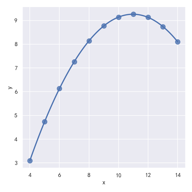
A different problem is posed by “outlier” observations that deviate for some reason other than the main relationship under study: 一个不同的问题是由“异常值”观测造成的,这些观测由于某种原因偏离了所研究的主要关系: In the presence of outliers, it can be useful to fit a robust regression, which uses a different loss function to downweight relatively large residuals: 在存在异常值的情况下,拟合稳健(robust )回归是有用的,它使用不同的损失函数来降低相对较大的残差: robust参数: If True, use statsmodels to estimate a robust regression. This will de-weight outliers. Note that this is substantially more computationally intensive than standard linear regression, so you may wish to decrease the number of bootstrap resamples (n_boot) or set ci to None. 如果为真,则使用统计模型来估计稳健回归。这将降低异常值的权重。注意,这比标准线性回归的计算量要大得多,因此您可能希望减少引导重采样(n_boot)的数量或将ci设置为None。
sns.lmplot(x="x", y="y", data=anscombe.query("dataset == 'III'"),ci=None, scatter_kws={"s": 80})
sns.lmplot(x="x", y="y", data=anscombe.query("dataset == 'III'"),robust=True, ci=None, scatter_kws={"s": 80})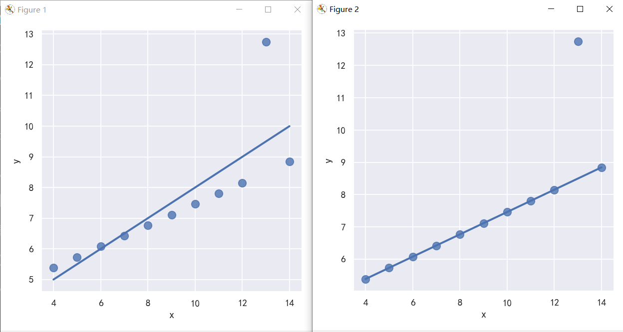
案例3-y值为离散值的线性拟合-参数logistic
tips["big_tip"] = (tips.tip / tips.total_bill) > .15
print(tips.head())When the y variable is binary, simple linear regression also “works” but provides implausible predictions: 当y变量是二进制时,简单线性回归也“有效”,但提供了令人难以置信的预测 The solution in this case is to fit a logistic regression, such that the regression line shows the estimated probability of y = 1 for a given value of x: 这种情况下的解决方案是拟合一个逻辑回归,这样回归线显示了给定x值y = 1的估计概率:
sns.lmplot(x="total_bill", y="big_tip", data=tips, y_jitter=.03)
sns.lmplot(x="total_bill", y="big_tip", data=tips,logistic=True, y_jitter=.03)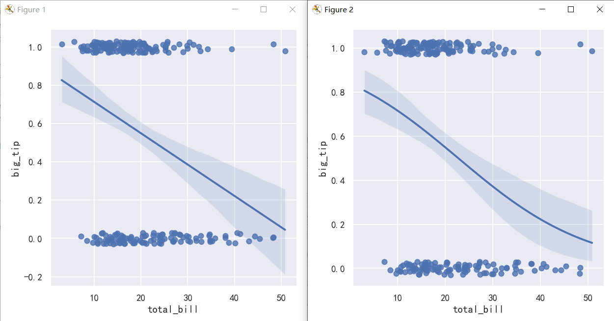
案例4-The residplot() function
参考:http://seaborn.pydata.org/generated/seaborn.residplot.html#seaborn.residplot
The residplot() function can be a useful tool for checking whether the simple regression model is appropriate for a dataset. It fits and removes a simple linear regression and then plots the residual values for each observation. Ideally, these values should be randomly scattered around y = 0: residplot()函数是检查简单回归模型是否适合数据集的有用工具。它拟合并移除一个简单的线性回归,然后绘制每个观测值的残差值。理想情况下,这些值应该随机分布在y = 0附近: If there is structure in the residuals, it suggests that simple linear regression is not appropriate: 如果残差中存在结构,则表明简单线性回归不合适:
fig,axes = plt.subplots(1,2)
fig.set_figheight(8)
fig.set_figwidth(16)
sns.residplot(x="x", y="y", data=anscombe.query("dataset == 'I'"),scatter_kws={"s": 80},ax=axes[0])
sns.residplot(x="x", y="y", data=anscombe.query("dataset == 'II'"),scatter_kws={"s": 80},ax=axes[1])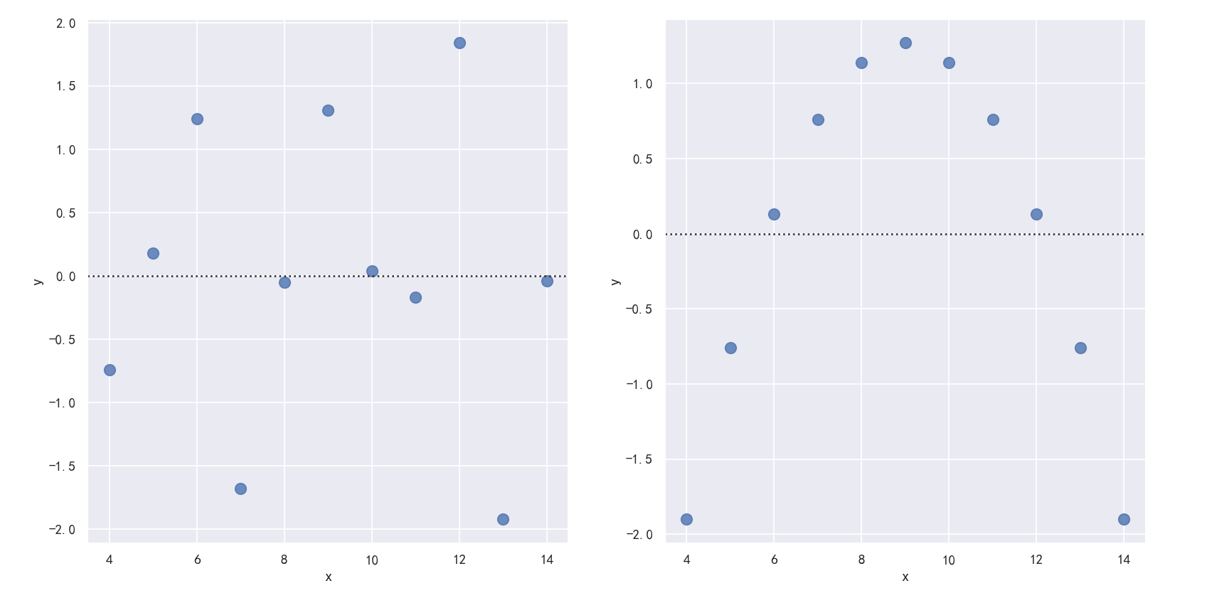
案例5-多变量的拟合回归
The plots above show many ways to explore the relationship between a pair of variables. Often, however, a more interesting question is “how does the relationship between these two variables change as a function of a third variable?” This is where the main differences between regplot() and lmplot() appear. While regplot() always shows a single relationship, lmplot() combines regplot() with FacetGrid to show multiple fits using hue mapping or faceting. 上面的图表显示了探索一对变量之间关系的许多方法。然而,一个更有趣的问题通常是“这两个变量之间的关系如何作为第三个变量的函数而变化?”这就是regplot()和lmplot()之间的主要区别所在。regplot()总是显示单个关系,而lmplot()将regplot()与FacetGrid结合起来,使用色调映射或面形显示多个拟合。 The best way to separate out a relationship is to plot both levels on the same axes and to use color to distinguish them: 区分关系的最佳方法是在同一轴上绘制两个层次,并使用颜色来区分它们: Unlike relplot(), it’s not possible to map a distinct variable to the style properties of the scatter plot, but you can redundantly code the hue variable with marker shape: lmplot不像relplot(),lmplot不可能将一个不同的变量映射到散点图的样式属性,但是你可以用标记形状冗余地编码色调变量:
参数markers=["o", "x"], palette="Set1"To add another variable, you can draw multiple “facets” with each level of the variable appearing in the rows or columns of the grid: 要添加另一个变量,您可以绘制多个“facet”,每个级别的变量出现在网格的行或列中:col参数
sns.lmplot(x="total_bill", y="tip", hue="smoker", data=tips)
sns.lmplot(x="total_bill", y="tip", hue="smoker",markers=["o", "x"], palette="Set1",col="time", row="sex", data=tips, height=3)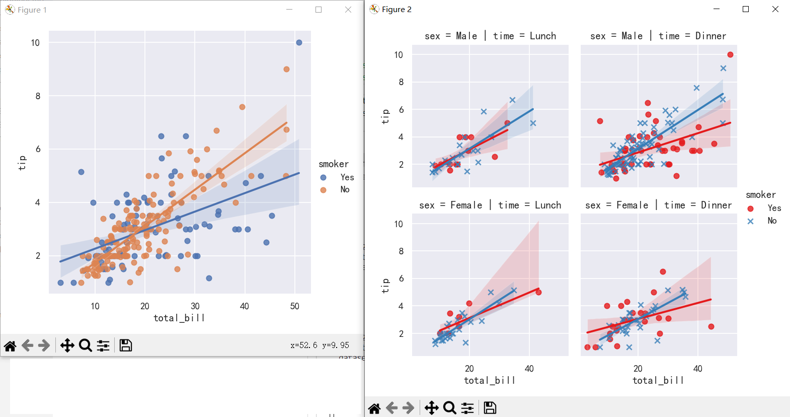
案例6-在其他上下文中绘制回归图Plotting a regression in other contexts
sns.jointplot(x="total_bill", y="tip", data=tips, kind="reg")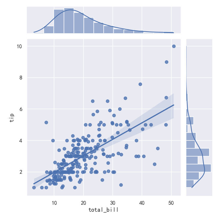
sns.pairplot(tips, x_vars=["total_bill", "size"], y_vars=["tip"],hue="smoker", height=5, aspect=.8, kind="reg")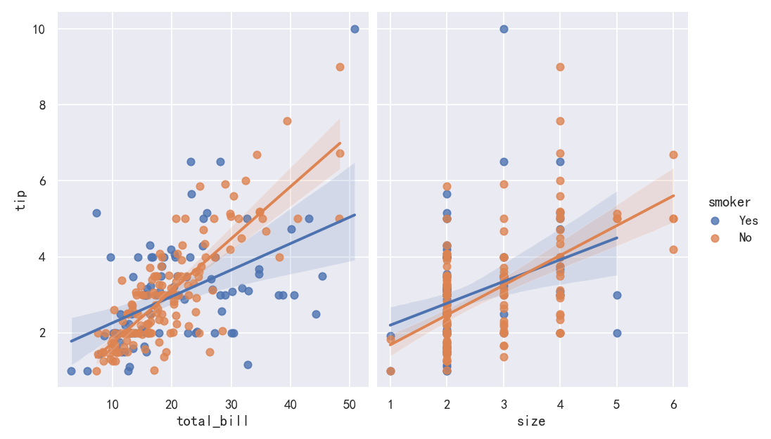
seaborn从入门到精通03-绘图功能实现05-构建结构化的网格绘图
总结
本文主要是seaborn从入门到精通系列第3篇,本文介绍了seaborn的绘图功能实现,本文是FacetGrid和PairGrid部分,同时介绍了较好的参考文档置于博客前面,读者可以重点查看参考链接。本系列的目的是可以完整的完成seaborn从入门到精通。重点参考连接
参考
【宝藏级】全网最全的Seaborn详细教程-数据分析必备手册(2万字总结)
FacetGrid
导入库与查看tips和diamonds 数据
import numpy as np
import pandas as pd
import matplotlib.pyplot as plt
import matplotlib as  mpl
import seaborn as sns
sns.set_theme(style="darkgrid")

mpl.rcParams['font.sans-serif']=['SimHei']
mpl.rcParams['axes.unicode_minus']=False

tips = sns.load_dataset("tips",cache=True,data_home=r"./seaborn-data")
tips.head()diamonds = sns.load_dataset("diamonds",cache=True,data_home=r"./seaborn-data")
print(diamonds.head())anscombe = sns.load_dataset("anscombe",cache=True,data_home=r"./seaborn-data")
print(anscombe.head())penguins = sns.load_dataset("penguins",cache=True,data_home=r"./seaborn-data")
print(penguins.head())iris = sns.load_dataset("iris",cache=True,data_home=r"./seaborn-data")
print(iris.head())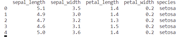
构建网格多子图-Building structured multi-plot grids
When exploring multi-dimensional data, a useful approach is to draw multiple instances of the same plot on different subsets of your dataset. This technique is sometimes called either “lattice” or “trellis” plotting, and it is related to the idea of “small multiples”. It allows a viewer to quickly extract a large amount of information about a complex dataset. Matplotlib offers good support for making figures with multiple axes; seaborn builds on top of this to directly link the structure of the plot to the structure of your dataset. 在研究多维数据时,一种有用的方法是在数据集的不同子集上绘制同一图表的多个实例。这种技术有时被称为“格子”或“格子”绘图,它与“小倍数”的思想有关。它允许查看者快速提取关于复杂数据集的大量信息。Matplotlib为制作多轴图形提供了良好的支持;Seaborn在此基础上构建,直接将图的结构链接到数据集的结构。 The figure-level functions are built on top of the objects discussed in this chapter of the tutorial. In most cases, you will want to work with those functions. They take care of some important bookkeeping that synchronizes the multiple plots in each grid. This chapter explains how the underlying objects work, which may be useful for advanced applications. 图形级函数构建在本章教程中讨论的对象之上。在大多数情况下,您将希望使用这些函数。它们负责一些重要的簿记,使每个网格中的多个图同步。本章解释了底层对象是如何工作的,这可能对高级应用程序很有用。
案例1-多个小子图-FacetGrid
The FacetGrid class is useful when you want to visualize the distribution of a variable or the relationship between multiple variables separately within subsets of your dataset. A FacetGrid can be drawn with up to three dimensions: row, col, and hue. The first two have obvious correspondence with the resulting array of axes; think of the hue variable as a third dimension along a depth axis, where different levels are plotted with different colors. 当您希望在数据集的子集中分别可视化变量的分布或多个变量之间的关系时,FacetGrid类非常有用。FacetGrid最多可以用三个维度绘制:row, col, and hue。前两个与得到的轴数组有明显的对应关系;可以将色调变量看作是沿着深度轴的第三维度,其中不同的层次用不同的颜色绘制。 Each of relplot(), displot(), catplot(), and lmplot() use this object internally, and they return the object when they are finished so that it can be used for further tweaking. relplot()、displot()、catplot()和lmplot()中的每一个都在内部使用该对象,并在完成时返回该对象,以便用于进一步调整。
g = sns.FacetGrid(tips, col="time")
按照col和row进行网格布局:
g=sns.FacetGrid(tips, col="time", row="sex")
Initializing the grid like this sets up the matplotlib figure and axes, but doesn’t draw anything on them. 像这样初始化网格会设置matplotlib图和轴,但不会在上面绘制任何东西。 The main approach for visualizing data on this grid is with the FacetGrid.map() method. Provide it with a plotting function and the name(s) of variable(s) in the dataframe to plot. Let’s look at the distribution of tips in each of these subsets, using a histogram: 在这个网格上可视化数据的主要方法是使用FacetGrid.map()方法。为它提供一个绘图函数和数据框架中要绘图的变量名。让我们用直方图来看看小费在每个子集中的分布情况:
g=sns.FacetGrid(tips, col="time", row="sex")
g.map(sns.histplot, "tip")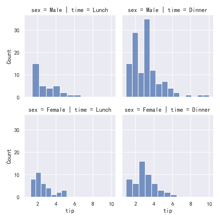
This function will draw the figure and annotate the axes, hopefully producing a finished plot in one step. To make a relational plot, just pass multiple variable names. You can also provide keyword arguments, which will be passed to the plotting function: 这个函数将绘制图形并注释坐标轴,希望在一个步骤中生成一个完整的图形。要制作关系图,只需传递多个变量名。你也可以提供关键字参数,这些参数将被传递给绘图函数:
g = sns.FacetGrid(tips, col="sex", hue="smoker")
g.map(sns.scatterplot, "total_bill", "tip", alpha=.7)
g.add_legend()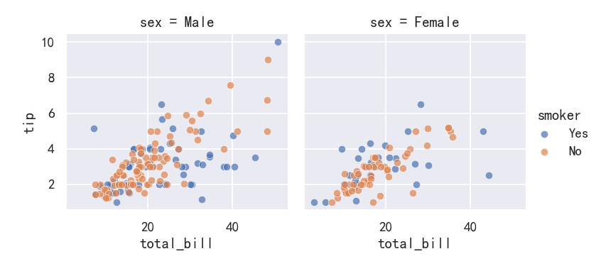
案例2-绘制成对数据关系Plotting pairwise data relationships
It’s important to understand the differences between a FacetGrid and a PairGrid. In the former, each facet shows the same relationship conditioned on different levels of other variables. In the latter, each plot shows a different relationship (although the upper and lower triangles will have mirrored plots). Using PairGrid can give you a very quick, very high-level summary of interesting relationships in your dataset. 理解FacetGrid和PairGrid之间的区别是很重要的。在前者中,每个方面都表现出相同的关系,条件是其他变量的不同水平。在后者中,每个图都显示了不同的关系(尽管上三角形和下三角形将有镜像图)。使用PairGrid可以非常快速、非常高级地总结数据集中有趣的关系。
g = sns.PairGrid(iris,y_vars=["sepal_length","sepal_width","petal_length","petal_width"],
                  x_vars=["sepal_length","sepal_width","petal_length","petal_width"], hue="species")
g.map_upper(sns.scatterplot)
g.map_lower(sns.kdeplot)
g.map_diag(sns.kdeplot, lw=3, legend=False)
g.add_legend()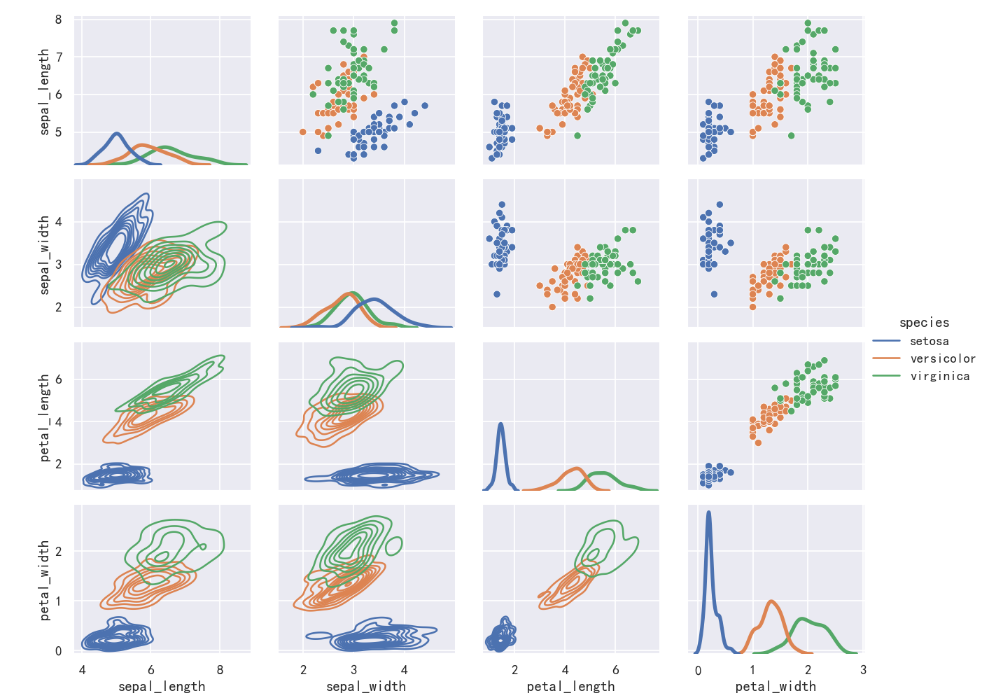
腾讯云开发者
