比较(三)利用python绘制词云图

比较(三)利用python绘制词云图
词云图(Wordcloud)简介
词云图主要用来可视化文本数据,通常以大小和位置表示关键字的频率,以此来比较不同关键词的重要程度。
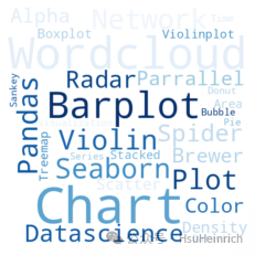
快速绘制
基于wordcloud
from wordcloud import WordCloud
import matplotlib.pyplot as plt

# 自定义文本数据
text=("Python Python Python Matplotlib Matplotlib Seaborn Network Plot Violin Chart Pandas Datascience Wordcloud Spider Radar Parrallel Alpha Color Brewer Density Scatter Barplot Barplot Boxplot Violinplot Treemap Stacked Area Chart Chart Visualization Dataviz Donut Pie Time-Series Wordcloud Wordcloud Sankey Bubble")

# 创建wordcloud对象
wordcloud = WordCloud(width=480, height=480).generate(text)

plt.imshow(wordcloud, interpolation='bilinear')
plt.axis("off")
plt.margins(x=0, y=0)
plt.show()
定制多样化的词云图
自定义词云图一般是结合使用场景对相关参数进行修改,并辅以其他的绘图知识。参数信息可以通过官网进行查看,其他的绘图知识则更多来源于实战经验,大家不妨将接下来的绘图作为一种学习经验,以便于日后总结。
wordcloud主要利用WordCloud绘制词云图,可以通过wordcloud.WordCloud[1]了解更多用法
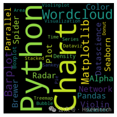
修改参数
from wordcloud import WordCloud
import matplotlib.pyplot as plt

# 自定义文本数据
text=("Python Python Python Matplotlib Matplotlib Seaborn Network Plot Violin Chart Pandas Datascience Wordcloud Spider Radar Parrallel Alpha Color Brewer Density Scatter Barplot Barplot Boxplot Violinplot Treemap Stacked Area Chart Chart Visualization Dataviz Donut Pie Time-Series Wordcloud Wordcloud Sankey Bubble")

# 创建wordcloud对象
wordcloud = WordCloud(
                width=480,
                height=480,
                max_font_size=100, # 最大字体
                min_font_size=10, # 最小字体
                max_words=30, # 最大词数量
                stopwords=["Python", "Matplotlib"], # 设置停用词
                background_color="white", # 设置背景色
                colormap="Blues" # 单词颜色
         ).generate(text)

plt.imshow(wordcloud, interpolation='bilinear')
plt.axis("off")
plt.margins(x=0, y=0)
plt.show()
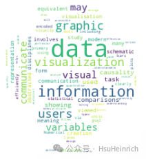
自定义形状
from wordcloud import WordCloud
import matplotlib.pyplot as plt
import numpy as np
from PIL import Image
# 自定义文本数据
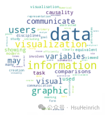
text=("Data visualization or data visualisation is viewed by many disciplines as a modern equivalent of visual communication. It involves the creation and study of the visual representation of data, meaning information that has been abstracted in some schematic form, including attributes or variables for the units of information A primary goal of data visualization is to communicate information clearly and efficiently via statistical graphics, plots and information graphics. Numerical data may be encoded using dots, lines, or bars, to visually communicate a quantitative message.[2] Effective visualization helps users analyze and reason about data and evidence. It makes complex data more accessible, understandable and usable. Users may have particular analytical tasks, such as making comparisons or understanding causality, and the design principle of the graphic (i.e., showing comparisons or showing causality) follows the task. Tables are generally used where users will look up a specific measurement, while charts of various types are used to show patterns or relationships in the data for one or more variables")
# 设置图片用以自定义形状
pic_mask = np.array(Image.open("wordcloud/python.jpeg"))
# 创建wordcloud对象
wordcloud = WordCloud(mask=pic_mask, background_color='white').generate(text)
plt.imshow(wordcloud, interpolation="bilinear")
plt.axis("off")
plt.margins(x=0, y=0)
plt.show()
总结
以上通过wordcloud的WordCloud快速绘制词云图,并通过其他绘图知识自定义各种各样的词云图来适应相关使用场景。
共勉~
参考资料
[1]
wordcloud.WordCloud: https://amueller.github.io/word_cloud/generated/wordcloud.WordCloud.html
本文参与 腾讯云自媒体同步曝光计划,分享自微信公众号。
原始发表:2024-06-17,如有侵权请联系 cloudcommunity@tencent.com 删除
评论
登录后参与评论
推荐阅读
目录
腾讯云开发者
