如何创建完整的圆形LinearLayout或RelativeLayout
我正在尝试创建一个完整的循环布局,以便如果我将任何内容放入该布局中。内容应该在圆圈内。这怎么可能?我试过以下方法。但它的形状并非一直都是圆形的。有时它会变成椭圆形,这取决于空间。如何始终保持布局的循环和内容应该在它里面?
<LinearLayout
            android:id="@+id/zodiac_Layout"
            android:layout_width="100dp"
            android:layout_height="100dp"
            android:orientation="vertical"
            android:background="@drawable/circular_background">

            <ImageView
                android:id="@+id/zodiac_img"
                android:layout_width="match_parent"
                android:layout_height="match_parent"
                android:layout_marginRight="2dp"
                android:adjustViewBounds="true"
                android:src="@drawable/sunrise" />

            <TextView
                android:id="@+id/zodiac_name"
                android:layout_width="wrap_content"
                android:layout_height="wrap_content"
                android:layout_gravity="center"
                android:layout_marginLeft="5dp"
                android:text="@string/na"
                android:textColor="#fff"
                android:textSize="@dimen/nakshatra_text_size" />
</LinearLayout>这是circular_background.xml
<?xml version="1.0" encoding="utf-8"?>
<shape xmlns:android="http://schemas.android.com/apk/res/android"
    android:shape="oval">
    <solid android:color="#50514F"/>
    <size android:width="5dp"
        android:height="5dp"/>
</shape>如果我做了ImageView match_parent呢。它是从布局的圆圈形状出来的。我希望内容沿着布局的圆形裁剪。

回答 1
Stack Overflow用户
发布于 2017-10-27 02:25:37
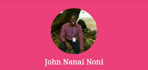
因为我们在评论中已经聊过了。现在我知道你真正想要的是你的ImageView和一个TextView的循环裁剪。因此,经过一项专门的工作之后,我决定形成一个输出的解决方案,如下图所示:
。
不用担心textView,你可以在任何地方定位它。即使是在图像的顶端!并改变它的大小!
首先,您必须知道在这方面没有默认实现,这意味着在android中没有提供循环裁剪视图的默认视图类。下面是使用XML 解决这个问题的两个替代方案!
优先选择(最佳选择)
我们将使用一个FrameLayout,它是一个在彼此之上添加视图的布局。这意味着,如果你把第一个,那么第二个将是顶部的第一个等等。
Requirements
- 要在圆形视图中很好地匹配图像,则应该是平方(这是逻辑的),所以我们需要设置宽度和高度相等的值。
- 我们将需要一个圆型与笔画(想法是把它放在一个精心计算的视图大小!)
在drawable文件夹中创建一个名为circular_image_crop.xml的文件。然后粘贴代码(不用担心稍后会描述的!)不要忘了阅读其中的评论:
<?xml version="1.0" encoding="utf-8"?>
 <shape xmlns:android="http://schemas.android.com/apk/res/android"
       android:shape="oval">
  <solid android:color="#00ffffff"/>
   <!--The above colour is completely transparent!-->
  <stroke android:width="20dp" android:color="#ec407a" />
  <size android:width="140dp" android:height="140dp"/>
</shape>创建该drawable文件后,我们将不得不使我们的FrameLayout (此框架布局不是任何视图的根视图,只需将其复制到您想要显示该布局的任何视图中),继续粘贴下面的代码(稍后我们将解释它!)再读一遍其中的评论:
<FrameLayout
        android:layout_width="match_parent"
        android:layout_height="wrap_content"
        android:background="#ec407a">

        <!-- This is our framelayout! Notice our background color is the same as the one in the stroke of our drawable. Also this is your image view notice the it has width and height similar (square) do use match parent or wrap content just define a square and views will be position by adjust view bounds true-->

        <ImageView
            android:id="@+id/image_view_user_profile_image"
            android:layout_width="100dp"
            android:layout_height="100dp"
            android:layout_gravity="center_horizontal"
            android:layout_marginTop="20dp"
            android:adjustViewBounds="true"
            android:contentDescription="@string/your_image_description"
            android:src="@drawable/your_image" />

        <!-- Ooh here we have another image! This is an image just for displaying our drawable and crop our image (how?? dont worry!) -->

        <ImageView
            android:layout_width="140dp"
            android:layout_height="140dp"
            android:layout_gravity="center_horizontal"
            android:contentDescription="@string/also_your_image_description_if_any"
            android:src="@drawable/circular_image_crop" />
        <!--This text view we almost forget here it is!-->
        <TextView
            android:id="@+id/your_text_view_id"
            android:layout_width="match_parent"
            android:layout_height="wrap_content"
            android:layout_gravity="bottom"
            android:layout_marginBottom="8dp"
            android:layout_marginTop="125dp"
            android:gravity="center"
            android:text="John Nanai Noni"
            android:textColor="#ffffff"
            android:textSize="16sp"
            android:textStyle="bold" />
    </FrameLayout>
如何工作和自定义!?
好的是,我们使用我们的框架布局和位置,我们的真正的看法在中心水平(方形图像)。我们制作了我们的drawable,这是一个圆形的,并且在中心有一个圆形的洞(空间),与的高度和我们的图片相匹配。最后,我们添加文本视图,并将其放在所有文本的顶部,但放在底部(不应该模糊图像,对吗?)
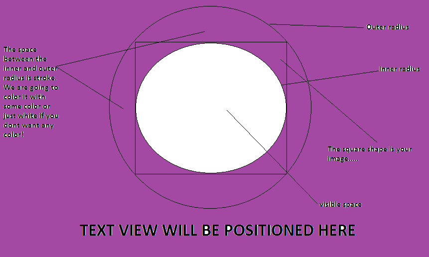
因此,我们理解这一点的方法是将下面的图像作为大纲来查看needed.(dont认为它的complicated):是什么
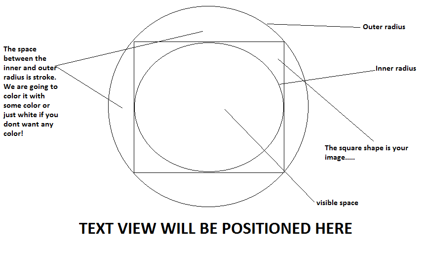
,所以从那里我们可以看到它是如何在中间的图像上进行的,圆形的作物等等,
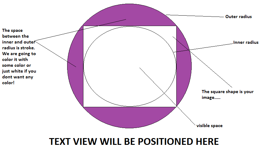
下一阶段:
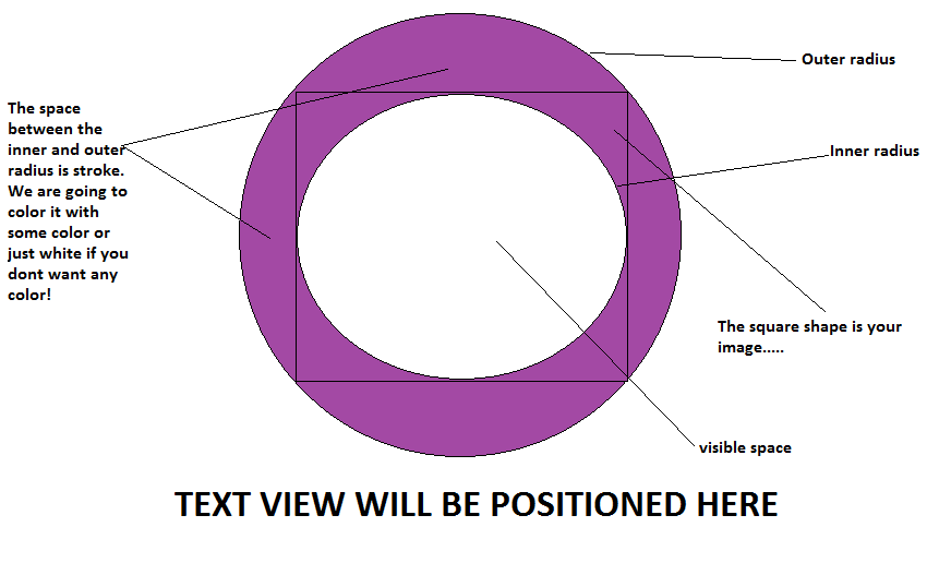
从开始,我们可以在整个布局(FrameLayout)中应用相同的背景颜色来隐藏圆形的东西,并留下我们自己的可见空间。
是的,我们已经完成了我们的布局!那定制呢。
Customization
对于颜色,你可以把你自己的颜色在任何地方的FrameLayout背景,以及笔画的可绘制。但是不要改变<solid>的颜色,它应该永远是完全透明的。
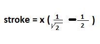
为了定制圆形作物的半径,让我们挖掘它的数学公式,计算出图像的覆盖范围!
数学
让您的图像的
width或height(图像是正方形的,记住)是x dps。那么drawable中的值是 stroke= 0.2071 * x 尺寸(高度和宽度)=笔画+ x 您可以2或3 dps消除截断错误!
实际上,后面的数学是基于下面的公式。如果您对下面的评论感兴趣,则此公式有效:
第二代
我认为对不关心圆形视图之间的空间的人来说,另一种选择是在CardView中创建ImageView,并使拐角半径half达到CardView的大小,例如,下面的代码:
<?xml version="1.0" encoding="utf-8"?>
<android.support.v7.widget.CardView
      xmlns:android="http://schemas.android.com/apk/res/android"
      xmlns:app="http://schemas.android.com/apk/res-auto"
    android:layout_width="280dp"
    android:layout_height="280dp"
    android:layout_gravity="center_horizontal"
    android:layout_margin="30dp"
    app:cardCornerRadius="140dp"
    app:cardElevation="12dp">

    <ImageView
        android:layout_width="200dp"
        android:layout_height="200dp"
        android:layout_gravity="center"
        android:adjustViewBounds="true"
        android:src="@drawable/login_back_ground" />

 </android.support.v7.widget.CardView>
这是我在android中获得的输出。而且,我也不能保证这将是什么样子,在各种设备,特别是旧的!

结论
这两种方法都是好的和有用的。理解这两者甚至会导致更多的定制,比如使用第一种选择和第二种方法来实现定制,比如添加圆形图像的高度。但是第一种方法适用于日常使用,它也给所有android设备带来了同样的体验。
我希望这将帮助未来的用户谁可能有同样的问题。
https://stackoverflow.com/questions/46972667
复制
![LeetCode 0139. 单词拆分[动态规划详解]](https://ask.qcloudimg.com/article-cover-image/3480372/thr3jr8k7b.jpg)
![LeetCode 0140. 单词拆分 II[动态规划详解]](https://ask.qcloudimg.com/article-cover-image/3480372/pvb2aae37t.jpg)


腾讯云开发者
