比较(八)利用python绘制指示器

比较(八)利用python绘制指示器
指示器(Indicators)简介
1
指示器是一系列相关图的统称,主要用于突出展示某一变量的实际值与目标值的差异,例如常见的数据delta、仪表盘、子弹图、水滴图等。
快速绘制
基于plotly
更多用法可参考Indicators in Python[1]
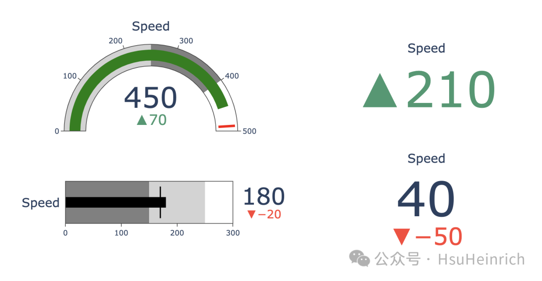
import plotly.graph_objects as go

fig = go.Figure()

# 自定义仪表盘
fig.add_trace(go.Indicator(
    domain = {'row': 0, 'column': 0},
    value = 450,
    mode = "gauge+number+delta",
    title = {'text': "Speed"},
    delta = {'reference': 380},
    gauge = {'axis': {'range': [None, 500]},
             'steps' : [
                 {'range': [0, 250], 'color': "lightgray"},
                 {'range': [250, 400], 'color': "gray"}],
             'threshold' : {'line': {'color': "red", 'width': 4}, 'thickness': 0.75, 'value': 490}}))

# 自定义子弹图
fig.add_trace(go.Indicator(
    domain = {'x': [0.05, 0.5], 'y': [0.15, 0.35]},
    mode = "number+gauge+delta", value = 180,
    delta = {'reference': 200},
    gauge = {
        'shape': "bullet",
        'axis': {'range': [None, 300]},
        'threshold': {
            'line': {'color': "black", 'width': 2},
            'thickness': 0.75,
            'value': 170},
        'steps': [
            {'range': [0, 150], 'color': "gray"},
            {'range': [150, 250], 'color': "lightgray"}],
        'bar': {'color': "black"}}))

# 基本delta
fig.add_trace(go.Indicator(
    domain = {'row': 0, 'column': 1},
    mode = "delta",
    value = 300,
    ))

# 自定义delta
fig.add_trace(go.Indicator(
    domain = {'row': 1, 'column': 1},
    mode = "number+delta",
    value = 40,
    ))

fig.update_layout(
    grid = {'rows': 2, 'columns': 2, 'pattern': "independent"},
    template = {'data' : {'indicator': [{
        'title': {'text': "Speed"},
        'mode' : "number+delta+gauge",
        'delta' : {'reference': 90}}]
                         }})
2
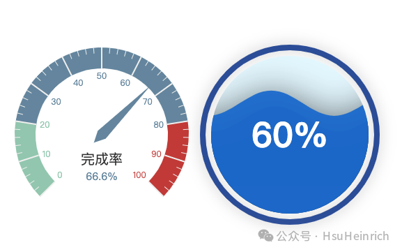
基于pyecharts
仪表盘只能居中,无法改变位置。水球图可以通过center参数改变位置。 更多用法可以参考pyecharts-gallery[2]
from pyecharts import options as opts
from pyecharts.charts import Gauge, Liquid, Grid, Page

# 创建仪表盘图表
g = (
    Gauge()
    .add("基本仪表盘", [("完成率", 66.6)],
         title_label_opts=opts.GaugeTitleOpts(font_size=20,
                         offset_center=[0,35]),
         detail_label_opts=opts.GaugeDetailOpts(formatter='{value}%',
                         offset_center=[0,60]),
         radius="50%")
    .set_global_opts(
        legend_opts=opts.LegendOpts(is_show=False),
        tooltip_opts=opts.TooltipOpts(is_show=True, formatter="{a} <br/>{b} : {c}%")
    )
)

# 创建水球图
c = (
    Liquid()
    .add("lq", [0.6, 0.7], center=["80%", "50%"])
)


# 在一个页面中显示两个图表,调整每个图的宽度
grid = (
    Grid()
    .add(g, grid_opts=opts.GridOpts(pos_left="10%", pos_right="55%"))
    .add(c, grid_opts=opts.GridOpts(pos_left="60%", pos_right="10%"))
)


grid.render_notebook()
3
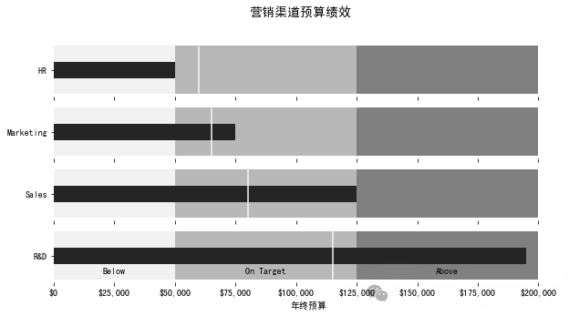
基于matplotlib
参考:Building a Bullet Graph in Python[3]
# 创建子弹图的函数
def bulletgraph(data=None, limits=None, labels=None, axis_label=None, title=None,
                size=(5, 3), palette=None, formatter=None, target_color="gray",
                bar_color="black", label_color="gray"):
    '''
    data: 需要绘制的数据,通常是一个二维列表,列表的元素为三元组,分别表示图例、目标值和实际值。例如:[["图例A", 60, 75]]
    limits: 子弹图的分段标准,例如:[20, 60, 100] 表示图形将被分成 <20, 20-60, >60-100 这几个区段
    labels: 子弹图中每个区段的名称
    axis_label: x轴的标签
    title: 图形标题
    size: 图形大小
    palette: 子弹图的颜色板
    formatter: 用于格式化x轴刻度的格式器
    target_color: 目标值线条的颜色,默认是灰色
    bar_color: 实际值条形的颜色,默认黑色
    label_color: 标签文本颜色,默认灰色
    '''
    # 确定最大值来调整条形图的高度(除以10似乎效果不错)
    h = limits[-1] / 10

    # 默认使用sns的绿色调色板
    if palette is None:
        palette = sns.light_palette("green", len(limits), reverse=False)

    # 如果只有一组数据,创建一个子图;否则,根据数据的数量创建多个子图
    if len(data) == 1:
        fig, ax = plt.subplots(figsize=size, sharex=True)
    else:
        fig, axarr = plt.subplots(len(data), figsize=size, sharex=True)

    # 针对每个子图,添加一个子弹图条形
    for idx, item in enumerate(data):

        # 从创建的子图数组中获取轴对象
        if len(data) > 1:
            ax = axarr[idx]

        # 格式设置,移除多余的标记杂项
        ax.set_aspect('equal')
        ax.set_yticks([1])
        ax.set_yticklabels([item[0]])
        ax.spines['bottom'].set_visible(False)
        ax.spines['top'].set_visible(False)
        ax.spines['right'].set_visible(False)
        ax.spines['left'].set_visible(False)

        prev_limit = 0
        # 画出各个区段的柱形图
        for idx2, lim in enumerate(limits):
            ax.barh([1], lim - prev_limit, left=prev_limit, height=h,
                    color=palette[idx2])
            prev_limit = lim
        rects = ax.patches
        # 画出表示实际值的条形图
        ax.barh([1], item[1], height=(h / 3), color=bar_color)

        # 计算y轴的范围,确保目标线条的长度适应
        ymin, ymax = ax.get_ylim()
        # 画出表示目标值的线条
        ax.vlines(item[2], ymin * .9, ymax * .9, linewidth=1.5, color=target_color)

    # 添加标签
    if labels is not None:
        for rect, label in zip(rects, labels):
            height = rect.get_height()
            ax.text(rect.get_x() + rect.get_width() / 2, -height * .4, label,
                        ha='center', va='bottom', color=label_color)
    # 设置x轴刻度的格式
    if formatter:
        ax.xaxis.set_major_formatter(formatter)
    # 设置x轴的标签
    if axis_label:
        ax.set_xlabel(axis_label)
    # 设置子图的标题
    if title:
        fig.suptitle(title, fontsize=14)
    # 调整子图之间的间隔
    fig.subplots_adjust(hspace=0)
import matplotlib.pyplot as plt
import seaborn as sns
from matplotlib.ticker import FuncFormatter
import matplotlib as mpl

plt.rcParams['font.sans-serif'] = ['SimHei'] # 用来正常显示中文标签

# 格式化为货币
def money(x, pos):
    return "${:,.0f}".format(x)
# 通过自定义函数格式化刻度值
money_fmt = FuncFormatter(money)

# 自定义数据
data = [("HR", 50000, 60000),
                 ("Marketing", 75000, 65000),
                 ("Sales", 125000, 80000),
                 ("R&D", 195000, 115000)]
# 自定义颜色
palette = sns.light_palette("grey", 3, reverse=False)

# 绘制子弹图
bulletgraph(data, limits=[50000, 125000, 200000],
            labels=["Below", "On Target", "Above"], size=(10,5),
            axis_label="年终预算", label_color="black",
            bar_color="#252525", target_color='#f7f7f7', palette=palette,
            title="营销渠道预算绩效",
            formatter=money_fmt)
4
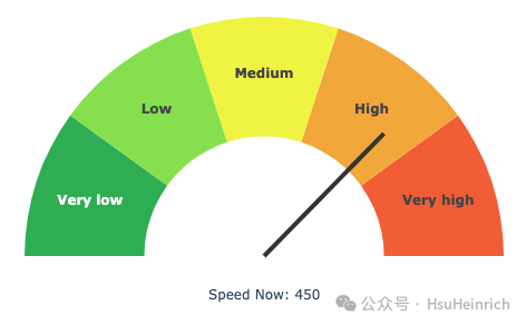
定制多样化的指示器
参考:Gauge Chart with Python[4]
利用plotly模拟仪表盘
import plotly.graph_objects as go
import numpy as np

plot_bgcolor = "white"
quadrant_colors = [plot_bgcolor, "#f25829", "#f2a529", "#eff229", "#85e043", "#2bad4e"]
quadrant_text = ["", "<b>Very high</b>", "<b>High</b>", "<b>Medium</b>", "<b>Low</b>", "<b>Very low</b>"]
n_quadrants = len(quadrant_colors) - 1

current_value = 450
min_value = 0
max_value = 600
# 指针长度
hand_length = np.sqrt(2) / 4
# 指针角度
hand_angle = np.pi * (1 - (max(min_value, min(max_value, current_value)) - min_value) / (max_value - min_value))

fig = go.Figure(
    data=[
        # 半圆型饼图构造仪表盘
        go.Pie(
            values=[0.5] + (np.ones(n_quadrants) / 2 / n_quadrants).tolist(),
            rotation=90,
            hole=0.5,
            marker_colors=quadrant_colors,
            text=quadrant_text,
            textinfo="text",
            hoverinfo="skip",
        ),
    ],
    layout=go.Layout(
        showlegend=False,
        margin=dict(b=0,t=10,l=10,r=10),
        width=450,
        height=450,
        paper_bgcolor=plot_bgcolor,
        # 注释
        annotations=[
            go.layout.Annotation(
                text=f"Speed Now: {current_value}",
                x=0.5, xanchor="center", xref="paper",
                y=0.4, yanchor="bottom", yref="paper",
                showarrow=False,
            )
        ],
        # 指针
        shapes=[
            # 圆点
            go.layout.Shape(
                type="circle",
                x0=0.48, x1=0.48,
                y0=0.52, y1=0.52,
                fillcolor="#333",
                line_color="#333",
            ),
            # 线
            go.layout.Shape(
                type="line",
                x0=0.5, x1=0.5 + hand_length * np.cos(hand_angle),
                y0=0.5, y1=0.5 + hand_length * np.sin(hand_angle),
                line=dict(color="#333", width=4)
            )
        ]
    )
)
fig.show()
5
总结
以上通过plotly、pyecharts和matplotlib绘制了各种各样的指示器。也利用plotly通过自定义方式模拟出仪表盘的效果。
共勉~
参考资料
[1]
Indicators in Python: https://plotly.com/python/indicator/
[2]
pyecharts-gallery: https://gallery.pyecharts.org/#/README
[3]
Building a Bullet Graph in Python: https://pbpython.com/bullet-graph.html
[4]
Gauge Chart with Python: https://community.plotly.com/t/gauge-chart-with-python/57279
本文参与 腾讯云自媒体同步曝光计划,分享自微信公众号。
原始发表:2024-07-22,如有侵权请联系 cloudcommunity@tencent.com 删除
评论
登录后参与评论
推荐阅读
目录
腾讯云开发者
