R用户要整点python--matplotlab画图
R用户要整点python--matplotlab画图

用户11414625
发布于 2024-12-20 16:00:16
发布于 2024-12-20 16:00:16
代码可运行
文章被收录于专栏:生信星球520
运行总次数:0
代码可运行
1.单变量和双变量画图
(1)单变量图之直方图
import matplotlib.pyplot as plt
import seaborn as sns
iris = sns.load_dataset('iris')
list(iris)
#hist
plt.hist(iris['sepal_length'])
plt.show()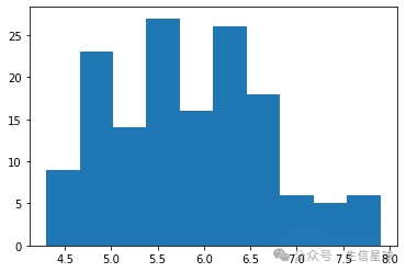
(2)双变量图之散点图
#scatter
plt.scatter(iris['sepal_length'], iris['sepal_width'])
plt.show()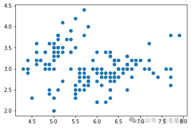
练习
1.total_bill列画直方图
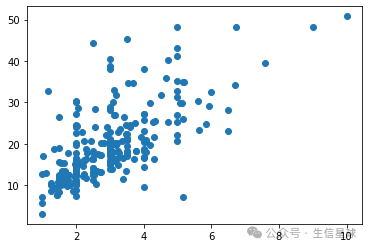
2.以tip列为横坐标,total_bill列为纵坐标画散点图
import matplotlib.pyplot as plt
import seaborn as sns

tips = sns.load_dataset('tips')

# Univariate histogram
plt____
____
# Bivariate scatterplot
____
plt.show()
答案
import matplotlib.pyplot as plt
import seaborn as sns

tips = sns.load_dataset('tips')

# Univariate histogram
plt.hist(tips.total_bill)
plt.show()

# Bivariate scatterplot
plt.scatter(tips.tip,tips.total_bill)
plt.show()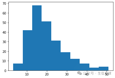
(3)设置标题和横纵坐标
fig,ax = plt.subplots()
ax.scatter(iris['sepal_length'],iris['sepal_width'])
ax.set_title('Sepal Length')
ax.set_xlabel('Sepal Length')
ax.set_ylabel('Sepal Width')
plt.show()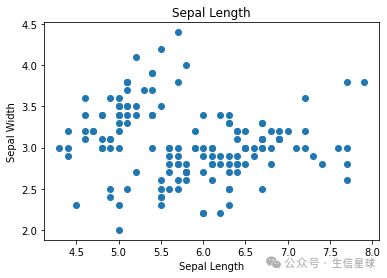
如果横坐标出现重叠可以倾斜一下。
fig,ax = plt.subplots()
ax.scatter(iris['sepal_length'],iris['sepal_width'])
ax.set_title('Sepal Length')
ax.set_xlabel('Sepal Length')
ax.set_ylabel('Sepal Width')
plt.xticks(rotation = 45)
plt.show()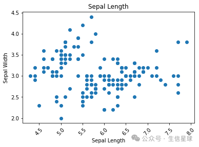
练习
用.set_title()设置标题为Histogram,用.set_xlabel设置横轴标题为Total Bill
import matplotlib.pyplot as plt
import seaborn as sns
tips = sns.load_dataset('tips')

# Create a figure with 1 axes
fig, ax = plt.subplots()

# Draw a histplot
ax = sns.histplot(tips['total_bill'], kde = True)

# Label the title and x axis
ax.set_title('Histogram')
ax.set_xlabel('Total Bill')
plt.show()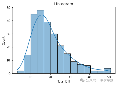
2.子图
ax是axes的缩写
插播:figure和axes以及axis的关系
查询到:
什么是 figure?
figure 表示「画布」,表示 atplotlib 绘制图表的空间,在绘制图表时,要先创建一个画布,才能在加入各种元素,储存或输出图片时,也都是以 figure 为单位进行储存或输出。
什么是 axes?
axes 表示「坐标系统」,如果是二维图表,axes 会包含两个坐标轴 (axis )、如果是三维图表,axes 会包含三个坐标轴(axis),依此类推,在一个 figure 之中,可以设定多个 axes,下图呈现 figure、axes 和 asix 的关系。
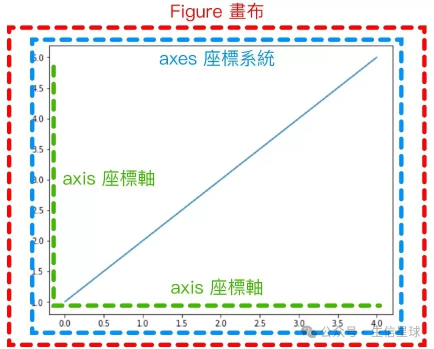
https://steam.oxxostudio.tw/category/python/example/matplotlib-figure-axes.html
(1)figure里只有一张子图
fig,ax = plt.subplots()
ax.scatter(iris['sepal_length'],iris['sepal_width'])
plt.show()
(2)figure里有多张子图
fig,(ax1,ax2) = plt.subplots(1, 2)
ax1.scatter(iris['sepal_length'],iris['sepal_width'])
ax2.hist(iris['sepal_length'])
plt.show()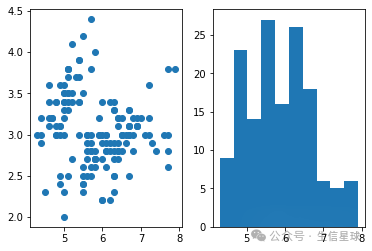
练习:子图
创建一个只有一张子图的figure,以tip列为横坐标,total_bill列为纵坐标绘制散点图。
创建一个两张子图的figure,有1行两列,第一列是散点图,第二列是直方图。
import matplotlib.pyplot as plt
import seaborn as sns

tips = sns.load_dataset('tips')
# Create a figure with 1 axes
fig, ax = plt.____(1, 1)

# Plot a scatter plot in the axes
____.scatter(tips____, tips____)
plt.show()

# Create a figure with scatter plot and histogram
fig, (ax1, ax2) = plt.subplots(____, ____)
____(tips['tip'], tips['total_bill'])
____(tips['total_bill'])
plt.show()
答案
import matplotlib.pyplot as plt
import seaborn as sns

tips = sns.load_dataset('tips')
# Create a figure with 1 axes
fig, ax = plt.subplots()

# Plot a scatter plot in the axes
ax.scatter(tips.tip, tips.total_bill)
plt.show()# Create a figure with scatter plot and histogram
fig, (ax1, ax2) = plt.subplots(1, 2)
ax1.scatter(tips['tip'], tips['total_bill'])
ax2.hist(tips['total_bill'])
plt.show()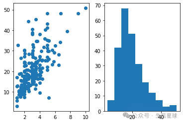
练习:axes用于seaborn
1.tip列画seaborn直方图,赋值给dis,查看dis的type
2.创建一个两张子图的figure,有1行两列,第一列是散点图,第二列是直方图(要用seaborn画)
# histplot of tip
import seaborn as sns

tips = sns.load_dataset('tips')

dis = sns.histplot(tips['tip'], kde = True)
# Print the type
print(type(dis))
## <class 'matplotlib.axes._subplots.AxesSubplot'>

# Figure with 2 axes: regplot and histplot
fig, (ax1, ax2) = plt.subplots(1,2)
sns.histplot(tips['tip'], ax=ax1, kde = True)
sns.regplot(x='total_bill', y='tip', data=tips, ax=ax2)
plt.show()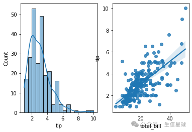
本文参与 腾讯云自媒体同步曝光计划,分享自微信公众号。
原始发表:2024-09-05,如有侵权请联系 cloudcommunity@tencent.com 删除
评论
登录后参与评论
推荐阅读
目录
腾讯云开发者
