
响应图像库解决方案
提问于 2015-11-27 08:09:55
我想问一下反应灵敏的画廊。
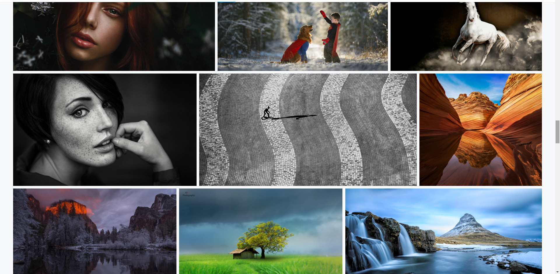
这就是我想做的一个例子。所以,正如你所看到的,图像的大小不是固定的。这只是缩略图和节省的比例。
我不知道它是如何工作的。我应该如何使我的反应?
应该怎么做呢?如果有现成的解决办法,请告诉我。
谢谢。

回答 2
Stack Overflow用户
回答已采纳
发布于 2015-11-27 08:40:24
就像其他人说的,你可以使用砖石。
演示: https://jsfiddle.net/2Lzo9vfc/193/
<div class="gallery">
    <img src="http://placehold.it/450x150">
    <img src="http://placehold.it/350x150">
    <img src="http://placehold.it/250x150">
    <img src="http://placehold.it/550x150">
    <img src="http://placehold.it/150x150">
    <img src="http://placehold.it/250x150">
    <img src="http://placehold.it/350x150">
    <img src="http://placehold.it/450x150">
</div>
JS
$('.gallery').masonry({
  itemSelector: 'img',
   columnWidth: 1,
});
或者你可以试着用这样的柔性盒做点什么
演示: https://jsfiddle.net/2Lzo9vfc/194/
CSS
img {
    margin: 5px;
    flex: 1 0 auto;
}

.gallery {
    display: flex;
    flex-direction: row;
    flex-wrap: wrap;
    align-items: flex-start;
}或者你可以使用column,但我认为这个支持是非常糟糕的。
演示: https://jsfiddle.net/2Lzo9vfc/197/
img {
    display: inline-block;
    margin: 10px;
    width: 100%;
}

.gallery {
    -moz-column-count: 3;
    -webkit-column-count: 3;
    column-count: 3;
    -moz-column-gap: 1em;
    -webkit-column-gap: 1em;
    column-gap: 1em;
}Stack Overflow用户
发布于 2015-11-27 08:15:12
http://masonry.desandro.com/是你所需要的。
页面原文内容由Stack Overflow提供。腾讯云小微IT领域专用引擎提供翻译支持
原文链接:
https://stackoverflow.com/questions/33961184
复制


![[叶子]在centos上搭建mcbe服务器并安装mcsm面板](https://ask.qcloudimg.com/http-save/yehe-8203638/05aa2c841bfbd3eabedd1e393ce1a6cc.png)


腾讯云开发者
