位置4背景图像在上、左、右和底部
提问于 2021-07-13 05:02:26
我正在尝试设计一个下面的UI。
为此,我创建了两个图像,将用作背景。注意:总共需要四个图像,但底部的图像可以用作顶部的转置,同样的,右可以使用左的转置。
我能够放置顶部和左边,但无法放置底部和右边的形象。
  <div class="layout-shape-container">
    <div class="top-shape" style="text-align: center;">
      dfdffddfdffd
      dfdffddfdffd
      dfdffddfdffd
      dfdffddfdffd
      dfdffddfdffd
      dfdffddfdffd
      dfdffddfdffd
      dfdffddfdffd
    </div>

    <div class="left-shape" style="">
      <p>dsds</p>
      <p>sdsdsdds</p>
      <p>dsds</p>
      <p>sdsdsdds</p>
      <p>dsds</p>
      <p>sdsdsdds</p>
      <p>dsds</p>
      <p>sdsdsdds</p>
      <p>dsds</p>
      <p>sdsdsdds</p>
      <p>dsds</p>
      <p>sdsdsdds</p>
      <p>dsds</p>
      <p>sdsdsdds</p>
    </div>
  </div>
CSS:
.layout-shape-container{
    margin-bottom: 172px;
    position: relative;
    width: 900px;
    height: 900px;
}
.top-shape{
    background-image: url("https://i.ibb.co/QPZTzSJ/top-triangle-shape.png");
    height: 50%;
    width: 100%;
    background-repeat: no-repeat;
    z-index: 9;
}
.left-shape{
    background-image: url("https://i.ibb.co/TchQ4rp/left-triangle-shape.png");
    height: 100%;
    width: 100%;
    background-repeat: no-repeat;
    top: 172px;
    left: 0;
    position: absolute;

}这是小提琴。
有人能帮我理解吗,我该如何定位正确的和底部的形象?
另外,在不使用这些形状图像的情况下可以实现布局吗?

回答 3
Stack Overflow用户
回答已采纳
发布于 2021-07-13 06:08:23
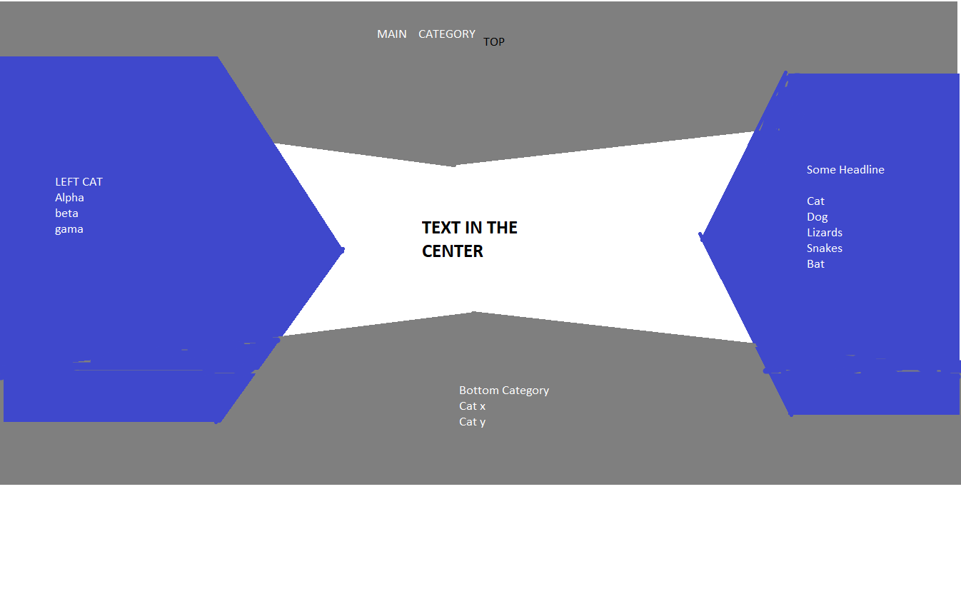
您可以对形状使用clip-path,以及一些绝对定位和flex显示器。
* {
  padding: 0;
  margin: 0;
  box-sizing: border-box;
  font-size: .9rem;
}

#main {
  display: flex;
  justify-content: space-between;
  align-items: center;
  width: 100%;
  background: white;
  height: 100vh;
  position: relative;
}

#left {
  flex: 1;
  height: 80%;
  background: blue;
  clip-path: polygon(0% 0%, 75% 0%, 100% 50%, 75% 100%, 0% 100%);
  display: flex;
  flex-direction: column;
  justify-content: center;
  align-items: center;
}

ul li {
  list-style: none;
}

#sect {
  flex: 2;
  display: flex;
  justify-content: center;
  padding: .5rem;
}

#right {
  flex: 1;
  height: 80%;
  background: blue;
  clip-path: polygon(25% 0%, 100% 0%, 100% 100%, 25% 100%, 0% 50%);
  display: flex;
  flex-direction: column;
  justify-content: center;
  align-items: center;
}

#top {
  display: flex;
  align-items: flex-start;
  justify-content: center;
  background: #ddd;
  position: absolute;
  top: 0;
  left: 0;
  width: 100vw;
  height: 20vh;
  clip-path: polygon(100% 0, 100% 77%, 50% 100%, 0 77%, 0 0);
}

#bottom {
  display: flex;
  align-items: flex-end;
  justify-content: center;
  background: #ddd;
  position: absolute;
  bottom: 0;
  left: 0;
  width: 100vw;
  height: 20vh;
  clip-path: polygon(50% 1%, 100% 23%, 100% 100%, 0 100%, 0 23%);
}<div id="main">
<!-- absolutely positioned elements for top and bottom
placed on top so z-index is behind following content-->
<div id="top">This is the top section</div>
<div id="bottom">This is the bottom section</div>
<!-- main flex container starts here
Place a justify-content: space-between to space
left and right elements to far edges -->
<div id="left">
<ul>
<li>List Item 1</li>
<li>List Item 2</li>
<li>List Item 3</li>
<li>List Item 4</li>
</ul>
</div>
<div id="sect">"Lorem ipsum dolor sit amet, consectetur adipiscing elit, sed do eiusmod tempor incididunt ut labore et dolore magna aliqua.</div>
<div id="right">
<ul>
<li>List Item 1</li>
<li>List Item 2</li>
<li>List Item 3</li>
<li>List Item 4</li>
</ul>
</div>
</div>
Stack Overflow用户
发布于 2021-07-13 05:49:02
下面你会找到一个开始的例子。
我使用这个代码来完成这个任务:https://codepen.io/stoumann/pen/abZxoOM
对于边界,也有一些方法可以做到这一点。
body{
  margin: 0;
}
.container{
  position:relative;
  height:100vh;
}
.top{
  width:100%;
  height:100px;
  background: grey;
}
.top-2{
  position:absolute;
  top: 100px; /* Should be equal to .top height */
  height:20px;
  width: 100%;
  background: grey;
  clip-path: polygon(100% 0%,0% 0%,50% 100%);
}
.left{
  width:20%;
  height:80%;
  position:absolute;
  top:10%;
  left:0;
  background: blue;
}
.left-2{
  width: 20px;
  height: 80%; /* Should be equal to .left height */
  position:absolute;
  top:10%;
  left:20%;  /* Should be equal to .left width */
  background: blue;
  clip-path: polygon(0% 0%,0% 100%,100% 50%);
}<div class="container">
<div class="top"></div>
<div class="top-2"></div>
<div class="left">
dfdffddfdffd
dfdffddfdffd
dfdffddfdffd
dfdffddfdffd
dfdffddfdffd
dfdffddfdffd
dfdffddfdffd
dfdffddfdffd
</div>
<div class="left-2"></div>
</div>
Stack Overflow用户
发布于 2021-07-13 06:35:07
由于蓝色/白色的形状只是用于装饰,而不是具有很大的语义值,所以您可能希望将其放入一个伪元素中,而不是放在主HTML中,在该HTML中,额外的div(s)除了给出一点背景颜色之外,没有任何其他意义。
下面是一个粗略的例子,很明显,您希望更改%值以适应实际情况。它在后伪元素上加入线性梯度背景,然后剪裁成多边形形状。前面的伪元素提供了底层灰色背景。如果您用%来定义div的维度,那么整个事情就会变得响应起来。
.layout-shape-container {
  margin-bottom: 172px;
  position: relative;
  width: 900px;
  height: 900px;
}

.layout-shape-container::before,
.layout-shape-container::after {
  content: '';
  position: absolute;
  top: 0;
  left: 0;
  width: 100%;
  height: 100%;
}

.layout-shape-container::before {
  background: gray;
  z-index: -2;
}

.layout-shape-container::after {
  background-image: linear-gradient(to right, blue 0, blue 30%, white 30%, white 70%, blue 70%, blue 100%);
  z-index: -1;
  clip-path: polygon(0 20%, 30% 20%, 50% 50%, 70% 20%, 100% 20%, 100% 80%, 70% 80%, 50% 50%, 30% 80%, 0% 80%);
}<div class="layout-shape-container"></div>
页面原文内容由Stack Overflow提供。腾讯云小微IT领域专用引擎提供翻译支持
原文链接:
https://stackoverflow.com/questions/68362969
复制相关文章


腾讯云开发者
