
使用可变宽度的LIst和<dd> (包括JSFiddle)创建定义JSFiddle
我有一个定义列表,其中的术语和定义都是不同宽度的。编辑:为了澄清,当我说不同宽度时,我的意思是它们不能是固定的宽度。显然,这一效果很容易通过设置‘’的宽度来实现,我需要每一对并排地坐着,如果有必要的话,就会变成多行,而不是在下面包装。
下面是一个显示我的问题的JSFiddle:http://jsfiddle.net/2H9YN/ (下面的代码)
编辑:请注意颜色仅供参考。它们对最终设计没有意义。
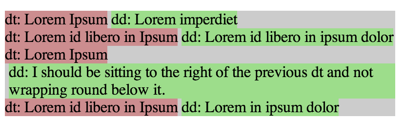
我现在有这样的情况:
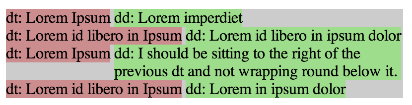
但我想要这个:
HTML:
<dl>
    <dt>dt: Lorem Ipsum</dt>
    <dd>dd: Lorem imperdiet </dd>
    <dt>dt: Lorem id libero in Ipsum</dt>
    <dd>dd: Lorem id libero in ipsum dolor </dd>
    <dt>dt: Lorem Ipsum</dt>
    <dd>dd: I should be sitting to the right of the previous dt and not wrapping round below it.</dd>
    <dt>dt: Lorem id libero in Ipsum</dt>
    <dd>dd: Lorem in ipsum dolor </dd>
</dl>
CSS:
dl
{
    width:400px;
    background-color: rgba(0, 0, 0, 0.2);
    float: left;
}

dt
{
    clear:both;
    float:left;
    background-color: rgba(255, 0, 0, 0.3);
}

dd
{
    float:left;
    background-color: rgba(0, 255, 0, 0.3);
    margin: 0 0 0 4px;
}本质上,我正在寻找<dd>来填充<dt>留给它的空间,如果这意味着它需要包装,那么它将在自己下面包装,而不是在相邻的<dt>下面包装。

回答 2
Stack Overflow用户
发布于 2013-03-16 04:39:37
下面是一些可能有用的CSS:
dl {
    width: 400px;
    background-color: rgba(0, 0, 0, 0.2);
    overflow: auto;
}

dt {
    background-color: rgba(255, 0, 0, 0.3);
    float: left;
    clear: left;
    margin-right: 10px; /* Margin work */
    padding: 5px; /* Padding works */
}
dd {
    background-color: rgba(0, 255, 0, 0.3);
    display: table-cell;
    padding-left: 10px; /* Padding works */
    padding-bottom: 10px;
    margin-left: 100px; /* Margin does not work */
    margin-bottom: 100px;
}小提琴参考:http://jsfiddle.net/audetwebdesign/45jDK/
对它为什么工作的解释
(1)要查看背景色,请将overflow: auto设置为dl。由于所有子元素都是浮动的,默认情况下高度会折叠为零。
(2)您希望dt从新行开始,所以使用clear: left,这样dt就不会试图在一个简短的dd元素之后流动。
(3)对于dd来说,使用display: table-cell似乎可以做到这一点。
在dt上,padding和margin按预期工作。在dd上,padding起作用,但margin没有作用,可能是因为table-cell是如何工作的。
我在Firefox上试过这个,但没有其他地方。
PS
我在其中一个dt元素上添加了一些额外的内容,以了解极端情况将如何呈现。我还试验了width of dl,布局保持稳定。
Stack Overflow用户
发布于 2013-03-16 06:29:56
事实上,您正在使用一个定义列表,这使得这很难做到。如果没有某种容器来强制dt和dd之间的关系,就必须在某个地方设置限制。
由于Flexbox实现的不同,我在Opera中最接近您的标记工作,而不是Chrome:
dl {
  width: 400px;
  background-color: rgba(0, 0, 0, 0.2);
  float: left;
  display: -webkit-flexbox;
  display: -ms-flexbox;
  display: -webkit-flex;
  display: flex;
  -webkit-flex-wrap: wrap;
  -ms-flex-wrap: wrap;
  flex-wrap: wrap;
  -webkit-flex-align: start;
  -ms-flex-align: start;
  -webkit-align-items: flex-start;
  align-items: flex-start;
}

dt {
  background-color: rgba(255, 0, 0, 0.3);
  -webkit-flex: 0 0;
  -ms-flex: 0 0;
  flex: 0 0;
  white-space: pre;
}

dd {
  background-color: rgba(0, 255, 0, 0.3);
  margin: 0 0 0 4px;
  -webkit-flex: 1 1 50%;
  -ms-flex: 1 1 50%;
  flex: 1 1 50%;
}
当然,只有在每dt不超过1dd的情况下才能起作用。
如果您愿意更改标记,使您有某种类型的行容器,那么您就有更多的选项。它不必是一个表,它可以是一堆包含h1 (dt)和段落(dd)的文章。标记并不重要,只是元素是如何组合在一起的。
<table>
    <tr>
        <th>dt: Lorem Ipsum</th>
        <td>dd: Lorem imperdiet </td>
    </tr>

    <tr>
        <th>dt: Lorem id libero in Ipsum</th>
        <td>dd: Lorem id libero in ipsum dolor </td>
    </tr>

    <tr>
        <th>dt: Lorem Ipsum</th>
        <td>dd: I should be sitting to the right of the previous dt and not wrapping round below it.</td>
    </tr>
</table>
再次使用Flexbox,我们可以得到一个完美的匹配,直到你的灰色背景通过时,元素没有足够的内容到达终点。对于非Flexbox浏览器,我们也可以得到一个合理的退路:
table {
  width: 400px;
  background-color: rgba(0, 0, 0, 0.2);
}

table, tbody, th, td {
  display: block;
}

tr {
  display: block;
  display: -webkit-flexbox;
  display: -ms-flexbox;
  display: -webkit-flex;
  display: flex;
  -webkit-flex-align: start;
  -ms-flex-align: start;
  -webkit-align-items: flex-start;
  align-items: flex-start;
}

th, td {
  display: table-cell;
  vertical-align: text-top;
}

th {
  background-color: rgba(255, 0, 0, 0.3);
  white-space: pre;
  font-weight: normal;
}

td {
  background-color: rgba(0, 255, 0, 0.3);
  margin: 0 0 0 4px;
}https://stackoverflow.com/questions/15449114
复制


腾讯云开发者
