按角度以编程方式转换(旋转)一个元素
按角度以编程方式转换(旋转)一个元素
提问于 2021-02-04 04:34:11
我是在角度框架中编码。当选择了特定的输入(cvv)时,我需要旋转一个元素(div) (翻转卡-内部)。
我不能使用:focus,因为输入元素不是我需要旋转的元素的兄弟或子元素。
这必须以编程的方式完成吗?任何帮助都将不胜感激。
当选择cvv输入时,灰色卡片应该旋转。
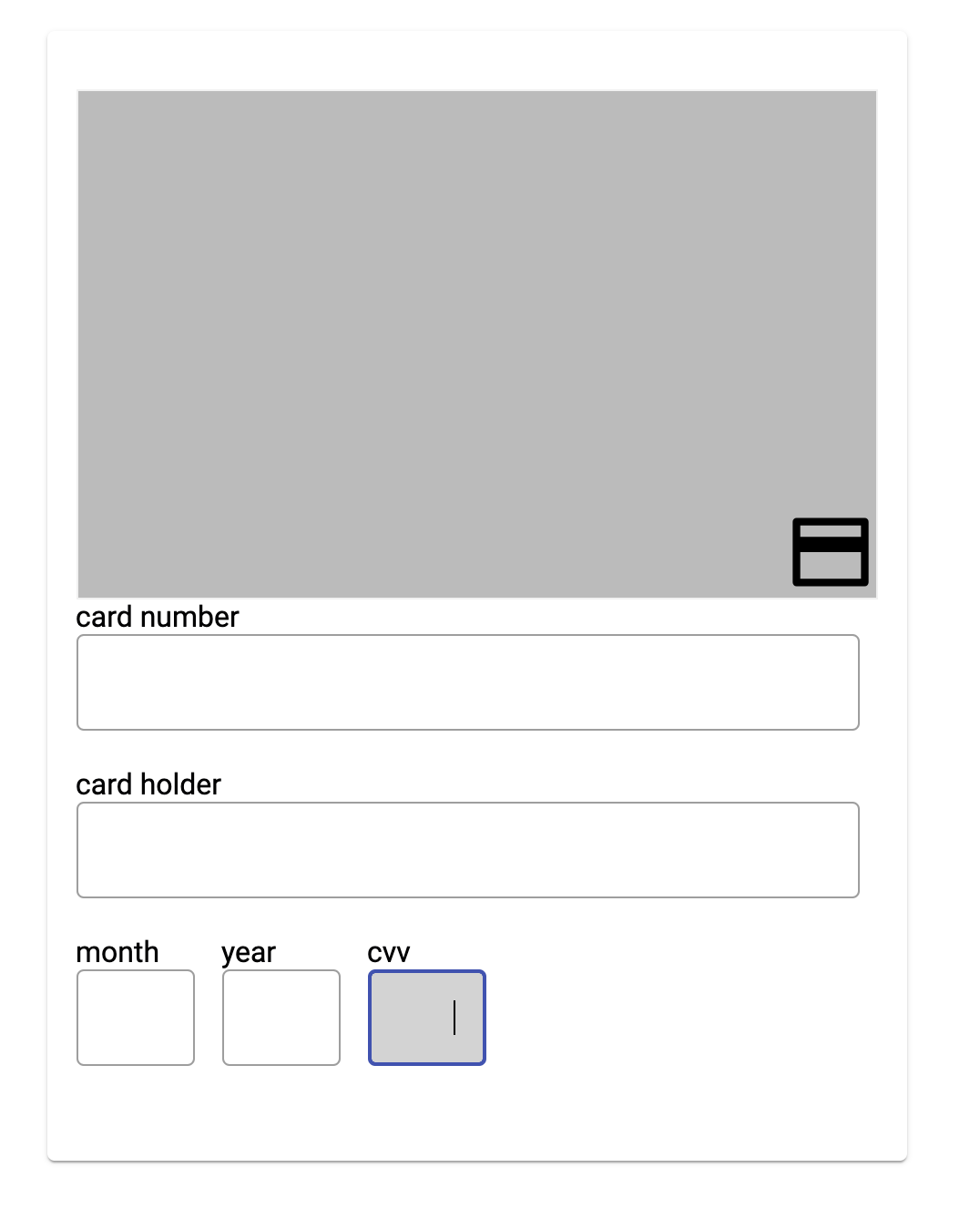
<div class="container">
  <p-card>
    <div class="flip-card">
      <div class="flip-card-inner">
        <div class="flip-card-front">
          <img
            src="../../../../../assets/creditCard.svg"
            alt="Avatar"
            style="width: 50px; height: 50px; align-self: flex-end"
          />

          <p>{{ cardNumber }}</p>
        </div>
        <div class="flip-card-back">
          <h1>John Doe</h1>
          <p>Architect & Engineer</p>
          <p>We love that guy</p>
        </div>
      </div>
    </div>

    <div class="input-container">
      <label for="cardnumber">card number</label>
      <input type="text" pInputText [(ngModel)]="cardNumber" />
    </div>

    <div class="input-container">
      <label for="cardholder">card holder</label>
      <input type="text" pInputText [(ngModel)]="cardHolder" />
    </div>

    <div class="expiry-container">
      <div class="input-expiry">
        <label for="month">month</label>
        <input style="width: 65px" type="text" pInputText [(ngModel)]="month" />
      </div>

      <div class="input-expiry">
        <label for="year">year</label>
        <input style="width: 65px" type="text" pInputText [(ngModel)]="year" />
      </div>

      <div class="input-expiry">
        <label for="cvv">cvv</label>
        <input
          class="cvv"
          style="width: 65px"
          type="text"
          pInputText
          [(ngModel)]="cvv"
        />
      </div>
    </div>
  </p-card>
</div>
css
.container{
    padding: 50px;
}

/* The flip card container - set the width and height to whatever you want. We have added the border property to demonstrate that the flip itself goes out of the box on hover (remove perspective if you don't want the 3D effect */
.flip-card {
    background-color: transparent;
    width: 440px;
    height: 280px;
    border: 1px solid #f1f1f1;
    perspective: 1000px; /* Remove this if you don't want the 3D effect */
  }

  /* This container is needed to position the front and back side */
  .flip-card-inner {
    position: relative;
    width: 100%;
    height: 100%;
    text-align: center;
    transition: transform 0.8s;
    transform-style: preserve-3d;
  }

  /* Do an horizontal flip when you move the mouse over the flip box container */
  /* .flip-card:hover .flip-card-inner{
    transform: rotateY(180deg);
  } */


  /* Position the front and back side */
  .flip-card-front, .flip-card-back {
    position: absolute;
    width: 100%;
    height: 100%;
    -webkit-backface-visibility: hidden; /* Safari */
    backface-visibility: hidden;
  }

  /* Style the front side (fallback if image is missing) */
  .flip-card-front {
    background-color: #bbb;
    color: black;
    display: flex;
    justify-content: flex-end;
  }

  /* Style the back side */
  .flip-card-back {
    background-color: dodgerblue;
    color: white;
    transform: rotateY(180deg);
  }


  .input-container{
   display: flex;
   flex-direction: column;
   margin-bottom: 20px;
   margin-right: 10px;
  }

  .expiry-container{
    display: flex;
    flex-direction: row;
    margin-bottom: 20px;

  }

  .input-expiry{
    display: flex;
    flex-direction: column;
    margin-right: 15px;
  }

  input:focus  {
    background-color: lightgray;
}回答 3
Stack Overflow用户
回答已采纳
发布于 2021-02-04 05:13:22
Stack Overflow用户
发布于 2021-02-04 05:17:17
在在https://angular.io/guide/attribute-directives上触发的<input>处使用一个:focus。这应该添加一个CSS类到卡,使其旋转。之后,删除这个模糊类。
import { Directive, ElementRef, HostListener, Input, Renderer } from '@angular/core';
@Directive({
    selector: '[onFocus]',
})
export class OnFocusDirective {
    private el: ElementRef;

    constructor(private _el: ElementRef, public renderer: Renderer) {
        this.el = this._el;
    }

    @HostListener('focus', ['$event']) onFocus(e) {
        // set class
    }

    @HostListener('blur', ['$event']) onBlur(e) {
        // reset class
    }
}Stack Overflow用户
发布于 2021-02-04 05:24:48
这就是你如何用角度来做的。这是stackblitz链接https://stackblitz.com/edit/angular-yca7ia?file=src/app/app.component.css
import {
  Component,
  ElementRef,
  OnInit,
  Renderer2,
  ViewChild
} from "@angular/core";

@Component({
  selector: "my-app",
  templateUrl: "./app.component.html",
  styleUrls: ["./app.component.css"]
})
export class AppComponent implements OnInit {
  cardNumber;
  cardHolder;
  month;
  year;
  cvv;
  @ViewChild("cardImg", { static: false }) cardImg: ElementRef;
  constructor(private elem: ElementRef, private renderer: Renderer2) {}

  ngOnInit() {}

  onCVVFocus() {
    this.renderer.addClass(this.cardImg.nativeElement, "img-rotate");
  }

  onFocusOut() {
    this.renderer.removeClass(this.cardImg.nativeElement, "img-rotate");
  }
}
增加了以下CSS:
.img-rotate {
  transform: rotate(90deg);
}页面原文内容由Stack Overflow提供。腾讯云小微IT领域专用引擎提供翻译支持
原文链接:
https://stackoverflow.com/questions/66045727
复制相关文章


相似问题
以编程方式旋转UIViewController
以编程方式旋转UITextView
以编程方式“旋转”焦点
以编程方式旋转UIView
以编程方式旋转UINavigationController
添加站长 进交流群
领取专属 10元无门槛券
AI混元助手 在线答疑

关注 腾讯云开发者公众号
洞察 腾讯核心技术
剖析业界实践案例

腾讯云开发者
