
使用CSS指向非活动选项卡的活动选项卡?
提问于 2017-08-01 14:18:44
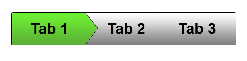
是否有一种方法,使用CSS,使其在单击标签时(如下图所示),标签“指向”一个不活动的选项卡?
我试图使绿色的Tab 1(在下图中)指向表2和3,然后单击Tab 2,它指向Tab 3。然而,当您单击Tab 3时,它将保持矩形(没有箭头)。
我一直在尝试各种堆栈溢出片段,它们成功地将箭头放置在选项卡的上方或下面,但似乎没有一个在重叠活动选项卡旁边的非活动选项卡中工作。
这是我的HTML的基本结构:
<ul>
  <li class="active">
    <a href="#">Tab 1</a>
  </li>
  <li>
    <a href="#">Tab 2</a>
  </li>
  <li>
    <a href="#">Tab 3</a>
  </li>
</ul>至于CSS,我一直在使用类似这样的代码片段:https://codepen.io/mimoYmima/pen/MwzQym
我遇到的问题似乎是,由于选项卡是向左浮动的,所以无法使活动选项卡的箭头与其他选项卡重叠。

回答 3
Stack Overflow用户
发布于 2017-08-01 14:38:56
您可以利用一个伪元素,将其绝对定位为活动选项卡的箭头。除非列表项被赋予“活动”选项卡,否则它将被隐藏。原始HTML标记仍未被触及。
html,
body {
  height: 100%;
  margin: 0;
}
html {
  font-family: sans-serif;
}
body {
  display: flex;
}
ul {
  margin: auto;
  padding: 0;
  display: inline-block;
  list-style-type: none;
  overflow: hidden;
  background-color: #eee;
  background-image: linear-gradient( #fff, #ddd);
  border-radius: 1rem;
  border: 1px #888 solid;
  font-weight: bold;
}
li {
  float: left;
  padding: 1.5rem 4rem;
  border-right: 1px #aaa solid;
  position: relative;
}
li:last-child {
  border: none;
}
a {
  text-decoration: none;
  color: #000;
}
.active {
  background-color: #0b0;
  background-image: linear-gradient( #0b0, #090 );
}
li.active::after {
  content:'';
  width: 3rem;
  height: 3rem;
  background-color: #eee;
  position: absolute;
  border: none;
  transform: scaleX( 0.75 ) rotate( 45deg ) translate( -50% );
  top: 50%;
  right: -2.45rem;
  margin-top: -0.45rem;
  border-top: 1px #888 solid;
  border-right: 1px #888 solid;
  background-color: #0b0;
  background-image: linear-gradient( 130deg, #0b0, #090 );
  border-top-right-radius: 0.5rem;
}<ul>
<li class="active">
<a href="#">Tab 1</a>
</li>
<li>
<a href="#">Tab 2</a>
</li>
<li>
<a href="#">Tab 3</a>
</li>
</ul>
Stack Overflow用户
发布于 2017-08-02 02:32:30
只需添加三角形使用伪元素到活动选项卡和其他模拟三角形边框。演示:
ul {
  list-style-type: none;
  display: flex;
  margin: 0;
  padding: 0;
}

ul > li {
  padding: 10px 40px;
  font-weight: bold;
  font-size: 24px;
  height: 40px;
  border: 1px solid #000;
  border-right: none;
  background: linear-gradient(to bottom, #fdfdfd, #828282);
}

ul > li.active {
  background: #66d835;
  position: relative;
}

ul > li.active:before,
ul > li.active:after {
  content: "";
  position: absolute;
  left: 100%;
  top: 0;
}

/* triangle border for active tab */
ul > li.active:before {
  transform: translateX(1px);
  border: 30px solid transparent;
  border-left-color: #000;
  z-index: 1;
}

/* triangle for active tab */
ul > li.active:after {
  /* border-width equal half of the height */
  border: 30px solid transparent;
  border-left-color: #66d835;
  z-index: 2;
}

/* border-radius for first tab */
ul > li:first-child {
  border-top-left-radius: 5px;
  border-bottom-left-radius: 5px;
}

/* border-radius for last tab but not active */
/* and right border */
ul > li:not(.active):last-child {
  border-right: 1px solid #000;
  border-top-right-radius: 5px;
  border-bottom-right-radius: 5px;
}

ul > li > a {
  height: 100%;

  /* styles for text centering */
  display: flex;
  align-items: center;
  justify-content: center;
}

ul > li > a,
ul > li > a:hover,
ul > li > a:active,
ul > li > a:visited {
  color: inherit;
  text-decoration: none;
}<ul>
<li class="active">
<a href="#">Tab 1</a>
</li>
<li>
<a href="#">Tab 2</a>
</li>
<li>
<a href="#">Tab 3</a>
</li>
</ul>
Stack Overflow用户
发布于 2017-08-01 14:35:01
你不需要浮动箭头div。
我已经分叉了您链接到的代码页,并编辑了CSS,以在您共享的图形中创建效果。以下是我编辑的版本:
https://codepen.io/sigil/pen/YxWZGa
<!-- language: lang-css -->
/* Button-arrow CSS: */
.arrow {
  cursor: pointer;
  display: inline-block;
  height: 40px;
  position: relative;
  line-height: 2.5em;
  padding-left: 2em;
  padding-right: 2em;
  background: white;
  color: black;
  border: 1px solid #eee;
}
.arrow:after {
  border-left: 20px solid white;
}
.arrow.active {
  background-color: yellow;
}
.arrow.active,
.arrow.active:after {
  z-index: 50;
  border-left: 20px solid yellow;
}
.arrow.active:after {
  content: "";
  position: absolute;
  border-bottom: 20px solid transparent;
  border-top: 20px solid transparent;
  height: 0px;
  width: 0px;
  margin-right: -20px;
  right: 0;
}
.arrow:hover,
.arrow:active {
  background: yellow;
  color: black;
}
.arrow:hover:after,
.arrow:active:after {
  border-left: 20px solid yellow;
}

/* General styles to set a baseline 'look' - not related to the button-arrow CSS above */
body, html {
  font-family: helvetica;
  background: #333;
  color: #CCC;
}
.content {
  text-align: center;
  margin: 0 auto;
}

a:visited, a:link {
  color: #F93;
}
<!-- language: lang-html -->

<html>
<body>
  <div class="content">
    <p>Button with an arrow on the right. Just uses an anchor tag and css, so you can use it with your existing buttons easily by just adding the class of "arrow"! Also includes a hover state.</p>

    <a class="arrow active">Arrow</a><a class="arrow">Arrow</a><a class="arrow">Arrow</a>
  </div>
</body>
</html>

<!-- end snippet -->页面原文内容由Stack Overflow提供。腾讯云小微IT领域专用引擎提供翻译支持
原文链接:
https://stackoverflow.com/questions/45448537
复制相关文章


点击加载更多


腾讯云开发者
