谷歌Chrome视口-锚定扩展方向与柔性盒
Google中有一个问题,当元素放置在一个包含space-between或center正确内容的柔性盒容器中时,元素会向不同的方向展开/折叠。
在火狐、IE11、边缘或Safari中,这不是问题,因为元素总是向下扩展。
我很好奇:
- Chrome的行为是否符合一些规范?如果是,是哪一个?
- 如果没有,那么为什么在Chrome中这样做呢?(IMHO,点击触发器随机消失是可怕的UX。)
- Chrome的行为可以在某种程度上被修改或禁用吗?例如:通过CSS还是元标签?
更新1:如果可能的话,我已经将 铬虫追踪器#739860 提交给Chromium寻求洞察/解释。
以下是插入的两个例子。描述这个问题的完整测试套件可以在本笔中找到:https://codepen.io/jameswilson/full/xrpRPg/,我选择在本例中使用slideToggle,以便展开/折叠运动是动画的,并且对眼睛是可见的。同样的行为也发生在details标签上,但是跨浏览器支持还不存在,展开/折叠太简陋了。
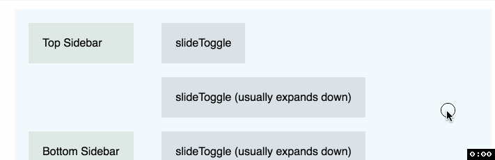
Ex 1: Chrome的膨胀/折叠行为--在对齐的柔性盒之间
$('button').click(function() {
  $(this).next().slideToggle();
})body {
margin: 30px;
font-family: sans-serif;
}
aside,
aside div,
summary,
main,
button,
details p,
button + p {
background: rgba(0,0,0,.09);
border: none;
padding: 20px;
margin: 0;
}
.flexcontainer {
display: flex;
}
aside {
flex: 1;
position: relative;
max-width: 25%;
background: mintcream;
display: flex;
flex-direction: column;
position: relative;
}
aside.space-between {
justify-content: space-between;
}
aside.center {
justify-content: center;
}
main {
flex: 3;
position: relative;
max-width: 75%;
background: aliceblue;
vertical-align: top;
height: 100%;
}
main > * + * {
margin-top: 20px;
}
button + p {
display: none;
}<script src="https://ajax.googleapis.com/ajax/libs/jquery/2.1.1/jquery.min.js"></script>
<section class="flexcontainer">
<aside class="space-between">
<div>Top Sidebar</div>
<div>Bottom Sidebar</div>
</aside>
<main>
<div>
<button>slideToggle</button>
<p>Other browsers: always expands downward.<br>
Chrome: Should always expand downward because Top Sidebar is always visible.</p>
</div>
<div>
<button>slideToggle (usually expands down)</button>
<p>Other browsers: always expands downward.<br>
Chrome: Should expand downward while Bottom Sidebar and Top Sidebar are both visible. But will expand upward if you scroll down far enough so that Top Sidebar is off-screen.</p>
</div>
<div>
<button>slideToggle (usually expands down)</button>
<p>Other browsers: always expands downward.<br>
Chrome: Should expand downward while Bottom Sidebar and Top Sidebar are both visible. But will expand upward if you scroll down far enough so that Top Sidebar is off-screen.</p>
</div>
</main>
</section>
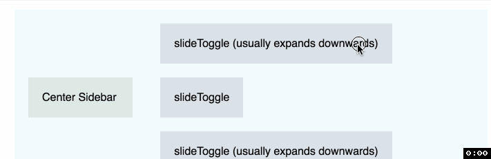
Ex 2:中心正确的柔性盒的膨胀/崩溃行为
$('button').click(function() {
  $(this).next().slideToggle();
})body {
margin: 30px;
font-family: sans-serif;
}
aside,
aside div,
summary,
main,
button,
details p,
button + p {
background: rgba(0,0,0,.09);
border: none;
padding: 20px;
margin: 0;
}
.flexcontainer {
display: flex;
}
aside {
flex: 1;
position: relative;
max-width: 25%;
background: mintcream;
display: flex;
flex-direction: column;
position: relative;
}
aside.space-between {
justify-content: space-between;
}
aside.center {
justify-content: center;
}
main {
flex: 3;
position: relative;
max-width: 75%;
background: aliceblue;
vertical-align: top;
height: 100%;
}
main > * + * {
margin-top: 20px;
}
button + p {
display: none;
}<script src="https://ajax.googleapis.com/ajax/libs/jquery/2.1.1/jquery.min.js"></script>
<section class="flexcontainer">
<aside class="center">
<div>Center Sidebar</div>
</aside>
<main>
<div>
<button>slideToggle (usually expands downwards)</button>
<p>Other browsers: always expands downward.<br>
Chrome: Usually expands downwards. Expands in both directions when the top-edge of the container scrolls out of the viewport.</p>
</div>
<div>
<button>slideToggle</button>
<p>Other browsers: always expands downward.<br>
Chrome: Usually expands downwards. Expands in both directions when the top-edge of the container scrolls out of the viewport.</p>
</div>
<div>
<button>slideToggle (usually expands downwards)</button>
<p>Other browsers: always expands downward.<br>
Chrome: Usually expands downwards. Expands in both directions when the top-edge of the container scrolls out of the viewport, but then resumes expanding downwards again when Center Sidebar scrolls out of view.</p>
</div>
</main>
</section>
回答 1
Stack Overflow用户
发布于 2017-07-04 07:04:57
将此代码添加到flex容器中:
overflow-anchor: none
这将禁用Chrome中名为“滚动锚定”的功能,这将导致盒的向上扩展(订正码)。
在Chrome中,扩展框的向上/向下方向取决于视图中的滚动位置,而不是布局本身。
为了改善用户体验,Chrome对这种行为采取了一种独特的方法。
基本上,它们将DOM元素绑定到当前滚动位置。屏幕上这个特定(“锚”)元素的移动将决定对滚动位置的调整(如果有的话)。
他们称这种方法为“滚动锚定”。这个算法在这个页面上解释:https://github.com/WICG/ScrollAnchoring/blob/master/explainer.md
这个行为目前对Chrome是唯一的,但是谷歌正在推动标准化。
根据Scroll锚定文档,将overflow-anchor: none应用于适当的元素将禁用滚动锚定调整。
更多信息:
https://stackoverflow.com/questions/44826446
复制


相似问题
使用柔性盒将内容扩展到整个视口。
为什么填充我的视口高度使柔性盒工作?
WooThemes -柔性滑块:柔性视口的高度
使用柔性盒(Chrome中的不一致性)‽进行视口高度继承
Chrome显示问题与柔性盒和溢出
领取专属 10元无门槛券
AI混元助手 在线答疑

洞察 腾讯核心技术
剖析业界实践案例

腾讯云开发者
