
无法让CSS Flex响应。Divs离开屏幕
提问于 2020-01-04 09:02:19
我正在尝试创建一个简单的布局,使用css在2行屏幕上显示4个框。
我想要实现的是,我希望能够向我的HTML中添加更多的div,并且每当div到达屏幕右侧的末尾时,就不会再添加div,并且应该有一个新的行。然而,每当我添加超过一定数量的div时,div就开始移出屏幕。我希望div只停留在屏幕大小的100%以内,并在到达页面视图的末尾后移动到新行。
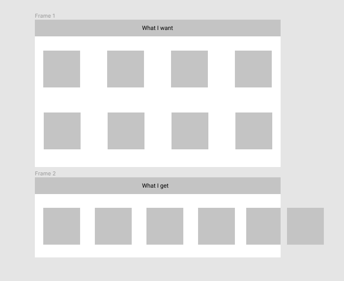
下面的照片显示了我目前正在得到什么,我应该得到什么。
这是我的一些代码..。
HTML
body {
  margin: 0;
  padding: 0;
  box-sizing: border-box;
  background-color: #212121;
  overflow-x: hidden;
}

header {
  display: flex;
  width: 100%;
  margin: auto;
  height: 100px;
  align-items: center;
  box-shadow: 0px 3px 10px gold;
  background: #212121;
  position: sticky;
  top: 0px;
}

.logoContainer,
.navLinks {
  display: flex;
}

.logoContainer {
  flex: 1;
}

nav {
  flex: 1;
}

.navLinks {
  justify-content: space-around;
  cursor: pointer;
  margin-right: 20px;
  color: white;
}

.navLink {
  font-size: 18px;
  padding-left: 10px;
  padding-right: 10px;
}

ul {
  list-style: none;
}

.containers {
  display: flex;
  background: green;
}


.gold1,
.gold2,
.gold3,
.gold4,
.gold5 {
  background-color: white;
  border-radius: 10px;
  margin-top: 40px;
  flex: 1;
}

.title {
  text-align: center;
  padding-top: 10px;
}

.price {
  text-align: center;
  margin-top: 40px;
  font-size: 24px;
  font-weight: bold;
  color: black;
}
button {
  width: 100px;
  height: 35px;
  border-radius: 10px;
  background: rgb(14, 170, 14);
  border: none;
  cursor: pointer;
  font-size: 16px;
}

.button {
  text-align: center;
  background-color: white;
}<div class="containers">
<div class="gold1">
<h1 class="title">shop 1</h1>
<p class="price">$5</p>
<div class="button">
<button>Buy</button>
</div>
</div>
<div class="gold2">
<h1 class="title">shop 2</h1>
<p class="price">$5</p>
<div class="button">
<button>Buy</button>
</div>
</div>
<div class="gold3">
<h1 class="title">shop 3</h1>
<p class="price">$5</p>
<div class="button">
<button>Buy Gold</button>
</div>
</div>
<div class="gold4">
<h1 class="title">shop 4</h1>
<p class="price">$5</p>
<div class="button">
<button>Buy</button>
</div>
</div>
<div class="gold5">
<h1 class="title">shop 5</h1>
<p class="price">$5</p>
<div class="button">
<button>Buy</button>
</div>
</div>
</div>
请注意:由于某些原因,代码片段没有显示我的屏幕显示的内容。我会尽力解决这个问题的。
你可以看到一些东西。
- 盒子从屏幕上消失了。
- 当屏幕变小时,盒子不会互相叠在一起(我希望这是响应性的,在小屏幕上,所有的盒子堆叠在一起,只显示4个盒子/行)。
提前谢谢你的帮助。

回答 3
Stack Overflow用户
发布于 2020-01-04 10:25:17
您需要在css中添加一些额外的flex属性才能正常工作。
如果要共享每个元素的属性,则不需要为每个元素创建类,如果要添加某些内容,则可以创建类并将它们添加到元素和这些添加或删除属性中。我的意思是.gold1,.gold2,.gold3 ..。等等,它们并不是必要的,您只能使用.gold,因为所有这些框都将共享它们的css属性。
flex-direction: column; // for mobile devices
flex-wrap: wrap;此外,您还需要使用媒体查询来添加或删除css id、类、标记的属性.
在这里你可以看到一个你想要的例子(点击运行代码片段并转到完整的页面)
body {
      background: #111;
      box-sizing: border-box;
    }

    body>h1 {
      text-align: center;
      color: white;
    }

    .container {
      margin: auto;
      display: flex;
      justify-content: center;
      flex-direction: column;
      background: green;
      width: 90%;
    }

    .gold {
      background: white;
      border-radius: 10px;
      margin-top: 10px;
      padding: 10px;
    }

    .title {
      text-align: center;
      padding-top: 10px;
    }

    .price {
      text-align: center;
      margin-top: 40px;
      font-size: 24px;
      font-weight: bold;
      color: black;
    }

    .button {
      text-align: center;
      background-color: white;
    }

    button {
      width: 100px;
      height: 35px;
      border-radius: 10px;
      background: rgb(14, 170, 14);
      border: none;
      cursor: pointer;
      font-size: 16px;
    }

    @media (min-width: 992px) {
      .container {
        justify-content: space-between; /* add this */
        flex-direction: row; /* change direction */
        flex-wrap: wrap; /* wrap content */
      }

      .gold {
        width: 22%; /* assign a lower width */
      }
}<!DOCTYPE html>
<html lang="en">
<head>
<meta charset="UTF-8">
<meta name="viewport" content="width=device-width, initial-scale=1.0">
<meta http-equiv="X-UA-Compatible" content="ie=edge">
<title>Document</title>
</head>
<body>
<h1>Flex</h1>
<div class="container">
<div class="gold">
<h1 class="title">Shop 1</h1>
<p class="price">$5</p>
<div class="button">
<button>Button</button>
</div>
</div>
<div class="gold">
<h1 class="title">Shop 2</h1>
<p class="price">$5</p>
<div class="button">
<button>Button</button>
</div>
</div>
<div class="gold">
<h1 class="title">Shop 3</h1>
<p class="price">$5</p>
<div class="button">
<button>Button</button>
</div>
</div>
<div class="gold">
<h1 class="title">Shop 4</h1>
<p class="price">$5</p>
<div class="button">
<button>Button</button>
</div>
</div>
<div class="gold">
<h1 class="title">Shop 5</h1>
<p class="price">$5</p>
<div class="button">
<button>Button</button>
</div>
</div>
<div class="gold">
<h1 class="title">Shop 6</h1>
<p class="price">$5</p>
<div class="button">
<button>Button</button>
</div>
</div>
<div class="gold">
<h1 class="title">Shop 7</h1>
<p class="price">$5</p>
<div class="button">
<button>Button</button>
</div>
</div>
<div class="gold">
<h1 class="title">Shop 8</h1>
<p class="price">$5</p>
<div class="button">
<button>Button</button>
</div>
</div>
<div class="gold">
<h1 class="title">Shop 9</h1>
<p class="price">$5</p>
<div class="button">
<button>Button</button>
</div>
</div>
<div class="gold">
<h1 class="title">Shop 10</h1>
<p class="price">$5</p>
<div class="button">
<button>Button</button>
</div>
</div>
<div class="gold">
<h1 class="title">Shop 11</h1>
<p class="price">$5</p>
<div class="button">
<button>Button</button>
</div>
</div>
<div class="gold">
<h1 class="title">Shop 12</h1>
<p class="price">$5</p>
<div class="button">
<button>Button</button>
</div>
</div>
</div>
</body>
</html>
Stack Overflow用户
发布于 2020-01-04 09:11:43
我找到了答案。我所需要做的就是添加flex-wrap: wrap,它给了我想要的输出。
Stack Overflow用户
发布于 2020-01-04 14:07:53
使用flex方向行,然后在容器类中编写flex-wrap:wrap
页面原文内容由Stack Overflow提供。腾讯云小微IT领域专用引擎提供翻译支持
原文链接:
https://stackoverflow.com/questions/59592932
复制相关文章


点击加载更多


腾讯云开发者
